 nus-pe-bot
commented
2 years ago
nus-pe-bot
commented
2 years ago Team's Response
The 'Original' Bug
[The team marked this bug as a duplicate of the following bug]
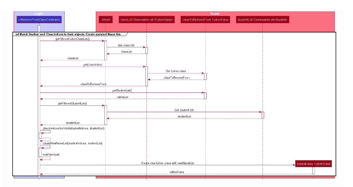
Diagram with too much detail
Note from the teaching team: This bug was reported during the Part II (Evaluating Documents) stage of the PE. You may reject this bug if it is not related to the quality of documentation.
Text is hard to read. Perhaps it should be broken down into smaller diagrams
[original: nus-cs2103-AY2122S1/pe-interim#5684] [original labels: severity.Low type.DocumentationBug]
Their Response to the 'Original' Bug
[This is the team's response to the above 'original' bug]
This diagram does follow the guidelines to include only 1 component from logic and shows the lower level details of the command interacting with the model. However, we recognised that it can be hard to read the text without zooming in. From this screenshot, it recommends that it should be VeryLow only.
It is also hard to introduce reference frames as all the parts are very interconnected.
Items for the Tester to Verify
:question: Issue duplicate status
Team chose to mark this issue as a duplicate of another issue (as explained in the Team's response above)
- [x] I disagree
Reason for disagreement: While the bugs are of the same nature (font and details), I believe this is not a duplicate bug given errors across multiple diagrams should not be flagged as duplicates... as stated in the module website:
While zooming in solves the problem, several diagrams have slightly small fonts. Particularly,
RemoveFromClassCommandsequence diagramClasses Uisequence diagram