Team's Response
No details provided by team.
The 'Original' Bug
[The team marked this bug as a duplicate of the following bug]
Formatting in the appendix of the DG
Note from the teaching team: This bug was reported during the Part II (Evaluating Documents) stage of the PE. You may reject this bug if it is not related to the quality of documentation.

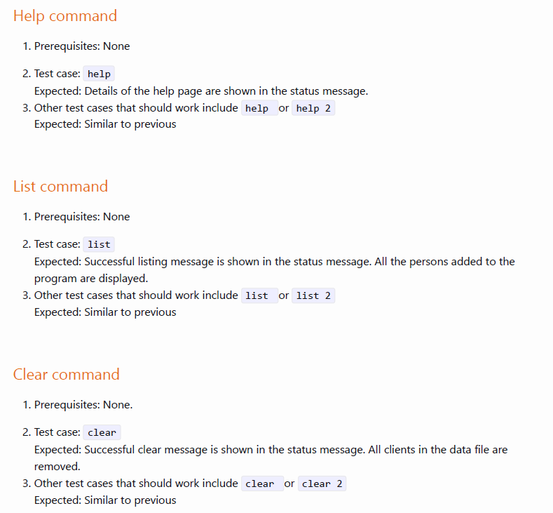
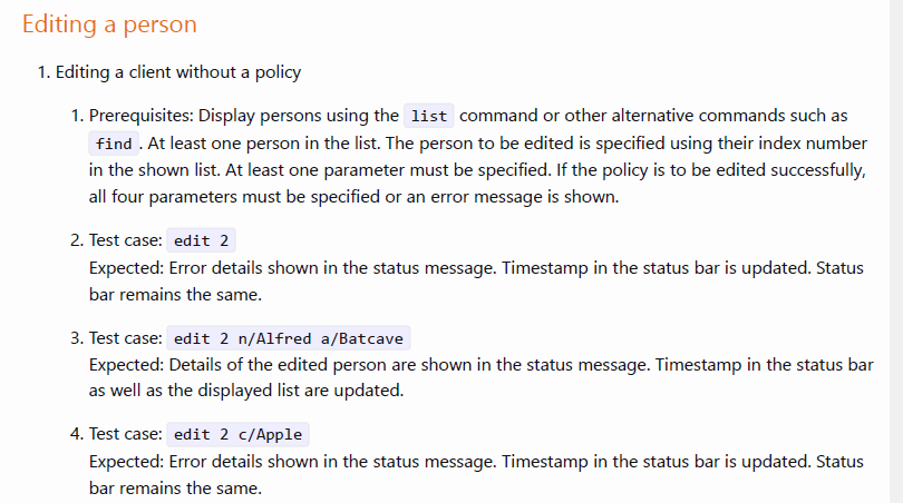
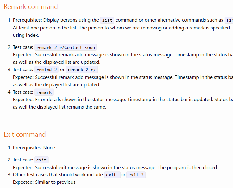
Inconsistent spacing. For point 2 and 3 of each command as shown above, there is no space between the lines compared to the rest of the DG. Other commands in the DG also have this issue. This makes the DG look quite messy.
Example of DG as shown below that have consistent spacing for comparison.
Other issues:
[original: nus-cs2103-AY2324S1/pe-interim#5195] [original labels: type.DocumentationBug severity.VeryLow]
Their Response to the 'Original' Bug
[This is the team's response to the above 'original' bug]
We don't see how this can hinder the user's ability to read sentences from left to right, top-down.
Items for the Tester to Verify
:question: Issue duplicate status
Team chose to mark this issue as a duplicate of another issue (as explained in the Team's response above)
- [ ] I disagree
Reason for disagreement: [replace this with your explanation]
## :question: Issue response Team chose [`response.Rejected`] - [x] I disagree **Reason for disagreement:** The lack of consistency in formatting can distract some users and this particular bug would be classified under `too much/little padding` in the guidelines for bug triaging, hence I flagged it as a cosmetic issue with `severity.veryLow` and it should not be rejected. 


For the
Finding a personall the points have one space between them but for theSort commandandBatch Delete commandonly the first point has one space between the 2nd while the rest (between 2, 3, 4 etc) have no spaces in between. There should be consistent formatting for a better reader experience.