Team's Response
Unfortunately, the user prompt contains a grammatical error. It should be phrased: "Does the progress bar below look well formatted?" As this is a a typo issue that does not affect usage, we deprioritized it to "very low".
This section gives users the option to customize their User Experience based on whether the progress bar is correctly displayed or not. This is a standard procedure used by several CLI applications such as for example by Oh My ZSH. We used this best practice, to ensure the best possible UX for individuals that can see the special characters ░ and█.
Besides including as much context as possible in the user profile creation process, we also explained the reason for this step in this section of the UG:

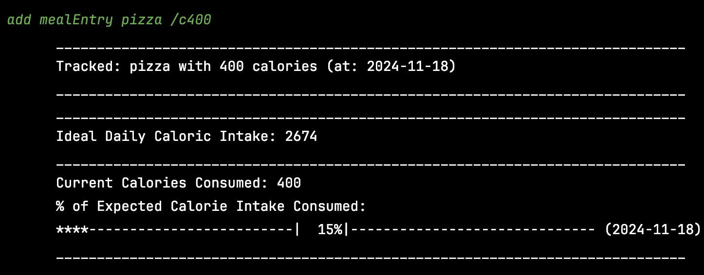
For reference, after users for whom the progress bar was not correctly displayed entered "n", all subsequent progress bar visualizations make use of standard characters to build the progress bar instead. This resulting progress bar looks as follows:

Items for the Tester to Verify
:question: Issue severity
Team chose [severity.VeryLow]
Originally [severity.Low]
- [ ] I disagree
Reason for disagreement: [replace this with your explanation]
So far I still have no idea what this is used for: