 soc-pe-bot
commented
4 months ago
soc-pe-bot
commented
4 months ago Team's Response
No details provided by team.
The 'Original' Bug
[The team marked this bug as a duplicate of the following bug]
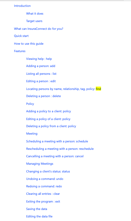
Subsections are not indented at Table of Contents
Note from the teaching team: This bug was reported during the Part II (Evaluating Documents) stage of the PE. You may reject this bug if it is not related to the quality of documentation.
As per title, it would be better if the subsections can be indented, making it more readable for the user.Suggestion: For the policy section, indent the subsections (add, edit, etc.) by one level, to make it clearer for the reader. This can be applied to the Person and Meeting section as well.
Severity: VeryLow as this is purely a cosmetic issue.
[original: nus-cs2103-AY2324S2/pe-interim#2729] [original labels: type.DocumentationBug severity.VeryLow]
Their Response to the 'Original' Bug
[This is the team's response to the above 'original' bug]
The subsections were intentionally designed that way for our CS2101 guidelines. Anyway we think indentation is very subjective.
Items for the Tester to Verify
:question: Issue duplicate status
Team chose to mark this issue as a duplicate of another issue (as explained in the Team's response above)
- [x] I disagree
Reason for disagreement: Both of these issues are reported by me.
For the "original bug", the problem lies in there is no indentation, a cosmetic issue.
For the "duplicated bug", the problem lies in there is basically no subsection for some parts of the documentation, a structural issue.
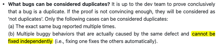
These are two separate issues that should not be considered as duplicates. Fixing one of them does not automatically fix the other issue, and they can only be fixed independently.
## :question: Issue response Team chose [`response.Rejected`] - [x] I disagree **Reason for disagreement:** Since this should not be marked as a duplicate, and the team only responded to the "original bug" and not this one, there is basically no justification for rejecting this bug from the team. I would like to reiterate that this is a valid concern as not having subsections has a real impact on how the user understands the product and find relevant informations.
## :question: Issue severity Team chose [`severity.VeryLow`] Originally [`severity.Low`] - [x] I disagree **Reason for disagreement:** Since this is not merely a cosmetic issue in the UG, it should be counted as `Low` instead of `VeryLow`.
For other features like Policy and Meeting, there is a subsection for each of these respectively before branching into their related subsections.
However, for Client status, the same structure does not apply, although the same can be done.
Why is this significant: It makes finding information harder for the reader, and it does not give an idea of how the features are structured on a high level.
Severity: I marked this as Low as this is more than just a cosmetic issue. It is related to how the features are being presented to the end user, giving them a rough idea of how they can benefit from the app, on first glance.