Open trusktr opened 6 years ago
Hi @trusktr! The way this spec is written you're right in your interpretation - the way EQCSS works is that as long as there is at least one element matching both the selector, and query conditions, that entire contained stylesheet is applied to the page.
@element .two {
p {}
}
^ this query would mean: as long as at least one element in the document matches the selector .two
, output the following stylesheet to the page: p {}
.
While this can apply to elements on the page outside the scoped element(s), you could target only those <p>
tags within elements with a class of .two
by writing a stylesheet like this:
@element .two {
:self p {}
}
However, this spec is from a year ago, and mirrors the features of the EQCSS plugin. There are people who think that the 'scoped stylesheet' ought to be limited only to those element(s) matching both the selector and query conditions and their children only.
Just yesterday I wrote up these notes for what I think the current thinking, and a more likely proposal for inclusion in CSS might be: https://gist.github.com/tomhodgins/a45e1b670ca7384326d3f1ac5b2d6ebc#scoped-stylesheets
However, the syntax described in yesterday's document doesn't have any polyfills for plugins written that behave that way yet!
That's interesting, it could definitely be useful in certain ways, like "if there's a <sparkly-button>
anywhere on the page, make the background of the page sparkle too".
About the word "scoped", yes, I think it is more intuitive to think of it as having limited application of the style sheet (f.e. limited to elements in the the targetted @element). Maybe the spec can be re-worded so that won't confuse intuition (CSSinJS and React users, etc, think of "scoped" in the "only-inside-the-component" sort of way, it's all too common).
Yep, the "scoped-stylesheets" example is more similar to it.
I thought that's what the spec describes?
$this
or :self
doesn't make sense to me unless it only effects elements inside the one defining the queries.
That's what separates element- from container-queries in my mind too. 🤔 That's also the approach I'll try to push for during the WICG talks, @tomhodgins
@ZeeCoder the spec I have here was written to match EQCSS's features originally, so the scoping described in it is not limited to :self
and children simply because EQCSS didn't work that way.
Today, after having EQCSS and seeing where it has been useful and where it hasn't I'm okay with a more limited approach, but I do I think I should point out the usefulness of a few selectors that relate are deeply interlinked with :self
and $this
, that I feel should be included, even in a 'limited' approach:
:parent
↑
:previous ← :self → :next
↓
children
↓
etc
Consider this the 'nuclear family' of :self
that includes the scoped element(s) themselves, plus all of their children, but also the parentElement
, previousElementSibling
, and nextElementSibling
of :self
. I think this would be more useful than just:
:self
↓
children
↓
etc
If you think of :self
as a point of reference, and think the scoped stylesheet should be 'from the perspective' of that point of reference, I'm okay with examples like this not being allowed:
/* definitely outside of our element */
@element input (min-characters: 15) {
body { background: lime; }
}
/* totally unrelated element that happens to be in the DOM */
@element input (min-characters: 15) {
#sidebar { background: lime; }
}
But I do think the following can be useful and should be considered part of a limited solution. They're still all scoped to :self
, but touch things directly adjacent to it, and younger siblings. To me, this feels like the natural way :self
as a point of reference works:
/* the parentElement of :self */
@element input (min-characters: 15) {
:parent {}
}
/* the previousElementSibling of :self */
@element input (min-characters: 15) {
:previous {}
}
/* the nextElementSibling of :self */
@element input (min-characters: 15) {
:next {}
}
@element input (min-characters: 15) {
:self ~ label {}
}
This would open up things like :self ~ *
and :parent ~ *
which appear like they should work—and maybe they should? I had never tried to write a scoped selector like :self ~ .thing
until recently when I was trying to refactor :parent
out of this demo, I wanted to do it without :parent
, and to be able to write a small helper function to help with the calculations. The only way I could think to get the same job done was by using 2 extra elements in HTML, and selectors like :self ~ .left
and :self ~ .right
. Scroll down here to the bottom to see the recreated demo: http://staticresource.com/helpers
overflow('.overflow pre', 'left', `
:self ~ .left {
opacity: 1;
}
`)
overflow('.overflow pre', 'right', `
:self ~ .right {
opacity: 1;
}
`)
As for 'element queries' versus 'container queries' versus 'scoped stylesheets'. I see it like this:
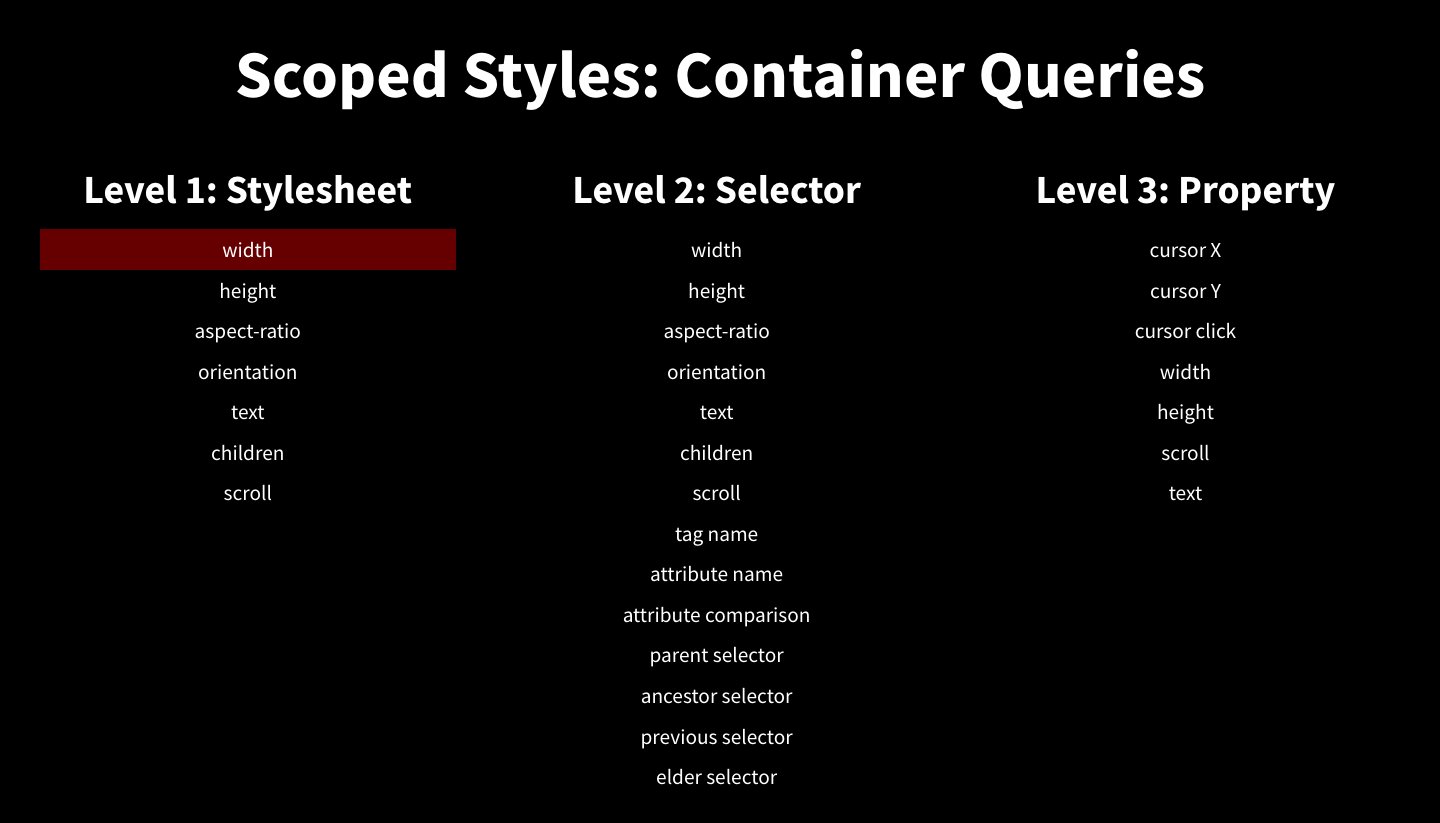
Scoped stylesheets: stylesheets scoped to the point of view of an element in the DOM Element Queries: scoped stylesheet with at least one responsive condition Container Queries: width-based element queries limited to elements and their children
So with these definitions, the following statements are all true:
I see the most useful element query features as:
width
height
characters
children
scroll
aspect-ratio
orientation
And container queries seems concerned only about:
width
I don't even hear people including height
when discussing 'container queries', but when talking about 'element queries' in the more general sense you get my list from above plus even more exotic features. I think while the majority of queries written will likely be width-based queries on elements, I really don't want people to cage in their understanding of what's possible or miss out on what could be if they're currently only looking at, or thinking about 'container queries'. There's so much more that can be done, and isn't much different from or harder to accomplish than just the width
feature! Let's aim high and hope for all of them :D
Let's aim high and hope for all of them :D
Yeah!
Maybe an optional :root
keyword can still be useful for that original case:
@element input (min-characters: 15) {
:root #error-exists-icon { background: red }
}
And/or maybe something like
@element input (min-characters: 15) {
:ancestor(#error-exists-icon) { background: red }
}
This at least makes it obvious what it does, while perhaps the limited scope is default.
As for the query having a "responsive condition", let's not limit it to "responsiveness". Let's keep the door open to other ideas too (I think of "responsive" as having to do with responsive design and width/height).
For.e. imagine something like
@element input (value > 15) {
:ancestor(body) #error-exists-icon { background: red }
}
Where that applies if the numerical value of the input is greater than 15.
We might want things like
@element input (isNaN(value)) {
:ancestor(body) #error-exists-icon { background: red }
}
Those sort of conditions don't strike me as what falls in "responsive design", though the styling is responsive to some condition in the literal sense.
I guess we can still define it as "responsive design" if we want to, because it literally is. :)
All right, let's start the discussion then XD
it's very useful to see your definition for "scoped" stylesheet and element / container queries.
I'll try to give me mine, because I think we have differing definition on container queries.
scoped stylesheet: based on you description these stylesheets are not actually scoped in the usual use of the word. they are global stylesheets (except for :self) injected when a certain element meets certain conditions. scoping usually means containment / encapsulation, while here they're just related to an element through their conditions. Hence the confusion imho.
element / container queries: I think for some reason you see container queries by definition inferior to element queries, while to me they're everything element queries are, only with added "actual" scoping of the styles. All container queries differ from element queries, is that the classes inside such a query will not be global, and would only work inside the containing DOM element. Therefore, characters, scroll, width / height all could work just the same for container queries, there's absolutely no reason why it wouldn't. this is exactly the reason why I said it doesn't matter much whether we'll call it element- or container- query, booth could work. however I still feel strongly that container would be better, because:
on contextual selectors: I still don't agree that we need parent / next / previous. components should be composable without side-effects. if we allow :parent, for example, then just by embedding a component into another, the parent's styles (it's internal state) might change. your demo example too is easily achievable with a container syntax that supports conditions for scroll. (I've described this to you before) imagine in another language that an instance of class "A" saves class "B"'s instance in a local variable, and just through that act, instance of B changes local variables in instance of A. same idea here, we should avoid that.
I really think all you want is achievable with a container query syntax without these contextual selectors.
On 2 Jan 2018 13:57, "Tommy Hodgins" notifications@github.com wrote:
@ZeeCoder https://github.com/zeecoder the spec I have here was written to match EQCSS's features originally, so the scoping described in it is not limited to :self and children simply because EQCSS didn't work that way.
Today, after having EQCSS and seeing where it has been useful and where it hasn't I'm okay with a more limited approach, but I do I think I should point out the usefulness of a few selectors that relate are deeply interlinked with :self and $this, that I feel should be included, even in a 'limited' approach:
:parent ↑
:previous ← :self → :next ↓ children ↓ etc
Consider this the 'nuclear family' of :self that includes the scoped element(s) themselves, plus all of their children, but also the parentElement, previousElementSibling, and nextElementSibling of :self. I think this would be more useful than just:
:self ↓ children ↓ etc
If you think of :self as a point of reference, and think the scoped stylesheet should be 'from the perspective' of that point of reference, I'm okay with examples like this not being allowed:
/ definitely outside of our element / @element input (min-characters: 15) { body { background: lime; } } / totally unrelated element that happens to be in the DOM / @element input (min-characters: 15) {
sidebar { background: lime; }
}
But I do think the following can be useful and should be considered part of a limited solution. They're still all scoped to :self, but touch things directly adjacent to it, and younger siblings. To me, this feels like the natural way :self as a point of reference works:
/ the parentElement of :self / @element input (min-characters: 15) { :parent {} } / the previousElementSibling of :self / @element input (min-characters: 15) { :previous {} } / the nextElementSibling of :self / @element input (min-characters: 15) { :next {} }
@element input (min-characters: 15) { :self ~ label {} }
This would open up things like :self ~ and :parent ~ which appear like they should work—and maybe they should? I had never tried to write a scoped selector like :self ~ .thing until recently when I was trying to refactor :parent out of this demo https://codepen.io/tomhodgins/pen/egpmWN, I wanted to do it without :parent, and to be able to write a small helper function http://staticresource.com/helpers/overflow.js to help with the calculations. The only way I could think to get the same job done was by using 2 extra elements in HTML, and selectors like :self ~ .left and :self ~ .right. Scroll down here to the bottom to see the recreated demo: http://staticresource.com/helpers
overflow('.overflow pre', 'left',
:self ~ .left { opacity: 1; }
)overflow('.overflow pre', 'right',
:self ~ .right { opacity: 1; }
)As for 'element queries' versus 'container queries' versus 'scoped stylesheets'. I see it like this:
Scoped stylesheets: stylesheets scoped to the point of view of an element in the DOM Element Queries: scoped stylesheet with at least one responsive condition Container Queries: width-based element queries limited to elements and their children
So with these definitions, the following statements are all true:
- 'scoped stylesheets' are a prerequisite for 'element queries'
- 'element queries' are 'scoped stylesheets' plus responsive breakpoints
- all 'container queries' are 'element queries'
- not all 'element queries' qualify as 'container queries'
- HTML has no concept of a 'container' defined anywhere in the spec
- there already exists a great deal of writing about what an 'element' is in HTML
I see the most useful element query features as:
- width
- height
- characters
- children
- scroll
- aspect-ratio
- orientation
And container queries seems concerned only about:
- just width
I don't even hear people including height when discussing 'container queries', but when talking about 'element queries' in the more general sense you get my list from above plus even more exotic features. I think while the majority of queries written will likely be width-based queries on elements, I really don't want people to cage in their understanding of what's possible or miss out on what could be if they're currently only looking at, or thinking about 'container queries'. There's so much more that can be done, and isn't much different from or harder to accomplish than just the width feature! Let's aim high and hope for all of them :D
— You are receiving this because you were mentioned. Reply to this email directly, view it on GitHub https://github.com/tomhodgins/element-queries-spec/issues/10#issuecomment-354771661, or mute the thread https://github.com/notifications/unsubscribe-auth/ADglEip0zSikdiwNol4Q62vLpuJ1BUOeks5tGjXjgaJpZM4RPxjy .
Also, imagine this:
@element input (min-characters: 15) {
body { background: red; }
}
@element input (min-characters: 15) {
body { background: green; }
}
What happens here? Also: if multiple different element wants to change the same global styles, which do I actually want?
I think this is the difference between two viewpoints: I work with "components" on a regular bases, and use OOCSS methodologies (like BEM) to achieve scoping of styles. This, in effect means, that I avoid using the cascade as much as possible, while you want to make it work not only downwards the DOM tree, but upwards too.
I'm sorry, but I'm strongly against that effort.
scoped stylesheet: based on you description these stylesheets are not actually scoped in the usual use of the word. they are global stylesheets (except for :self) injected when a certain element meets certain conditions. scoping usually means containment / encapsulation, while here they're just related to an element through their conditions. Hence the confusion imho.
I feel like I've created confusion in this thread even :) This spec here where this issue is opened I wrote last year and works the way I've been doing scoped stylesheets from 2014-2017, but the scoped stylesheet idea in this spec isn't what I'm considering 'current' for 2018. To see the 'current' idea of what I think should be proposed, check out CSS Element Query Syntax for 2018 Where the 'scoped stylesheets' are limited and not global. Imagine:
@element .example (min-width: 500px) {
.class1 {}
}
Acts as though it is:
:matches(.example:self) .class1 {}
By the time it hits the stylesheet - or something like that. They would be scoped to the .example
elements that match the query conditions… I'm OK with that kind of limitation, and although it cuts out a ton of possibility for global styling, it doesn't cut out a ton of practical usefulness, and it seems a lot closer to the type of 'scoped stylesheet' you're wanting too.
element / container queries: I think for some reason you see container queries by definition inferior to element queries, while to me they're everything element queries are, only with added "actual" scoping of the styles.
All container queries differ from element queries, is that the classes inside such a query will not be global, and would only work inside the containing DOM element.
Therefore, characters, scroll, width / height all could work just the same for container queries, there's absolutely no reason why it wouldn't. this is exactly the reason why I said it doesn't matter much whether we'll call it element- or container- query, booth could work.
however I still feel strongly that container would be better, because: - it signals immediately that it's more than: "if an element's width is x, apply these styles" @container suggests that elements are expected to becontained, and the syntax implies that such styles are local to the container.
the word "element" suggests that it's only about the element, while it's really mostly about it's children that it contains.
again, container not being in the html spec doesn't matter much to me, it's a concept, like @media. there's no media element in the html spec either. it really doesn't matter.
Media Queries (@media) query conditions about the media being used to display the HTML. Element Queries (@element) query conditions about the elements being used to display the HTML. Would Container Queries (@container) query conditions about the containers being used to display HTML? What's a container in HTML?
@container input (min-children: 20) {
:self { border-color: red; }
}
Does it feel right to say <input>
, which is a void tag in HTML and can't even contain HTML content, that it's more correct to call it a 'container' in this context than an 'element'? By definition it cannot ever contain anything, what would a container query query?
To me container query
instantly makes me think of Docker, not CSS. The next thing I think is: it must query the things inside a 'container'. So the immediate thought is that I'm styling an element based on its children rather than styling an element and its children based on itself. (Only min-children
and max-children
sound like things a 'container query' could query to me intuitively)
Anybody confused about what a 'container' is in HTML can go and look that up…where?
I made some images to illustrate what I think the difference between element queries and 'container queries' as most people think of them are:
Currently in use these cover both implementations like EQCSS where you have a whole stylesheet inside, as well as things like CSSplus/Selectory and QSS where you only have the ability to add something special to a selector and query & style that one individual element (not even its children). Any querying of elements at any level is found within the group of 'element queries'.
Container queries, as most people who use the term understand it, refers primarily to width-based query conditions on elements, for the use of applying styles to that element (and usually limited to only affecting it and its children: :self, :self *
)
I would say that 100% of 'Container Queries' fall within the larger concept of 'Element Queries', just like all 'Element Queries' and 'Container Queries' fall within the larger concept of 'Scoped Styles'. CSS Variables are a way to scope styles to individual elements…just at the property level rather than at the level of a selector, or a whole stylesheet. CSS Variables are also under the umbrella of 'Scoped Styles' as well :D
on contextual selectors: I still don't agree that we need parent / next / previous. components should be composable without side-effects. if we allow :parent, for example, then just by embedding a component into another, the parent's styles (it's internal state) might change. your demo example too is easily achievable with a container syntax that supports conditions for scroll. (I've described this to you before) imagine in another language that an instance of class "A" saves class "B"'s instance in a local variable, and just through that act, instance of B changes local variables in instance of A. same idea here, we should avoid that.
'Components' aren't something in HTML, that's another concept we put on top of it. CSS already has :has()
(though it's not supported) so it seems it's already a line that's been crossed by the CSS WG. Perhaps a rule of thumb with a component-based workflow is to avoid using a parent selector - avoiding the use of a selector while doing a certain task is a lot better to me than never implementing it because sometimes, some people build in a certain way.
One thing I've noticed from using element queries is that, even when I'm thinking in 'self-responsive components', it's not like the 'outmost containing element' is the only one I'm querying. I often have queries on different elements within the same 'component'.
I really think all you want is achievable with a container query syntax without these contextual selectors.
Can you build some examples? I've gotten a lot of use out of :parent
in EQCSS and most of the things I've done with it would have required JS or HTML changes to achieve otherwise, I'm not sure how I could just CSS my way through this functionality.
Also, imagine this:
@element input (min-characters: 15) {
body { background: red; }
}
@element input (min-characters: 15) {
body { background: green; }
}
What happens here? Also: if multiple different element wants to change the same global styles, which do I actually want?
The way EQCSS works, currently it would be like this if no <input>
tags were at least 15 characters long:
And if 1 or more <input>
tags in the document had at least 15 characters of value, the output would (for EQCSS) be equivalent to a stylesheet like this:
body { background: red }
body { background: green }
So normal CSS precedence would take effect here. It's not really any different than what would happen in this example:
@media (min-width: 500px) {
body { background: red }
}
@media (min-width: 500px) {
body { background: green }
}
I work with "components" on a regular bases, and use OOCSS methodologies (like BEM) to achieve scoping of styles. This, in effect means, that I avoid using the cascade as much as possible, while you want to make it work not only downwards the DOM tree, but upwards too.
I'm sorry, but I'm strongly against that effort.
I'm not saying we should be able to navigate up, down, sideways, and all over the place like XPath does with its axes: https://www.w3schools.com/xml/xpath_axes.asp
Even if specced I don't see it being supported by browsers any time soon. You might think of :has()
as the ancestor
axe for XPath. It seems like the type of scoping you want for scoped stylesheets could be described as 'only elements contained within XPath's descendant-or-self
axe' ;)
Just like :focus-within
and :target-within
are more limited than supporting all of :has()
and using :has(:focus)
or :has(:target)
, I'm proposing that instead of :has()
and being able to select any ancestor element at all, perhaps a more limited selector, like :has(> :self)
could be useful. If you already know :self
, its direct parent can be found using parentElement
, which is simpler than searching through the whole document to see if an element contains another element.
Likewise, a previous element selector is impossible the way CSS currently works, but if :has()
were supported you could do something like :has(+ :self)
. Again, that's a lot simpler than searching through the document for an elder sibling matching a selector or something, it's just the previousElementSibling
of :self
. I have no doubt these selectors are useful, I'm just floating the idea that with :self
they might be nice, limited, 'cheaper' ways to get some of the most useful parts of :has()
exposed in a way that's easy enough (I hope) to support :D
I think we got a bit sidetracked here, what we talk about are starting to become topic of the WICG discussions on container/element queries, rather than this specific spec. 😅
@trusktr sorry to disrupt your otherwise simple issue, carry on. 👍
I read the spec, but I can't understand what "scoping" means, or at least I don't understand what it is useful for.
For example, I would think that in the following example only the
p
inside of.two
is styled:https://codepen.io/anon/pen/MrmqeX
But instead what I see is something like "Because there exists an element with class
.two
anywhere on the page, then apply this style in global scope which applies to all elements on the page even if they are outside of the element with class.two
".I was hoping that styles inside of the
@element
query would apply only to elements that are found inside of the element(s) targeted with@element
. This would be similar to nesting in SASS/LESS/Stylus.Is this not the case? Do you mean to rather do something like "If there is a
<video>
element anywhere on the page, then style the whole page in some way"?