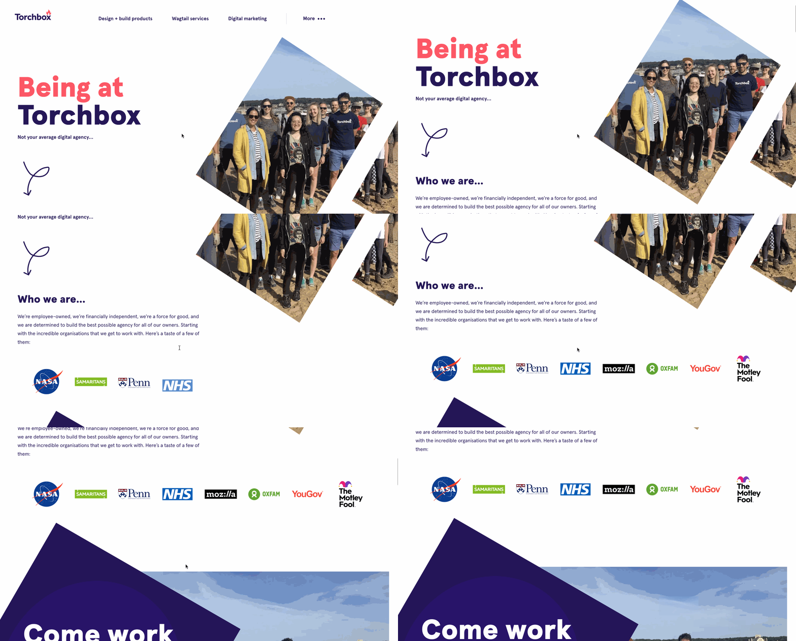
Having read into recommended animation practices for better user experience, I will reduce the scope of this MR so only the logos receive an animated entrance, as well as one or two arrows which won't distract from the content.
I think that reducing the proposed site animations will improve the user experience, especially in the case of the Benefits list component, which is repeated often in the site and would be annoying to watch stagger in each time.
Description of Changes Made
Adds SVG loop animation and logo fade in on scroll animation.
I've made a custom hook for the SVG arrow animation which has been applied to the three different SVG arrow components. I've simplified these SVG files so they are smaller and animate smoother.
A further hook has been added for animating multiple child components. This could be refactored to be more generic, supporting different animation objects or intersection observer settings.
How to Test
Link to changes made on preview site
Screenshots
Expand to show more
MR Checklist