 ilin-andrey
commented
1 year ago
ilin-andrey
commented
1 year ago I afraid that your "ugly" approach is the only approach which works in your case. Datepicker component doesn't allow to define state, it is uncontrolled component, on re-render you unmount it from DOM and then mount it back as a fresh component with same default values.
 maakle
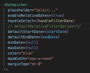
 mitrotasios
 angelhodar
So I am facing the following issue. I am fetching data from my API via a hook (in the code
useHeadcount). I am using Nextjs & SWR for fetching. This hook needs thestartDateandendDatefrom tremor's Datepicker to query the API for the headcount in that range. I am controlling those outside with a simple useState. Whenever a user selects the dates from the Datepicker component, thehandleFilterDateis called and updates the variables.The issue that arrises here is that the whole component is mounted and re-rendered, whenever I select something from the datepicker, resetting
startDateandendDateback to the default values I set. This results that a user is unable to select a date range, always going back to the defaults. The behavior can be seen in the screen recording here.I tried to use useCallback (on handleFilterDate) and useMemo (on the DatePicker component) but unsuccessfully. The only ugly solution was to refactor the whole component, making Datepicker not relying on data, isLoading or error and due to the rerender. I'll paste the ugly solution below.
There has to be a better & cleaner way how to solve this. Any ideas what to do that? The ugly solution can't be the only solution...
Code:
Ugly solution that works...