 csandman
commented
3 years ago
csandman
commented
3 years ago Did you figure it out @DemChing ?
Closed DemChing closed 3 years ago
csandman
commented
3 years ago Did you figure it out @DemChing ?
 DemChing
commented
3 years ago
DemChing
commented
3 years ago No, it seems the problem only occurs in my laptop. I cannot reproduce it in other device so I closed it.
 cworf
commented
3 years ago
cworf
commented
3 years ago @DemChing Im guessing that your laptop has a high DPI screen. I have been having this problem as well and can give basic steps to reproduce on any monitor. basically, it occurs on higher DPI screens, for example: 4k monitors, where scaling is used by the operating system to make text readable. to reproduce the problem on standard dpi monitors without scaling applied on the OS:
(note: these steps are specific to a windows machine, I dont know how to adjust text scaling on a mac, but i'm sure there is a way so replace step 1 with that)
It does not matter what element you try to capture in this scenario, it will always be x percentage larger with empty space on the right and bottom sides. I have tried using some of the solutions in other threads aimed at improving the quality of output with regard to different dpi screens, and it indeed improves the "quality" of the output in that the output is more crisp (solves a different issue), however it simply scales the same empty space issue as states in the op.
Its almost as though the container must be scaled BEFORE being rendered. Im totally lost as to how to accomplish this. but its a real issue im surprised has no solution yet as text scaling on high dpi monitors is very common, as it happens by default on windows.
 nipunadodan
commented
3 days ago
nipunadodan
commented
3 days ago html2canvas solved that issue by passing window.devicePixelRatio as follows,
html2canvas(canvasRef.current, { scale: window.devicePixelRatio })Is there an equivalent for this?
I prefer to use dom-to-image as it supports CSS filters as well. But this issue holds me down.
nipunadodan
commented
3 days ago I found a solution, this will scale the element into the right dimensions so it won't have an empty space anymore; Thanks @cworf, for pointing me in the right direction.
const scale = window.devicePixelRatio;

domtoimage.toBlob(el, {
    height: el.offsetHeight * scale,
    width: el.offsetWidth * scale,
    style: {
        transform: `scale(${scale})`,
        transformOrigin: 'top left',
        width: `${el.offsetWidth}px`,
        height: `${el.offsetHeight}px`
    }
})
I have an div with size 100x50. I scale it up to
4and output it as PNG. The size of resulted PNG is 500x250 instead of 400x200. However, the content inside the div only scale to4, leaving the remaining space empty.Here is the illustration of what I got: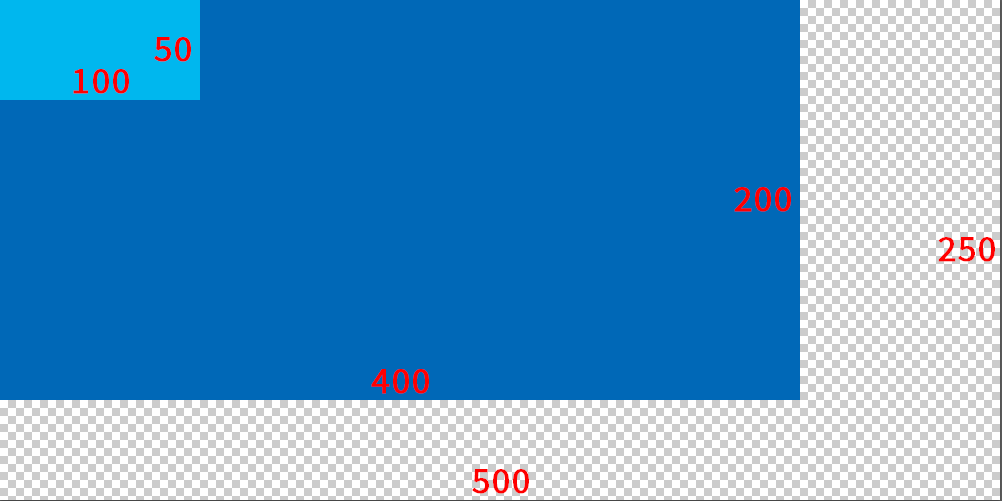
The code I used:
Changing the
scale,widthorheight(also tried to change theoptions.style) but no luck. I find thatwindow.devicePixelRatiois some how affecting the size. (in my case that is1.25). It seems the effective area is constrained to the scaled size but the output size will multiply with the DPI ratio. Is there any way to remove those extra space?