 drgrumpy
commented
11 years ago
drgrumpy
commented
11 years ago +1 for ems
Closed ifesdjeen closed 12 years ago
drgrumpy
commented
11 years ago +1 for ems
 gerardo-rodriguez
commented
11 years ago
gerardo-rodriguez
commented
11 years ago +1 for ems. If you are looking for a semantic, em-based grid system, the Bourbon Neat Grid is a great option. Foundation 4 is much better than previous iterations and can work if you need a "full" package.
 cvrebert
commented
11 years ago
cvrebert
commented
11 years ago Quoting @mdo in Issue № 6342 (regarding v3, which is still under development), emphasis mine:
We explored the use of rem units over pixels, but found little benefit to offset the implications of their use. IE8 would still need a pixel fallback, and that's a lot of duplicate lines of code. Moreover, using rems everywhere instead of pixels would exacerbate that problem. Mixing rems and pixels doesn't seem to make sense either right now. However, we can and will continue to evaluate this in future releases.
 ksclarke
commented
11 years ago
ksclarke
commented
11 years ago +1 for ems
 tristanchambers
commented
11 years ago
tristanchambers
commented
11 years ago +1 for ems
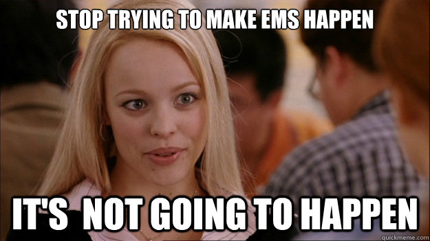
 jahvi
commented
11 years ago
jahvi
commented
11 years ago Based on @mdo's response this meme express my feelings accurately towards this issue
 roelbarreto
commented
11 years ago
roelbarreto
commented
11 years ago +1 for em
 gmx
commented
11 years ago
gmx
commented
11 years ago +1 for ems
 ghost
commented
11 years ago
ghost
commented
11 years ago +1 for rems/ems
 lanthaler
commented
11 years ago
lanthaler
commented
11 years ago +1 for rems
 chrylis
commented
10 years ago
chrylis
commented
10 years ago +1 again for relative units. My Galaxy S3's 2.5-inch-wide 720px screen displays px-valued styles tiny, and the whole point of using a responsive layout is to be able to use equivalent descriptions for desktop and mobile.
 tmaiaroto
commented
10 years ago
tmaiaroto
commented
10 years ago You can have all the gripes with em/rem in the world, but at the end of the day this framework has absolutely appalling typography. The grid system, various components, and JavaScript are all well and fine, but it needs to seriously step up its game with typography. +1 for rems and considering the use of a baseline grid.
Some people have already tried to work toward it...But for older versions of Bootstrap. https://github.com/vwall/compass-twitter-bootstrap https://github.com/jonschlinkert/vertical-rhythm
To be clear, I really like Bootstrap and think it's super awesome. It just needs to push the design a tiny bit farther. I'm trying to find a good solution to the problem myself...Including non-invasive add-ons so that it can be completely optional.
 carasmo
commented
10 years ago
carasmo
commented
10 years ago Respond.js has supported ems for a few years.
Well, it's pretty easy to convert the media queries to ems and it's MUCH better, especially due to page zooming and because of the following:
The 62.5% value made sense on the desktop as we were trying to approximate physical print sizes on screens that somewhat varied in size but were by and large consistent at 72 dpi. Because of the much larger variance in dpi, big differences in physical size, and differences in browser implementation on mobile, if you are trying to make a responsive site, I don't think using this value to gauge a font baseline is relevant any more..(...unless you only use it for the largest and presumed desktop layout but then use a different set of values altogether for the presumed mobile layouts...and I say presumed because of certain tablets or larger mobiles whose landscape dimensions are similar to the size of a PC so end up matching to a 'desktop' media query) https://github.com/scottjehl/Respond/issues/18#issuecomment-1076030*
Now I've got some mixins for rems on fonts, margins, and padding so IE8 can see the fonts in rem which I have to figure out based on a 16px baseline. BTW, IOS is 16px that's why the page zooms when you focus an input unless you have a fix in your css for that.
Target Size / Base Size = Value Since we can assume that browsers use 16px as default (after all, that's what Jonathan Snook did to assume that 62.5% is 10px), then your Base is 16. If you want 32px, then 32 / 16 = 2, want 40px then 40 / 16 = 2.5, want 24 then 24 / 16 = 1.5. The same goes for 75%... Determine what 75% is (it's 12) and perform the same calculation. If you want 32px, then 32 / 12 = 2.666, want 40px then 40 / 12 = 3.333, want 24 then 24 / 12 = 2. http://stackoverflow.com/questions/11352783/how-to-calculate-rem-for-type
There's a thread on here on vertical rhythm https://github.com/twbs/bootstrap/issues/11601. It's been VERY good to remove all top margins and even just have a bottom margin on hr tags, no guess work and hardly any over-rides. Plus you can make some nice spacers with empty hr and use that visible-xs on them. Yum
carasmo
commented
10 years ago // Extra small screen / phone
// Note: Deprecated @screen-xs and @screen-phone as of v3.0.1
//@screen-xs: 480px;
//@screen-phone: @screen-xs-min;
@screen-xs-min: 480px;
@screen-xs-min: 30.000em;
// Small screen / tablet
// Note: Deprecated @screen-sm and @screen-tablet as of v3.0.1
//@screen-sm: 768px;
//@screen-tablet: @screen-sm-min;
@screen-sm-min: 768px;
@screen-sm-min: 48.000em;
// Medium screen / desktop
// Note: Deprecated @screen-md and @screen-desktop as of v3.0.1
//@screen-md: 992px;
//@screen-desktop: @screen-md-min;
@screen-md-min: 992px;
@screen-md-min: 62.000em;
// Large screen / wide desktop
// Note: Deprecated @screen-lg and @screen-lg-desktop as of v3.0.1
//@screen-lg: 1200px;
//@screen-lg-desktop: @screen-lg-min;
@screen-lg-min: 1200px;
@screen-lg-min: 75.000em;html font-size is now 100%
IE 8 is behaving.
 ribzin
commented
10 years ago
ribzin
commented
10 years ago I'm switching to Foundation. REMs !!
 boulox
commented
10 years ago
boulox
commented
10 years ago +1 bs v4 drop ie8 support and switch to rem unit :)
carasmo
commented
10 years ago I have ems and rems and all was rather easy to adjust myself and have fallbacks for IE8 which people still use
boulox
commented
10 years ago @carasmo if you use rem for every rules in your CSS, the ie8 fallback duplicate all lot of code. It's personal opinion but i believe so much extra bites don't worth it.
carasmo
commented
10 years ago I use a ZDroid pull request on the responsive utilities, which eliminated over 200 lines of compiled CSS, then I use one small reset file so I don't have to mess with the less files. I base my font size on 16px for the html (100%). Respond.js already supports ems.
This is the compiled less for all font-sizes which uses a mixin to create:
/* -------------- [ convert BOOTSTRAP font sizes to REMS ] --------*/ .close { font-size: 21px; font-size: 1.3125rem; } .badge { font-size: 12px; font-size: 0.75rem; } .dropdown-menu { font-size: 14px; font-size: 0.875rem; } pre { font-size: 13px; font-size: 0.8125rem; } .navbar-brand { font-size: 18px; font-size: 1.125rem; } .tooltip { font-size: 12px; font-size: 0.75rem; } .progress-bar { font-size: 12px; font-size: 0.75rem; } .popover-title { font-size: 14px; font-size: 0.875rem; } legend { font-size: 21px; font-size: 1.3125rem; } output { font-size: 14px; font-size: 0.875rem; } .form-control { font-size: 14px; font-size: 0.875rem; } .input-group-addon { font-size: 14px; font-size: 0.875rem; } .input-sm { font-size: 12px; font-size: 0.75rem; } .input-lg { font-size: 18px; font-size: 1.125rem; } .btn { font-size: 14px; font-size: 0.875rem; } .btn-lg { font-size: 18px; font-size: 1.125rem; } .btn-sm { font-size: 12px; font-size: 0.75rem; } .btn-xs { font-size: 12px; font-size: 0.75rem; }
The gutters and all else is are in percentages and I use px when it's appropriate.
 mdo
commented
10 years ago
mdo
commented
10 years ago  jasny
commented
10 years ago
jasny
commented
10 years ago If you want to use EM / REM with Bootstrap 3, try this gist.
 RogueSkolar
commented
10 years ago
RogueSkolar
commented
10 years ago Big up for that @jasny!
The pixel issue has been the only thing that has held me back in adopting Bootstrap to the fullest and thus mostly been working with Foundation. Big fan of both frameworks for various reasons, just that damn pixel issue... and to refactor, well it's a bit laborious especially for time starved folks. BS4 sounds real promising, this is a great development, great stuff @mdo! Very pleased about this.
Hi,
Would you be interested in getting rid of Pixel measurements and taking a more flexible approach, using EM?
For things like, for example Legend size, paddings for headings, alert blocks, buttons nav tabs. These things are more likely to be relative than absolute.
Also, sizes of input controls, sizes or labels and many more things. All of them rely heavily on the base font size, and it will such an improvement to have all those things in a relative measurements (em) rather than absolute (px).