twbs / bootstrap

The most popular HTML, CSS, and JavaScript framework for developing responsive, mobile first projects on the web.
https://getbootstrap.com
MIT License
170.88k stars 78.88k forks source link

.invalid-feedback doesn't show for .input-group with an invalid control #23454

Closed simmerz closed 6 years ago

simmerz commented 7 years ago

Example:

<div class="form-group col-md-4">
  <label class="form-control-label is-invalid" for="valuation_value">Estimated Value</label>
  <div class="input-group is-invalid">
    <span class="input-group-addon">£</span>
    <input class="form-control is-invalid" min="0" type="number" value="" name="valuation[value]">
  </div>
  <div class="invalid-feedback">can't be blank, is not a number</div>
</div>

Results in:

screen shot 2017-08-15 at 11 59 15

I would expect to see can't be blank, is not a number under the input-group.

aedart commented 7 years ago

In your example, you might need to place the <div class="invalid-feedback"> right after the input (at least from what I understood in the docs).

<div class="form-group col-md-4">
  <label class="form-control-label is-invalid" for="valuation_value">Estimated Value</label>
  <div class="input-group is-invalid">
    <span class="input-group-addon">£</span>

    <input class="form-control is-invalid" min="0" type="number" value="" name="valuation[value]">
    <!-- feeback right after input -->
    <div class="invalid-feedback">can't be blank, is not a number</div>
  </div>
</div>
simmerz commented 7 years ago

@aedart If I do that, it tries to fit in the feedback inside the input-group, which breaks the layout

aedart commented 7 years ago

Yes, you are right. Perhaps a span can do the trick.

Also, I just realized that you are also setting the .is-invalid on the parent div. I do not think that this has any effect at all. Only elements with form-control or .custom-select should be affected by this.

simmerz commented 7 years ago

I tried on the parent div. In the end, I've added the following which does what I want, but my gut says this should work off the shelf:

.input-group.is-invalid {
  ~ .invalid-feedback {
    display: block;
  }
}
aedart commented 7 years ago

You are right, just created the fiddle that shows you point: https://jsfiddle.net/aedart/tLwsztc0/

However, I'm not sure if the authors are going for this or not. But it does seem like a clear "lack" that invalid-feedback's appearance is entirely controlled by a siblings' state, ...

mdo commented 7 years ago

Definitely something to see if we can support. We're also missing proper support for checks and radios as mentioned in another issue.

mdo commented 7 years ago

Sorry, to elaborate, the problem is we're not actively asking folks to add a class to the parent of an input. With the HTML5 validation move in Beta 1, we're triggering everything off the state of the input. We need to see if there's something else we can do for the input group, but it's tough given that markup and styling for presenting inputs that way.

fjsuarez commented 7 years ago

Related to this issue, when using is-invalid on an input-group, it should give the border to the entire component.

<div class="input-group is-invalid">
    <div class="input-group-addon">%</div>
    <input type="number" class="form-control" required>          
</div>
<div class="invalid-feedback">
</div>

This snippet generates something that looks like this:

image

Applying border to the entire input-group would make it look more consistent with other default input controls, such as file input:

image

mdo commented 7 years ago

other default input controls, such as file input:

To be clear, that's not a default input control—that's a hacked up custom form control :).

tochoromero commented 7 years ago

I'm having the same problem. But since I'm coming from the alpha version and I was using form-control-feedback with custom JS to hide it when needed, I was able to just override the display of the invalid-feedback:

.invalid-feedback {
  display: block;
}

I know this is not ideal, but at least it allowed me to move forward.

tmorehouse commented 7 years ago

I was encountering this issue as well, trying to figure out how to get the invalid-feedback to show when the invalid-feedback is not a sibling of the input (i.e input groups, etc.) and using a feedback text for custom file-input is another good example where this new method fails.

I don't think HTML5 validation is actually ready for the real web yet (not until CSS parent selectors become available, which I think is never).

Once could add in a JavaScript routine to monitor the validity state of an input (or the is-valid/invalid class) and then check for any elements that may have a for attribute that matches the input's ID, or via the aria-describedby attribute (which can contain a list of element IDs), and apply the states to those elements.

But it feels bad using JavaScript to correct this shortcoming.

Having a 'valid-feedback` element would be nice as well, or at least the ability to change the color of the invalid-feedback to green

It would be at least nice to get the ability to place a class on the input-group, and for radio-groups or stacked check boxes, etc (i.e feedback messages to select one)

wilsmex commented 7 years ago

I'm having this issue as well.
As mdo mentioned, It's impossible to trigger the 'block' status with the following markup being that everything is being triggered from the single input state. You have to have an 'is-invalid' state that gets added to the parent, as there are not 'parent' selectors in css...

  <div class="input-group mb-2 mr-sm-2 mb-sm-0">
    <div class="input-group-addon">@</div>
    <input type="text" class="form-control is-invalid" id="xyz" placeholder="xyz">
  </div>
  <div class="invalid-feedback">
     Please provide a valid state.
  </div>

Being that I use solely 'server validation' as they're calling it, I need that parent element 'is-invalid' hook back?

talynone commented 7 years ago

How would this be done on a centered bootstrap form centered using the grid system and I wanted to show validation message under the input box on an grouped input box ?

holotrek commented 7 years ago

Here's my temporary workaround until they fix this: https://codepen.io/evshell18/pen/WEzOdj

It's not perfect, and only really works well as long as you have only 1 line of validation text. If your text is longer than a line it might be in danger of flowing over the elements below it, as shown in the example.

Hopefully this gets fixed soon. It should be based on applying the .is-invalid class to the .input-group and having .form-controls within react to it.

jwnoz commented 7 years ago

temporary solution is to add these css

.input-group {
    flex-wrap: wrap!important;
}

.input-group .invalid-feedback {
    flex-basis: 100%!important;
}

this will force the feedback to wrap into the 2nd line, then in your html put feedback below input


<div class="input-group is-invalid">
    <div class="input-group-addon"></div>
        <input type="number" class="form-control" required>
    <div class="invalid-feedback"></div>
</div>`
tbolon commented 7 years ago

@jwnoz it does not work correctly when the addon is at the end of group: the right border is removed. It is caused by the .input-group-addon:not(:last-child) rule.

jwnoz commented 7 years ago

@tbolon for that you need to manually add back the border

.input-group .input-group-addon:nth-last-child(2) {
    border-left: 0!important;
    border-right: 1px solid rgba(0,0,0,.15);
    border-radius: .25rem!important;
    border-top-left-radius: 0!important;
    border-bottom-left-radius: 0!important;
}

use nth-child selector if you have more than one feedback

https://codepen.io/anon/pen/VzdPON

ReSpawN commented 7 years ago

If you ask me, all solutions above seem hacky - at best. The validation support for forms in Alpha 6 and TWBS 3 was a lot better. We're now sorta forced to rely on HTML5 input states rather and advanced markup for column model, input grouped input's.

Eagerly looking forward to a solution, for now I rely on my own CSS skills to make it work, as even examples from the docs don't support is-invalid properly. :(

FQ400 commented 7 years ago

I have the same situation as @tochoromero and just overwrite it. Is there a reason behind setting .invalid-feedback to display: none?

ChrisMBarr commented 7 years ago

I'm using angular, and I control the visibility of the feedback with that so I don't care about the nearby element with the is-invalid class.

This is my solution to add the d-block class and then manually make it always show exactly when I want it to.

<div class="invalid-feedback d-block" ng-if="form.$submitted && form.username.$invalid">
lilpug commented 7 years ago

i ran into this issue as well as i personally use VueJS to i handle all my own showing of validation errors and classes etc. I have built the following quick CSS file that extends the bootstrap 4-beta validation and allows you to do what you did originally in bootstrap 3, I have also added a JSFiddle example link, hope this helps anyone looking to do something similar.

https://github.com/lilpug/bootstrap-4-beta-validation https://jsfiddle.net/lilpug/1m7heqqr/1/

martinbean commented 7 years ago

Urgh, just ran in to this myself.

Why can’t we just have the .has-error, .has-success, and .form-control-feedback classes back? 😞

tmorehouse commented 7 years ago

We should be able to have both the old way and the new way.

As well, it is nice to be able to show feedback in the success state as well, not just the invalid state.

Edit: it appears that there is an undocumented valid-feedback class. See https://github.com/twbs/bootstrap/issues/24811

jimmymain commented 7 years ago

damn: logged a question on stackoverflow before finding this issue. maybe the visibility there will create some up-votes for supporting both the has-* and :invalid feedback mechanisms. To be honest :valid doesn't have the flexibility of the old method, and I agree with @tmorehouse on displaying success as well as failure.

mdo commented 7 years ago

Testing out something in https://codepen.io/emdeoh/pen/ZXXQKM. Not perfect yet, but wanted to capture something to see if I can make a fix in Beta 2.

tmorehouse commented 7 years ago

@mdo Interesting.

It would be nice to be able to style the input addons too with the proper color/outline.

One thought would be to use flex ordering, and place the input first, and all the addons after, which would allow them to be styled with sibling selectors. But this makes accessibility a bit awkward, as what is provided to screen readers is not in the same order as presentation (i.e. say a $ was the first addon, or a checkbox was the first addon, and tab-order was changed since flex ordering doesn't change tab ordering).

Still, It also doesn't work well with form-groups, where you might have the feedback outside of the input-group (say if someone is making a re-usable form-group component).

Another consideration is when using a framework such as Angular, vue, React, etc, where validation is performed in the component (where more complex validation can take place, such as verifying that user's email exists in the DB, etc). There is no easy way to provide consistent feedback look and feel.

One may as well throw away the form-group markup, as it doesn't work with many of the custom inputs. (custom file - and even plain file inputs - especially has issues with the pseudo :invalid and :valid states in Firefox. the button inside the native file picker has the pseudo state, but the outer box of the file input doesn't)

I still think it would be worth while extending the .is-valid and .is-invalid classes to a form-group (or other outer container), that will trigger styles on input-groups, etc, and the valid/invalid feedback text similar to the bootstrap V3 and Boostrap V4.alpha code.

You can still leave in native browser validation for those that want it.

mdo commented 7 years ago

Thought about order, but that also fubars any hope of styling the rounded corners properly since first and last child or of type don't work.

No chance of extending the classes outside the inputs either right now. My goal is to provide as much validation behavior without any additional JS to toggle classes based on a parent or child.

tmorehouse commented 7 years ago

I still think both methods could be made available. native browser validation, and a few optional CSS class triggers for "server side" validation (which is a misnomer, as the validation could be done with client side JavaScript)

tmorehouse commented 7 years ago

And a note about accessibility... if one uses aria-describedby to point at the invalid-feedback element text, even though it may be hidden by CSS, some screen readers will still proudly read out the invalid feedback text (hidden or not), even when the input is valid or not validated.:

https://developer.paciellogroup.com/blog/2015/05/short-note-on-aria-labelledby-and-aria-describedby/

The ARIA attributes aria-labelledby and aria-describedby can be used to provide an accessible name or accessible description for a subset of HTML elements. It is important to note that by design, hiding the content (using CSS display:none or visibility:hidden or the HTML hidden attribute) of the element(s) referenced by these attributes does not stop the content from being used to provide the name/description.

So the current "rely on the browser" to handle validation and feedback has many more issues than just being visually "pretty" or "the latest" fad.

Methods to provide context sensitive name/description text If you want to associate context sensitive text, such as an error message you can:

  • Add the referenced element to the DOM when the error state occurs.
  • Add the error text as child of the referenced element in the DOM when the error state occurs. non error state: <p id="error1"></p> error state: <p id="error1">incorrect mallory!</p>
  • Add the id reference in the DOM to the aria-labelledby/aria-describedby attribute, when the error state occurs.

The above basically states that server (or client script) is needed to ensure proper accessibility. Hence, relying on CSS sibling selectors to hide error information when an error hasn't occurred is faulty.

@patrickhlauke what is your take on this for A11Y?

davhdavh commented 7 years ago

Please support is-(in)valid on the form-group element, or just any parent element of the invalid-feedback and. input elements.. That would solve most of the issues.

martinbean commented 7 years ago

The warning state would be welcomed back, too. I used to use it for drawing attention to inputs on edit forms that may have side effects but aren’t errors, i.e. inputting an article title in all-uppercase when it doesn’t need to be, or a warning that changing the name of an account will change that account’s URLs.

shtse8 commented 7 years ago

I have the same issue. I can't use the invalid-feedback with input-group properly.

Konafets commented 7 years ago

invalid-feedback has the following properties:

    display: none;
    margin-top: .25rem;
    font-size: .875rem;
    color: #dc3545;

So its not displayed.

printercu commented 7 years ago

I've faced an issue and it's slightly related to input-group: it's usual to have some input groups, but with separate inputs, without collapsing borders like input-group does. For example:

And it may require that all of them should have single error message. Workaround with flex-wrap may be unacceptable in some cases.

datune commented 7 years ago

To save others some time from reading the whole thread, it seems that currently, incl. beta2, one possible workaround is to use .flex-wrap and force a width of 100% on the .invalid-feedback element (so it wraps):

        <div class="col-6">
            <label for="validationName">Your name</label>
            <div class="input-group flex-wrap">
                <div class="input-group-addon">@</div>
                <input type="text" class="form-control" id="validationName">
                <div class="invalid-feedback w-100"></div>
            </div>
        </div>

Note the w-100 class on the .invalid-feedback element and the .flex-wrap on the input-group element.

@mdo Any plans for upcoming releases to resolve this?

@martinbean : Why not use sass @extend if you really want to use .has*?

.has-error {
    @extend .is-invalid;
}
.has-success {
    @extend .is-valid;
}

Personally I don't think it makes any difference (other than bc) what those classes are named, but I do think that is-valid makes a lot more sense than .has-success. After all, a form control is-valid, but a form control has-success?

martinbean commented 7 years ago

After all, a form control is-valid, but a form control has-success?

@datune But a form control is warning doesn’t make sense; has warning does.

printercu commented 7 years ago

Why not use sass @extend if you really want to use .has*?

@datune it doesn't work. Here is part of selector: .form-control.is-invalid ~ .invalid-feedback it requires .invalid-feedback to be sibling to .has-error but not the child. This works for inputs, but not for form-checks:

.has-error {
  .form-control { @extend .is-invalid; }
}
.has-success {
  .form-control { @extend .is-valid; }
}

However there seems to be an issue with highlighting label for invalid input: https://github.com/twbs/bootstrap/blob/2e920625395334c8211bff86daed7ffbf21a1f8f/scss/mixins/_forms.scss#L71-L79 With css3 selector it's possible only to highlight only label following input. So .has-error is required for now to make it possible to customize label for invalid input.

robvaneck commented 7 years ago

just add a d-flex, like below and it will show

<div class="input-group"></div> <div class="invalid-feedback d-flex" *ngIf="pattern.controls['field'].errors">

yunti commented 6 years ago

@borriej adding d-flex as you suggested worked perfectly and fixes the display: none that @Konafets mentioned as the cause of the issue. For a permanent fix this will need to be included automatically.

Note the border issue that @fjsuarez mentioned is definitely an ugly issue - is there a separate issue for this?

robvaneck commented 6 years ago

@yunti, in my opinion you should leave the invalid border-color as it is. Only the input is false, not the add-on. Else create your own styling.

martinbean commented 6 years ago

@borriej The border color isn’t the problem. It’s the fact the selectors then don’t show the corresponding .invalid-feedback messages because they’re not sibling elements of the input.

migliori commented 6 years ago

d-flex seems to me the best solution so far. it solves the problem while waiting for the next version without CSS or HTML hack.

I think it is important not to add anything to the input-group container. Semantically, the error message should not be included in the group. The last-child should therefore not be modified.

An alternative to d-flex is to add the .was-validated class to the form (logical), and the simple css: . was-validated. invalid-feedback { display: flex! important}

mdo commented 6 years ago

New take on this coming in #25020. Demo of a new upcoming example featuring input group validation styles is at https://codepen.io/emdeoh/pen/mpewXo (hit the submit button to test). Please share feedback!

SPodjasek commented 6 years ago

@wilsmex I have similar issue with server side validation. Luckily for me I had to cope with following markup:

<div class="form-group has-danger">
    <label>Some field</label>
    <div class="input-group is-invalid">
      <span class="input-group-addon">@</span>
      <input type="text" class="form-control form-control-lg is-invalid">
    </div>
    <div class="invalid-tooltip">Error</div>
</div>

And solution for not displayed tooltip was pretty simple, replace this:

https://github.com/twbs/bootstrap/blob/eaaad9574c82a92f70c5a1870451b178e34b915a/scss/mixins/_forms.scss#L53-L56

...with this:

.form-control,
.custom-select,
.input-group {
    .was-validated &:#{$state},
    &.is-#{$state} {

@mdo Maybe this could be applied as solution for server side validation case, when you can place feedback in parent of .input-group?

mdo commented 6 years ago

We're aiming to only put the classes on the inputs, not the parents. Maybe that's something we can expand on in a future update?

printercu commented 6 years ago

@mdo is it planed to add ability to customize labels for invalid inputs as it was in bs3?

UPD. It seems to work now but only for custom checkboxes/radios as ~-selector applies only to following elements.

mdo commented 6 years ago

@printercu No, you cannot color the label of most inputs because the label comes before the input. There's no CSS selector that can target that. You could get fancy with some flexbox order, but that's about it.

printercu commented 6 years ago

This way is not as flexible as bs3 was :(

I think most of applications will not decide to move validations to js as they are not useful for now without external libs. Also, because server-side validation is required anyway for security reasons, implementing js validations doubles the work to be done.

What if small js plugin will simply add .has-error/.has-succes class to closest .form-group on validation state change? This will keep flexible customization and bring js validations support.

Or at least to add a setting similar to $enable-transitions to make bs4 work the old way (support .has-error class on .form-group).

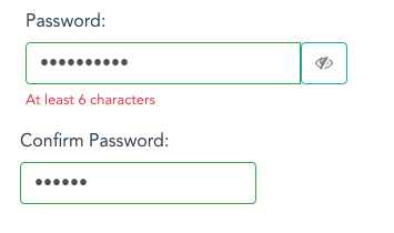
ghost commented 6 years ago

Using the latest beta-3, the invalid-feedback does not show up ( as in the beta-2 ) If I add the class="d-flex" to the invalid-feedback , then it shows up BUT when valid , it does not disappear ( should become display:none )

`

        <div class="">

            <div role="group" class="input-group">
                <input id="passwordInput" aria-invalid="true" class="form-control is-invalid" aria-describedby="passwordLiveFeedback" type="password">
                <div class="input-group-btn">
                    <a href="#" role="button" class="btn btn-info"><i aria-hidden="true" class="fa fa fa-eye-slash"></i></a>
                </div>
            </div>

            <div id="passwordLiveFeedback" class="invalid-feedback">
                                 At least 6 characters
             </div><!----><!----><!---->

        </div>
    </div>

    <div id="userInputGroup5" role="group" aria-labelledby="userInputGroup5__BV_label_" class="b-form-group form-group">
    <label id="userInputGroup5__BV_label_" for="confirmPasswordInput" class="col-form-label pt-0">Confirm Password:</label>

    <div class="">

        <input id="confirmPasswordInput" class="form-control is-invalid" aria-describedby="confirmLiveFeedback" aria-invalid="true" type="password"> 

        <div id="confirmLiveFeedback" class="invalid-feedback">
                             At least 6 characters
            </div><!----><!----><!---->
        </div>

    </div>`

Is this something to be fixed in the 4.0.0 release or not ( should I trick it ? )

screen shot 2018-01-02 at 16 59 49

screen shot 2018-01-02 at 17 00 25

ghost commented 6 years ago

Using the latest beta-3, the invalid-feedback does not show up ( as in the beta-2 ) If I add the class="d-flex" to the invalid-feedback , then it shows up BUT when valid , it does not disappear ( should become display:none )

`

        <div class="">

            <div role="group" class="input-group">
                <input id="passwordInput" aria-invalid="true" class="form-control is-invalid" aria-describedby="passwordLiveFeedback" type="password">
                <div class="input-group-btn">
                    <a href="#" role="button" class="btn btn-info"><i aria-hidden="true" class="fa fa fa-eye-slash"></i></a>
                </div>
            </div>

            <div id="passwordLiveFeedback" class="invalid-feedback">
                                 At least 6 characters
             </div><!----><!----><!---->

        </div>
    </div>

    <div id="userInputGroup5" role="group" aria-labelledby="userInputGroup5__BV_label_" class="b-form-group form-group">
    <label id="userInputGroup5__BV_label_" for="confirmPasswordInput" class="col-form-label pt-0">Confirm Password:</label>

    <div class="">

        <input id="confirmPasswordInput" class="form-control is-invalid" aria-describedby="confirmLiveFeedback" aria-invalid="true" type="password"> 

        <div id="confirmLiveFeedback" class="invalid-feedback">
                             At least 6 characters
            </div><!----><!----><!---->
        </div>

    </div>`

Is this something to be fixed in the 4.0.0 release or not ( should I trick it ? using standard input in col + button in another col... my current fix... )

screen shot 2018-01-02 at 16 59 49

![Uploading Screen Shot 2018-01-02 at 17.00.25.png…]()