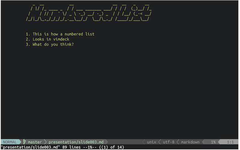
Looks like the lowercase "p" is what causes this. The sample presentations use all-caps for each header, which I recommend.
Closed sloria closed 9 years ago
Looks like the lowercase "p" is what causes this. The sample presentations use all-caps for each header, which I recommend.
I copied the "Numbered List" example from the README, and I still the issue:
README:

ACTUAL:

Oh I see... I must have changed the default space after I created the screenshots. I'll add an option that can be passed in to specify what bottom margin the user would like for their headers. I'll let you know when it's finished.
Ok. That was a lot easier than I thought. New usage says...
Usage: vimdeck [<command>] [<file>]

Commands:

  slideshow          generate and show slides (default)
  generate           generate slides only
  open               open slides in presentation folder (no file needed)

Options:

  --mouse, -m           mouse support for navigating slides
  --no-indent, -I       skip indentation
  --no-ascii, -A        skip ascii headers
  --no-filetype, -n     use vim's plaintext syntax highlighting
  --header-margin, -m   bottom margin for headers. default: 1
  --header-font, -h     specify header font (http://www.figlet.org/fontdb.cgi)
                        foregoes the ability to have small and large headers
Example:
vimdeck -m 2 slides.mdLet me know if you have any issues with it.
One other thing to note... you were using a single hash in your markdown (h1/#) versus the example double hash (h2/##). That might make a difference since they use different figlet fonts.
Works great! Thanks.
The header text is cramped:
The output differs from the screenshots in the README, which appear to have an extra newline between the header and the body. The extra space makes the slides look much nicer.