 KrasnayaPloshchad
commented
8 years ago
KrasnayaPloshchad
commented
8 years ago Now I think <U+FE2E, U+FE2F> can be generated via a mark to mark table, it’s suitable for all caps style.
Open KrasnayaPloshchad opened 8 years ago
KrasnayaPloshchad
commented
8 years ago Now I think <U+FE2E, U+FE2F> can be generated via a mark to mark table, it’s suitable for all caps style.
 typiconman
commented
8 years ago
typiconman
commented
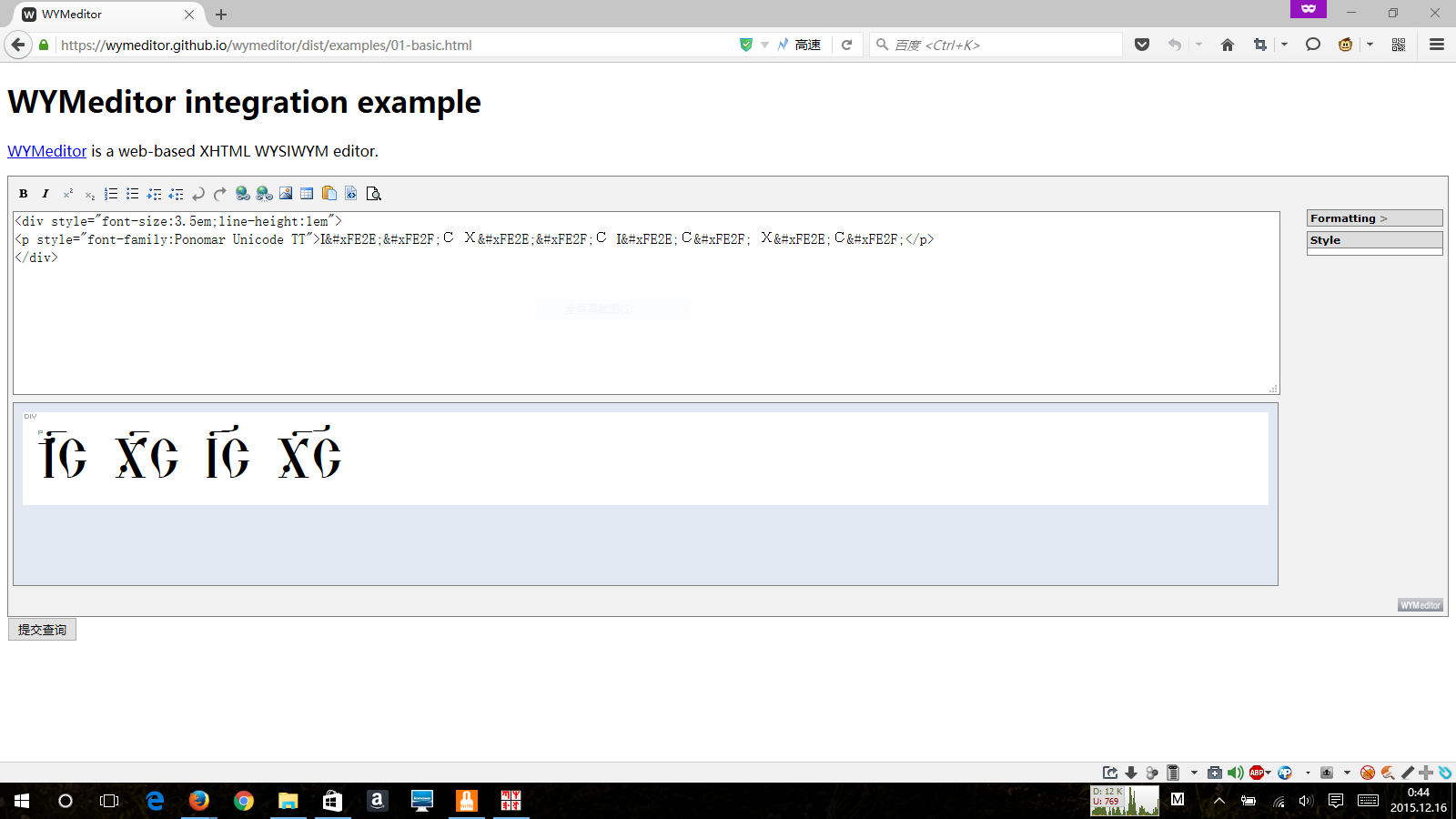
8 years ago The correct way to encode the Double Titlo is: І[U+FE2E]С[U+FE2F] Х[U+FE2E]С[U+FE2F]
What do you mean by it being "broken"? Which font are you using?
KrasnayaPloshchad
commented
8 years ago I just using Ponomar Unicode, I don’t know whether Fevodosk Unicode and/or Menaion Unicode also appearing this problem.
Here is my test result:
 In this case Double Titlo don’t link in Ponomar Unicode in your way, and overlay with base letter.
typiconman
commented
8 years ago Works as expected in Firefox 42.0 on Linux Mint 17 Qiana, other than the poor positioning over the I, which needs to be fixed.
 Sounds like a problem with your rendering of OpenType features. What browser / OS are you using?
KrasnayaPloshchad
commented
8 years ago I have used Firefox 40.0 on Windows 10 when I post this issue. Now I was updated Firefox to 42.0, but I still unhappy with positioning.
KrasnayaPloshchad
commented
8 years ago  Additionaly, I had a misclick to close the issue, sorry.
 mamyt
commented
8 years ago
mamyt
commented
8 years ago In Windows 10, it seems to depend on the browser that is used. Microsoft Edge (the latest from Microsoft in terms of browsers) for once actually gives the best result. Firefox is okay, but Chrome fails completely. Examples are posted below. TestingCombiningTilde.pdf
typiconman
commented
8 years ago Yes, there is definitely some work that can be done on adjusting the heights. But that is actually kind of difficult to do in OpenType.
KrasnayaPloshchad
commented
8 years ago 
typiconman
commented
8 years ago You are not entering them correctly. It should be I[U+FE2E]C[U+FE2F].
typiconman
commented
8 years ago Too complicated to fix, so I'm bumping this to the next release.
KrasnayaPloshchad
commented
8 years ago You can try to create a branch repo for this work, then other people can help.
KrasnayaPloshchad
commented
7 years ago Recently OpenType specification introduced OpenType Variation technology, does it help?
typiconman
commented
7 years ago I suppose you could use the Variations to create expanding widths of the titlo glyph. https://medium.com/@tiro/https-medium-com-tiro-introducing-opentype-variable-fonts-12ba6cd2369#.3pn2hj1m8 However, this is still very low priority on the list of things to support.
 StefanPeev
commented
5 months ago
StefanPeev
commented
5 months ago @typiconman @KrasnayaPloshchad As far as I can see the problem is not solved still. I offered my suggestions in #75. Well, actually the glyphs /uniFE2E and /uniFE26 can connect correctly above two letters without the help of /uniFE2F if /uniFE2E and /uniFE26 are a little bit longer then now and if the anchors are placed correctly. However a little compromise is necessary to get things right for all possible cases. The horizontal bar of the diacritics Titlo (/uniFE2E and /uniFE26) must be strictly horizontal. In this way, we will be sure that, in all possible cases, there will be no discrepancies in one direction or the other at the place of assembly.
typiconman
commented
5 months ago @StefanPeev attempts to fix this are welcome. As I have played around with this quite a bit previously, I'll warn right away that it is quite difficult to do. Yes you can make the titlo halves longer, but what if they are above narrow characters, like the і? As I said above, I don't see this as a big priority since titlos over two or more characters are not used in Synodal orthography, for which this font is designed. The effort may be better spent fixing titlo positioning in an ustav-era font such as Shafarik or Menaion, or in creating a decorative font for iconographers to use. But, again, pull requests are always welcome.
typiconman
commented
5 months ago See also the discussion in #25 and other threads referred to in this one.
StefanPeev
commented
5 months ago @typiconman If we have a good solution for Ponomar Unicode the same method can be used for any other font. The situation can be solved in FontLab 8 very simply: we add an anchor point to the first base letter in such a way that the Titlo diacritic /uniFE2E to be left justified. On the other hand we add an anchor point to the second base letter in such a way that the Titlo diacritic /uniFE26 to be right justified. If the horizontal bars of /uniFE2E and /uniFE26 are long enough, they will stick together in a nice way. I'll see how to do this in FontForge also. Here is the same solution for the project Veleka World (the revisions are still not published in the project).
Hello,
I have encountered a confusion about combining titlo half, because there is a different font behavior for them.
The Spasskaya tower have an icon including Cyrillic nomina sacra marked with long titlo:
In the develop version of GNU FreeFont, the annotation can be implement in this way:
І<U+FE2E, U+FE2F>С Х<U+FE2E, U+FE2F>С, but it seems not work with your fonts, maybe can be implement in this way:І<U+FE2E>С<U+FE2F> Х<U+FE2E>С<U+FE2F>, but the titlo seems broken. I don’t know which combinations looks proper.P.S. You can get the develop version of GNU FreeFont from here, Microsoft Windows user can extract the font file by 7-zip: https://code.launchpad.net/~dns/+recipe/freefont