ubuntu / yaru

All Ubuntu Yaru GNOME themes
https://community.ubuntu.com/c/desktop/theme-refresh
GNU General Public License v3.0
1.35k stars 182 forks source link

Missing squircle icons for major open source apps like Inkscape, Gimp, Chromium? #1083

Closed ubuntujaggers closed 5 years ago

ubuntujaggers commented 5 years ago

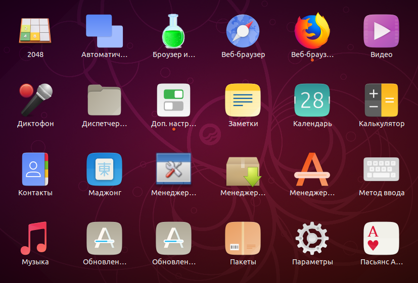
I think we now have a squircle icon for all apps that are installed by default - what about non-default apps that a lot of users install straightaway?

While we wait for the full script solution - should we put some of the most popular apps on squircles like we did with Firefox and Thunderbird? I was thinking Gimp, Inkscape and Chromium for starters...?

eaglersdeveloper commented 5 years ago

An icons of third-party applications shouldn't be in Yaru. They must be created by developers and be built into in their applications. We already have a few third-party application icons. Let's stop.

Feichtmeier commented 5 years ago

Hm, I agree with @eaglersdeveloper a bit

I could think of gnome apps as an absolute ultra stop limit (Gimp, inkscape, etc.) but since there is that big icon overhaul on the way I don't think it is really necessary
http://jimmac.musichall.cz/stuff/icon-revolution/ Tbh they do not fit perfectly into the new ubuntu style, but they are for sure better than the current pseudo realistic gnome icons

Too reduce the optical gap between our icons and third party and/or gnome app icons, we could try to de-squircle some suru app icons, like @ubuntujaggers did with the symbolic icons. just an idea :man_shrugging: Only de-squircle if it works

Feichtmeier commented 5 years ago

With de-squircling I mean 1) keep the suru folding style, make it still look like origami 2) bring some variation into the icon shapes, thus destroying the desire to surufy every icon on the planet.... very bad example but something "like this" for every app icon image Another bad example... a different icon theme... totally different style but to show that it does not have the problem to look "alien" beside "none-squircly" icons image

Feichtmeier commented 5 years ago

Origami has ofc also many shapes and has not a rule to make everything a squircle ( https://i-ref.de/iref-impuls/nur-ein-blatt-papier-atemberaubende-origami-kunst-von-gonzalo-garcia-calvo/ ) As long as we keep the current origami style we could try to de-squircle our icons. If that is too much work I would ofc understand

eaglersdeveloper commented 5 years ago

This is bad idea.

Better to close this issue :)

Feichtmeier commented 5 years ago

Okay and why is it a bad idea to de-squircle the base shapes? Origamis are not squircles. The unified base shape creates the original problem. It creates the desire to surufy every icon. Would be awesome if you could try to improve your communication skills. :face_with_head_bandage:

ubuntujaggers commented 5 years ago

I think it's definitely worth ongoing discussion - whether we chat in this Github issue or on discourse.ubuntu.com or wherever :)

Personally I'm a fan of squircles. But if the design team elects to make the shapes more varied, the amount of work isn't a problem and I can draw some. The device icons show that you can do Suru designs in a non-Suru way.

Rhythmbox would be a good example, as you suggest, because you could restore the classic stand-up speaker shape. It might be possible to do that by copying the proportions of the keyboard device icon exactly, only rotated through 90°, rather than slightly deforming the squircle.

Speaking purely personally... looking at your link, my preference would be to take the new Gnome icons as our reference point and do Suru versions of all the third party apps in that list, matching them icon for icon. If they can do their own icons for GIMP and Inkscape, then it must be permissible for us to redraw the same apps using squircles, like we did with LibreOffice. And matching the Gnome icon set might be an achievable ambition for us (whereas trying to do every app in the app store isn't). But that's just my personal opinion, speaking as a squircle fanatic :) and I'm happy to draw non-squircular icons if that's what the design team agrees on.

eaglersdeveloper commented 5 years ago

Speaking purely personally... looking at your link, my preference would be to take the new Gnome icons as our reference point and do Suru versions of all the third party apps in that list, matching them icon for icon.

GNOME application icons (not Adwaita) is licensed under GPL. We can't just take and use them in Yaru.

eaglersdeveloper commented 5 years ago

Would be awesome if you could try to improve your communication skills.

I dreaming about this.

Feichtmeier commented 5 years ago

Yes discussion is welcome indeed!

When you put a square a circle and a triangle beneath each other, a hexagon doesn't suddenly look out of place.

Whereas when you put 4 exact squares beneath each other and you then add a triangle it looks out of place.

And that is the basic problem you have with uniform icon shapes. Ofc they look great, I totally love the Suru icons. Especially the thin and elegant symbolic icons. I would even say Yaru really needs them as part of its identity.

De-squircling was just an idea. Let's see what @madsrh and @clobrano say

And as Didier already said as long as we don't ruin anY license we can Surufy any icon we like. It's not like we violate against any law or something ;D

Feichtmeier commented 5 years ago

@eaglersdeveloper ofc we can. That's what GPL is about. As long as we document the license correctly

ubuntujaggers commented 5 years ago

(For clarity, when I said "match them icon for icon", I meant: if they have a Gnome icon for an app, then we have a Suru icon for the same app. I didn't actually mean taking their designs :) - although as Feichtmeier points out that would actually be permitted if we did it correctly.)

ubuntujaggers commented 5 years ago

When you put a square a circle and a triangle beneath each other, a hexagon doesn't suddenly look out of place.

Whereas when you put 4 exact squares beneath each other and you then add a triangle it looks out of place.

You're quite right - this is why I have such high hopes for the squircles script, which is my favourite solution in the long term, because it means we can have my beloved squircles and everything is still uniform :)

madsrh commented 5 years ago

To be honest, I'm a bit torn on this topic. Although I really like the new Suru Firefox icon, I'm still not used to it and I'm not sure I ever will prefer it over the upstream icon (maybe it's still just the background color 🤷‍♂️ ).

@Feichtmeier suggested to have all the icons that is installed by default in the dock, be suru styled. That was a realistic goal, but in the end we will always have mixed icons because users will run Spotify, Chrome, Telegram, Atom and so on.

The script solves that. @clobrano has there been any progress since this comment regarding the script?

Looking at my Window 10 and OSX desktop icons, it's a mixed bag too.

ubuntujaggers commented 5 years ago

@madsrh

"Although I really like the new Suru Firefox icon, I'm still not used to it and I'm not sure I ever will prefer it over the upstream icon."

I haven't been able to use it live yet - I can't get snaps to work since I upgraded to Cosmic, so I can't comment on this one (I might try replacing the icons manually).

IMO Firefox was a hard icon to do because our hands were tied in terms of altering the colours and design even slightly to adapt them to the theme. So it was literally a case of finding the least objectionable colour for the squircle, and even that was hard because Firefox has quite lurid colours and the Ubuntu dock is dark.

LibreOffice ended up being a lot easier because we had the freedom to adapt the pictogram to Suru colours and shapes as long as it was still recognisable.

IMO, open source apps like Inkscape could be more like a LibreOffice experience than a Firefox experience for us, because we have the freedom. I might groan a bit inside if there was another Firefox to do :P but would enjoy at least trying Inkscape etc.

clobrano commented 5 years ago

I must admit that I tend to prefer Gnome approach lately. As said by the others, forcing a suru style in more apps made the non-suru icons way more visible.

About the surufy icon script: unfortunately there is no update. Other than the old open points, there's the new svg-only direction that stopped me. If we're going to drop png icons, the script won't work anymore.

On Sun, 6 Jan 2019, 16:35 ubuntujaggers <notifications@github.com wrote:

@madsrh https://github.com/madsrh

"Although I really like the new Suru Firefox icon, I'm still not used to it and I'm not sure I ever will prefer it over the upstream icon."

I haven't been able to use it live yet - I can't get snaps to work since I upgraded to Cosmic, so I can't comment on this one (I might try replacing the icons manually).

IMO Firefox was a hard icon to do because our hands were tied in terms of altering the colours and design even slightly to adapt them to the theme. So it was literally a case of finding the least objectionable colour for the squircle, and even that was hard because Firefox has quite lurid colours and the Ubuntu dock is dark.

LibreOffice ended up being a lot easier because we had the freedom to adapt the pictogram to Suru colours and shapes as long as it was still recognisable.

IMO, open source apps like Inkscape could be more like a LibreOffice experience than a Firefox experience for us, because we have the freedom. I might groan a bit inside if there was another Firefox to do :P but would enjoy at least trying Inkscape etc.

— You are receiving this because you were mentioned. Reply to this email directly, view it on GitHub https://github.com/ubuntu/yaru/issues/1083#issuecomment-451750671, or mute the thread https://github.com/notifications/unsubscribe-auth/ACwAHqG6CrFPcDfeXnhudAmWFDKnv5uyks5vAhergaJpZM4ZyMJ5 .

Feichtmeier commented 5 years ago

I fear that the new style of the gnome app icons do not fit to this theme project : / They have a very specific style (lightly leveled, no border, a bit "toy-like"). http://jimmac.musichall.cz/stuff/icon-revolution/ Some icons are even very hard to recognize as what they are (for example "Icon preview") image

Especially the symbolic icons are very thick and ruin the sharp and sleek look of yaru a bit.

If we would consider upstream icons, we really must keep the yaru symbolic icons. It is a very important part of the look. Like the ubuntu font. But honestly, I think this would be a bad idea. The level of sharpness and professional look of the suru icons is really not reached by these new icons - sorry. And it looks like the "design" progress is already done, so I see not much room to interact into these new icon guidelines.

It is linux so we have the choice - why shouldn't we chose?

My biggest favorite would be the none-squircle-yaru icon version, even if it is a shitload of work

ubuntujaggers commented 5 years ago

Well I feel like consensus is building against putting everything on squircles :P but this is what I'd started doing as a WIP for a possible approach to Inkscape. It's basically just the flat version of the logo with Suru palette/drop shadow/highlight:

image

@clobrano, if I understand correctly, the Ruby script for the symbolic icons is working with svgs... if the current Surufy script will stop working, is the general idea of having "some" script still viable? I seem to vaguely remember that the change to svg introduced a problem with permissions for a particular folder, but I can't remember where I read that or if I just dreamt it.

Or... is it more the case that the mood in the design team is moving towards abandoning the uniform shape for app icons, because it's more trouble than it's worth? Sounds like you and @feictmeier are open to exploring this (if by "the Gnome approach" you mean non-uniform shapes) and @madsrh has mixed feelings about the success/wisdom of putting Firefox on a squircle?

If so: should I try desquircle-ising a couple of app icons as a starting point for discussion?

You know what... just an idea... but maybe Joey Sneddon would run a poll on OMG! Ubuntu!, as a sort of "advisory referendum". We could show what icons we've got coming in 19.04 - highlighting examples like Firefox, Thunderbird, LibreOffice - maybe add some concept art like Inkscape - and basically find out how much Ubuntu users like squircles versus other options?

EDIT: I suppose the problem with a poll is you look bad if you don't do what it says, lol.

Feichtmeier commented 5 years ago

I just love your attitude @ubuntujaggers ! :heart:

I don't think that public polls can help us with making the right decision. Polls on the hub often didn't help (dialogues).

Tbh I would love to see a de-squircled approach but I don't want to force anything here.

I think everyone loves the suru icons from the "look"-point of view. The problem is rather the "square, square, square, triangle" situation ;)

In the end, if we keep the current contributors to yaru for icons, where is the problem to maintain a parallel icon set to those new toy-like/candy-like gnome icons? If squircle or de-squircled, gnome has not many up-to-date and "current" apps. As you can see on that website I linked two times now. It is a lot less work than ... let's say.. a complete icon set for android :see_no_evil:

Feichtmeier commented 5 years ago

@Feichtmeier suggested to have all the icons that is installed by default in the dock, be suru styled. That was a realistic goal, but in the end we will always have mixed icons because users will run Spotify, Chrome, Telegram, Atom and so on.

Indeed! I think speaking of ubuntu - as a distributions for the Linux "masses" - default-installed-apps vs real third party apps (commercial apps) is a far bigger problem than suru icons vs gnome icons. The "square, square, square, triangle" situation is present for ubuntu users when they install apps like spotify, telegram, vscode, skype, etc. Or bitwigs, waveform, chrome, etc etc

iOS and even ubuntu phone devs can "force" the app devs to provide a certain icon shape, because those apps are only used in one "style-environment". The rules are set, there is not much room. So a forced shape is no problem.

In the Linux Desktop land this is a different story. "GNOME-users" (i.e. ubuntu users/fedora users) install kde apps, gnome apps, electron apps, whatever they want and need. Kde users vice versa So a forced shape is problematic.

eaglersdeveloper commented 5 years ago

Since MIUI 9, Xiaomi preinstall two icon themes.

First is shaped:

Second vice versa:

We also can preinstall in Ubuntu two icon themes like in MIUI. User will can change icons in GNOME Tweaks.

eaglersdeveloper commented 5 years ago

New messaging-app icon might look like this: messaging-after

eaglersdeveloper commented 5 years ago

settings-app: settings-app-after

Feichtmeier commented 5 years ago

Awesome! That looks really good imho ! I don't know if two icon themes are a good idea though. We already have adwaita+ Yaru preinstalled.

ubuntujaggers commented 5 years ago

These look lovely!

Tbh, because the Suru palette is light and the default launcher is dark, you could probably remove the squircle from almost every Suru icon which has a pictogram on a squircle (rather than being a squircle-shaped object) and the resulting icons would look great, like these do.

For me, it would be a tiny bit sad because the dark launcher with bright squircles is what I picture when I think "next gen Ubuntu", ever since I had my BQ Aquarius Ubuntu Phone. And a launcher with squircles has been part of my Ubuntu desktop since Unity days (because I never ran that script to flatten it). I don't know any other desktop with squircle buttons and it's a nice visual differentiator for Ubuntu if we can get it to work.

But, as you demonstrate, it's possible to remove squircles with attractive results, if that's what we want to do instead.

For me, the key question is: do we have confidence that it will eventually be possible to add squircles to icons automatically? This could either be a script or a shell extension with a launcher change (or just the latter if we don't mind a mix in the app grid).

I feel that a script should be possible for svgs because each is stored as xml, so it could just be a case of performing text operations. If we don't already have an svg expert, I'm happy to study them and try to work out what steps a script would have to perform to scale/reposition the existing icon and put a squircle behind it, by adding to and changing the xml.

If we do have confidence that we can do this in future, I think the only reason to abandon squircles is if we think Ubuntu will look better without them.

clobrano commented 5 years ago

I feel that a script should be possible for svgs because each is stored as xml, so it could just be a case of performing text operations.

I'm sure it would be possible, I just don't know how yet :smile: It will probably be a bit trickier in the transition from all png to all svg, since we're going to have mixed icons that need to be managed differently

Feichtmeier commented 5 years ago

There is a setting in dash to dock which adds a colored background to the app icon (even without glossy)

ubuntujaggers commented 5 years ago

I'm sure it would be possible, I just don't know how yet 😄

This I might be able to help with... I don't have any scripting, but I looked at svg xmls a couple of times to diagnose problems and could go further into it to work out what the script would have to do and document steps.

I feel like the major steps would be:

But, of course: I don't want to keep pushing squircles if the design team is coming round to the idea that they just aren't necessary. @eaglersdeveloper has confirmed that we can make a set of very attractive non-uniform Suru icons, so I can see that's also an option.

Feichtmeier commented 5 years ago

As far as I understood @clobrano correctly the script currently has no solution to snapped and flatpaked applications/application icons. Most snaps don't use the relative path icon name (some do). So they use an icon which is stored in the snap directories and I think the script is not allowed to manipulate that.

A dash to dock backlight solution would be universal. But then we should have no squircles around the pictorgrams because otherwise we end up with squircles within squircles (squircleception ;D)

Currently I don't find this option in dashtodock but it was included once https://youtu.be/TMkBy0e2ZiY Also without the glossy effect

DO NOT install dashtodock in ubuntu, currently it destroys the dock settings and you need some didier skills to restore the ubuntu dock :)

ubuntujaggers commented 5 years ago

@feichtmeier

"As far as I understood @clobrano correctly the script currently has no solution to snapped and flatpaked applications/application icons. Most snaps don't use the relative path icon name (some do). So they use an icon which is stored in the snap directories and I think the script is not allowed to manipulate that."

Ah, that was the bit I vaguely remembered, and wasn't sure whether I'd read it or dreamed it :) Thanks for the reminder.

I think you could make the launcher backlight exactly the same size proportions as the Suru squircle, and then you wouldn't get squircle-ception for existing Suru icons because the icon would exactly cover the backlight? But it would certainly mean you don't have to include a squircle for future Suru icons that are just going to be a pictogram on a plain squircle.

Feichtmeier commented 5 years ago

@ubuntujaggers

and then you wouldn't get squircle-ception for existing Suru icons because the icon would exactly cover the backlight?

No, currently with our icon set we would have a squircle-ception (my god all those words... de-squircling... squircle-ception...) for pre-installed apps. We have some room for margin/padding in the dock styling though. But I think the backlight would work best with a de-squircled Origami/Yaru-set Would be awesome if you and/or @eaglersdeveloper could create a bunch of fastly-mocked-up de-squircled origami icons which could then be placed inside a mocked-up picture with a dock. So maybe the idea isn't so good like it is in my head but I would need to see it first. My inkscape skills are so crappy that everything looks like a bad idea if I would try to mock it up :)

Edit: we can also change the border-radius of the app icon background in the dock (the roundness of the background)

clobrano commented 5 years ago

"As far as I understood @clobrano https://github.com/clobrano correctly the script currently has no solution to snapped and flatpaked applications/application icons. Most snaps don't use the relative path icon name (some do). So they use an icon which is stored in the snap directories and I think the script is not allowed to manipulate that."

The problem is only the packaging. As snap it would lack of the permission to read /snap folder, but as debian package it could

On Mon, 7 Jan 2019 at 12:56, Feichtmeier notifications@github.com wrote:

@ubuntujaggers https://github.com/ubuntujaggers

and then you wouldn't get squircle-ception for existing Suru icons because the icon would exactly cover the backlight?

No, currently with our icon set we would have a squircle-ception (my god all those words... de-squircling... squircle-ception...) for pre-installed apps. We have some room for margin/padding in the dock styling though. But I think the backlight would work best with a de-squircled Origami/Yaru-set Would be awesome if you and/or @eaglersdeveloper https://github.com/eaglersdeveloper could create a bunch of fastly-mocked-up de-squircled origami icons which could then be placed inside a mocked-up picture with a dock. So maybe the idea isn't so good like it is in my head but I would need to see it first. My inkscape skills are so crappy that everything looks like a bad idea if I would try to mock it up :)

— You are receiving this because you were mentioned. Reply to this email directly, view it on GitHub https://github.com/ubuntu/yaru/issues/1083#issuecomment-451912366, or mute the thread https://github.com/notifications/unsubscribe-auth/ACwAHqrmc_XsmmGe1R_We_anptlev9_mks5vAzYBgaJpZM4ZyMJ5 .

eaglersdeveloper commented 5 years ago

new-icons

ubuntujaggers commented 5 years ago

@feichtmeier

"Would be awesome if you and/or @eaglersdeveloper could create a bunch of fastly-mocked-up de-squircled origami icons which could then be placed inside a mocked-up picture with a dock."

Yep, no problem :)

Feichtmeier commented 5 years ago

@eaglersdeveloper Wow I think this looks very good and still very much like pieces of paper - which is the initial idea of origami like icons, right? This would eliminate the square, square, square, triangle problem for sure. Could you show a picture with commercial apps in between?

ubuntujaggers commented 5 years ago

Here are a couple more:

circle help app non squircle ubiquity

ubuntujaggers commented 5 years ago

I think that's enough icons to mock up a non-squircle Suru launcher at normal resolution that woud be real enough to make a decision, because it's a good mix. You have:

If we did that at 1:1 resolution as a full screen mockup I think people could make a decision on choosing this option?

Feichtmeier commented 5 years ago

If we did that at 1:1 resolution as a full screen mockup I think people could make a decision on choosing this option?

Yes that should be a good idea. Like "a real screenshot" with a mix of pre installed apps and post installed apps from various sources

Some modern icons couldn't also not hurt like Spotify, Skype, vscode and do on

ubuntujaggers commented 5 years ago

This is definitely not meant to sound negative, it's just food for thought: if we do abandon the idea of uniform Unity 8-style squircle icons... do we actually need to make/maintain our own icon theme for Yaru? This might be a good moment to ask that question even if the answer is "yes".

There must be a lot of good usable "paper-y" themes out there that could theoretically ship with Ubuntu. I'm sure a lot of icon designers would be delighted if their set were chosen as the new official icon theme for Ubuntu, and we could always work with an upstream maintainer if upstream were active.

I've never used Papirus so I don't know how much I'd like it, or whether it gels properly with Yaru, but I know it's popular:

image

...and there must be some beautiful icon themes out there in styles that would nicely complement Yaru.

So, I guess my open question is: do we remember why Suru was chosen in the first place, when there are more complete icon sets available? And does the original choice of Suru still make sense if we're going to radically fork it and take squircles out?

I suppose it's a bit like choosing a rare car because you like the idea of driving it, but upgrading it more and more because it's inconvenient... until it slowly starts to look and feel less unique. At some point, you pause to reconsider whether you're getting enough benefit to justify the inconvenience.

EDIT: That does sound really negative lol, I definitely want to carry on making icons for Ubuntu, but I think radically changing direction on Suru is a good point to ask that question.

Feichtmeier commented 5 years ago

@ubuntujaggers

Well papirus looks a lot different imho. It uses other colors, other shades, other highlights. It looks a lot more "comic"-like. I agree that you have a point, but I'd say if we would decide to drop fullcolor suru icons, we should rather use the new adwaita icons (we need suru symbolic icons!). Let's wait for @madsrh and @clobrano Currently there are three ideas in this issue 1) Keep as is and advance to some more squircle icons 2) Remove squircle background shape and keep a fullcolor icon set for X icons 3) Remove all fullcolor suru icons but keep the symbolic icons for the "slim" yaru look in headerbars etc and just use upstream fullcolor icons

clobrano commented 5 years ago

if we would decide to drop fullcolor suru icons, we should rather use the new adwaita icons

I suppose it's a bit like choosing a rare car because you like the idea of driving it, but upgrading it more and more because it's inconvenient... until it slowly starts to look and feel less unique. At some point, you pause to reconsider whether you're getting enough benefit to justify the inconvenience.

I think both are very good points.

I really like this mockup and I'd be tempted to follow it, however we (I meant the Yaru team) didn't choose Suru iconset, so it shouldn't be our decision to drop it as well.

What is the real problem we are facing? The fact that non-suru icons look weird if we have many Suru icons? It could be (for sure) solved with the scripting (if we decide to keep on that direction).

Feichtmeier commented 5 years ago

What is the real problem we are facing?

It is not a big problem but a concern I have read some times "on the internet" by various "users" that the ubuntu icons are currently "incomplete". This comes from the fact that there are some icon sets around that really have hundreds and hundreds of app icons in their set and thus create the illusion to be complete (which gets destroyed in the moment you install snaps and flatpaks because icon sets can't target them) So we end up with the "square square square triangle" situation which bothers some, but some just don't give a damn. I thought a good target would be to provide suru icons for every app preinstalled in ubuntu. But then the user installs spotify snap or whatever and you have the "square square square triangle" situation again. :man_shrugging: Here I wrote down three possible solutions: https://github.com/ubuntu/yaru/issues/1083#issuecomment-451969554 A fourth would be just to close this issue and move on :) And a fifth would be the script. But are you sure that you can target flatpaks and snaps with the script @clobrano ?

ubuntujaggers commented 5 years ago

First attempt at mocking up a larger launcher with the default launcher opacity and a mix of non-squircle Suru/3rd party icons (sorry the colour went slightly naff on upload...):

image

ubuntujaggers commented 5 years ago

we (I meant the Yaru team) didn't choose Suru iconset, so it shouldn't be our decision to drop it as well.

Ah, that I didn't know.

Don't get me wrong, I love Suru and would love to carry on doing them with squircles and would love for the script to swoop in and squirclify the remainder, that's my fond hope. But, whatever Ubuntu ultimately decides to go with, I'm happy to help with any svg work that's needed in support of it.

ubuntujaggers commented 5 years ago

@feichtmeier

"I thought a good target would be to provide suru icons for every app preinstalled in ubuntu."

I think it was a very sensible target - I just wondered if carrying on in the same way for some of the top third party apps would be a good "stretch goal" :) Doing the same apps that Gnome is doing is IMO very achievable - just need to work out the squircles situation.

Feichtmeier commented 5 years ago

Tbh I would not see a problem to provide icons for open source apps from gnome. In adwaita the situation is different: they make icons for adwaita and with the same guidelines all the gnome app icons are updated but they ship with the app and not with the adwaita set

eaglersdeveloper commented 5 years ago

Honestly, I didn't get used to new icons. Now I find an application worse than before.

2019-01-09 15-17-48

Feichtmeier commented 5 years ago

Hm... yeah. Was just an experiment. Maybe we should just keep everything as it is and add some open source icons.

eaglersdeveloper commented 5 years ago

No no no. So we will become second-class distribution like Manjaro or MX Linux.

Feichtmeier commented 5 years ago

Alright, though that comment is highly exaggerated and dramatized, let's just keep everything as it is (Squircles, PNGs). That way we can see if the surufy script works as a solution (snaps, flatpaks?).