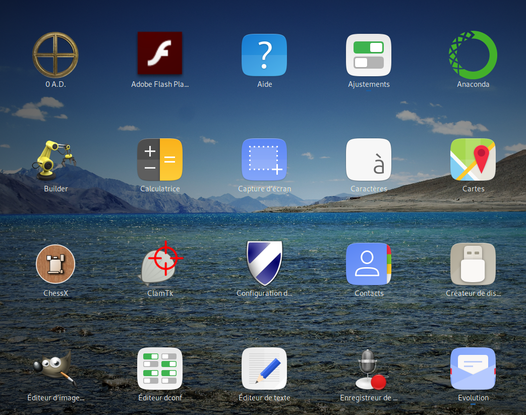
There was some discussion on https://github.com/ubuntu/yaru/issues/1083. I think that going with Suru is pretty bad idea, of course some scripts can be created or whatever, it is like going around issue that you created yourself and this "fix" will have another issues.
New Adwaita icons are looking pretty good now and they look pretty consistent with 3rd party apps and won't probably look really out of place with Yaru theme.
Hi,
In the Ubuntu's French forum Disco thread, we are a few (not everybody of course !) to find that the choice of squared new icons does not look good, with full gratitude to the big work already done :
1- There are some squared apps but not all, this is not visually consistent : Ok, some work can be done again. But is it possible to do such a hard work for ALL apps ? The old Ubuntu icon theme does change some apps icons but the feeling is consistent.
2- I don't know if it has been discussed, but we are a few to find that the Firefox (e.g.) icon is too small in its squared container :