Feichtmeier
commented
5 years ago
Feichtmeier
commented
5 years ago Yes please!
Closed madsrh closed 5 years ago
Feichtmeier
commented
5 years ago Yes please!
 meetdilip
commented
5 years ago
meetdilip
commented
5 years ago This is what I use for my personal icon theme

 Fredorn
commented
5 years ago
Fredorn
commented
5 years ago This is what I use for my personal icon theme
Nice ! ;)
 DanyGee
commented
5 years ago
DanyGee
commented
5 years ago I really like the new trash icon - it blends with the new theme very well. I hope it will not get changed. Btw, funny how tastes differ.
 ubuntujaggers
commented
5 years ago
ubuntujaggers
commented
5 years ago I really like the new trash icon - it blends with the new theme very well. I hope it will not get changed. Btw, funny how tastes differ.
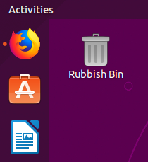
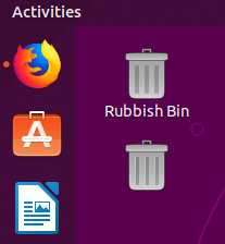
Tbh, I like the current icon as well. As per the logo, it's based on a recycling bin (which is often blue, especially for paper) rather than a traditional metal bin. Obviously it will be different from country to country, but, in the UK, I haven't seen one of these:

...since the 1980s. So the blue recycling bin feels a bit more up-to-date, and I think it's a nice colour.
I think I'm right in saying that Windows uses the same symbolism of a square tub with a recycling logo, but with the blue/white inverted?
 clobrano
commented
5 years ago
clobrano
commented
5 years ago Probably the reference for current trash icon is this one

:)
but as for the shopping bag, 3D-ish icons looks a bit odd in this Yaru set
we could also consider this

which is probably easier to made using the new shapes
 madsrh
commented
5 years ago
madsrh
commented
5 years ago we could also consider this
+1 yes, Humanity (again) had this one
I haven't seen one of these .since the 1980s. So the blue recycling bin feels a bit more up-to-date, and I think it's a nice colour.
I have never seen that blue trashcan, but perhaps it's a geographic thing. Anyway, the take away in this issue is that the current trash bin doesn't look like a trash bin (outside UK) and design that we decide to go with (blue bin, 80' garbage can or a paperbasket) it has to match the symbolic icons 🗑
Feichtmeier
commented
5 years ago As some people pointed out it's a combination of wrong 3d usage in a theme that has no other 3dish icon plus the blue that looks very un-yaru-ish
DanyGee
commented
5 years ago Leave the current trashcan icon alone - its a great, modern design. To all critics here: Open Inkscape (or whatever) and post your wonderfull designs here - lets see how easy is to create a nice, yaru-ish trashcan icon :smile: Don't forget it has to look good in 16px too :wink:
ubuntujaggers
commented
5 years ago I've got an idea for something, might be tomorrow though (busy day!).
Feichtmeier
commented
5 years ago @danygee you are basically almost alone in fanboying this trash can.
You don't have to tell anyone here what we need to leave alone. How about you leave this repo alone, we don't need people with such aggressive attitude here.
DanyGee
commented
5 years ago This is still an open discussion, so anyone can post his own opinion and everyone has to respect it. I just have enough of empty criticism from ppl that criticize someones professional, hard work, comparing it to some obsolete designs, and (what is the worst) don't show their own proposals. You know, talk is cheap, as always. Wan't a better trashcan icon? Create one! See how hard it is, experience what you have take into account creating it. Maybe you will understand this way why the new traschan icon looks like this.
Feichtmeier
commented
5 years ago Do you realize that we contribute to this repo since Novemeber 2017? What the hell!
DanyGee
commented
5 years ago Really? Thats nice, so let me see your proposal for the best trashcan icon :eyes: Don't waste your precious time arguing.
clobrano
commented
5 years ago Wan't a better trashcan icon? Create one!
Correct, this is actually a thread talking about creating new stuff. Stop complaining on people openly discussing on how to proceed. Many things are hard to do, that does not mean they can't be criticized.
Now, please everybody stops wasting time
Feichtmeier
commented
5 years ago Don't waste your precious time arguing.
let me see your proposal
Leave the current trashcan icon alone
Create one!
Maybe you will understand
Look, I don't know who you are or what ever you contributed to this project (or any other open source project) other than 4 disrespectful comments in one issue, but what you definitely don't need and can't is telling me or us what and how we organize, discuss and finally contribute in this repository.
It is perfectly fine to express your preference for the current trashcan, which you did, and we recognized. So thank you very much for your "contribution".
ubuntujaggers
commented
5 years ago This is what I wanted to try - the only rubbish receptacle I can think of that matches one of the core Suru shapes is a pedal bin, and this is my first attempt:
Also tried it in grey (silver) - IMO it looked drab for Yaru.
@DanyGee, this is the Github for the default Ubuntu theme and this is where the theme and new icons get made. There always has to be discussion before people start making new icons. Sometimes the discussion leads to something better, sometimes it doesn't. As much as I like the current icon, it isn't universally loved ("the new trash can icon really ought to trash itself!" - OMG Ubuntu) so it's wise to discuss it and experiment with other designs. It's not empty criticism or cheap talk because the people in this thread are the people who actually make the current default theme that ships with Ubuntu.
ubuntujaggers
commented
5 years ago The other thing I wanted to try is a grey oblong with a lid, adding handles and grooves to make the Sesame Street-style "trash can" that's abstract enough for Suru.
DanyGee
commented
5 years ago @ubuntujaggers @Feichtmeier Thx for clarifying. Understood.
ubuntujaggers
commented
5 years ago (I'm trying to draw a non-blue or Sesame Street-style bin as well, but all efforts so far have been rubbish.)
ubuntujaggers
commented
5 years ago IMO this is not terrible and is sort of Suru-shaped but I prefer the blue pedal bin:

I think if you gave this one to Oscar the Grouch he'd think he was meant to cook a casserole.
ubuntujaggers
commented
5 years ago Second attempt at a bin for Oscar:

Does anyone have any strong feelings about the blue pedal bin? I think it's the most conservative possible change that still looks like a bin, we'd just have to change the symbolic to match it.
madsrh
commented
5 years ago It's a solid attempt @ubuntujaggers 😄 but perhaps a paperbasket works better than the Sesame Street-style bin

I'm not 100% sold but I'm +1 for exploring the pedal bin option. Have you got an idea for the symbolic icon?
ubuntujaggers
commented
5 years ago 
??
ubuntujaggers
commented
5 years ago Tbh I think we could make the symbolic mimetypes more like their full colour counterparts too...
ubuntujaggers
commented
5 years ago Looking over the thread I think the best Oscar Grouch one is this:

Not sure why I didn't just copy it but I'll have a go next.
ubuntujaggers
commented
5 years ago Hey, this doesn't look awful at all! Nicked the gradient from the USB creator...
@madsrh @clobrano @Feichtmeier?
 rvz420
commented
5 years ago
rvz420
commented
5 years ago I really love the default blue trash. But I can't see the 3d effect you see... I always thought it was a "post mounted bin"

But if it has to be changed the one with the pedal is also great, I don't know why but the blue has charm. 😄
madsrh
commented
5 years ago @ubuntujaggers This doesn't look bad at all
I'm not sure if it's a good idea to add a highlight to the vertical lines, but you could do something like this:

Feichtmeier
commented
5 years ago It looks good but there are parts leaking out of the baseplate. Even in our new baseplates that is very atypical :)
madsrh
commented
5 years ago It looks good but there are parts leaking out of the baseplate. Even in our new baseplates that is very atypical :)
@Feichtmeier Unless you prefer to keep Sam's original or keep the pedal (that Will voted 👎 ), I don't see how this would be possible without adding a background just for the sake of keeping the baseplate shape. We are making the same exception with the shopping new bag 👜 which I really think works great.
ubuntujaggers
commented
5 years ago Tbh I am happy to have the upstream Suru icon, the blue pedal bin, or the latest Oscar the Grouch bin (with or without extra highlights) in this context. So, I await the verdict :+1:
ubuntujaggers
commented
5 years ago Actually, did I dream this, or will the desktop trash icon vanish soon anyway? I don't think the full colour version is used anywhere other than here, so if it goes, it's sort of moot and we might as well keep the upstream Suru one?
Feichtmeier
commented
5 years ago No there will be an extension for 19.4 which re-implements a desktop via gnome shell
madsrh
commented
5 years ago Tbh I am happy to have the upstream Suru icon, the blue pedal bin, or the latest Oscar the Grouch bin (with or without extra highlights) in this context. So, I await the verdict
In that order or just happy with any of the suggestions? Did you deliberately leave out the paper basket?
...will the desktop trash icon vanish soon anyway...
Well, let's see what happens here. Gnome has these ideas that users don't need desktop icons, a system tray, a dock, a minimize button, dialog buttons outside the headerbar and so on, but Ubuntu has users that expect many of these "features". So sometimes, like with the desktop icons, Ubuntu devs are opting to maintain the desktop workflow Ubuntu users are used to.
Anyway, I don't want to make this call, but if the desktop trash icon is going away at some point, it would make sense for us to pick the trash metaphor that works best as symbolic icon.
ubuntujaggers
commented
5 years ago In that order or just happy with any of the suggestions?
No strong order, but probably:
Upstream Suru icon (because I like the colour, don't mind the design, and it means I don't have to look at it every day and agonise over whether I did a good enough job :smile: )
Blue pedal bin
Oscar the Grouch
But honestly, no strong feelings between them and happy to go with consensus. I've currently got the Oscar the Grouch bin because I built it to do the screenshot.
I didn't leave out the waste paper basket deliberately, it just didn't occur to me... I haven't drawn one yet, and I or someone else would have to come up with a good-looking one. I have no objection to a waste paper basket :)
 real-amano
commented
5 years ago
real-amano
commented
5 years ago Not in love with the pedal bin, nor with Sam's 3D one.
I think that "Oscar the grouch" is much more self descriptive and Suru/Yaru enough :)
Those are my favorite incarnations:https://user-images.githubusercontent.com/3986894/53323777-667f6c00-38df-11e9-8a33-b01fb1e6a508.png
Feichtmeier
commented
5 years ago Prbly you are right! That one looks indeed very good
real-amano
commented
5 years ago We should think about empty and full states of the proposals as well. As that bin is closed, there is no chance to see its state.
ubuntujaggers
commented
5 years ago If the UI freeze is soon, do we want to do one of the new bins or leave it as-is for this release?
Also, is the full/empty distinction an important UI feature? Not saying don't do it, but maybe we could merge a new bin and then merge a two-design version when we have the second. If it's important to distinguish then that approach is no good however.
clobrano
commented
5 years ago I've always found annoying the icon of bin full 😀
ubuntujaggers
commented
5 years ago I've always found annoying the icon of bin full grinning
Mine is never empty anyway, I only discovered this feature when I started drawing bins!
madsrh
commented
5 years ago We could just add a bag in front of the bin like you did here: https://user-images.githubusercontent.com/38893390/53301276-a8a99e80-3848-11e9-9528-b0150c988ad7.png
EDIT: isn't this also how the symbolic icon works now?
real-amano
commented
5 years ago Not showing the full/empty state is like removing a feature.
meetdilip
commented
5 years ago We could just add a bag in front of the bin like you did here: https://user-images.githubusercontent.com/38893390/53301276-a8a99e80-3848-11e9-9528-b0150c988ad7.png
EDIT: isn't this also how the symbolic icon works now?
With colours for full and empty
madsrh
commented
5 years ago With colours for full and empty
While it's good to have an indicator of the state, IMO these colors doesn't fit very well the style of the Suru icons.
EDIT: Also there's only two states (as I understand it) here: Empty and Full. IMHO it doesn't make sense that if you delete a 5kb file on a fresh install the trashcan turns red, signaling danger/warning/take-action!
ubuntujaggers
commented
5 years ago 
??
ubuntujaggers
commented
5 years ago Not showing the full/empty state is like removing a feature.
100% - just wondered if it was an important feature or could be "gapped".
madsrh
commented
5 years ago @ubuntujaggers doesn't the bag look a bit too round? 💰
Perhaps something like:

ubuntujaggers
commented
5 years ago That's a great bag, where's it from? Do you have just the bag on a clear or pale background...? :)
I've always felt that this icon doesn't remind me very much of a trashcan: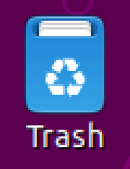
The current icon reminds me more of a mailbox:
Could we (@ubuntujaggers or @eaglersdeveloper ) draw a new one using a similar metaphor to the symbolic icon? This would also fix https://github.com/ubuntu/yaru/issues/868
Random inspiration from the internet: