 eaglersdeveloper
commented
6 years ago
eaglersdeveloper
commented
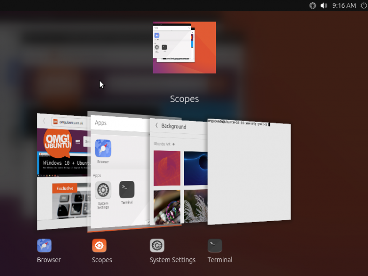
6 years ago I suggest use the icon in Suru style:

I took idea from the Scopes icon:
Closed Feichtmeier closed 6 years ago
eaglersdeveloper
commented
6 years ago I suggest use the icon in Suru style:
I took idea from the Scopes icon:
 merlijn-sebrechts
commented
6 years ago
merlijn-sebrechts
commented
6 years ago I think in terms of usability, you can argue either way. Using "OS logo" for "applications menu" is common:
 ya-d
commented
6 years ago
ya-d
commented
6 years ago Sorry, but I'll quote myself here. Even in Unity the dash is for much more than apps, its a system wide function to discover files or media, look up dictionaries, … plus open apps.
From a usability/UX standpoint I think this is quite a bit different to macOS or Windows. macOS uses the Apple logo for it's system menu (About, Settings, App Store, Power, …), Windows uses its own logo for the "start" menu (Files, Settings, Power + Apps). While "Show Applications" is, well, just that: an app overview. So while the brand logo could be related to "the system" in general, I fail to see the relation of the Ubuntu logo in Communitheme to anything Ubuntu.
 Feichtmeier
commented
6 years ago
Feichtmeier
commented
6 years ago Na it's not only an app overview. You can type and search also from there :) The GNOME Dash has 3 states
You can go into the search view from either one of the two.
ya-d
commented
6 years ago Search is more or less a filter for which applications are shown (maybe Settings are added in, not sure). Activities (windows + workspaces) seems much more like what "the system" or OS does to me, I have no real gripe with adding an Ubuntu logo there.
Feichtmeier
commented
6 years ago Well there are several arguments pro and con the ubuntu logo as the app grid logo. Here are two pros:
The con's are in the opening post. But either way, we have to wait for guadec and didis return with the final decision. If GNOME doesn't like this branding we use the app grid icon.
merlijn-sebrechts
commented
6 years ago I agree to go with the recommendations of the Gnome folks. I didn't know didrocks was going to ask them.
Just to clarify something to @ya-d
Regardless of how you open search in Gnome 3; it will show all search providers. This includes
This is almost exactly the behavior of Unity and Windows.
An example:

ya-d
commented
6 years ago Oh, ok. Thanks for correcting that, Merlijn! I'll stick with the difference to Windows and Mac though as they provide system functions like shutdown etc in their branded menus.
But I'm not saying there are no other arguments by any means, I just wanted to add mine to the conversation. There are pretty reasonable points either way which have to be weighted. I'm sure you'll find a good solution for branding and usability while still pleasing upstream.
?? Maybe there could be same kind of a "badge" to the icon: either an app grid icon with an Ubuntu badge or an Ubuntu logo with an app grid badge. Just a quick thought. Probably too much/busy.
 godlyranchdressing
commented
6 years ago
godlyranchdressing
commented
6 years ago I really like the Suru icon idea, the current monochrome logo looks a little unfriendly.
 madsrh
commented
6 years ago
madsrh
commented
6 years ago I really like the Suru icon idea, the current monochrome logo looks a little unfriendly.
Really? I really love the current monochrome very much (as mentioned elsewhere 🤷♂️ )
The Suru icon, looks exactly like that... an icon from an application. I think it's kind of misleading

godlyranchdressing
commented
6 years ago @madsrh I agree about that too, but still, I like it! :laughing:
Reposting a mockup from @taciturasa on the community forum.

I know we're still waiting on @didrocks's response on replacing upstream stuff.
 didrocks
commented
6 years ago
didrocks
commented
6 years ago So, we just discussed this as part of GUADEC. The general agreement is that it doesn't make sense to replace the app grid with the ubuntu logo.
We can explore adding it on top, next to Activities, but keep the "activities" wording please. Sounds good for everyone?
Feichtmeier
commented
6 years ago @didrocks great news! Then we have at least some ubuntu logo - and in the end we all agreed that the app grid button made more sense. @godlyranchdressing could you make a PR (again) for this one? :)
merlijn-sebrechts
commented
6 years ago @didrocks I'm curious to hear the reasoning behind this. I don't mind going with their guidelines, but I'd like to hear their explanation because to me this seems a counter-intuitive decision; activities is similar to a "window spread" on Unity and "task view" on Windows. It's not a menu so it seems to go against this common UI pattern. :thinking: Although I just realized that if you press the "Ubuntu" button on your laptop, you open activities instead of the app grid, so at least that will be consistent.. Upstream Gnome could then put the foot next to "activities" so their "hide-the-windows-key" stickers will actually help UX :)
From a UX perspective, the best thing might be to put the "Task View" icon from Windows ( ) next to activities. But then we don't have any branding which is always visible.. Bye bye Ubuntu logo on a hacker's laptop in movies.. :smile:
A third option might be to use the "window switcher" key icon from the chromebook. Since Chromebooks are becoming more popular than Windows laptops in the US, this might be good too.

Note: To add to the confusion, earlier versions of Unity actually had a very similar button for the dash(menu) in that exact place

 polyjitter
commented
6 years ago
polyjitter
commented
6 years ago ^ This. I understand it's not the way it is in GNOME, so there's that confusion, but we're already moving away from a lot of default GNOME patterns, esp. the dock, so I don't see why it can't be changed for the better here. I've outlined my reasoning in the communitheme thread on discourse, with even more reasoning as to why it should maybe be an upstream thing too. I'm not too torn either way, as all I've done so far is mess around in inkscape/gimp a bit, but it is a bit frustrating that the reasoning seems so vague.
Just to pop this down from there, for reference:
The change from a label to an OS button may seem weird, but, paradoxically, I feel it may be more communicative to new and old users what that button does than “Activities” does. “Activities” doesn’t relay the idea of the gnome dash very well, but users have been trained on what a start menu is with Windows. It’ll be a likely thing for a new user to explore, and it’ll communicate the space as incredibly important to the experience like it should be: just like Windows Start or macOS Apple menu, the branding is a signpost.
That, and I feel it’s pill shape would make for a very good home button/modern gesture slider for GNOME Mobile, when purism’s new mobile shell hits critical mass and if ubuntu ever makes its way onto that :wink:
and later:
It makes maybe more sense in the context of vanilla GNOME; there, it really is the one main menu for everything, so it makes sense for it to be branded like the start button (on vanilla GNOME, that being the GNOME footprint), as well as giving the shell a strong identity for users. That’s where you “start” when you turn your computer on; it’s like a table where everything is laid out for you. It combines the start menu and the task view, thinking in terms of windows. It’s the GNOME way.
It also makes sense in respect to Purism’s GNOME Mobile efforts: instead of an activities label, they’re using an up arrow to signify the “home” (which for now is just the app grid, but in the future will be the full gnome dash, if i read right). A pill works better than that, imo, as not only is it a more regonizable home button, it also opens the door to future gesture control the likes of which we’re seeing in iOS, Android, Moto phones, etc., that actually came from webOS, GNOME’s direct influence. It also just works visually on both desktop and mobile devices.
That’s not to say that it doesn’t still make sense in regards to ubuntu; the gnome dash is still the most important paradigm in GNOME, and basically what the whole experience is centered around. It’s still the “main table”. Using the ubuntu logo instead of the gnome footprint would make more sense for this instance, but it still serves most of the same purpose.
Feichtmeier
commented
6 years ago 
That's the best I've made so far... I hope Aaron comes online soon x D
_common.scss:
#panelActivities.panel-button {
    background-image: url("activities.svg");
    background-size: contain;
    text-align: right;
    width: 100px;
}

_dock.scss:
  .show-apps {
    .overview-icon {
      border-radius: $small_radius;
    }
    &:active, &:checked {
      .overview-icon { background-color: $base_active_color; box-shadow: none; }
    }
  }
+ a custom .svg file I've created
polyjitter
commented
6 years ago As a quick addendum before I step away for a bit, activities would great as a tooltip for the button, though I believe that'd require upstream changes.
On Mon, Jul 9, 2018, 1:08 PM Merlijn Sebrechts notifications@github.com wrote:
@didrocks https://github.com/didrocks I'm curious to hear the reasoning behind this. I don't mind going with their guidelines, but I'd like to hear their explanation because to me this seems a counter-intuitive decision; activities is similar to a "window spread" on Unity and "task view" on Windows. It's not a menu so it seems to go against this common UI pattern. 🤔
From a UX perspective, the best thing might be to put the "Task View" icon from Windows ([image: image] https://user-images.githubusercontent.com/1492981/42464748-48ba6b60-83aa-11e8-8eb9-4e90a38a6bc8.png) next to activities. But then we don't have any branding which is always visible.. Bye bye Ubuntu logo on a hacker's laptop in movies.. 😄
Note: To add to the confusion, earlier versions of Unity actually had a very similar button for the dash(menu)
[image: image] https://user-images.githubusercontent.com/1492981/42464397-2d5b5ee8-83a9-11e8-9fdf-4e0196d5d0c0.png
— You are receiving this because you were mentioned. Reply to this email directly, view it on GitHub https://github.com/ubuntu/gtk-communitheme/issues/584#issuecomment-403550526, or mute the thread https://github.com/notifications/unsubscribe-auth/ARScQEgbm3ffF2tOJ3ElppSx0EnIlzCZks5uE431gaJpZM4U89yf .
Feichtmeier
commented
6 years ago @galgalesh I was thinking about this, too.
The ubuntu button for activities makes as much sense as the ubuntu button for the app grid. :man_shrugging: In both cases I would just have liked it because of the "ubuntu-branding".
The main function of the button is the window spread PLUS the second big function which is the ability to drag windows on a different workspace
@taciturasa thanks for participating in this discussion :heart: Yet, could we stay a bit more un-emotional about this? :smile: We all waited for the decision from the GNOME designers for our implementations. So now we have the decision and this is not the correct place to question the decisions of the upstream designers. We can do as much about his as you in this channel of communication.
polyjitter
commented
6 years ago Although I just realized that if you press the "Ubuntu" button on your laptop, you open activities instead of the app grid
This is something I was thinking too with the pill. It's basically your home button, no matter the form factor.
polyjitter
commented
6 years ago @Feichtmeier right, not trying to be too emotional about this one way or the other. Sorry if that's the way it came off!
Feichtmeier
commented
6 years ago @taciturasa np, this whole topic is kind of hot! :dancer: :smile: Edit: removed your double comment :)
After making the length smaller we got a better spacing.
Edit: -.- had to restart the shell, alt+f2+rt was not enough


polyjitter
commented
6 years ago @Feichtmeier looks great! Is it perhaps the box shadow for active that's messing things up?
EDIT:
Edit: -.- had to restart the shell, alt+f2+rt was not enough
nvm lol
Edit: removed your double comment :)
oops, my bad, sent through email
Ignoring the other stuff (I didn't actually realize it was upstream GNOME designers that made the decision; I thought there was a third middleman party who did it), I wanna draw attention to the Suru-shaped app grid button I did, and see if anyone finds it a better fit than the default GNOME app grid button? It uses the GNOME app grid shape, just placed inside a white Suru squircle.
Feichtmeier
commented
6 years ago @taciturasa I liked the idea of drawing the shape around it. However, as @madsrh already pointed out, if it has the same "paper-effects" like box.shadows and outlines, it looks like it's some application and not part of the shell functionality. But I couldn't tell from the screenshot you've attached if it has those effects or if it is flat.
@madsrh @clobrano I will make a PR because I want to test how good the icon scales on big screens.
polyjitter
commented
6 years ago Nope, it indeed doesn't have the paper effects - that was something I was cognizant of 😄
Here's the full size of it, so you can see for yourself. The alignment is super off, as I'm aware - I couldn't be bothered because my linux install is nuked and I decided I'd just be turning it into something real if someone liked the idea anyways.

Feichtmeier
commented
6 years ago @taciturasa could you give me a link to the file? Please .SVG
polyjitter
commented
6 years ago It'll be ~7 hours until I get home and can grab the svg, but I'll plop it down as soon as I can!
On Mon, Jul 9, 2018, 2:55 PM Feichtmeier notifications@github.com wrote:
@taciturasa https://github.com/taciturasa could you give me a link to the file? Please .SVG
— You are receiving this because you were mentioned. Reply to this email directly, view it on GitHub https://github.com/ubuntu/gtk-communitheme/issues/584#issuecomment-403584032, or mute the thread https://github.com/notifications/unsubscribe-auth/ARScQJHfzmAAPfHuZB5tioAo8KZ6SunOks5uE6cOgaJpZM4U89yf .
polyjitter
commented
6 years ago Okay, next question is can we play around with the Ubuntu logo plus activities wording INSIDE the pill? Sorry for still keeping this going, I'm a lame and unabashed webOS apologies :P
On Mon, Jul 9, 2018, 2:56 PM taciturasa ustin.a.h@gmail.com wrote:
It'll be ~7 hours until I get home and can grab the svg, but I'll plop it down as soon as I can!
On Mon, Jul 9, 2018, 2:55 PM Feichtmeier notifications@github.com wrote:
@taciturasa https://github.com/taciturasa could you give me a link to the file? Please .SVG
— You are receiving this because you were mentioned. Reply to this email directly, view it on GitHub https://github.com/ubuntu/gtk-communitheme/issues/584#issuecomment-403584032, or mute the thread https://github.com/notifications/unsubscribe-auth/ARScQJHfzmAAPfHuZB5tioAo8KZ6SunOks5uE6cOgaJpZM4U89yf .
Feichtmeier
commented
6 years ago I also thought about this, since I liked your mock-up. However, this would reduce the customization since you would need to place the text inside the svg.
polyjitter
commented
6 years ago Right, that makes sense. In that case, what does the difference look like between transparent Ubuntu logo inside the white circle vs. Just a white Ubuntu logo? The second way was how it was back in gnome2 Ubuntu days, iirc, and I think it may fit better at such a small size because it's a simpler shape?
On Mon, Jul 9, 2018, 3:16 PM Feichtmeier notifications@github.com wrote:
I also thought about this, since I liked your mock-up. However, this would reduce the customization since you would need to place the text inside the svg.
— You are receiving this because you were mentioned. Reply to this email directly, view it on GitHub https://github.com/ubuntu/gtk-communitheme/issues/584#issuecomment-403590341, or mute the thread https://github.com/notifications/unsubscribe-auth/ARScQLneL3uGIbDpmTI4oWjTfHCiUFwaks5uE6wngaJpZM4U89yf .
Feichtmeier
commented
6 years ago Read what didier reported from guadec. Ubuntu logo yes but with the text :)
polyjitter
commented
6 years ago Sorry, miscommunication - I meant in regards to the Ubuntu logo next to the text :)
On Mon, Jul 9, 2018, 4:11 PM Feichtmeier notifications@github.com wrote:
Read what didier reported from guadec. Ubuntu logo yes but with the text :)
— You are receiving this because you were mentioned. Reply to this email directly, view it on GitHub https://github.com/ubuntu/gtk-communitheme/issues/584#issuecomment-403604815, or mute the thread https://github.com/notifications/unsubscribe-auth/ARScQMHmt3RBN-F7Bwg4PSSWJCgLUi4Hks5uE7j3gaJpZM4U89yf .
didrocks
commented
6 years ago I guess the whole discussion should be on the hub anyway, to include more community members. I just wanted to update on that PR here as it was related ;)
We are going to discuss general themability this afternoon at GUADEC btw, not only this icon where we took the decision yesterday about it. In a nutshell, the grid icon shows a grid. Putting the grid icon as the top (as stated multiple times in my blog post suit) isn't suitable, because you would have 2 similar buttons spacially closed, (Activity and app grid), having slightly different behavior.
polyjitter
commented
6 years ago Again think that was another miscommunication. Feicht was adding an Ubuntu logo next to the activities text, and I was wondering if it wasn't a better idea to go with a white Ubuntu logo instead of the one in the circle that he has now.
On Tue, Jul 10, 2018, 4:46 AM Didier Roche notifications@github.com wrote:
I guess the whole discussion should be on the hub anyway, to include more community members. I just wanted to update on that PR here as it was related ;)
We are going to discuss general themability this afternoon at GUADEC btw, not only this icon where we took the decision yesterday about it. In a nutshell, the grid icon shows a grid. Putting the grid icon as the top (as stated multiple times in my blog post suit) isn't suitable, because you would have 2 similar buttons spacially closed, (Activity and app grid), having slightly different behavior.
— You are receiving this because you were mentioned. Reply to this email directly, view it on GitHub https://github.com/ubuntu/gtk-communitheme/issues/584#issuecomment-403747766, or mute the thread https://github.com/notifications/unsubscribe-auth/ARScQEXsyHKvA9yBXfdIN-MEvyzfg2nGks5uFGnIgaJpZM4U89yf .
Feichtmeier
commented
6 years ago @taciturasa please post your new grid icon ideas in here. I've merged the PR for now because we need to get a clean gnome shell repo because didier will move the code into this repo (and change the build settings ofc).
polyjitter
commented
6 years ago Gotcha!
On Thu, Jul 12, 2018, 11:31 AM Feichtmeier notifications@github.com wrote:
@taciturasa https://github.com/taciturasa please post your new grid icon ideas in here. I've merged the PR for now because we need to get a clean gnome shell repo because didier will move the code into this repo (and change the build settings ofc).
— You are receiving this because you were mentioned. Reply to this email directly, view it on GitHub https://github.com/ubuntu/gtk-communitheme/issues/584#issuecomment-404553278, or mute the thread https://github.com/notifications/unsubscribe-auth/ARScQIh6lFSX-MhQpHD2ySX5RGRXELKJks5uF2vFgaJpZM4U89yf .
eaglersdeveloper
commented
6 years ago Let's look at the various Android shells. Despite the fact that in Android Nougat and higher renounce app drawer, there are still shells in which you can optionally turn it on.
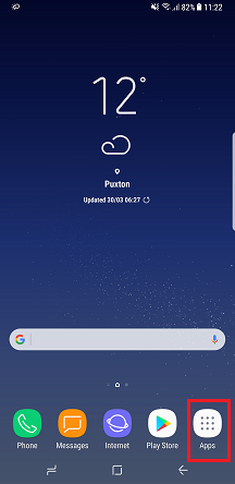
Samsung Experience (optional):
LG UX (optional):

Huawei EMUI (optional):

Sony Xperia UI (default):

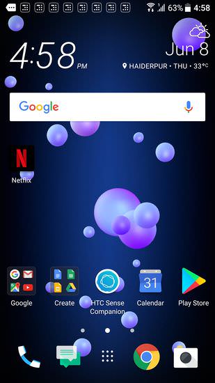
HTC Sense (default):
Almost everyone uses app grid in shape. Everything except HTC Sense.
Feichtmeier
commented
6 years ago There might be a reason to follow a different desktop environment but:
eaglersdeveloper
commented
6 years ago there are also Android launchers which hide it completely and work with only swiping up
I talked about this:
Despite the fact that in Android Nougat and higher renounce app drawer, there are still shells in which you can optionally turn it on.
In Pixel Launcher and Samsung Experience the menu opens with swipe up. In LG UX, MIUI, EMUI, Flyme and other Asian shells apps located on the homescreen by default.
Why are we talking about mobile OS? Let's go back to the desktop!
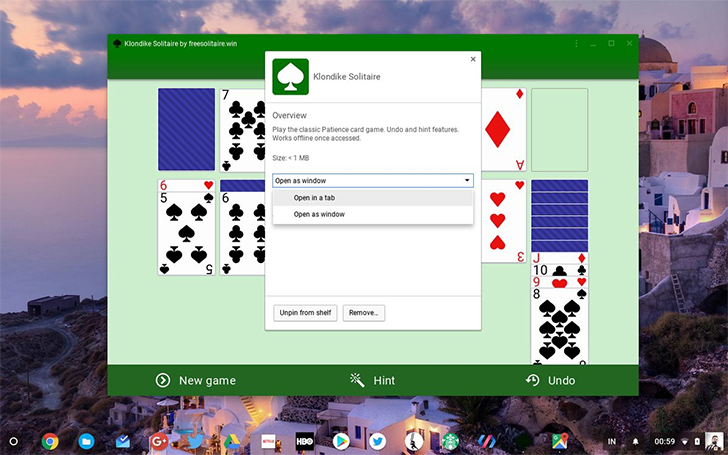
Chrome OS. The app menu icon resembles the Android's Home icon. Background of this icon: a translucent circle, looks like circle application icons (if not visible, enlarge image).
Windows 10 Taskbar. Start is button with monochrome Windows logo. But icons of PWA apps also monochrome.

macOS Dock. Launchpad is responsible for showing the list of applications. And its icon app grid or a system logo. It's a rocket.
 .
The application with the macOS logo is the file manager. However, it provides a shell, as Windows Explorer.
.
The application with the macOS logo is the file manager. However, it provides a shell, as Windows Explorer.
Feichtmeier
commented
6 years ago ? I don't know, you brought the android screenshots in here.
The point is it will be an appgrid icon that's for sure. No matter if Windows has Windows button for their windows things or macos got that macos button.
Upstream has an appgrid and this theme will have an appgrid too.
So for whatever reason the upstream icon might not fit into our monochrome icon set we use, we could search for a slightly alternated look. So I am still looking forward for @taciturasa 's icon.
Edit: or yours ofc!
eaglersdeveloper
commented
6 years ago I don't know, you brought the android screenshots in here.
I showed that designers rarely use the app grid with a shape.
13.07.2018 14:17, Feichtmeier пишет:
? I don't know, you brought the android screenshots in here.
The point is it will be an appgrid icon that's for sure. No matter if Windows has Windows button for their windows things or macos got that macos button.
Upstream has an appgrid and this theme will have an appgrid too.
So for whatever reason the upstream icon /might/ not fit into our monochrome icon set we use, we could search for a slightly alternated look. So I am still looking forward for tracituras icon.
— You are receiving this because you commented. Reply to this email directly, view it on GitHub https://github.com/ubuntu/gtk-communitheme/issues/584#issuecomment-404791339, or mute the thread https://github.com/notifications/unsubscribe-auth/AmXYWRc7uVyrAv9jAG-8zKShxwEHLAKdks5uGHOegaJpZM4U89yf.
polyjitter
commented
6 years ago I don't exactly see how that's relevant. That attempt was ruled out. Usability-wise, it's nothing but stylistic preference. It's not easier or harder to use a bare app grid or an app grid within a shape on any form factor.
On all the desktop examples you've shown, they don't have a UX pattern anywhere near GNOME's, where the app grid button opens the app grid, by stock within the dash only. Windows opens its own vertical menu, ChromeOS is trying to fit into android's schema by emulating the idea of a home, and macOS has launchpad, but it's not the main focus for launching applications, and it's treated like a separate app.
 Luxamman
commented
6 years ago
Luxamman
commented
6 years ago The app grid icon is not right for me to be honest. Have to say that the logo in the top-bar isn't working for me either (and the logo branding is gone anyway because it looks just like a circle) and already miss the nice Ubuntu (branding) logo as the app launcher.
We discussed that several times and so I'm a little confused why to shake up everything again. Maybe we can have a kind of activities icon as a replacement for "Activities" (like a multi-window icon) but it needs to be the same width like the dock underneath to look good. But this also can make problems with the upstream...?
Feichtmeier
commented
6 years ago The reason for the appgrid icon is the news Didi brought from guadec (the upstream designers don't want anything else than the app grid logo there because it's the appgrid button)
Luxamman
commented
6 years ago Well. Disappointing.
 Paz-it
commented
6 years ago
Paz-it
commented
6 years ago So it can be a tiny appgrid ::: surrounded by the circle of friends logo. :thinking:
Feichtmeier
commented
6 years ago My problem would be not the fact that there is the appgrid icon but that I need to fiddle with the Ubuntu logo now at activities. Because it always is wrong aligned in any of the situations (long string or short string).
Feichtmeier
commented
6 years ago  We could also try "something like this"
If we would use a clever combination of forms there could be a nice transition effect.
However we would need to double check if this would be against upstream yet again
We could also try "something like this"
If we would use a clever combination of forms there could be a nice transition effect.
However we would need to double check if this would be against upstream yet again
lol @ gnome shell when the already sluggish animation became even more laggy while using peek
polyjitter
commented
6 years ago https://owo.whats-th.is/59be37.svg
Here's a quick first test, sorry it took so long; been busy. Think the squares might need to be slightly smaller, as well as have less border radius.
Feichtmeier
commented
6 years ago @taciturasa thanks for your work.
I must admit that I'd rather use your first icon or the upstream one. This one looks really big

polyjitter
commented
6 years ago Yeah, that's what I was afraid of. More attempts on the way.
Edit: it has been decided that this theme will follow upstream and use an app grid icon for the "show apps" button in gnome shell/dash to dock, so we will discuss if and how we can improve the icon regarding our theme
Previously discussed here: https://github.com/ubuntu/gnome-shell-communitheme/pull/137 https://github.com/ubuntu/gnome-shell-communitheme/issues/134