 didrocks
commented
6 years ago
didrocks
commented
6 years ago I find the aubergine to be a little bit garish (a little bit with the new proposed gradient for gdm). Anyway to revisit with darker colors? (Maybe it's only the image rendering doing this?)
 madsrh

 Feichtmeier
 eaglersdeveloper


 clobrano


 matthewpaulthomas


 8none1
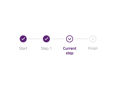
@madsrh Mock-ups:
Basic ideas:
Progress so far: