ui-alchemy / ui_alchemy-rails

http://www.ui-alchemy.org
MIT License
14 stars 21 forks source link

Need Logo and Favicon for Project #59

Closed ehelms closed 11 years ago

andyfitzsuse commented 11 years ago

I've got this.

Any ideas for inspiration? besides windcastles?

at first I thought something simple like a road sign

converge

but it s a little too similar to bazaar folks bazaar

Unless I get a better Idea soon, i'll do a quick "uni the unified unicorn" and be done with it ;-)

ehelms commented 11 years ago

Agreed, looks too much like Bazaar and conjures up thoughts of the early web's site under construction icon. This is an area I tend to not be great at but things that come to mind conceptually are coming together of elements, focusing, many becoming one. Yea, not the best help here unless we went abstract. I'll let the logo nerds go forth with ideas.

jeperry commented 11 years ago

Voltron?

kybaker commented 11 years ago

@andyfitz Seriously Uni the unified unicorn is a great idea.

jeperry commented 11 years ago

Agree - And we could have rainbow colors coming together to make white.

kybaker commented 11 years ago

Yes, double rainbows coming together to make one cloud at the end. We will have Uni the unicorns unified cloud.

ehelms commented 11 years ago

Googling images of Unicorns I can't find a single one that doesn't make me cringe. Nothing close to this - http://www.mylittledjango.com/ lest we get confused as a Django project.

On Thu, Aug 30, 2012 at 11:25 AM, kybaker notifications@github.com wrote:

Yes, double rainbows coming together to make one cloud at the end. We will have Uni the unicorns unified cloud.

— Reply to this email directly or view it on GitHubhttps://github.com/Katello/converge-ui/issues/59#issuecomment-8163072.

Go Pack and War Eagle, Eric D. Helms

Ph.D. Student - North Carolina State University

kybaker commented 11 years ago

So here it is - Uni the unified unicorn flying though the unified rainbow cloud.

https://fedorahosted.org/katello/wiki/converge-ui_logo

andyfitzsuse commented 11 years ago

Great start Kyle. I love the hoofs the best . Did you draw that ?

Anyone want to help us refine? - i'll crank out the .ico .png and webkit touch icon variants if we decide on one unicorn variants

inkscape source svg here http://file.bne.redhat.com/~afitzsim/converge-ui-unicorn.svg

andyfitzsuse commented 11 years ago

Actually after all that, i'm still not convinced a unicorn is the right thing for us .. I kind of mentioned it so that somebody would be forced to come up with something or fear being stuck with a unicorn.

last chance for alternative proposals folks

jtomasek commented 11 years ago

Just some ideas: Uniform - some simplified navy uniform, symbol of unity of looks Handshake (Shaking hands) - self explanatory

I am okay with Unicorn though:)

ehelms commented 11 years ago

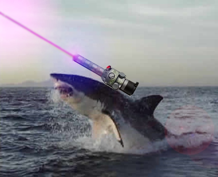
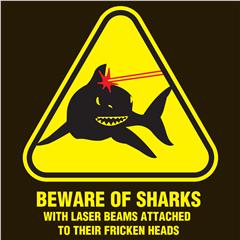
I just can't get over the fact that it's a unicorn either or take it seriously. I have liked the ideas of things coming together to converge. Maybe we need lasers instead of rainbows, sharks with lasers on their head!

jeperry commented 11 years ago

I worked up a few more abstract concepts using an interlocking c and u, these can and should be embellished with color.

https://fedorahosted.org/katello/attachment/wiki/converge-ui_logo/converge-marks.png

Let me know if you want the source.

kybaker commented 11 years ago

@andyfitz Those concepts are great. I really like the siamese unicorn head with the heart. If we don't use that for this I will use it for something else.

ehelms commented 11 years ago

I like the abstract CU symbol, and i also like the black unicorns mirrored with the road down the middle. The rainbows are to much for me On Aug 31, 2012 10:49 AM, "kybaker" notifications@github.com wrote:

@andyfitz https://github.com/andyfitz Those concepts are great. I really like the siamese unicorn head with the heart. If we don't use that for this I will use it for something else.

— Reply to this email directly or view it on GitHubhttps://github.com/Katello/converge-ui/issues/59#issuecomment-8194366.

knowncitizen commented 11 years ago

@jeperry I like what you've started. Perhaps some mix of that and Uni?

andyfitzsuse commented 11 years ago

I think lasers are a good direction. Nothing beats lasers

@jeperry I like the idea of doing a logo mark with the letters but it reminds me of http://www.gomonews.com/wp-content/uploads/2010/03/shazam-logo.jpg

@kybaker have at it mate . I just can't take unicorns seriously enough to think they would create a considered web app framework ;-)

I'll try something with two diagonal lasers .. If we need mascot , it can be a shark with a laser equipped prosthesis

andyfitzsuse commented 11 years ago

Research phase

shark1

shark2

shark3

shark4

shark5

shark6

n1zyy commented 11 years ago

I actually really liked the unicorn logos, especially the bottom-right one. (And it looks much friendlier than the one on GitHub's error pages: https://github.com/images/error/angry_unicorn.png )

Of course, it's hard to go wrong with laser-sharks, too. Though I think the people who couldn't take a unicorn seriously wouldn't take a laser shark much more seriously. (Unless it were chasing them.)

andyfitzsuse commented 11 years ago

with lasers we can do simple things like an abstract V we can even do a sharks fin with a V and build out the narrative from there. that way we have something insanely simple to call on that can expand into a full blown set of illustrations.

but of course i've spent too long on this. stand by for lasers

andyfitzsuse commented 11 years ago

ok this is a joke test

inspired by http://html9responsiveboilerstrapjs.com/

andyfitzsuse commented 11 years ago

shouldn't really be spending much time on this but here's something.

ehelms commented 11 years ago

I do appreciate you spending some time on it, as I am terrible at this sort of thing. I dig it, although I will be the bad guy and ask about other colors as everything I work with seems to be blue :)

andyfitzsuse commented 11 years ago

n1zyy commented 11 years ago

Wow. :+1:

Sharp as rise up lights.

knowncitizen commented 11 years ago

I dig the purple. definitely rise up lights sharp :)

jcoufal commented 11 years ago

ui-alchemy

andyfitzsuse commented 11 years ago

isn't that the the dyslexic font? ;-)

http://dyslexicfonts.com/ http://en.wikipedia.org/wiki/Dyslexie

jcoufal commented 11 years ago

@andyfitz no :) it's some open source one which I edited (very quick solution now, just to display my idea).

jzigmund commented 11 years ago

I like the @jcoufal logo, but without the "ui-" part. what about use only "Alchemy"?

andyfitzsuse commented 11 years ago

http://codepen.io/andyfitz/full/IteFH

kybaker commented 11 years ago

@andyfitz - What if you were to make the colors of the shapes semi-transparent? I think it will add depth and look cool when they overlay in the animation. If you make the one set red and the other blue they would make the purple when they lined up. It may look cool or like a rainbow mess either way may be worth a try.

harlandouglas commented 11 years ago

I think it looks good! I wouldn't change the colors but playing around with a semi-transparent version might be a solid option. Nice work on the variable speed of the two graphics. One nice option might be to adjust the ease as the the two objects meet, then speed it up as it moves away. This will help re-enforce the converge idea of this design. It could take some real work to nail down the timing but I think it will turn out to be pretty sweet.

This would be a great for indeterminate progress indicator, if you guys shy away from a traditional one. I'm not sure about having an animated Favicon, nor sure if this is the intended purpose of this graphic but I like the direction this is going and glad you moved away from the Unicorn. This is a more refined/mature design solution that fits the needs of this project and actually conveys a visual metaphor to converge. Nice Work!