nus-pe-bot
commented
3 years ago
nus-pe-bot
commented
3 years ago Team's Response
Hi, thank you for your report! : ) We are glad and grateful that you have spent the effort to try out and test our products. We appreciate your effort in trying to help us further polish our product. We understand that you might have some confusions in some of our features. We would love to explain and elaborate more on this. However, after careful consideration and discussion, we decide to reject this problem.
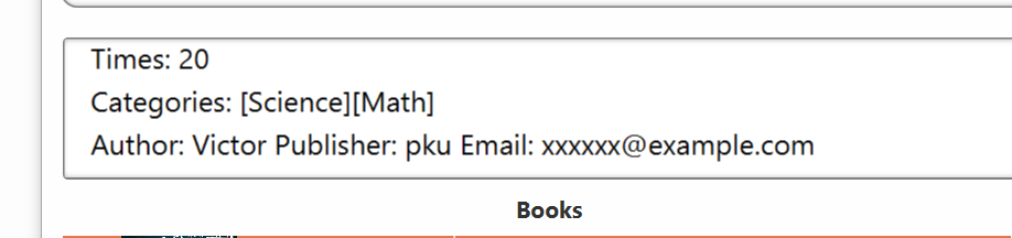
Firstly, when we designed the current layout, the motivation is to group the author name, publisher name, and email address in 1 line since they are rather parallel. They are all different from categories or times, thus it is reasonable to group them together.
Secondly, we think that this varies on personal preference. Some may have other preferences such as add another newline before the email or before different category tags. Thus, we think that this should be considered as a bug.
Thirdly, according to the CS2103 website, this does not affect the usage or functionalities of our application, thus the severity should be VeryLow.
Additionally, our team has decided to change the type into Feature Flaw, because this was not any sort of unhandled user behavior, and neither the User Guide or the Developer Guide specifies that the information needs to be presented in 1 line.
With the given the reasons, our team decided to reject the issue. Thank you again for your response, and our team hopes that you can understand our decision.
Items for the Tester to Verify
:question: Issue response
Team chose [response.Rejected]
- [x] I disagree
Reason for disagreement: I feel that it is an issue as the layout may be confusing at first glance. Since Author and Publisher are at the same line, it seemed as though the author name is Victor Publisher, both capitalised. I feel that it is a minor cosmetic flaw within the UI as there could have been some sort of design to distinguish the two different inputs (author and publisher). I understand the reasoning to group them together, however the current linear layout can be misleading when there is no clear separation between the different parameters in a line.
:question: Issue type
Team chose [type.FeatureFlaw]
Originally [type.FunctionalityBug]
- [ ] I disagree
Reason for disagreement: [replace this with your explanation]
Publisher should be a new line