 Ethkuil
commented
1 year ago
Ethkuil
commented
1 year ago The UI may be not perfect because I'm not proficient in that. It's good to do some improvement if you think so.
Closed Ethkuil closed 1 year ago
Ethkuil
commented
1 year ago The UI may be not perfect because I'm not proficient in that. It's good to do some improvement if you think so.
 payne911
commented
1 year ago
payne911
commented
1 year ago First of all, thanks for this PR. 👍
I have a few comments:


In a more general sense, some things may be worth discussing.
It's a little troublesome because I'm more familiar with frameworks like Vue
Honestly, I've been wanting to rewrite the entire thing using a framework, but I'm a bit low in terms of time that I can commit to this endeavor. Personally, I would probably opt for React because I've been wanting to learn to use it since it's the most used in the corporate world, but a rewrite in Vue could be just as interesting anyways. If you have the motivation to do it, go ahead (and I would definitely favor the usage of TypeScript).
The project was initially too small to justify using frontend frameworks, but now it has grown enough to justify the rewrite because:
The UI may be not perfect [...] It's good to do some improvement if you think so.
I'm not very talented at it either, don't worry. We should probably discuss this a bit before you spend more time refining the current approach. Some ideas to consider (I believe option 3 would be the best final result, and option 2 is probably both a better approach and easier to code than option 1):

>0 (and others) are input fields, and I think it's a good idea to have pre-filled values because it makes it more obvious how to use them in terms of syntax. I quickly drew a "mock up", but I've also found a few examples in the wild.

 Ethkuil
commented
1 year ago
Ethkuil
commented
1 year ago Thanks for your detailed comments.
- It seems like this change renders the "Ahead filter" of the "Query settings" dialog (opened with the clog icon) useless: consider simply removing it.
I think so too, but it's backwards incompatible, so that I didn't remove it before just waiting for your opinion.
- Is there a way to keep the current approach that adds a row even if the second batch of requests hasn't finished yet? I believe it's a better approach because it provides faster feedback to users, instead of letting them think the process is stalled or slow.
I think the rising call count is enough to tell users everything goes well. What's more, it's a little tricky to do that: we need to add a fork into data array before we confirm it's indeed useful, so that we have to remove it from the array. The cost is too expensive for me.
- Your table rows have a border on the left-side: that would need to be removed.
There is a misunderstanding. Maybe it's just because I mouse over the inappropriate position.
- I haven't had time to verify this, but make sure the filtering would not prevent rows from registering themselves (what I mean is that if filtering is applied, and then removed, the entries that were filtered out should reappear).
Certainly I have tested it.
I largely agree with you. I hope that this project could be refactored with a modern framework, whether utilizing Vue or React. At the same time a corresponding UI component library would be much helpful. With these, we can simply choose "option 3" after all it's a common feature that we don't need to implement it again.
If you think it's OK, maybe I can refactor it in the spare time, using Vue3, Element UI Plus as UI library (because I'm more familiar with them lol) and TypeScript (I love it!). I cannot guarantee a relatively short time frame to begin and finish, but I think it'll be shorter than half a year.
And by the way we can also use tools based on React if you think it's better, because I also have a plan to learn it.
payne911
commented
1 year ago but it's backwards incompatible
I think it's possible to make a retrocompatible change: after removing the option, you can nonetheless reuse the saved value and use that as the default prefill for the filter field. Here's the relevant code pointer: https://github.com/useful-forks/useful-forks.github.io/blob/master/website/src/settings.js#L22-L36 The problem with this approach would be that this value would be there permanently. It's probably better to just remove the thing entirely and not care about previous settings. ... in any case, that change can be its own PR, so you don't really have to bother with it just yet if you don't want. For now, the preference can remain.
I think the rising call count is enough to tell users everything goes well.
Fair enough. (Although I liked how active and dynamic it looked.)
I've tested your branch. There are a few bugs that would need to be ironed out:
ahead:<0 or ahead:>9999999 before running the query, it will result in an empty table, and the tool will thus display the message reserved for when there are no forks to display (img 1). But then if you remove the filter and there were actually forks, the message remains (img 2).

 Once the scan is done, this message should be updated dynamically based on the filtered results. The same goes for the "Export as CSV" button.

Comments:
:" character to specify values?Regarding the rewrite:
With these, we can simply choose "option 3" after all it's a common feature that we don't need to implement it again.
Can you point me toward some specific documentation displaying what this common feature would look like?
we can also use tools based on React if you think it's better, because I also have a plan to learn it.
Then this looks like the perfect opportunity to learn it. ;)
Ethkuil
commented
1 year ago Something easy will be replied first as following:
... in any case, that change can be its own PR, so you don't really have to bother with it just yet if you don't want. For now, the preference can remain.
In fact I prefer to simply delete it, too.
The corners of the input fields are broken. Both of these should be rounded:
For smaller screens, there is an overlap. That's another good argument to move the filter box elsewhere.
I have made a simple adjustment to fix them. Do you think the following is satisfying?

The bug 1 and 2 are both about "messages". I will try to write a commit named "Fix wrong message display after filtering".
Consider not allowing people to input filters until the request ends (either via success, or API rate limit).
I think the current is better because you may hope that useless forks won't appear in the all process. And we can achieve that.
Am I understanding correctly that for every fork row added to the table, you recreate the entire table? I noticed "slow-downs" for queries that result in big tables (e.g. useful-forks.github.io/?repo=libgdx/libgdx) when you move the mouse around on the rows (which highlights them on hover). The lag isn't there when the scan stalls (and thus isn't periodically recreating the table).
It recreate the entire table iff the table data is updated (iff the request for a list of forks succeed) or the filter is updated.
I'm not sure why it slowed down when moving the mouse around on the rows. I'm sorry but could you confirm that so it is or just a coincidence?
There should now be two CSV buttons: one to download the subset of filtered results, and another one to download the full list.
I never use this feature so ignored it before... The button now can download the subset of filtered results. I'm not sure whether the other button is necessary or not, but certainly you can add one if need.
I'm not sure why, but the fact that the filter input field has no button would make me think that it applies automatically. It took me a split second to realize I needed to press 'Enter' to submit.
You're right. I have amended it.
The filtering syntax bothers me a bit. Why require an extra ":" character to specify values?
The reason lies within the title: Add GitHub-style filter ...
Pointer for adding an icon in your input field: bulma.io/documentation/form/general/#with-icons

To supplement a prompt in placeholder could be simpler and is also universally used.
Can you point me toward some specific documentation displaying what this common feature would look like?
Element Plus - Table - filter Element Plus - Table - custom header
we can also use tools based on React if you think it's better, because I also have a plan to learn it.
Then this looks like the perfect opportunity to learn it. ;)
Certainly it's all right, if you can accept that I need to spend much more time to finish the job because of learning lol.
payne911
commented
1 year ago I prefer to simply delete it
Sounds good. Although let's discuss that in another PR after we are with this one.
Current result (EDIT: oops, the filter field is "light" because I was testing out what it would look like without the is-dark class):

A few things:
keyword:< will filter everything out. Can we avoid that by only applying filters once at least a digit is placed after the symbols?The first 4 points are the most critical ones.
To supplement a prompt in placeholder could be simpler and is also universally used.
I'm not sure what you mean.
I will try to write a commit named "Fix wrong message display after filtering".
Sounds good to me.
I'm sorry but could you confirm that so it is or just a coincidence?
I can't reproduce the problem anymore, and it was pretty minute anyways. Let's ignore this for now.
While your linked examples look great, I think it'd be wiser to use React. It's much more widely adopted within the industry, and so would probably increase the likelihood of future contributions.
And of course, there are tons of libraries as well. For example:
Ethkuil
commented
1 year ago I'm sorry for late response because I'm just too busy this week. Tired and nearly crazy.
"Fix wrong message display after filtering" has been committed, which I promised but hadn't finished before.
- The filter field should be positioned in between "Export CSV" and the table. (And make sure it only appears when there is at least 1 row that exists.)
I agree that it should be positioned under the row "Queried repository". And "between 'Export CSV' and the table" is also not bad for me.
(But I almost wanted to cry when I saw how "useful_forks_inject" was built. 😥I haven't changed them because I'm not familiar with JQuery.)
But in my opinion, it's reasonable for users to edit the filter field before the searching finishes and at this time the filter should also work.
- Due to the immediate filtering, using keyword:< will filter everything out. Can we avoid that by only applying filters once at least a digit is placed after the symbols?
Done.
- Rename the CSV button to "Export filtered table as CSV", but only when a filter is applied.
My idea: "Export the following table as CSV". The simple is better. Do not increase complexity unnecessarily.
- There should be an indicator of how many rows are being hidden by the filters. It could be the same kind of little badge as the one used to display the amount of calls.
Would you mind providing an example that this feature helps?
To supplement a prompt in placeholder could be simpler and is also universally used.
I'm not sure what you mean.
I mean, a suitable placeholder is enough and maybe we don't need a filter icon. Certainly it's also OK if added, but I won't do that myself.
Certainly I'm convinced that React is powerful enough. After all, developers won't choose a framework if it's so weak. I will try to learn React and use it in useful-forks in my spare time.
payne911
commented
1 year ago I'm sorry for late response
This is all voluntary. No worries! :)
Note: before testing your PR, I merged my latest changes in. They do not affect your logic.
I agree that it should be positioned under the row "Queried repository". And "between 'Export CSV' and the table" is also not bad for me.
Glad we agree on that.
[Can we avoid that by only applying filters once at least a digit is placed after the symbols?] Done.
You introduced a bug. Here's a sequence of events to demonstrate:


Only the currently-being-built token should not be treated. The other ones are fine.
My idea: "Export the following table as CSV".
Actually a good idea. Although I'd prefer shorter. How about "Export table below as CSV" ?
Would you mind providing an example that this feature helps?
You can ignore the request. I'll add it myself if I feel motivated enough, I guess.
but I won't do that myself.
Same as above.
I will try to learn React
Great news 👍
Ethkuil
commented
1 year ago You introduced a bug. Here's a sequence of events to demonstrate...
I make some changes to achieve as below:
/**
 * 1. Empty filter means no filter.
 * 2. Filter string is a list of conditions separated by spaces.
 * 3. If a condition is invalid, it is ignored, and the rest of the conditions are applied.
 */
How about "Export table below as CSV" ?
It's actually better. I replaced the string for both the button and the note in settings.
payne911
commented
1 year ago I like the rules you opted for. 👍
Three last things:
a, b, d, n, s, f)Ethkuil
commented
1 year ago
- The position of the filter field
I don't know how to edit
$('#useful_forks_inject').append(
    $('<div>', {id: UF_ID_WRAPPER}).append(
        $('<div>', {id: UF_ID_HEADER}),
        $('<div>', {id: UF_ID_MSG}).html(landingPageTrigger()),
        $('<div>', {id: UF_ID_DATA}).append(
            $('<table>', {id: UF_ID_TABLE}).append(
                $('<tbody>')
            )
        )
    )
);
- Consider adding aliases for each columns (for ahead, behind, date, name, stars, forks: a, b, d, n, s, f)
I feel it a bit "no so useful". After all, useful-forks is not a tool used daily, like Git. I will prefer to wait for the novel type of table that allows filter for each column directly.
But it's easy to implement so I can do that if you think it's useful indeed.
- Is there a link to the "GitHub-style" filters documentation we could point users to?
It's here: about-searching-on-github
However, I think the syntax is simple enough for users to get.
payne911
commented
1 year ago I don't know how to
This should help you understand: https://github.com/useful-forks/useful-forks.github.io/blob/master/website/src/csv-export.js#L15
But it's easy to implement so I can do that if you think it's useful indeed.
If it's an easy grab, it's worth it.
the syntax is simple enough for users to get
I agree, but I like to appease curious minds. I'll try to figure out a way to integrate that link once the PR is merged.
Ethkuil
commented
1 year ago The position of the filter field
Sorry I decide to give up. The filter field should be positioned under the msg about searching, but if so then it'll be under the Introducing msg. Different types of msgs occupy the same area.
I consider making do is enough for now.
If it's an easy grab, it's worth it.
Done.
payne911
commented
1 year ago This might help you achieve the goal of not always displaying the filter field:
const FILTER_DIV_ID = "uf_filter_field_div";
const FILTER_INPUT_ID = "uf_filter_field";
const INPUT_FIELD = $('<input>', {
                       class: 'input is-dark',
                       type: 'text',
                       id: FILTER_INPUT_ID,
                       placeholder: 'Type your filter here. eg: ahead:>=1 behind:<5'
                    })
const FILTER_DIV = $('<div>', {id: FILTER_DIV_ID, class: "mt-2"}).append(INPUT_FIELD);
Also, I found another messaging bug: when we input a repo which doesn't exist, the returned message is UF_MSG_EMPTY_FILTER instead of UF_MSG_ERROR.

Ethkuil
commented
1 year ago Also, I found another messaging bug: when we input a repo which doesn't exist, the returned message is UF_MSG_EMPTY_FILTER instead of UF_MSG_ERROR.
It has been fixed now and I have checked the code relate to msg management to avoid the similar bugs.
Well, these works should be finished when taking necessary refactor. But at that time I didn't notice them.
Ethkuil
commented
1 year ago This might help you achieve the goal of not always displaying the filter field
Thank you. However, it's not my goal. I still think it's reasonable for users to input a filter even if the searching results haven't come.
payne911
commented
1 year ago I still think it's reasonable for users to input a filter even if the searching results haven't come.
This may be fair, but I disagree with the idea that this extra input field should appear at all times.
When a new user lands on the home page, it should only see the repository field because that's all they should care about at that point. Another field is just confusing.
Again: I'm fine with showing the filter field during the scan, but not before it begins. Nor should it be displayed when there are no useful forks.
Essentially, at the earliest it could be displayed once this condition is fulfilled: https://github.com/useful-forks/useful-forks.github.io/blob/master/website/src/queries-logic.js#L316
... but it'd be even better if it was only displayed when this one is called at least twice (i.e. at least two useful forks are listed): https://github.com/useful-forks/useful-forks.github.io/blob/master/website/src/queries-logic.js#L221
And of course, when any of those 3 messages are displayed, it would make no sense to display that field either: https://github.com/useful-forks/useful-forks.github.io/blob/master/website/src/queries-init.js#L7-L9
Ethkuil
commented
1 year ago I disabled the automatic formatting function because I found that it will affect almost all the original code. And I'm glad to fix that now because you also noticed that.
What's more, the mix of snake case and camel case in function naming exists and it's ignored. When I edit the file, I fail to guess what the difference may mean, and so I just name my functions like the near function.
By the way, in my humble opinion, the codebase itself hasn't been something clean, so there is no need to pay too much attention to small changes. Maybe it's only the whole rewrite that can be considerable.
Ethkuil
commented
1 year ago Again: I'm fine with showing the filter field during the scan, but not before it begins. Nor should it be displayed when there are no useful forks.
Essentially, at the earliest it could be displayed once this condition is fulfilled: master/website/src/queries-logic.js#L316
... but it'd be even better if it was only displayed when this one is called at least twice (i.e. at least two useful forks are listed): master/website/src/queries-logic.js#L221
And of course, when any of those 3 messages are displayed, it would make no sense to display that field either: master/website/src/queries-init.js#L7-L9
(By the way, " UF_MSG_EMPTY_FILTER" should not be considered. If you filter out all forks and now you want to delete some conditions, I consider you won't want to see the filter field has gone.)
I hope the the current version can satisfy you. And the solution is:
I have tested it and feel satisfied. How about you?
payne911
commented
1 year ago By the way, " UF_MSG_EMPTY_FILTER" should not be considered
Good point. Agreed.
the codebase itself hasn't been something clean
Absolutely agreed. The codebase is messy, among other things because I began the project by forking someone else's project. That led to two different styles mixing together, and initially the changes were so minimal I didn't bother with applying a linter. Then the project grew, and I never really paid much attention to that aspect because it was just a sideline hobby written in a language I pretty much never use.
Thus, it's mostly random styles, and since a rewrite to React is indeed something I'm considering, I don't plan on spending time on fixing the current issues related to that.
To conclude: please revert 11334a5 : I'd rather not have the git blame affected globally like that (plus, it makes it harder to review your PR).
I have tested it and feel satisfied. How about you?
I'll test your update in the upcoming days. Thanks for all your work, and for providing me with good alternate visions/opinions.
payne911
commented
1 year ago And a follow-up for myself:
is-dark class maybe only when there is valid input? and red color when one of the inputs is broken?): feels extremely superfluous and annoying to add)Ethkuil
commented
1 year ago The progress bar disappears when the filters are edited while it's displayed. This is critical.
I checked how the progress bar is added and removed. Then I thought "maybe the progress bar shouldn't be contained in messages". Based on the idea I fixed the bug. I have used reference in VSCode to confirm I have edited everywhere need to be edited and nowhere else.
payne911
commented
1 year ago Sorry for the miscommunication. The message associated with the progress bar is important as well because it explains why the user has to wait.
Currently, only the progress bar remains.

payne911
commented
1 year ago You seem to have fixed it. Well done! :)
I recorded another bug: https://imgur.com/a/2XJRch5
It seems to happen only when the filter is altered while requests are being issued.
payne911
commented
1 year ago I found another bug: using Ctrl + X or backspace to clear the entire text in the filter prevents it from being re-applied.
Here's a sequence of events:


Ethkuil
commented
1 year ago I found another bug: using Ctrl + X or backspace to clear the entire text in the filter prevents it from being re-applied.
It's undoubtedly a foolish bug. I have fixed it.
payne911
commented
1 year ago Could you explain to me a how your filtering/comparison code handles dates?
I thought one needed to convert with Date() to allow proper handling in JS.
payne911
commented
1 year ago Please review my latest commits. If you are fine with the current state of the PR, I'll go ahead and merge it.
Ethkuil
commented
1 year ago Could you explain to me a how your filtering/comparison code handles dates?
It's just "as is". Before this PR, this project has provided date info as string, like 2020-11-03. And string comparison works well as date comparison here.
For example, we consider d>2020-01-01. The first 5 chars, 2020-, same. And the 6th char, 1 and 0 where '1' > '0'. Therefore, we get 2020-11-03 > 2020-01-01.
Certainly, if we input d>2020, then 2020-11-03 will be kept too (equivalent to d>=2020-01-01). And d>2021 will filter out it. I think this is enough.
Ethkuil
commented
1 year ago Please review my latest commits. If you are fine with the current state of the PR, I'll go ahead and merge it.
The current version can not deal with d>2021-04.
I would like to change the regex to /([a-z]+)(<=|>=|[<=>])(\S+)/. It's more flexible, whereas it will lead to something else becomes different: if you type condition like d>2021p, the previous version will ignore it whereas this version will filter out all results because nothing can meet this requirement.
payne911
commented
1 year ago Interesting consideration. I think we could get to an even better regex, although definitely more complex.
[0-9]{4}(?:(?<!-|-[0-9])-[0-9]{0,2}){0,2}(?:) is used to not screw up with the value extraction(?<!) is used to not accept a match on 2020-- and 2020-1-Now the bummer I just noticed is that as you type d<2 it would basically filter out all the dates because 2 > 2020.
The better solution really would be to use Date(). Oh well! For now I'll go with this crazy regex.
payne911
commented
1 year ago @Ethkuil Congratulation: your PR made it through the review process.
Thanks again for your contribution! ❤️
Here is the final regex in all of its (monstrous) glory:
([a-z]+)(<=|>=|[<=>])([0-9]{4}(?:(?<!-|-[0-9])-[0-9]{0,2}){0,2}|[0-9]+)Gotta love how cryptic and unmaintainable regexes are.
Ethkuil
commented
1 year ago I want to touch base with you regarding our discussion about rewriting the repository with React.js. After considering my current workload and priorities, I have come to the realization that I won't be able to contribute to this project as much as I had initially hoped.
While there is a possibility that I may spend some time on this, the likelihood is low so that you can ignore it for now. (I'll keep you updated if I do decide to work on this.)
I apologize for any inconvenience or disappointment this may cause. Thank you for your understanding, and I wish you all the best with the project.
Best regards.
payne911
commented
1 year ago I apologize
No worries. Like I said: I planned on doing it myself anyways since it's a good learning opportunity. And it's not like you signed any contract.
I'm very glad to have collaborated with you. May your talent help other projects move forward. :)
For now, my focus will be on #59 since it's pretty high on my priority list.
There are 2 types of filter:
numberanddate. Tyey both support the following operators:>,<,>=,<=,=.The format of date should be
yyyy-mm-dd, like2022-01-01.number:
stars,forks,ahead,behind. date:pushedeg:
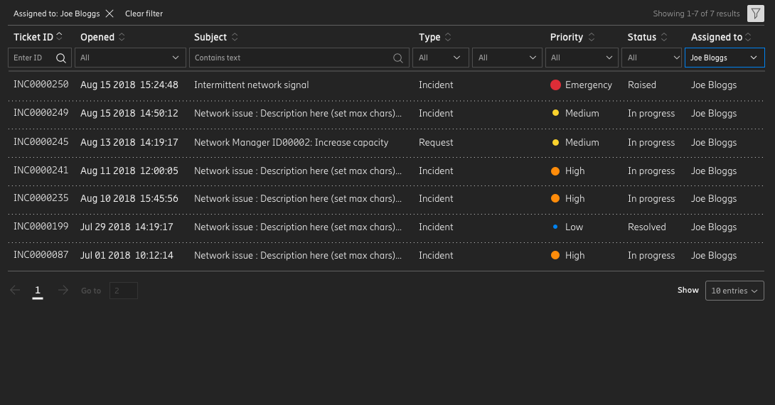
stars:>0 pushed:>2022-01-01Example screenshot:
I have done tests on
payne911/PieMenuandWilfred/difftastic. It worked well. Certainly it would be better if more checks are taken.It's a little troublesome because I'm more familiar with frameworks like Vue that supporting binding data with DOM, but here we have to update DOM ourselves and somewhere code about data and DOM are mixed.
I only did the necessary refactor to make it possible to add the feature of filtering.
And it would be much easier to implement "sort by columns"(#48 ) based on this PR. But I'm not so interested in that 🤔. I would be pleased if anyone would like to do that. Or I can try to solve it in spare time if needed.