 dsernst
commented
10 years ago
dsernst
commented
10 years ago One question: is this logo worth sticking to? Are the more compelling alternatives?
Open dsernst opened 10 years ago
dsernst
commented
10 years ago One question: is this logo worth sticking to? Are the more compelling alternatives?
dsernst
commented
10 years ago If worth sticking with, need to make vector file that can scale up cleanly.
dsernst
commented
10 years ago Alexander P had begun to take a stab at this back in February, and Margot L said she could help work on this together.
dsernst
commented
10 years ago @LetsFix/artisans designers want to chime in?
 alexperryfun
commented
10 years ago
alexperryfun
commented
10 years ago Get a magnifying glass
On Thu, Jul 10, 2014 at 12:48 AM, David Ernst notifications@github.com wrote:
@LetsFix/artisans https://github.com/orgs/LetsFix/teams/artisans designers want to chime in?
— Reply to this email directly or view it on GitHub https://github.com/LetsFix/letsfix.net/issues/10#issuecomment-48564936.
dsernst
commented
10 years ago Here are a number of other logo icon ideas I really like:
http://thenounproject.com/term/patch/20090/
http://thenounproject.com/term/heart/52346/
http://thenounproject.com/term/wrench/16906/
http://thenounproject.com/term/wrench/20387/
http://thenounproject.com/term/fire/44220/
http://thenounproject.com/term/tools/8182/
dsernst
commented
10 years ago dsernst
commented
10 years ago one idea:

(based upon Tools, designed by Shane Miller from the Noun Project)
things i like about this iconography:
it's inspired in part by the logos of GitHub & Gittip/Gratipay (new name)
would love to hear more opinions. what connotation does it have for you? any problems with it? any ideas for a more effective alternative?
dsernst
commented
10 years ago Tom B says:
you know the tools icon was always my favorite. I like this. And I like the slight purple. 'regal'
 aneeqa8952
commented
10 years ago
aneeqa8952
commented
10 years ago -patch is a good one, but is too visually similar to a computer chip, hence confusing
-like:
http://thenounproject.com/term/wrench/16906/ http://thenounproject.com/term/wrench/20387/ http://thenounproject.com/term/fire/44220/
-really like: the concept of the column
aneeqa8952
commented
10 years ago Of the few I came across, I liked this one: http://thenounproject.com/term/fist/29627/
Let's get together (fist) and do something (strike like lightning), make change!
aneeqa8952
commented
10 years ago The X tool symbol, is by-far, the strongest contender.
On the 'slight purple' - I sincerely believe that regality is not a tone that we would want to set among the platform and its users.
dsernst
commented
10 years ago Thanks for the comments! :dragon_face:
I like the fist!
Still like the flame a lot, maybe my second favorite. Concerns:
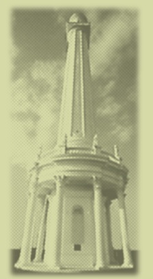
I find the column really beautiful. Concerns are:
Still like the wrench icons, especially this one.
So trying to retain this clear "fixing" aspect, but also incorporate more emotion, lead to the above mockup adding the pencil. Still unsure if it's not a tad boring.
And totally agree that regal is not the thing to emphasize. Do you think it's an issue for the current mockup?
That color choice was meant more in the spirit of empathy & care. Partly inspired by The Color Purple and its themes. Yet intentionally not a strong in-your-face color of purple. Alternative color suggestions welcome.
...Hope that wasn't too much at once! Of course there won't be one "right" answer with matters of style like this. Just trying to explore associations &c! :smile:
aneeqa8952
commented
10 years ago Color matters:
Purple, when used in web design and marketing, signifies luxury and extravagance.
I suggest:

Why orange?
aneeqa8952
commented
10 years ago It is important that we evaluate at different levels of depth.
The fist is a very clever rendering, yet at face-value, it imparts a violent vibe (exactly what you said).
With the column, I was thinking more along the lines of 'to hold up the weight of' fixing, but its one of the murkier concepts.
I like the set of wrench icons, too. I like this one better.
The two things that I really admire about your mockup:
aneeqa8952
commented
10 years ago Not a big fan of the fire icons in themselves but I like the 'idea' of the flame.
My initial idea was to design a gear flambé, but I definitely saw it clearer and better with a wrench.
Here's what I came up with:

dsernst
commented
10 years ago These comments ROCK! :rocket: Especially love the in depth color analysis link.
Your flame+wrench mockup is interesting!!! Might be a tad confusing in it's current form? Contradictory concepts? I think it's close to something really cool!
Still digesting how best to proceed, but I suppose I will make a different colored version of the tools mockup for comparison.
 k00kykelly
commented
10 years ago
k00kykelly
commented
10 years ago I'd love to see a wrench in a speech bubble mockup. The speech bubble makes me think about communication or working together.
dsernst
commented
10 years ago Great suggestion! :smiley_cat:
Only thing we have now resembling a logo is the favicon image of a globe. It is sized at 16x16 pixels, I believe, so comes out looking horribly rasterized when used in larger sizes elsewhere, such as Twitter.