Team's Response
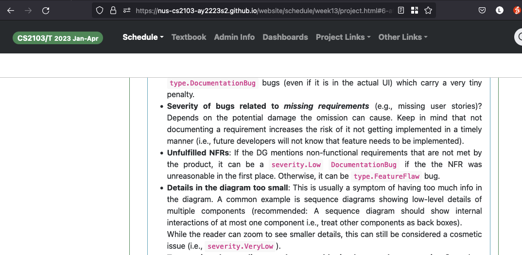
This bug is considered as a cosmetic issue, which should be assigned the severity severity.VeryLow according to the module website at https://nus-cs2103-ay2223s2.github.io/website/schedule/week13/project.html#6-attend-the-practical-exam-during-the-lecture-on-fri-apr-14th.

The 'Original' Bug
[The team marked this bug as a duplicate of the following bug]
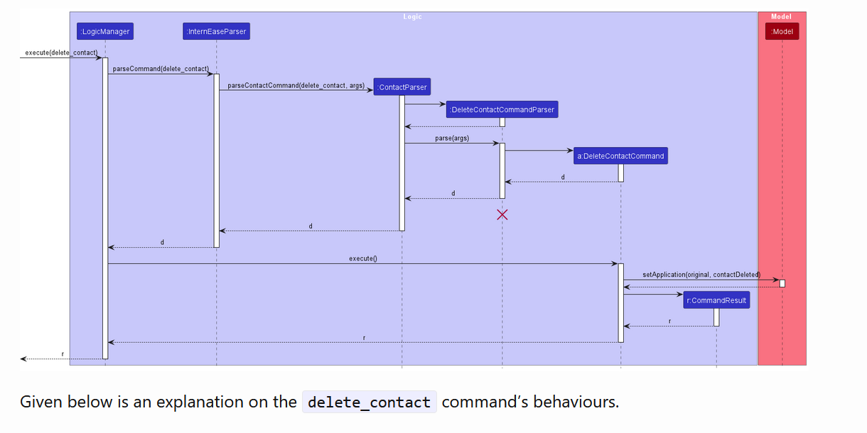
DG diagrams too small and hard to read
Note from the teaching team: This bug was reported during the Part II (Evaluating Documents) stage of the PE. You may reject this bug if it is not related to the quality of documentation.

Some of the diagrams in the DG are very small and hard to read.
[original: nus-cs2103-AY2223S2/pe-interim#1958] [original labels: severity.VeryLow type.DocumentationBug]
Their Response to the 'Original' Bug
[This is the team's response to the above 'original' bug]
While some of the diagrams in the DG were indeed slightly smaller than readable, there was not too much info, and low-level details were not included.
This bug is accepted as a cosmetic issue, as the user will have to zoom in to view the details of the diagrams.
Items for the Tester to Verify
:question: Issue duplicate status
Team chose to mark this issue as a duplicate of another issue (as explained in the Team's response above)
- [ ] I disagree
Reason for disagreement: [replace this with your explanation]
## :question: Issue severity Team chose [`severity.VeryLow`] Originally [`severity.Low`] - [ ] I disagree **Reason for disagreement:** [replace this with your explanation]
Compared to the text-size, it is clear that the font-size used for the diagram is extremely small such that the reader cannot understand what is shown.