Team's Response
Closing the add internship window is the intended behavior and is similar to the CLI alternative (The user's text in the text box is cleared after the user execute the command).
Regarding leaving 1 empty box by mistake, only COMPANY_NAME and JOB_TITLE are compulsory and is marked with red asterisk to indicate to user that it is compulsory. Hence, this design reduce the possibility of leaving an empty field as there are only 2 field to take note of. Other fields can be left empty as they are optional.
Items for the Tester to Verify
:question: Issue response
Team chose [response.Rejected]
- [x] I disagree
Reason for disagreement: > Closing the add internship window is the intended behavior and is similar to the CLI alternative (The user's text in the text box is cleared after the user execute the command).

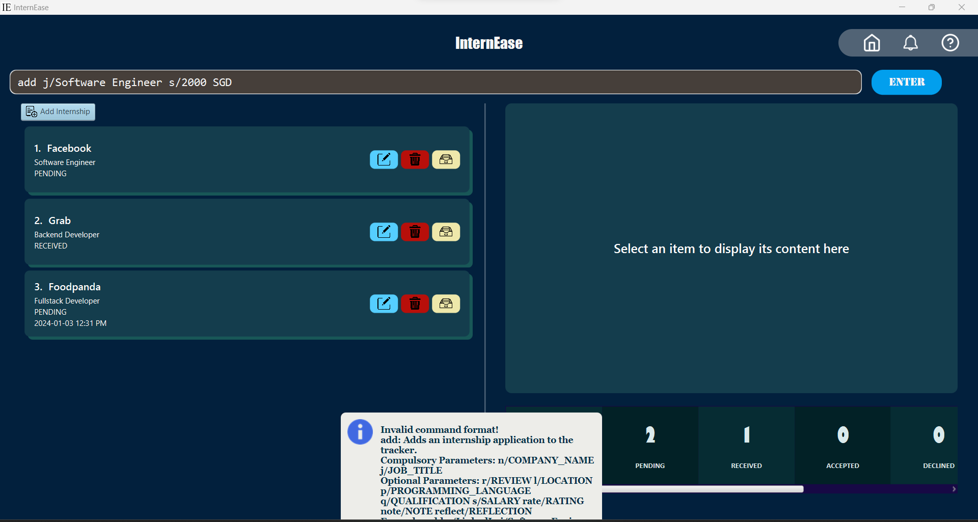
Contradicts observed behaviour where text box is not cleared even if internship application company name is not provided.
Good: The CLI behaviour demonstrates how easy it is for a user to rectify their mistakes. The user can just edit the invalid fields and re run the command. I would prefer a similar experience with the GUI.
Bad: Providing another example to help show why this is an important product flaw:

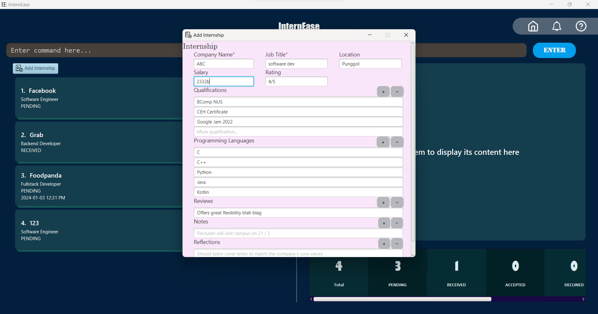
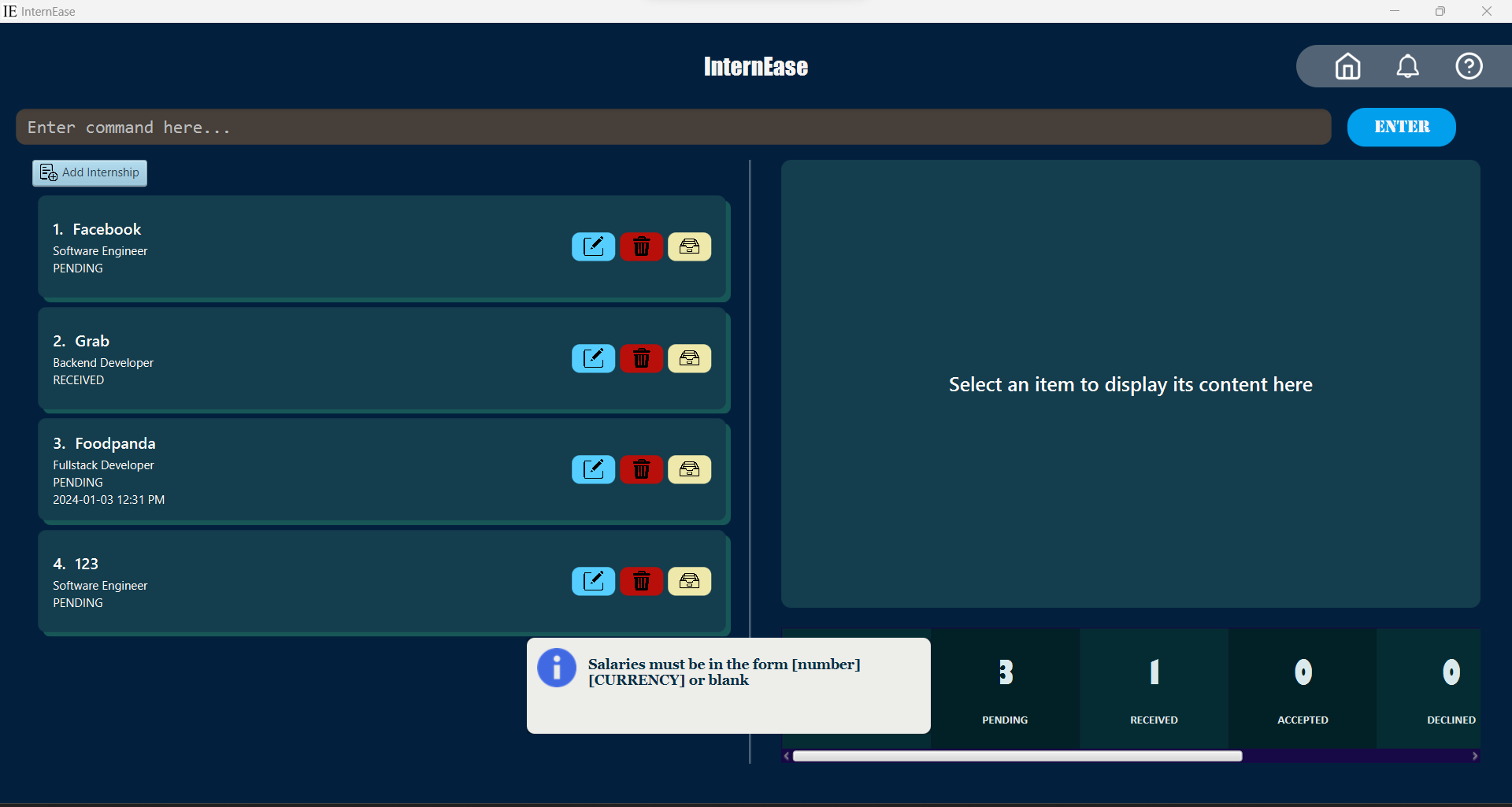
In this example, say there is a lot of information that the user has entered. Note how the provided salary value is invalid. Now if the user attempts to add this internship, an error message appears but at the same time, all the data that was typed is lost.

This is devastating for the user since he/she might have spent a long time filling the form only for the app to delete all the fields in an instant.
If the user has typed a lot of information but left 1 box empty by mistake, the entire window closes and all the data has to be typed out again. This is not convenient for the user.