veracrypt / VeraCrypt

Disk encryption with strong security based on TrueCrypt
https://www.veracrypt.fr
Other
6.74k stars 937 forks source link

Icons in OSX #9

Closed andreas-becker closed 3 years ago

andreas-becker commented 9 years ago

The Icons in Mac OSX aren't ready for Retina. In Launchpad they look like they are blurred. If you could post wich format and sizes you need, maybe we find someone creating new ones... or maybe i will give it a try ;-)

idrassi commented 9 years ago

I'm aware of this issue. I'm not an expert in graphics and any help on this field will be welcomed. Currently, the list of graphic files used:

Apart from the icns file, the XPM and BMP files are common to Linux and MacOSX. In order to optimize MacOSX display, we should have new high resolution graphic resources that can replace these XPM and BMP. Any help to make these graphics better (or even proposing new ones) is more than welcomed.

andreas-becker commented 9 years ago

Hey, i did create a new logo and icon in Illustrator, so it's possible to create images in all different sizes. I'm curious about your opinion.

veracrypt_v1_20150618

idrassi commented 9 years ago

Thank you for these images. This is a good step but I think the "safe" theme is too generic.At least, having a reference to VeraCrypt like using the letter V or something related to the encryption functionality.

andreas-becker commented 9 years ago

A second version including the productname. Maybe a key is better :-) veracrypt_v2_20150702

andreas-becker commented 9 years ago

And an all new approach

veracrypt_v5_20150703

volumeicon Colours, as always, can be changed.

idrassi commented 9 years ago

Amazing work! Thank you. I prefer the first set for its simplicity, visual identity and key-shape-like appoach.

In the second set, the VeraCrypt log is too small compared to the machine image. Also, a generic harddrive image is preferable to the MacMini one.

I'll try to get comments from others about this but for now the first set is my favorite pick.

andreas-becker commented 9 years ago

ohh ok, i see it was not quite clear... the last image with the mac harddrive is just to show, how the logo will look like if the dmg/pkg file on a mac is mounted. The logo itself is just the blue/green VC with the complete name underneath.

I personally think the last one is a more modern and serious one compared to the "safe" or "key" icon.

idrassi commented 9 years ago

I agree that this a good candidate. I would like to do a build of VeraCrypt that includes these icons to see how it look for real. For that, I will need ics files for MacOSX but also .ico for Windows. On Windows, different icons are needed depending on the context (Application icon, system notification tray icon, installer icon). If you could also help on this, this will be much appreciated.

Of course, your copyright will be preserved and mentionned in VeraCrypt credits.

Here are the current Windows icons (very basic...) veracrypt_icons

.

basnijholt commented 9 years ago

@andreas-becker these look amazing!

Not only the icons are in low resolution, but also the whole interface looks really blurry.

andreas-becker commented 9 years ago

@idrassi did you create a build with the provided icons? If so, could you hand it over to me? I'll check on OS X 10.10.5

idrassi commented 9 years ago

@andreas-becker I apologize for not giving an update on the new icons. The release of Windows 10 at the end of July forced me to work exclusively on making VeraCrypt compatible and after the release of version 1.12 and 1.13 I had to tackle several issues on Windows that are impacting many users.

Unfortunately, during this period, I had no time to work on MacOSX and Linux. But I will do my best this weekend to do a test build and share it with you.

Ben305 commented 8 years ago

Any news on this? Is there a build available for testing?

Qaatloz commented 8 years ago

I'm thinking of updating the keepasstruecryptmount plugin to support veracrypt. May i already use the nice styled icons from andreas?

Enigma2Illusion commented 8 years ago

Hello,

My preference would be the VC logo with the white background changing color when one or more volumes has been mounted. I will leave it to Andreas to showcase the background color that would work best for the logo when a volume is mounted to signify to the user that they have a volume mounted.

Andreas, I would recommend removing the word VeraCrypt since for system tray icon the word would be too small to see and only use the VC logo. Even for the larger logos, just use the VC logo.

Kind Regards.

danijelk commented 8 years ago

+1 on the new icons from here as well, anything to replace current one on OSX would be fine :)

idrassi commented 8 years ago

I have included the new icons in OSX build, and also Linux and Windows. You can get the new OSX installer for VeraCrypt 1.17-BETA from https://sourceforge.net/projects/veracrypt/files/VeraCrypt%20Nightly%20Builds/

Feedbacks are welcomed.

Thank you again to @andreas-becker for his amazing contribution.

Ben305 commented 8 years ago

The icons are looking great. But the icon above the "Mount" button isn't really sharp on retina displays (see screenshot below).

To make the text look really sharp on retina displays, two entries need to be added to the info.plist:

NSPrincipalClass NSApplication NSHighResolutionCapable

I have added these entries on my mac, and now the interface looks really good.

veracrypt 1 17 beta with plist-patch
elmat0 commented 8 years ago

These new icons are great!

I would like to include svg versions of them in the elementaryPlus icon theme as per this request. My proposed version (1,2) is ever so slightly modified by adding a border and discrete drop shadows to better fit the elementary theme. I may drop the VeraCrypt text and just use the glyph on the smaller scales.

Do you have any objections to this? I would obviously credit @andreas-becker as the original author here, and you are welcome to use the files if you ever find a need to have them in vector format.

andreas-becker commented 8 years ago

@elmat0, i already did create the images in vector format :-) Actually there is no recommendation or corporate identity/design for how to use the icons. So @idrassi should decide if it's ok to modify. By the way, we should create a "Style Guide" like TYPO3 did (https://typo3.org/about/the-brand/style-guide/), to present the most basic rules for the usage of the VeraCrypt logo and spelling.

quantum8 commented 8 years ago

@Ben305, can you post those plist lines that you've added? I've tried adding those keys and it didn't work for me.

Ben305 commented 8 years ago

@quantum8 This is my plist-file:

<?xml version="1.0" encoding="UTF-8"?>
<!DOCTYPE plist PUBLIC "-//Apple//DTD PLIST 1.0//EN" "http://www.apple.com/DTDs/PropertyList-1.0.dtd">
<plist version="1.0">
<dict>
    <key>CFBundleInfoDictionaryVersion</key>
    <string>6.0</string>
    <key>CFBundleIdentifier</key>
    <string>org.idrix.VeraCrypt</string>
    <key>CFBundleDevelopmentRegion</key>
    <string>English</string>
    <key>CFBundleExecutable</key>
    <string>VeraCrypt</string>
    <key>CFBundleIconFile</key>
    <string>VeraCrypt.icns</string>
    <key>CFBundleName</key>
    <string>VeraCrypt</string>
    <key>CFBundlePackageType</key>
    <string>APPL</string>
    <key>CFBundleSignature</key>
    <string>TRUE</string>
    <key>CFBundleVersion</key>
    <string>1.16.1</string>
    <key>CFBundleShortVersionString</key>
    <string>1.17-BETA</string>
    <key>CFBundleLongVersionString</key>
    <string>VeraCrypt 1.17-BETA</string>
    <key>LSRequiresCarbon</key>
    <false/>
    <key>NSHighResolutionCapable</key>
    <true/>
    <key>NSPrincipalClass</key>
    <string>NSApplication</string>
    <key>CSResourcesFileMapped</key>
    <true/>
</dict>
</plist>
quantum8 commented 8 years ago

Thanks @Ben305. Mine was the same as that, but I've pasted your copy into mine and it's still not taking effect for some reason. I've noticed the launch options in the info box shows low res selected and greyed out. Perhaps I'm missing something else?

screen shot 2016-01-11 at 11 28 42 am
squidfunk commented 8 years ago

Hi, Martin here from VOOLA - looks like you got "inspired" by our company logo, Andreas :-) FYI, we have been using this since the end of 2014.

VOOLA Logo

andreas-becker commented 8 years ago

Hi Martin, I promise, i haven't seen this logo before and the similarity is unintentionally. The logo was completely designed by me with no other logo as template (first as a sketch, then in Illustrator). I had a few versions with different colors choosen in adobe kuler, but this combination seemed best to me.

danijelk commented 8 years ago

They sure do look alike - color wise, but then again how many ways can you make a V with triangles :) http://www.shutterstock.com/cat.mhtml?searchterm=triangle+pattern

BenediktSchackenberg commented 8 years ago

nice one!

squidfunk commented 8 years ago

True, I already thought it's probably only a matter of time until someone comes up with a similar idea. The funny thing is that the color scheme matches, the forms match (for the V) and both names start with a V. Strange coincidence. However, Andreas, I heard you are already in contact with my co-founder Thomas, so I think this will not be a big problem, should be easily solvable. Maybe it's a good idea to differentiate via color, so we don't get confused for each other, but I leave it up to you.

keng42 commented 8 years ago

@quantum8 https://stackoverflow.com/questions/20426140/how-to-enable-use-low-resolution-on-retina-display-for-an-application-when-shi

idrassi commented 8 years ago

Some alternative colors for the logo.The idea behind the color choice is simple:

There are two possibilities at this stage: veracrypt_red_blue_256x256 veracrypt_gradient_256x256 Please vote for your favorite choice.
Ben305 commented 8 years ago

I like the left one!

elmat0 commented 8 years ago

Also a big fan of the left one. I hate to play devils advocate but it is strikingly similar to the Valvoline logo. ;p

stp242 commented 8 years ago

:+1: for the left one

Enigma2Illusion commented 8 years ago

I vote for the original Blue/Green logo since I do not see any issues with people getting confused between VeraCrypt and Voola logos.

To put it another way, think of the all the startup logos through large company logos that exist and there are bound to be some similarities.

The new red/blue logo looks like a backward checkmark with the letter C and does not represent the letters V and C. The Orange/Purple maintains the flow of V and C letters via the color transition, however to my eyes is not aesthetically pleasing to view.

silvether commented 8 years ago

@andreas-becker would you be willing to share the vectors for the new Veracrypt logo? I have some spare time and wanted to play around with them on a retina screen. They look great by the way!

andreas-becker commented 8 years ago

@idrassi , sorry for not beeing active in the last few months. I will marry soon and therefore had no time and desire for other things. @silvether , as you can see, there is no final decision made about the combination of the color. To not have a lot of different Veracrypt logos on the web I would therefore hesitate to made the logo public. If @idrassi s opinion is another, he also had the needed files and could hand them over to you.

ghost commented 8 years ago

Veracrypt starter under Linux syntax is wrong in /usr/share/applications/veracrypt.desktop file: replace first line by second # Exec=/usr/bin/veracrypt Exec=/usr/bin/veracrypt %f People, the icons are still not in the package and linked - want to help you with this!

jetelina commented 7 years ago

Hi, I like the left (red) icon.

I would also love this icon for for Windows version of VeraCrypt. See my comment here: https://sourceforge.net/p/veracrypt/discussion/features/thread/9298d888/#ed24

It would be great if tray icon can be unified and easily distinguishable for mounted and not mounted state.

Here is my suggestion: mount unmount

I also think that for low resolution icons (24x24px and less) there does not need to be the "VeraCrypt" text in icon. It is not readable and VC letters can use these pixels. VC letters are unique to VeraCrypt brand, so I believe removing the text will not harm the logo - and will enhance readability of VC.

andreas-becker commented 4 years ago

Hey @idrassi, long time no see. Do you need further help on icons, graphics or website?

idrassi commented 4 years ago

Hi @andreas-becker. Indeed, it has been long time. Your contribution was very helpful in giving VeraCrypt a visual identity. Although I don’t have a clear idea about tasks related to graphics, I think there is always room for enhancements. One thing that can enhanced is the bitmap used for Create Volume wizard: it looks blurry in MacOSX and it is not really professionally done (I just put together VeraCrypt logo with IDRIX one). Can you help in making a better bitmap for the wizard? The current bitmap is at https://github.com/veracrypt/VeraCrypt/blob/master/src/Format/VeraCrypt_Wizard.bmp

Thank you for your help.

andreas-becker commented 4 years ago

Sure i can. Do you already have a dedicated "picture" in mind?

idrassi commented 4 years ago

Thanks. I don’t have any idea any mind...but I trust your creativity!

andreas-becker commented 4 years ago

@idrassi , here's what i quickly put together (three different Versions)

Wizard v1 Wizard v2 Wizard v3

idrassi commented 4 years ago

@andreas-becker Thank you. Version 1 looks better to me but I feel that a symmetry is missing somewhere. Maybe the top part should be made lateral on the left side instead...or maybe I'm influence by current one. Any opinion @alt3r-3go on this?

Also a higher resolution with same proportion is needed because it is displayed blurry in UI.

alt3r-3go commented 4 years ago

Out of those three I also like number 1 the most, however to me personally there's too much empty space between the logo and the picture... :) I actually quite like the current one :D, maybe we should simply make a higher-res version of it?

andreas-becker commented 4 years ago

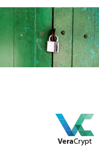
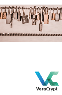
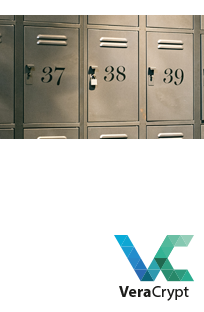
ok, maybe it looks better in context. Does there really have to be the logo in this view? VeraCrypt_Wizard_view_2 VeraCrypt_Wizard_view

alt3r-3go commented 4 years ago

Oh, that I like much better! The second version of it, with the logo, that is. The green part of the logo blending in with the picture a bit, but I think there's actually some charm about that.

andreas-becker commented 4 years ago

Jpg, 204x316, 144dpi VeraCrypt_Wizard_204x316_144

idrassi commented 4 years ago

Thank you @andreas-becker, I agree that this is good.

I have done an OSX build with and the screenshot below shows how it looks under OSX Mojave with dark mode. It is definitely better than existing one which was too white. I will include this new image in the upcoming 1.24-Update2 which I hope to be able to release tomorrow (oh wait...it is already tomorrow!!).

Just a small request: is it possible to have a version with a dimension of 204x370? I think a larger height is better in order to leave less space above and below in the wizard window.

VeraCrypt_Wizard_new_OSX

andreas-becker commented 4 years ago

I will provide the image with the new dimensions after work around 4/5pm.

Additional Infos for the used image Photo by Rob King on Unsplash

All photos published on Unsplash can be used for free. You can use them for commercial and noncommercial purposes. You do not need to ask permission from or provide credit to the photographer or Unsplash, although it is appreciated when possible.

andreas-becker commented 4 years ago

Here it is: VeraCrypt_Wizard_204x370_96 VeraCrypt_Wizard_204x370_96