Team's Response
The image is repeated as a convenience to the reader since the repeat explains it in detail, it would otherwise be cumbersome for the user to scroll up and down just to be able to refer to the diagram. The bug is assumed to be used as justification, and has already been reported elsewhere, hence this bug report is rejected.
Items for the Tester to Verify
:question: Issue response
Team chose [response.Rejected]
- [x] I disagree
Reason for disagreement: I disagree with the Dev team.
The two images were repeated in full in both areas, where they were explaining different things using the same diagram. As such, the diagram used in the initial Design Architecture section could have been greatly simplified, instead of being completely reused.
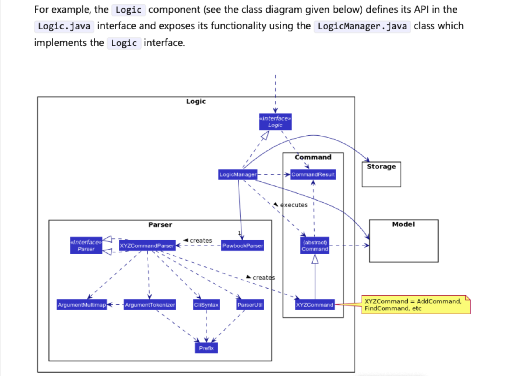
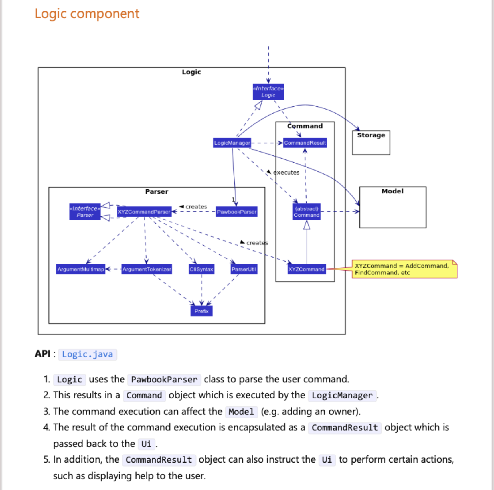
To elaborate further, I will reference Screenshot 1, that was used in the initial Design Architecture section, and Screenshot 2, which was also used in the Design section as part of the Logic section.
In Screenshot 1, this was the explanation given for the screenshot: "For example, the Logic component (see the class diagram given below) defines its API in the Logic.java interface and exposes its functionality using the LogicManager.java class which implements the Logic interface."
For the above explanation, it would have sufficed to show a simple diagram that showed only the Logic.java interface, as well as the LogicManager.java class that implements it. This would have resulted in a far simpler and easier to understand diagram for the reader that is relevant to the context. With this the reader does not have to be exposed to a barrage of information such as the association to Ui, Model, Command, CommandResult, etc that is irrelevant to the given context.
In Screenshot 2, which goes into detail about the Logic component, it is indeed within the scope and context to go into such detail. Especially since it goes into details on how the Ui, Model, Command, Logic, LogicManager and CommandResult classes are related with one another. Thus it is valid to show the full size diagram in this section.
Hence, the diagrams that were reused were indeed repetitive, and in the case of the first section in Screenshot 1, it was unnecessarily included and went into too much detail that was irrelevant to the context. A far simpler and different diagram would have sufficed in the first section.
Thus I disagree with the dev team that the image is repeated as a convenience to the reader, as the image used in the first section was too detailed and included additional information that was irrelevant to the reader at that section, which would actually INCONVENIENCE the reader instead.
Screenshot 1:

Screenshot 2:

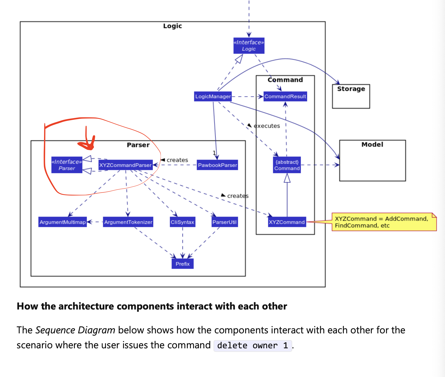
The logic diagram was repetitive in the Design Architecture section as an example, and again explained in it's own Logic section. Bugs were repeated in both diagrams as well
Bug that was repeated in both diagrams: Where the XYZCommand has two inheritance arrows going from XYZCommandParser to <> parser.

Screenshot showing reuse: