Team's Response
Regarding the reported documentation issue, concerning the layout of "Task Management Features" and "Parameters" sections in the User Guide:
We respectfully reject the notion that this layout presents a difficulty for users. The "Task Management Features" heading is accompanied by a line specifying 'Recommended Features for You to Get more out of ProfPlan'. Moreover, at the onset of the User Guide, the 'What is a Task in ProfPlan' section introduces various parameters, elaborating on them in the dedicated "Parameters" section.
This deliberate structuring aims to provide a coherent flow of information, guiding users through an introduction to parameters and then detailing them in the designated section. Therefore, we find it challenging to ascertain how this arrangement could lead to confusion if the user has followed the User Guide sequentially.
We appreciate the thorough assessment conducted but maintain our stance that the provided context within the User Guide establishes a logical and progressive understanding of the content.
Thank you for your consideration.
Items for the Tester to Verify
:question: Issue response
Team chose [response.Rejected]
- [x] I disagree
Reason for disagreement: Thank you for your explanation. While it has shed light on the reasons for your team's presenting of the "Task Management Features" section in the aforementioned layout, users will not have the benefit of your explanation to help them understand the structure of the section when they are reading it in the User Guide.
The "Recommended features for you to get more out of ProfPlan" phrase imply that what follows will be some "features" related to the section. Instead the heading "Parameters" of the same font size right below makes it seem like something is missing in the section.
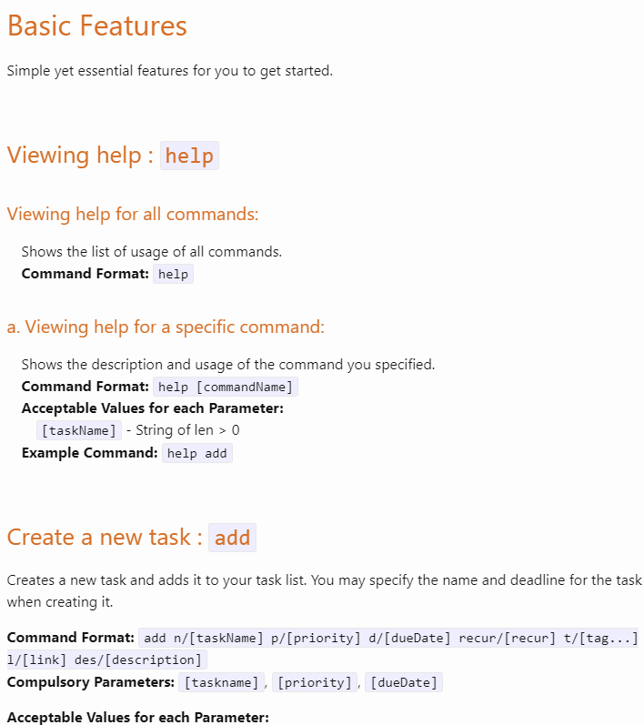
This is in contrast to previous sections in the User Guide, such as the one below, where proper formatting alone are sufficient to indicate that "Viewing help" and "Create a new task" are in the "Basic Features" section and that "Viewing help" has 2 subsections. Also, the relevant features are listed right below, affirming the phrase "Simple features for you to get started".

Furthermore, it would certainly be a hassle if users have to scroll back up to the start of the User Guide to understand the structure of the "Task Management Features" section then scroll back down to resume reading.
Thus, I maintain my position that the layout hinders the reader from easily understanding the section.
"Task Management Features" and "Parameters" are of the same font size, thus at first glance, users may think that they are two separate sections in the UG, when "Parameters" is supposed to be a part of the "Task Management Features" section.
There are also no explanations under "Task Management Features", making it difficult for users to understand the purpose of this section.