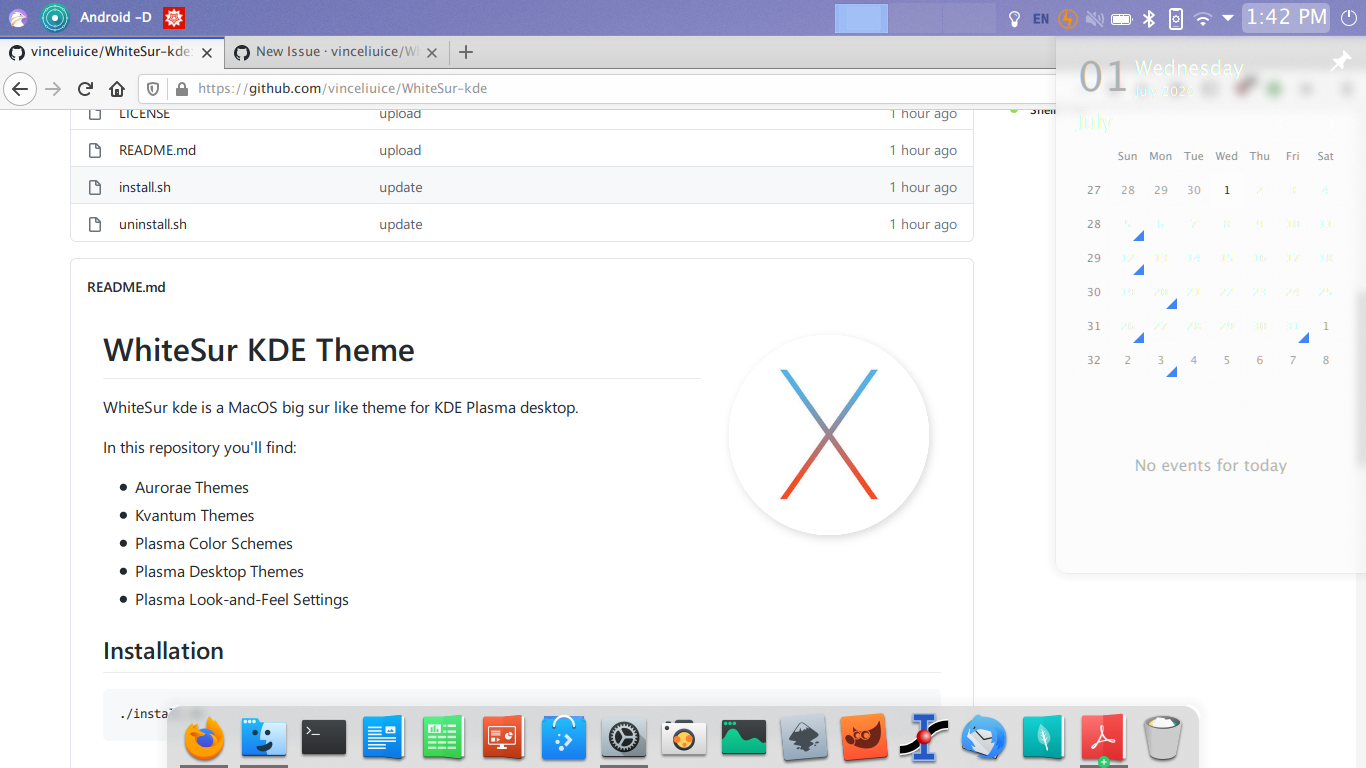
No problem! I'll add a black font version for light wallpapers
Open archisman-panigrahi opened 4 years ago
No problem! I'll add a black font version for light wallpapers
I take the icons from https://developer.apple.com/design/human-interface-guidelines/sf-symbols/overview/, Apple’s current icon width is two pixels wide, which is better displayed on the retina screen.
 In fact, the display on my 1080p device is not bad
Thanks for adding black font though. Made huge difference
Hey guys, how can I enable the black font version?
@vsviniciuslima use alt version
The things written in white are very hard to see, when the background already has white. Calendar, and Wifi settings are also almost invisible.

Not having a mac, I don't know how it is managed in macOS, but here are some suggestions.
Make the fonts black, like the global menu does.
Increase the blur in the menu
I feel option 1 may look better