mstergianis
commented
2 years ago
mstergianis
commented
2 years ago Any movement on this?
Open tmegan1 opened 2 years ago
mstergianis
commented
2 years ago Any movement on this?
 ashleyryan
commented
2 years ago
ashleyryan
commented
2 years ago Hi, yes, @lil-kim did some investigation work on the design side and discovered the issue is much more complex than simply fixing the alignment of the icon.
For example, if you have nested grouping with icons and collapse the navigation, the alignment is such that you can still tell which icons are children of other icons:

Long story short - this component is still in beta and we've realized we have much work to do on it to get the experience correct - especially once we start considering other breakpoints besides desktop, which this beta component does not do.
As a workaround, you can apply a margin to the icon to center align it, here is a stackblitz:
cds-navigation-item cds-icon {
  margin-left: var(--cds-global-space-5);
}Excellent thanks @ashleyryan for the update.
 tmegan1
commented
2 years ago
tmegan1
commented
2 years ago Thanks for the update, @ashleyryan!
We don't currently have any nested items in our nav bar so I didn't even notice what was going on with those secondary labels/icons.
There is some angular documentation on clarity.design that seems to resolve this by only applying icons to the top level navigation items (I think this helps keep visual clutter to a minimum as well). Though not as clearly illustrated, it also looks like, if a collapsed top level item with a carrot is clicked, the nav bar expands to reveal secondary items.

That workaround should be sufficient for now though. Thanks!
ashleyryan
commented
2 years ago That documentation is for the older clr/angular component, it doesn't necessarily apply to the newer Core component - though as we update the component we may bring some of that in.
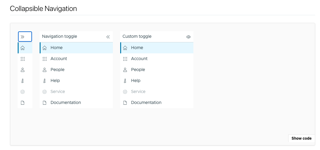
Describe the bug
The Clarity.design website as well as VMware's Clarity Figma assets show that when navigation/the left hand nav bar is collapsed, the icons should be centered horizontally in the space. However, in the Storybook documentation, the icons are left aligned. This is a small detail, but centering the icons rather than left aligning them would help balance the visual composition of the nav bar as well as any screen it is placed within.
How to reproduce
See documentation/example in Storybook: https://clarity.design/storybook/core/?path=/story/components-navigation--page
Scroll down to the "Collapsible Navigation" section.
Expected behavior
When the nav bar is collapsed, icons are centered within the horizontal space. When the nav bar is expanded, the icons do not move/jiggle but rather stay anchored in place as the width of the nav bar expands and additional text labels are revealed.
Versions
Clarity project:
Clarity version:
Framework:
(React, but applies to all/is more about trying to apply Clarity’s design tokens accurately)
Device:
Additional notes
Example of icons centered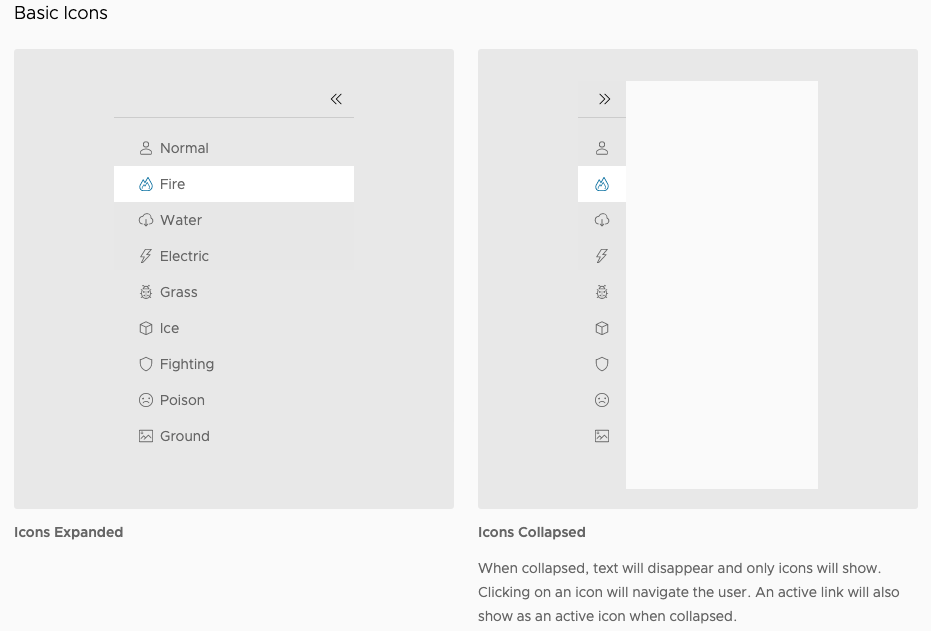
Screenshot of Storybook where icons are left aligned