Team's Response
No response provided.
The 'Original' Bug
[The team marked this bug as a duplicate of the following bug]
UG Not well formatted when change to pdf file
Note from the teaching team: This bug was reported during the Part II (Evaluating Documents) stage of the PE. You may reject this bug if it is not related to the quality of documentation.
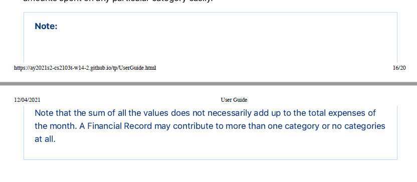
The note here is cut into 2 parts, instead, it should not be split if correct page break is used.
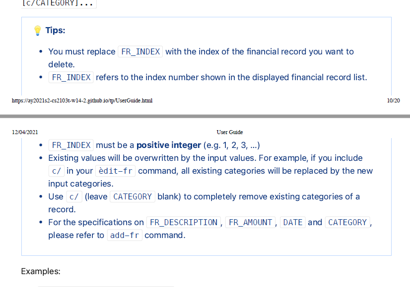
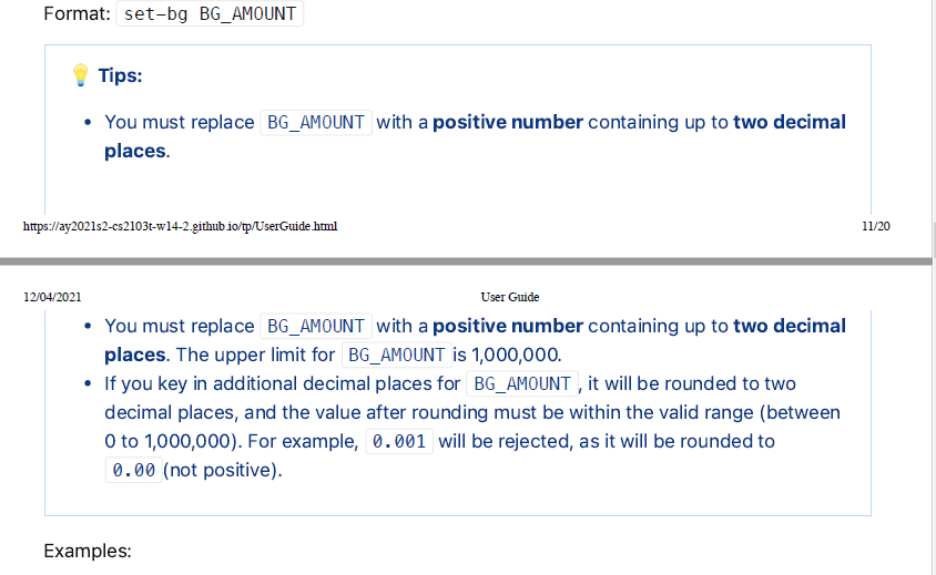
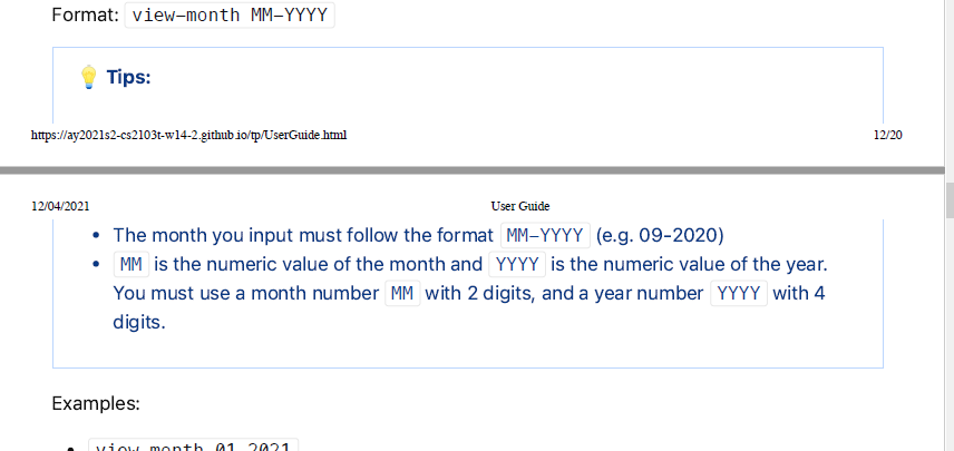
Other examples:
Initially, i put severity low but i met so many other examples so i make it medium because it is hard to follow when met several time.
[original: nus-cs2103-AY2021S2/pe-interim#1858] [original labels: severity.Medium type.DocumentationBug]
Their Response to the 'Original' Bug
[This is the team's response to the above 'original' bug]
Hi, we believe that this formatting issue is not in the scope of the PE. We also strictly followed Prof Damith's instructions when creating the PDFs for both our UG/DG. Any formatting error is due to the fact that the browser splits the pages based on the space used, and cannot be resolved on our end unless we took another method to create our PDFs, which was not required.
You were also actually allowed to view the UG and DG from our links (given below for reference). Thank you for your feedback!
https://ay2021s2-cs2103t-w14-2.github.io/tp/UserGuide.html https://ay2021s2-cs2103t-w14-2.github.io/tp/DeveloperGuide.html
Items for the Tester to Verify
:question: Issue duplicate status
Team chose to mark this issue as a duplicate of another issue (as explained in the Team's response above)
- [ ] I disagree
Reason for disagreement: [replace this with your explanation]
:question: Issue response
Team chose [response.NotInScope]
- [x] I disagree
Reason for disagreement: Under UG bugs in the website, messy User Guide is considered as a bug, so it is the team's responsibility to make the UG look neat before submission


There are many parts in the User Guide, especially the
Tipsbox, are seperated into 2 pages. This is very inconvenient for user to read.