Open rachelandrew opened 7 years ago
+1 This is one of the many things I think we want in order to be able to style the Grid, or style based on a position on the Grid. nth-row would be great — or really, nth-track (row or column). Also to be able to target a specific cell. To make the one cell where the 2nd row and 3rd column intersect, for example.
I think this is related to being able to style a cell. To target the second row and give it a background color. Ir to put a border around the cell where the 2nd row and 3rd column intersect. If we can target the cell or track, we can either style it, or style the content within it.
Thanks for opening this - here are a few use cases in which I'd fine it useful:
Styling elements that spill onto the second row or column:
Tiger Striping rows/columns
I like @jensimmons's suggestion to selecting the track as I could see the need to doing specific TRBL grid-gap on each of those.
The trouble with this is that selectors can be used to set the placement properties (grid-area
), which can change which row the item is in. :) For tables we work off of the markup only: the selector works even if you style the table as a list, so we don't have this cyclic problem.
The use case makes a lot of sense, but I don't see how to make it work...
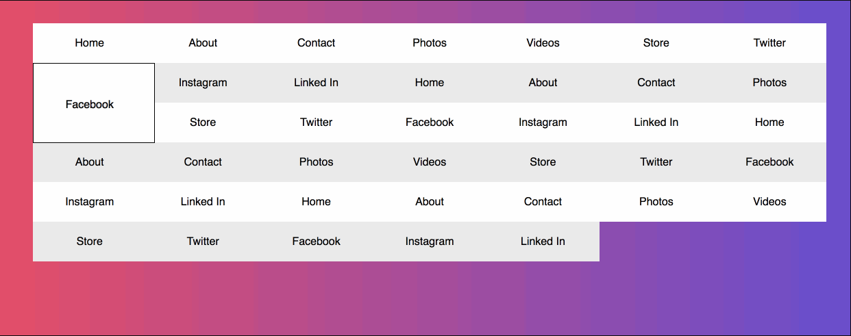
Adding to @fantasai's point, in @wesbos's 2nd example if there were some boxes that were n x m rather than 1 x 1 how should selecting nth-row/nth-column/nth-track affect boxes in multiple tracks? e.g. the 'facebook' element in the image below.
option 1
option 2
@fantasai wrote:
The trouble with this is that selectors can be used to set the placement properties (
grid-area
), which can change which row the item is in. :) For tables we work off of the markup only: the selector works even if you style the table as a list, so we don't have this cyclic problem.
The cyclic problem could be solved by applying the selector to the grid tracks, not to the grid items themselves, so grid-area
and Co. do not apply.
Having said that, it sounds like it might be solved by using pseudo-elements rather than pseudo-classes, similar to what's described in #499.
So, @rachelandrew's example might be achieved like this:
nav {
display: grid;
grid-template-columns: repeat(auto-fill, minmax(150px, 1fr));
}
nav::nth-row(1n+2) {
background-color: red;
}
@kartikadur wrote:
Adding to @fantasai's point, in @wesbos's 2nd example if there were some boxes that were n x m rather than 1 x 1 how should selecting nth-row/nth-column/nth-track affect boxes in multiple tracks?
Like the :nth-col()
pseudo-class described in Selectors 4, the selector also applies to items spanning over several tracks. I.e. when several selectors match the same area, the normal specificity and cascading rules apply.
Sebastian
This feature would be very useful!
@SebastianZ - The title of this issue is about nth-row
and I see only nth-column
in Selectors 4 draft..
yes nth-row
would be really awesome
@SebastianZ - The title of this issue is about
nth-row
and I see onlynth-column
in Selectors 4 draft..
Right. That should have read nth-row
. I've updated my example.
Sebastian
Would a fix for this! :D
Another use case would be a bookshelf sort of layout - i.e. adding a border or background image to go across all the rows
Would be so nice to create a checkered background for a calendar/planboard. To be able to style the rows and column(tracks) independent of it contents(items) for weekends for example (yellow line). Maybe add the ability to hover/active tracks.
In addition to be able to target the nth-row
and nth-column
for styling it would also be great to be able to target a row or a column with a hovered or focused cell. I.e.
nav::row-hover, nav::row-focus-within {
background-color: red;
}
I could use this feature as well. Would be great to have it!
The trouble with this is that selectors can be used to set the placement properties (
grid-area
), which can change which row the item is in. :) For tables we work off of the markup only: the selector works even if you style the table as a list, so we don't have this cyclic problem.The use case makes a lot of sense, but I don't see how to make it work...
Stab in the dark, but is there any precedent for ignoring certain properties declared in certain selectors?
Unfortunately, not possible. You can make it work once, but as soon as you have a second feature where a property can affect a selector, you can create loops by using one selector to set the other's properties, then the other selector to set the first's properties. You end up having to ban all properties that can affect any selector from being used in any of them, which is (a) annoying and weird, and (b) prevents us from ever adding more selectors that depend on existing properties (because we might break code currently validly using those properties with other property-affected selectors).
I’m also needing this becuase there is no collapse border for css grids.
So I have to only add border on right and bottom except for last row and column because parent container will have a border.
It's been 5 1/2 years. Is there any progress on this?
why does this not exist after so many years? There still is no solution.
Would absolutely make sense, need this for a real life project just now :-)
I'm inclined to close this issue as WONTFIX - it's fundamentally a cyclic styling problem, and thus is fundamentally unsolveable. We've addressed this in the FAQ.
@fantasai @rachelandrew , does this sound okay to y'all?
Can we approach this from a container query standpoint? Like we have style and size container queries, what is stopping us from having grid
queries?
It will apply not to the children themselves, but to anything nested inside them: I don't think there is anything that can impact the element's position in a grid from inside? Only on intrinsic dimensions, but not how the element is placed. While you couldn't style such a grid item directly, you will be able to style any of its nested elements (including pseudo-), which will be enough to cover most of the use cases for this. (And if we will have any feature like masonry that could lead to circularity due to the change in intrinsic size, for these cases it would be enough to require size containment for the grid items in question).
The use-cases given so far do want to style the grid item itself, not necessarily a child, tho.
If that was an acceptable compromise, tho, then yeah it would be doable. There is indeed no way for a descendant to affect what grid-area an item ends up in.
The use-cases given so far do want to style the grid item itself, not necessarily a child, tho.
Yes, but, in practice, allowing to style children in this way will unlock all of these use-cases, just in a bit clunkier way:
::contents
), then it will become possible to achieve it through CSS without extra HTML or hacks.::before
and ::after
and abspos them with inset: 0
over a grid item as a fake background, it will be possible with just CSS as well.Are there any other possible venues that could allow us to achieve these use-cases? If the more “desirable” (styling the item itself) are fundamentally unsolvable, then having a simple (just add a wrapper/use a pseudo) solution is infinitely better than no solution.
Well, almost no solution: I did write an article about one workaround using scroll-driven animations, “Position-Driven Styles”, and even mentioned this issue in it, but forgot to backlink. But, if another way is possible, I would love to not rely on wild hacks like that.
I've had various people ask me the same question as raised here: https://github.com/rachelandrew/cssgrid-ama/issues/115
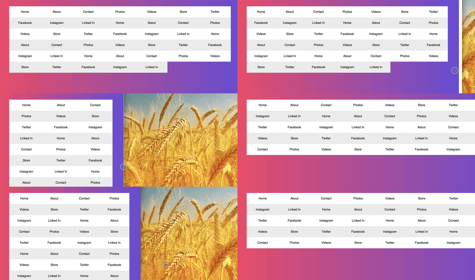
The use case is as described in that issue. If the author creates the following grid:
They then want to style items on the second (or nth) row differently to the first, they don't have a way to target it. I've mocked it up using MQs. https://codepen.io/rachelandrew/pen/yPJKeo?editors=1100
It's really a selectors issue, would the table pseudo-class selectors (https://drafts.csswg.org/selectors-4/#table-pseudos) work on grid items, or is this another instance of needing to be able to target a row or column of the grid, with the added complication of wanting to target the children of that row or column?
At the moment to do so, they need to go back to taking more control over the grid, rather than using auto-fill, so that they know where each item sits and can use nth-child on the items, or use media queries which makes for less flexible components.