 mrego
commented
6 years ago
mrego
commented
6 years ago Ok, we at Igalia have been taking a look to the example.
I created a reduced one, so it's easier to check the problem: http://jsbin.com/wojujiv/1/edit?html,css,output
It has a grid container with 4 auto columns.
And it has 3 images as grid items:
- The first one has 300px width and spans the first 2 columns (1st and 2nd columns).
- The second one has 150px width and spans the last 2 columns (3rd and 4th columns).
- The third one has 250px width and spans 2nd and 3rd column.
The algorithm process each of them:
- For the 1st image it sets as planned increase for 1st and 2nd column 150px.
- For the 2nd image it sets as planned increase for 3rd and 4th columns 75px.
- For the 3rd image it sets as planned increase for 2nd and 3rd column 125px.
Then it stays with the maximum for each column:
- 1st column: 150px
- 2nd column: 150px
- 3rd column: 125px
- 4th column: 75px
As you see the last 2 columns measure 200px in total, when it'll be enough if they measure 150px.
For example using grid-template-columns: 150px 150px 100px 50px would get a more packed result.

The problem is that the algorithm is trying to fulfill some preconditions. One of them is that it doesn't want that the order of the items to result in different track sizes (so it doesn't matter the order of how items are processed the result should be the same), that's why it process all the spanning items with the same span count together. It also wants to ensure that the minimum size requirements are fulfilled. And it has also the goal to have the result as compact as possible, but first it's following the previous preconditions.
We're not sure if there'll be a better way to do this and if it'd have any consequences in more complex examples with different items order and so on.
 frivoal
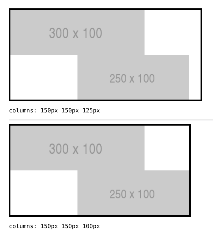
 css-meeting-bot
 Loirooriol
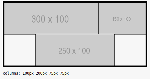
 dbaron
I just ran into a case that grid sizing ought to be able to deal with, but apparently cannot.
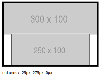
test: https://florian.rivoal.net/csswg/grid/grid-span-auto-001.html reference: https://florian.rivoal.net/csswg/grid/grid-span-auto-001-ref.html
This is grid with a few auto sized columns, and a bunch of elements spanning them in various ways. Given the size of the various things in it, it can be densely packed (as seen in the reference, with manually calculated sizes), but the current sizing algo leaves a bunch of unnecessary white space.
The motivating use case for this was trying to use grid to layout comics / manga (so it may become massively common if/when the Japanese Manga publishers starts using Grid). Since the browser has all the information it needs to calculate the "ideal" layout, grid should be able to handle that.
Finding the "correct" size doesn't seem to involve any particularly difficult math either. You cannot solve this by only resolving the (min/max) sizes of individual tracks, you also need to do the same for any pair of grid lines that items span between, but once you do that, you just have a simple system of linear equations to solve.
Now, if a grid item spans across several tracks which have different intrinsic sizing functions (like one column being max-content, and the other being min-content), I'm not 100% sure what the semantics are. But at least if all the columns it spans across have the same intrinsic sizing function, there should be no problem.