w3c / csswg-drafts

CSS Working Group Editor Drafts
https://drafts.csswg.org/
Other
4.52k stars 673 forks source link

[css-grid][css-flexbox][css-multicol] Styling Gaps/Gutters #2748

Open fantasai opened 6 years ago

fantasai commented 6 years ago

There's been a number of requests for styling grid gaps (gutters). We have a column-rule property from the multicol module we should probably try to re-use, but the styling requirements for grids are more complicated due to e.g. spanning elements, which we have to figure out what to do with.

There's also styling requirements that apply to both multicol and grid that we aren't meeting. (E.g. having the rule start not flush with the top/bottom of the column boxes but somewhat inset, various fancier graphical effects than a simple “line”.)

Basic line rules that can reasonably interact with spanning elements is the top priority, but we should have some idea at what else we might need to accommodate in the future.

This is a placeholder issue to collect use cases and examples, so that we understand problems we need to handle before we try to design a solution. Please add suggestions/examples/ideas/drawings/background info/warnings/suggestions/anything else that seems like it might be helpful! While we're unlikely to handle 100% of all the graphic design capabilities the Internet can imagine, we should at least aim to handle the more common cases.

tsiq-swyx commented 6 years ago

Just adding a couple common questions and our twitter discussion:

my use case - if i were to make this table and didnt want to use border-bottom or add (a few) extra 1px elements:

image

grid-row-gap-color: gray might do it? i am definitely not the guy to ask about coming up with css specs haha

I understand the conflict between columns and rows, but i would only use one or the other myself.

another way to do it would be to style between named or numbered line markers.

i love that you are still willing to consider this, please keep it up!
fantasai commented 6 years ago

@tsiq-swyx If you were to make that table, please, please use <table> markup? :) Data tables should be marked up with data table markup.

watershed commented 5 years ago

Hi. Rachel Andrew kindly let me know about this open issue. I've put a Pen together which I hope is a relevant use case: Horizontal lines between CSS grid rows.

SebastianZ commented 5 years ago

I believe allowing images of some form within the line gaps together with some way to inset them would cover all use cases.

Also, the name should be general enough to also cover horizontal rules. So it may be aligned to the gap property.

So, one approach extending column-rules syntax could be

gap-rule: [ <'gap-rule-width'> <'gap-rule-length'>? ] || [ [ <'gap-rule-style'> ||
    <'gap-rule-color'> ] | [ <'gap-rule-image'> ] ]

with gap-rule-width being an extended version of <line-width>

gap-rule-width = <length-percentage> | thin | medium | thick

where the percentage refers to the width of the gutter.

gap-rule-length would be used for insetting (or outsetting) the rule in the orthogonal direction to gap-rule-width with an initial value of 100%

gap-rule-length = <length-percentage>

where the percentage refers to the length of the gutter.

gap-rule-style = <line-style>
gap-rule-color = <color>

being the equivalents for column-rule-style and column-rule-color.

And the gap-rule-image would be defined as

gap-rule-image = <image> [ stretch | repeat | round | space ]{1,2}

where the repetition values work like for border-image-repeat.

The rule is always centered horizontally and vertically within the gutter.

Examples:

gap-rule: 1px solid silver; /* equal to the existing column-rule: 1px solid silver; */
gap-rule: 2px 80% dotted blue; /* draws a 2px wide blue dotted line spanning 80% of the length of the gutter */
gap-rule: 10px calc(100% - 20px) url(rule.svg) /* draws a 10px wide and 10px inset stretched image */

Regarding spanning elements and gutter intersections, there may be another property specifying whether the rules cross the elements or each other or are interrupted. E.g. something like

gap-rule-interrupt: [ continuous | interrupt ]{1, 2}

allowing to control the horizontal and vertical interruption individually.

Examples:

gap-rule-interrupt: continuous; /* draws the rule(s) without interruption by spanning elements or crossing rules */
gap-rule-interrupt: interrupt continuous; /* draws the rule(s) with interruption in vertical direction but not in horizontal direction */

I'll try to come up with some visual representations of the examples above.

Sebastian

SebastianZ commented 5 years ago

Here are the examples including their output:

gap-rule: 1px solid silver;

Example for `gap-rule: 1px solid silver;`

gap-rule: 2px 80% dotted blue;

Example for `gap-rule: 2px 80% dotted blue;`

gap-rule: 10px calc(100% - 20px) url(rule.svg)

Example for `gap-rule: 10px calc(100% - 20px) url(rule.svg)`

gap-rule-interrupt: continuous;

Example for `gap-rule-interrupt: continuous;`

gap-rule-interrupt: interrupt continuous;

Example for `gap-rule-interrupt: interrupt continuous;`

Sebastian

watershed commented 5 years ago

Good stuff Sebastian.

My only observation is that because grid-gap specifies the row gap first and the column gap optionally second, it is a bit odd for a property such as gap-rule-interrupt to do the inverse: specify the column interrupt first and the row interrupt second.

There should be a consistent pattern.

SebastianZ commented 5 years ago

@watershed Right, gap-rule-interrupt should follow the gap syntax, so first the row then the column.

Also, gap-rule-interrupt may be included in the gap-rule shorthand, so the syntax for it would then be like this:

gap-rule: [ <'gap-rule-width'> <'gap-rule-length'>? ] || [ [ <'gap-rule-style'> ||
<'gap-rule-color'> ] | [ <'gap-rule-image'> ] ] || <'gap-rule-interrupt'>{1,2}

So the full value to get the last example would be:

gap-rule: 1px solid silver continuous interrupt;

To allow to set the vertical and horizontal rules individually, the gap-rule property could also be split up into row-gap-rule and column-gap-rule.

Sebastian

SebastianZ commented 5 years ago

@fantasai Are there more use cases needed or anything else to push this forward?

Sebastian

SebastianZ commented 5 years ago

It wasn't explicitly mentioned yet, but styling gaps should also apply to Flexbox layouts.

Sebastian

BlueskyFR commented 5 years ago

Hello, This is my first post here. What if it was instead possible to add more options to the current grid-gap property while including @SebastianZ's idea? Like grid-gap: 10px, grid-gap: 10px 20px, grid-gap: 10px solid black, grid-gap: 10px 20px solid black, grid-gap: 10px 20px url(image.png), grid-gap: 10px 20px solid red solid black continuous interrupt.

What do you think ?

SebastianZ commented 5 years ago

Note that grid-gap got renamed to just gap (and also grid-row-gap and grid-column-gap to row-gap and column-gap) in order to be also used in flexbox and multi-column layout.

The rule styles might be applied directly in the gap property but this also brings some disadvantages. First, it would make the lengths ambiguous, because it mixes the sizes of the gaps with the width and length of the rule. Second, it requires you to always define both when you only want to overwrite one of them.

Sebastian

BlueskyFR commented 5 years ago

How is it possible to rename a css property? I mean, this will make incompatible many websites.

SebastianZ commented 5 years ago

Having a look at the syntax of my last comment from December 2018, I realized that it missed the optional second interruption value. Therefore I've now added a {1,2} behind it.

Sebastian

SebastianZ commented 5 years ago

How is it possible to rename a css property? I mean, this will make incompatible many websites.

The properties with the grid- prefix are still supported but marked as legacy names, see https://drafts.csswg.org/css-align/#gap-legacy.

Sebastian

Tyler-H commented 4 years ago

Another Stack Overflow question popped up about this feature https://stackoverflow.com/questions/59899641/is-it-possible-to-draw-all-css-grid-lines-as-dotted-borders-or-outlines-if-js-i

ByteEater-pl commented 4 years ago

Could gap-rule-interrupt apply to individual cells? Or another property overriding the default set on the grid container. (Probably both would be needed, as well as doing something sane with nested grids and subgrids.)

SebastianZ commented 4 years ago

@ByteEater-pl What are the use cases for having different values of gap-rule-interrupt for specific grid cells or areas? Anyway, that would then need support for styling grid areas as discussed in #499.

Sebastian

ByteEater-pl commented 4 years ago

OTOH roughly the same as for whole grids. Just worth killing another bird with the same stone if it turns out not to be much more work.

Anyway, that would then need support for styling grid areas as discussed in #499.

Not necessarily. There's usually at most one box slotted in a grid area. An if there are many, then document order or z-index could be consulted. (And yes, it'll be another thing to consider when flow inside areas is allowed.)

SebastianZ commented 4 years ago

Anyway, that would then need support for styling grid areas as discussed in #499.

Not necessarily. There's usually at most one box slotted in a grid area. An if there are many, then document order or z-index could be consulted. (And yes, it'll be another thing to consider when flow inside areas is allowed.)

Sure, it could work on the item level. Though basing the final display on document order or z-index seems rather hacky to me and is potentially confusing to authors.

Sebastian

yisibl commented 4 years ago

In the App of Alibaba Group, we have countless similar designs, and we hope to realize this feature in the specification as soon as possible.

image

jrjohnson commented 4 years ago

In order to create this calendar with the lines demarcating each hour (and half hour in a lighter shade) we currently have to create 48 extra divs just for styling.

<div class="hour-border hour-0"></div>
<div class="half-hour-border half-hour-0"></div>
<div class="hour-border hour-1"></div>
<div class="half-hour-border half-hour-1"></div>
...
weekly-calendar
fantasai commented 4 years ago

@jrjohnson That's a data table, not a grid-based layout; it should be using <table> markup...

jrjohnson commented 4 years ago

@fantasai I can understand why you'd say that, but when you start putting real events on a calendar and have to account for accessibility, performance, and responsiveness, we've found that it is impossible to make it work with a table. Using a grid allows us to build AT navigable markup while presenting a conventional calendar view at many different resolutions and as new events are added we don't have to re-calculate (and re-paint) inline markup for the entire table.

With some events:

weekly with events

I hope that additional context makes it easier to understand why I think this is a valid case for this feature. If there is more detail I can provide please let me know or if you're aware of a way to do this with a table I'd be thrilled to make that work, so please correct me if I'm missing that option.

SebastianZ commented 4 years ago

For what it's worth, my proposal could also apply to tables, it just needs to be defined to also work together with border-spacing (as long as it is not replaced by the row-gap/column-gap/gap properties).

Sebastian

MatsPalmgren commented 4 years ago

In general, this seems like a good feature to add since it addresses common existing use cases. If we can implement it as some kind of border or background rendering in the gutters (like column-rule is today), then it should be fairly straight-forward to implement I think.

una commented 4 years ago

One could theoretically style the background on the parent if they wanted to apply the style @yisibl and @tsiq-swyx's usecases

Screen Shot 2020-04-29 at 11 22 34 AM

Link

yisibl commented 4 years ago

@una It doesn't work in a list like the one below. Link

image

una commented 4 years ago

@yisibl ahh yes thank you for the illustration!

MatsPalmgren commented 4 years ago

I think it would be nice to have per-axis properties for this so that we can have independent styling for each axis. I think we can re-use the existing column-rule properties and just add corresponding row-* properties. And then add a shorthand to specify both at the same time, e.g. rule: <row-rule> [ '/' <column-rule> ]?.

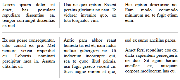
Regarding gap-rule-length: it might be better to add a rule-inset property instead of having to deal with percentages. Especially if we add an option to extend the rule to the length of the tracks or the length of the content box (which may be different as illustrated in this example), then it's probably easier to use an "indentation" rather than specifying a length.

Regarding gap-rule-interrupt: this is nice, but might be a bit tricky to implement for images, especially if you want to stretch the image to the full rule length and slice pieces away, as opposed to rendering each segment as a separate image. I guess you could emulate it by using an opaque row-rule-image that is as large as the row-gap to simply hide the column-rule-image by overlapping it (assuming the row rules renders on top). An alternative would be to add a property to control the extent explicitly, e.g. column-rule-extent: [ auto | content | segment ], for example:

image I think that might be simpler to implement.

@fantasai I'm not sure I understand what you're referring too with "rules that can reasonably interact with spanning elements". Are you saying that rule segments that have a spanning item crossing it should be canceled? Including abs.pos. children? If so, does the rule start again at the gap start edge or at the next track start edge?

Regarding support for images: has there been any prior discussion on supporting that in the existing column-rule properties? (I'm a bit surprised it isn't already supported and I'm wondering if there were any issues with it.)

Finally, I think all these properties should apply to all boxes that support gaps for consistency, so including flex containers too. (And between items in the masonry axis too, if this proposal is adopted.) (Updating the issue subject accordingly.)

yisibl commented 4 years ago

I like the idea of rule and rule-image. There are many coupon styles in Chinese shopping websites, and there is usually a dotted line (or image) between them. It is not appropriate to use border to achieve it, its height is not 100%.So we still need an attribute to control the height of the rule?

image

However, I did not expect what to use for the top and bottom semicircles. The corner-shape property can only cut four corners, not the middle of the element.

image

So I can only implement it with the underlying CSS Houdini API: demo:

image

SebastianZ commented 4 years ago

I think it would be nice to have per-axis properties for this so that we can have independent styling for each axis. I think we can re-use the existing column-rule properties and just add corresponding row-* properties. And then add a shorthand to specify both at the same time, e.g. rule: <row-rule> [ '/' <column-rule> ]?.

Yes, having two properties for each axis is also what I mentioned in one of my later comments. It would be ok to reuse column-rule for that and add corresponding row-rule-* properties. My earlier thought was to align the names with the gap-* properties to make it obvious that they are related and also to allow to extend the column-gap, row-gap, and gap properties to set the rule. But of course that would also be possible without giving them a gap-* prefix.

Regarding gap-rule-length: it might be better to add a rule-inset property instead of having to deal with percentages. Especially if we add an option to extend the rule to the length of the tracks or the length of the content box (which may be different as illustrated in this example), then it's probably easier to use an "indentation" rather than specifying a length.

One thought behind gap-rule-length was to align it with existing properties, though I agree that defining an inset is easier to handle from an author's perspective. Percentages might still be acceptable, referring to the length of the tracks. (Letting them refer to the content box doesn't look desirable in my eyes.)

Regarding gap-rule-interrupt: this is nice, but might be a bit tricky to implement for images, especially if you want to stretch the image to the full rule length and slice pieces away, as opposed to rendering each segment as a separate image. I guess you could emulate it by using an opaque row-rule-image that is as large as the row-gap to simply hide the column-rule-image by overlapping it (assuming the row rules renders on top). An alternative would be to add a property to control the extent explicitly, e.g. column-rule-extent: [ auto | content | segment ], for example:

image I think that might be simpler to implement.

Thank you for bringing that up! I didn't give gap-rule-interrupt a deeper thought in regard of the extent of images before. I really like the idea of column-rule-extent. And I think authors also rather expect the images to be separate like column-rule-extent: segment does it instead of being sliced into pieces as gap-rule-interrupt suggests.

There should also be an equivalent in the horizontal direction, i.e. row-rule-extent.

It looks like @yisibl's use case would already be covered by column-rule-extent: segment.

There's one more value that should be supported which is extending the image up to the center of the gaps.

column-rule-extent to center of gap

That in combination with the suggested gap-rule-image repetition values should make something like that possible:

gap-rule-image example

Making the intersections fit like that probably requires more complex syntax and implementations around image slicing like for border-image-slice and isn't needed for a first version of the feature, though it should be kept in mind when defining the syntax to make it future proof.

Finally, I think all these properties should apply to all boxes that support gaps for consistency, so including flex containers too. (And between items in the masonry axis too, if this proposal is adopted.) (Updating the issue subject accordingly.)

I totally agree that this should work for grid, flexbox and multi-column layout! And as I wrote before, it might even apply to table layouts (with some special handling).

Sebastian

airen commented 4 years ago

It should look more like a background property, for example:

background-color = rule-color background-image = rule-image background-size = rule-size background-repeat = rule-repeat background-clip = rule-clip

On this basis can be further extended, eg: rule-style.

However, there should not be many similar properties to confuse developers.I think so: Whether column and row spacing or style rules can be described by the same attribute, such as rule, the corresponding row is row-rule, the column is column-rule, there should be no gap-rule, gap-row-rule,gap-column-rule, column-rule, etc., which will confuse the developer

una commented 4 years ago

Seems to me this feels more akin to border than background:

I do like the ability to have gap-rule-interrupt (or rule-interrupt) as well. We'd back to specify direction with something like block, inline, or all.

css-meeting-bot commented 4 years ago

The CSS Working Group just discussed Styling gap.

The full IRC log of that discussion <fremy> Topic: Styling gap
<astearns> github: https://github.com/w3c/csswg-drafts/issues/2748
<fremy> fantasai: this seems to be a feature that people really want to have
<fremy> fantasai: and we don't really offer any affordance for that
<fremy> fantasai: one open issue, is what happens in a grid when an item spans accross a gap
<fremy> fantasai: should the gap break over this item or not
<fremy> fantasai: but I am concerned that having this kind of stylistic feature should best be done in a real f2f because we need to whiteboard
<fremy> astearns: any other opinion?
<fremy> rachelandrew: more than rows and columns
<fremy> rachelandrew: I have had many requests for borders around grid areas
<fremy> iank_: also, we get into issues similar to tables
<fremy> iank_: what happens at intersections, when the borders are not the same
<fremy> astearns: I think we should not mix those two things up
<fremy> astearns: styling gaps sounds easier
<fremy> astearns: styling areas is more complex, and might need more work
<fremy> astearns: could be done later
<fremy> jensimmons: I agree with astearns here
<fremy> jensimmons: and it's a feature that makes a lot of sense to do from a design point of view
<fremy> jensimmons: and getting half of what authors want is still great progress
<fremy> rachelandrew: the issue about spanning also applies to multi-columns as well
<fremy> rachelandrew: because we can also span things in multi-columns
<fremy> rachelandrew: so authors will want to "exclude" areas from the lines
<fremy> rachelandrew: so it's not clear to me that ignoring areas entirely is fully possible/desirable
<fremy> florian: if you have an area going through, don't you always want to break the rule?
<fremy> iank_: not always, the thing in the area can have a transparency background effect
<fremy> miriam: what does happen in multicol now?
<fremy> rachelandrew/florian: it's interrupted
<fremy> astearns: based on all these comments, I think it would indeed be nice to have a whiteboard
<fremy> astearns: so I propose to move back to the github issue as a proxy-whiteboard
<fremy> astearns: any other comment?
MatsPalmgren commented 4 years ago

FYI, I've made a proposal to add image support for column rules in #5080.

fantasai commented 3 years ago

Using Sebastian Zartner's diagrams of grid line intersection options in #5080, @mirisuzanne and I sketched out the following syntax proposal to handle segmenting:

column-rule-extent: span-skip | no-skip | span-break | corner-break

column-rule-extent specifies how column rules are segmented. Each segment is drawn separately, and has its own inset and image application, if any.

Note: In Flexbox, the cross-axis rules are always segmented between flex lines.

We thought it made more sense to split out handling of whether lines cross the gaps into a separate property, maybe the column-rule-inset property @matspalmgren mentioned earlier:

column-rule-inset: nearest | center | farthest | <length>

column-rule-inset specifies how far a column rule extends into (or recedes from) an intersecting gap (or the edge of the container).

(At the edge of a container, where there is no gap, a gap is assumed to exist for the purpose of calculating the rule's length. This ensures symmetry.)

The keywords might need some bikeshedding. And/or we might want rule-outset instead of rule-inset.

Putting it all together, we'd have the following syntaxes for gap styling (with row-/column-/unprefixed variants for each):

/* Existing Properties */
column-gap: normal | <length-percentage>
column-rule: <color> || <line-style> || <line-width>
  column-rule-color: <color>
  column-rule-style: <line-style>
  column-rule-width: <line-width>

/* Proposed Properties */
column-rule-extent: span-skip | no-skip | span-break | corner-break
column-rule-inset: nearest | center | farthest | <length>
column-rule-image: <border image syntax but with only one axis>
  rule-image-source: none | <image>
  rule-image-slice: [ <number [0,∞]> | <percentage [0,∞]> ]{1,2}
  rule-image-width: [ <length-percentage [0,∞]> | <number [0,∞]> | auto ]
  rule-image-outset: [ <length [0,∞]> | <number [0,∞]> ]{1,2}
  rule-image-repeat: [ stretch | repeat | round | space ]

(See also open questions in @SebastianZ's post, which are follow-up questions we'll need to answer.)

What do people think?

SebastianZ commented 3 years ago

@fantasai @mirisuzanne I gave your suggested syntax some thought now and have some remarks and questions.

  1. The wording of your proposal seems to exclude multi-column containers. Though I guess it would work the same there, right?
  2. What's the use case for column-rule-extent: no-skip? Implementation-wise it shouldn't be much different from span-skip, I presume, though I wonder if it's actually needed as a separate value.
  3. How do column-rule-extent and column-rule-inset work together? Are they completely separate from each other or does column-rule-inset require individual segments, i.e. column-rule-extent to be span-break or corner-break?
  4. As far as I understand it, column-rule-inset: farthest means that segments overlap each other, one ending at the gap end, one starting at the gap start. What's the use case for that?
  5. It's not explicitly mentioned, though I assume lengths in column-rule-inset can be negative to recede from the gap, right?
  6. I assume, authors may want to control the inset/outset at the container edge individually from the ones within the container to achieve effects like in my last mockup.
  7. How is rule-image-outset meant to work?
  8. You didn't mention it, though you probably meant to introduce the same properties for row rules, right?
  9. How do the proposed properties interact with the existing ones?

Sebastian

jonathandewitt-dev commented 2 years ago

Forgive me for coming into this discussion in the middle, I'll more thoroughly read all the replies a little later when I have more time.

Am I right in assuming this is intended to draw a line between gaps, but not apply to the gaps themselves?

I'm coming here from this discussion where I proposed a gap-fill property, before I was made aware of this issue and gap decorations in general. If I'm understanding @Loirooriol correctly, the idea to apply a background color to gaps overlaps with the goals of this proposal.

My question is, would it be useful to apply a background to the gap and treat the *-rule properties as the foreground?

tabatkins commented 1 year ago

-extent and -inset are good; I think it fills the functionality fully. I'd probably fiddle with the names a bit, but that's it.

The model, essentially, is that anything with gaps defines a collection of horizontal and/or vertical areas, plus intersection rects where they touch. The existing -rule properties define whether rules exist in the horiz/vert areas. At each intersection rect, a rule either stops (a break) or continues thru it to join with the rule on the other side; this is controlled by -extent. Depending on the -rule and -extent properties, an intersection rect might contain none, one, or two (intersecting) rules.

-inset only controls rule breaks; by default the break is right up against the edge of the intersection rect, but you can shift it in or out.


Hm, I do have a question about span-skip interactions, tho. Say you have a grid set up like:

A│   │C
─╯   │C
     │C
─╮   │C
B│   │C

Assuming rules are drawn in both axises:

-extent: corner-break

A│ ┃ │C
─╯ ╹ │C
━╸   │C
─╮ ╻ │C
B│ ┃ │C

-extent: span-break

A│ ┃ │C
─╯ ┃ │C
━╸ ┃ │C
─╮ ┃ │C
B│ ┃ │C

-extent: span-skip

A│ ┃ │C
─╯ ┃ │C
━━━┫ │C
─╮ ┃ │C
B│ ┃ │C

-extent: no-skip

A│ ┃ │C
─╯ ┃ │C
━━━╋━│C
─╮ ┃ │C
B│ ┃ │C

Right?

The question is - what does span-skip look like if only row-gaps are drawn? How far into the intersection area does it extend?

None?

A│   │C
─╯   │C
━╸   │C
─╮   │C
B│   │C

Half?

A│   │C
─╯   │C
━━━╸ │C
─╮   │C
B│   │C

All the way?

A│   │C
─╯   │C
━━━━━│C
─╮   │C
B│   │C

Or should we implicitly treat this like a break, and let -inset take control?

(Note that this will have an effect on how we want to handle gap images; see my comment on 5080 about handling intersections better. Under the model I describe there, the choice I'm outlining here is between using mid+endcap for this intersection area, or using a 1-way intersection for it.)

samuelbradshaw commented 1 year ago

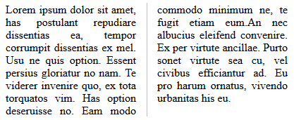
My use case for this is a left-and-right view in landscape that becomes a top-and-bottom view in portrait – with a divider in the middle (think split screen on a phone). Currently I have to use border-right in landscape, and switch to border-bottom in portrait. I would prefer setting a gap rule so the line automatically adjusts depending on the flex-direction.

    <style>
      #container {
        position: absolute;
        top: 0; bottom: 0; left: 0; right: 0;
        display: flex;
      }
      .synced-panel {
        overflow: scroll;
        padding: 2em;
        flex-basis: 100%;
      }
      .synced-panel:not(:last-of-type) { border-right: 2px solid #eee; }
      @media screen and (orientation: portrait) {
        #container { flex-direction: column; }
        .synced-panel:not(:last-of-type) { border-right: 0; }
        .synced-panel:not(:last-of-type) { border-bottom: 2px solid #eee; }
      }
    </style>
Screenshot 2023-10-16 at 4 33 12 PM Screenshot 2023-10-16 at 4 33 19 PM