Closed EiraGe closed 5 years ago
Thanks for raising this, Ella.
To clarify, pageZoomFactor
here means the ctrl+/- zoom in browser, as defined here, which is different from pinch zoom and device scale factor. We have three related coordinate spaces here: physical pixels, device independent pixels (DIPs) and CSS pixels:
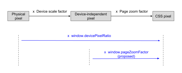
We already have window.devicePixelRatio
to convert between physical and CSS pixels, but there is currently no way to convert any of these to DIPs or back. The proposed pageZoomFactor
fills the gap.
The first question would be, why should content be aware of zoom level? I think content are supposed to be responsive to just the viewport, and the viewport changes based on the zoom level.
Ideally I hope content would never be able to be aware of zoom level. In Gecko, both window.outerWidth
and window.innerWidth
are based on the zoomed coordinate space. I would argue that we should change event.screen{X,Y}
the same way, but that could be tricky.
I would argue that we should change event.screen{X,Y} the same way, but that could be tricky.
It's definitely nicer to have event.screenX/Y
based on the zoomed coordinate space too, but it's very risky to change it since all major browser (except edge) have them unzoomed for many years.
the window.outerWidth
and window.innerWidth` in different coordinate space is definitely a bug in chrome. It's only a crazy way developers using to getting the zoom factor.
why should content be aware of zoom level?
I'm not very familiar with the use case except event part, but this chromium bug has 10+ stars, and also there are a lot of discussion here. This can be a sign showing that people are still care about the zoom level.
Here is an old WebKit bug that also shows the need for a new factor exposed to developers.
@upsuper: We also saw the challenge in changing event.screenX/Y
to an "ideal state". Almost all browsers are consistent today about it (see @EiraGe's doc here), and perhaps they are in this state for many years already! So this is out of question here.
People caring about the zoom level but no concrete usecase provided isn't a helpful situation. They may actually want something different that could deserve a better solution.
pageZoomfactor is usable on some situations yes. Like currently in our case - we want our content not be zoomed at all in any case, I can explain why if anyone interested. It can be currently extracted like this :
function browserZoom() {
if ('deviceXDPI' in window.screen) {
return window.screen.deviceXDPI / window.screen.systemXDPI;
}
// this works almost exactly also with Inspector open
return Math.min(window.screen.width / window.innerWidth, window.screen.height / window.innerHeight);
}
But CSS zoom is essential for us to render our content properly. What we do is we render iframes into webpages as guest and if and when that page has CSS zoom applied we absolutely need to know that, because we need to apply the exact same zoom to our content inside the iframe.
The easiest way is:
var bodyZoom = +window.getComputedStyle(document.body).zoom || 1;
var htmlZoom = +window.getComputedStyle(document.documentElement).zoom || 1;
var totalCSSZoom = bodyZoom * htmlZoom;
Now I apply totalCSSZoom
to iframe's documentElement
and as a result iframe contents scale properly as expected. This works on every browser except Chrome, as Chrome informs window.getComputedStyle(document.documentElement).zoom
wrong. The default is 1
, but for example on Windows and HiDPI i get 2
. And Chrome is wrong only on default. The same case, Winndows and HiDPI, but:
html {
zoom: 1;
}
fixes that, now window.getComputedStyle(document.documentElement).zoom
returns 1
, as expected. The rendering being exactly the same. The problem is that knowing if there is zoom applied in some some documentElement
class is hard and annoying.
Back to my case - currently Chrome would render on Windows our iframe content 2 times bigger as expected. Naturally I have a fix,
var oldCSS = document.head.style.cssText;
document.head.style.cssText = 'display: block;zoom:' + win.getComputedStyle(document.body).zoom;
var totalCSSZoom = window.innerWidth / (document.head.clientWidth + window.innerWidth - document.documentElement.clientWidth);
document.head.style.cssText = oldCSS;
but I would like to get correct values from window.getComputedStyle()
pageZoomfactor is usable on some situations yes. Like currently in our case - we want our content not be zoomed at all in any case, I can explain why if anyone interested.
So you want to disable browser zooming on your page. I'm indeed interested why, and I'm also wondering how you can disable that by knowing that factor.
But CSS zoom is essential for us to render our content properly. What we do is we render iframes into webpages as guest and if and when that page has CSS zoom applied we absolutely need to know that, because we need to apply the exact same zoom to our content inside the iframe.
You should probably not rely on zoom
property. It's non-standard, and there are browsers don't support it.
Also, it seems to me when using browser zooming, iframe as well as its content would get that zoomed together automatically. Am I missing something?
1) nope, we currently have decided to counteract. The reason is we render boxes which should be closable and there can be cases when box in user zoomed page can grow too big and hide close button. Also we do not want our boxes to be rendered too small. The solution is to detect browser zoom and apply correction to our boxes keeping them visually constant, desired size.
2) I do not try to rely on zoom property, but to render content in iframe i must apply the equal zoom into iframe content. Otherwise main page content and iframe content are zoomed diferently.
3) Correct, browser zooming is like matrix transform, everything is scaled. But CSS zoom acts only for current window context.
nope, we currently have decided to counteract. The reason is we render boxes which should be closable and there can be cases when box in user zoomed page can grow too big and hide close button. Also we do not want our boxes to be rendered too small. The solution is to detect browser zoom and apply correction to our boxes keeping them visually constant, desired size.
How is a large zoom different from user changing their window to a smaller size that your box would simply overflow? As I mentioned above, I believe sites should just be responsive to the viewport size, regardless of it being from zooming or window resizing. Am I missing something?
I do not try to rely on zoom property, but to render content in iframe i must apply the equal zoom into iframe content. Otherwise main page content and iframe content are zoomed diferently.
Correct, browser zooming is like matrix transform, everything is scaled. But CSS zoom acts only for current window context.
So why do you use zoom
at the first place?
1) In theory I can counteract to small window too, but this is not currently priority.
2) Our customers use. I work for Sleeknote where we render our content into our customers pages. Customers vary and some use CSS zoom to scale their content as part of responsive efforts. Most typical being applying 75% when viewport is less than something. My task is to adapt our content to all this.
In theory I can counteract to small window too, but this is not currently priority.
How about making your content responsive to viewport size, so that you solve the two problems together without using any hack for getting browsers' zoom ratio?
This browser zoom has nothing to do with the CSS zoom issue at hand. I regret to even pointing it out and are not interested discussing it further. Let's concentrate on the issue at hand - incorrect reporting of CSS zoom and why it is needed.
This issue is about exposing browser zoom factor. And I see no usecase of this.
CSS zoom is non-standard, so whether it's correctly reported, or even what's its correct behavior, is out of scope here, I suppose.
I was kindly asked: https://bugs.chromium.org/p/chromium/issues/detail?id=899707#c13 to present my use case here. I did. I'm out now.
Looks like the use-cases we mentioned so far can be solved through the the original point @upsuper mentioned: the content should be responsive to just the viewport.
Let me add a different example that seems to need the proposed pageZoomFactor
.
This threejs demo "links" the physical movement of the mouse to 3D direction of view, using movementX/Y
coordinates in PointerLock API. The degree of rotation shouldn't be affected by browser zoom here. Today Chrome wrongly exposes movementX/Y
in physical pixel, so it works. But if we make Chrome spec compliant (movementX/Y
and screenX/Y
in same coordinate space), there would no way for developers to "link" back to the physical movement of the mouse here. (With pageZoomFactor
they can because physical-offset is movementX/Y
times pageZoomFactor
divided by devicePixelRatio
, see the diagram above).
@upsuper: Do you think this justifies the proposal here?
If you do want physical movement to mean the logical movement, maybe you have to use page zoom factor. But I would argue that "physical" movement is probaby a rather arbitrary measurement, would you want to also get user's DPI? Actually, probably a zoom-aware mouse DPI data would fit that usecase better?
For this case, I would suggest that, imagine you don't use pointer lock, and thus can still see the cursor on the screen. In that case, you would probably want to use a normalized position based on the width or height rather than the "physical" movement.
The problem here is the lack of the cursor (because of PointerLock): there is no visual cue that explicitly links the effect (the 3D rotation angle in the threejs demo above) to the movement of mouse. So the user must "get used to" how physical movement determines the angle. Making this dependent on zoom factor looks counter-intuitive.
Having said that, I agree this is not a prominent use-case.
Closing this as there is no good use-case. (I thought I already closed it months ago but somehow I didn't)
In retrospect, this seems to have been a duplicate of #449
window.devicePixelRatio
includes both the device scale and the page zoom. However, there is no easy way to get the page zoom factor alone.Developers use different ways to get the zoom factor, but they are either inaccurate or not specced (e.g window.outerWidth / window.innerWidth, and window.getComputedStyle()['zoom'])
In addition, as mentioned in this comment,
event.screenX/Y
are in DIP(device independent pixels), which includes zoom, andclientX/Y
are in CSS pixel. Lacking page zoom factor causes developer having trouble converting between the coordinates spaces.I therefore propose adding a new window.pageZoomFactor to expose the zoom factor.