 rchrdnsh
commented
4 years ago
rchrdnsh
commented
4 years ago man, i just found out that this has not already existed since 2003...is this even close to existing?
Open richiksc opened 4 years ago
rchrdnsh
commented
4 years ago man, i just found out that this has not already existed since 2003...is this even close to existing?
rchrdnsh
commented
4 years ago this could change the world for web based audio and video players, no?
rchrdnsh
commented
4 years ago Could we say ::range-control or ::range:handle as opposed to ::range-thumb, as this feels like a very specific(to english?) and awkward choice?
I could imagine people from other languages then english finding that very odd, no?
 richiksc
commented
4 years ago
richiksc
commented
4 years ago @rchrdnsh However, thumb is the term that browsers have already been using. I think it is the official technical term for it as well.
rchrdnsh
commented
4 years ago hmmmm...could we not...just...change it? I'm not all that concerned about official terms if official terms aren't so great...but I'm willing to be persuaded if there are any materials that could logically support the use of the word 'thumb'. But ultimately if it's something that can not be changed for historical or technical reasons, then ok. But if we just added control or handle, and then let thumb live a long and natural life, then when it was no longer used we simply removed it...could that kind of thing be possible?
 gnat
commented
3 years ago
gnat
commented
3 years ago This would be amazing to make standard! control / track is also a great suggestion for intuitiveness. Keeping thumb would be a mistake unless there's a good reason for it; I also found thumb to be confusing at first (I am a native English speaker).
That said, either is better than this remaining non-standard.
 dfvalero
commented
3 years ago
dfvalero
commented
3 years ago what can we do to move this?
richiksc
commented
3 years ago @dfvalero, yeah, I'd love to push this forward.
richiksc
commented
3 years ago @fantasai Is it possible to flag this for WG discussion?
 emilio
commented
3 years ago
emilio
commented
3 years ago I've added this to the agenda to discuss it. I think the proposal is reasonable, but given it matches Gecko, it may be interesting what other implementors think about it.
There's a few details about which properties apply to these pseudo-elements which may be interesting to flesh out too. For example Firefox's UA style has these !important declarations which other engines may or may not have.
cc @mfreed7
 gregwhitworth
commented
3 years ago
gregwhitworth
commented
3 years ago Similar to how we handled the file input I would like for this to be uniform with the Open UI effort which itself is trying to holistically define form control parts outside of psuedo elements themselves. Additionally, not only across UAs but what common patterns exist across component libs, OS, etc. The range control itself can take on many forms outside of what is currently implemented by UAs. I get the desire for a short term solution but I would like to ensure that we're not designing ourselves into a corner. I hadn't seen this or else I would have had someone tackle the research in Open UI for range already.
gnat
commented
3 years ago Let's not lose sight this is a simple story about a minor iteration to just standardise what has already been in place for a long long time.
It would be sad if this was shelved in the hope of a full redo- that would warrant an entirely different discussion.
gregwhitworth
commented
3 years ago @gnat that's why this line is the important part to focus on in my comment:
I get the desire for a short term solution but I would like to ensure that we're not designing ourselves into a corner.
I'm not opposed to solving this as I wasn't opposed to the file control discussion more that we should ensure that we're not designing ourselves into a corner.
gregwhitworth
commented
3 years ago Ok, had a little bit of time to sit down and update the Slider analysis on Open UI. The concepts across libs can be seen here.
But more importantly, I dug into each for the part concepts they support and the subsequent naming of these sub-parts. The table rendered below can be seen here.


Based on this, specific to your proposal I am thumb and track win out across almost all endpoints. progress not so much but there isn't much agreement here across the industry it seems but there is agreement that this is needed, even though a few don't currently ship with this supported.
A few that I'll propose for the Open UI anatomy will be number output, content start/end, marks, steps, mark content and probably tooltip. So basically for now I'll avoid two handles. That said nothing in the above will block this.
We may want to consider marks, steps and mark content as these are actually already standardized - some UAs render them and others don't but they aren't reachable. To scope to this I think I'll just give my support to the current proposal and create a new one for those others to bring interop on the prefixed ones.
dfvalero
commented
3 years ago Hi @gregwhitworth, I think that there is no option to style the "Filled Selected Track" for webkit browsers
richiksc
commented
3 years ago @dfvalero
Hi @gregwhitworth, I think that there is no option to style the "Filled Selected Track" for webkit browsers
A 'filled selected track' has been present in the range control for Chromium-based browsers since Chrome 81.
https://blog.chromium.org/2020/03/updates-to-form-controls-and-focus.html?m=1
dfvalero
commented
3 years ago Hi @gregwhitworth,
Yep but, as far as i know, there is no way to style it :'(
gregwhitworth
commented
3 years ago @dfvalero @richiksc that is why there is no name for it but the concept does exist. That's why I broke them apart. The fact that the concept exists in the UA but doesn't have access shouldn't be overlooked. That's why I wanted this research. We should also ensure that the tick marks and values work as well which currently is spec'd but not supported and should be reasoned about while we discuss these psuedo's.
gregwhitworth
commented
3 years ago Oh, one thing that we haven't discussed is the limitations on styling of those psuedo elements. I haven't done that research - @richiksc any chance you did that across the UAs because that will need to be defined as well.
richiksc
commented
3 years ago @gregwhitworth I haven't done any research on that yet, but I can work on it.
gregwhitworth
commented
3 years ago @richiksc the best way I've found is to iterate over all dom APIs on the prototype chain for a given el under .style and apply potential values based on type and then check if that was applied since you can access these psuedos. My gut instinct is any layout/positioning props outside of display: none will not apply. So you'd primarily be looking at color modifications. It would be good likewise to understand if transition or animations work on various ones.
richiksc
commented
3 years ago @gregwhitworth Sorry, could you explain that further? As far as I know, you can't access a pseudo-element from JavaScript, so there's no way to iterate over its .style attribute.
Edit: In addition, we are only discussing modern/evergreen browsers, right? So effectively I'd only have to test Webkit/Blink (Chrome, Opera, Safari, Edge, Safari iOS, Samsung Internet) and Gecko (Firefox)?
gregwhitworth
commented
3 years ago @richiksc ahh, valid point - my apologies wrote that up in haste, historically I did it on DOM nodes themselves. Seems like we'll need to do this the old fashioned way then. As noted above, I'd test the following as a good start for manual testing or we can spelunk in the code to determine which props they don't allow.
emilio
commented
3 years ago Regarding properties, we only used to restrict a couple ones. https://bugzilla.mozilla.org/show_bug.cgi?id=1663819 is related here.
 css-meeting-bot
commented
3 years ago
css-meeting-bot
commented
3 years ago The CSS Working Group just discussed [css-pseudo-4] Standardizing input[type="range"] styling, and agreed to the following:
RESOLVED: Continue working on standardizing these 3 pseudosgregwhitworth
commented
3 years ago @richiksc did you get a chance to test these? I took an action to clarify the proposal on this but there was agreement to put forth the psuedo elements in general. @emilio gave us a head start here and I've asked @smfr for the same content from webkit if possible.
richiksc
commented
3 years ago @gregwhitworth Unfortunately, I didn't get time to test these, as the school year has now started.
richiksc
commented
3 years ago As Blink uses a paint effect to fill in the "progress" of the range, would switching to a pseudo element severely impact performance?
gregwhitworth
commented
3 years ago @richiksc no worries at all - thanks for taking the time to open the issue.
As Blink uses a paint effect to fill in the "progress" of the range, would switching to a pseudo element severely impact performance?
If any I would expect it to be negligible. @dandclark or @mfreed7 would be able to provide more insight into this.
 trullock
commented
3 years ago
trullock
commented
3 years ago Since Chrome 80 introduced styling for the range-progress, did it also introduce a pseudo-selector like -moz-range-progress?
 yairEO
commented
3 years ago
yairEO
commented
3 years ago Range input, in my opinion, lack vitale capabilities which can enhance UX, therefore I have enhanced it with features (HTML & CSS only):
https://codepen.io/vsync/pen/mdEJMLv
My design solves some of the issues, that I, as an internet user, experience:
value of the range slidemin/max values without manually moving the thumb to the edgesstep size without first moving the thumbI want the user to know all these without having to first interact with the input control, and to achieve this knowledge, one must write a lot of CSS.
My understanding is that UI controls are meant to be as basic as possible, the bare minimum, so developers would expand upon it as they wish.
I would be happy if native inputs such as range would include out-of-the-box shadow-dom nodes such as included in my implementation, which developers could change/toggle without having to write/import tons of CSS.
richiksc
commented
3 years ago @yairEO I think your proposed additions would fall under @gregwhitworth's Open UI project, which aims to standardize components found in many UI libraries, including things like double-sided range and value labels. This is more about standardizing the CSS selectors for the existing range element.
yairEO
commented
3 years ago @richiksc - Thanks, I wasn't aware of that initiative.
gregwhitworth
commented
3 years ago @yairEO yeah - the majority of the gaps you noted are not in all browsers nor component libraries but I do agree that they should be included. The ones you denoted are captured in the table here: https://open-ui.org/components/slider.research.parts
The primary being "content end" and "content start" as well as "number output" - these were merely identifying capabilities that overlapped. That said there were solid usecases for even the ones that only were solved in a few component libraries.
css-meeting-bot
commented
3 years ago The CSS Working Group just discussed [css-pseudo-4] Standardizing input[type="range"] styling.
gregwhitworth
commented
3 years ago @emilio as noted in the meeting you wanted to work on this and I don't want to be a blocker here in any way. Given that I expect the indicator pseudo with base styles to be a required resolution to standardize these pseudo elements in a meaningful way (eg: the necessary restrictions) I recommend we land on a clear solution there.
Relevant issues:
So here's the steps we need to take to finalize this:
This does a few things, this fills the gap I requested earlier regarding the limitations as once we have a base set of styles there actually aren't any limitations to the author outside of fully replacing the content with complex HTML but that can come later.
@emilio can you please review the base style issue above - give your feedback and then we can move on to step 2?
Let me know if you have any questions.
Note: We may not need the full anatomy full defined in order to unlock the 3 above but we need to ensure that we're not blocking any of the scenarios that we may want to add in the future.
rchrdnsh
commented
3 years ago Another thing that I have recently ran into needing is a 3rd fill, in my use case for a buffer fill...aka...how much of the audio and/or video has loaded and is playable...so there would be the track, then the buffer fill, which would be separate from the handle and progress fill, if that makes sense. Just wanted to voice that use case for everybody :-)
 samuelbradshaw
commented
2 years ago
samuelbradshaw
commented
2 years ago I agree that "handle" is a more intuitive word than "thumb." What about the highlighted range between a start handle and end handle when trimming a video – is that considered the same type of thing as the "progress" section on a slider?
 thebabydino
commented
2 years ago
thebabydino
commented
2 years ago The below are my thoughts on this, based on coding hundreds of very different range input designs over the past few years. You can see a small sample of the sliders I coded in the collage below (these are actual screenshots of the range inputs I styled):

So far, the comments in this issue only talk about standard pseudos, but to me, that's not really an issue. Currently, it's often actually convenient to have different pseudos because the internal Shadow DOM structure and the way parts work/ are sized/ move also depends on the browser. This means that often, different styles are needed for WebKit browsers and Firefox.
Making things standard needs to start with the Shadow DOM structure, not with the pseudo names. Otherwise, getting consistent results cross-browser is going to become more difficult, not easier.
Here's the structure I came to the conclusion would be best for a simple, single thumb slider (we can discuss multiple handles later as I've also dealt with that - detailed in this two part article I wrote for CSS-Tricks: one and two):
track part::-ms-fill-lower and ::-ms-fill-upper; like in the IE/ old Edge these need to be nested inside the track, with one end attached to the corresponding end of the content-box of the track and the other end attached to the middle of the thumb (this is not how ::-moz-range-progress works and that's a big problem because it means that, as it is, this Firefox pseudo is... pretty much unusable)thumb part that's a sibling of the track (not a child as it is the case in WebKit browsers) or doesn't have its motion restricted by the track or by the actual range input the way it's currently happening; this thumb and the track should be middle aligned vertically (currently not the case in WebKit browsers)This structure would allow for all the very different designs I've tried to code and which cannot be currently CSS-ed without adding extra elements or using pretty awful hacks which may lead to code breaking five months down the line or down a rabbithole of fixing the problems generated by fixes to earlier problems caused by fixes to problems we had before that and so on...
I'll be coming back to this with a list of major issues this structure would fix, illustrated by practical range input examples.
gregwhitworth
commented
2 years ago I agree 100% with @thebabydino as I noted to @mfreed7 in the Open UI issue on this. If we go the route of standardizing the anatomy we should do this in Open UI. I'm also fine with standardizing psudeos to unlock basic styling but it should be inline with the anatomy for the complete solution so requiring a standardized anatomy.
Additionally, I think any new pseudos should likewise come with the default UA stylesheet to handle the fallback to not hit some of the issues outlined by @thebabydino
I'd personally recommend going the route of <selectmenu> rather than pseudos.
 mfreed7
commented
2 years ago
mfreed7
commented
2 years ago +1 to bringing this (back) to OpenUI to standardize the anatomy. @thebabydino ’s comment above is a great start on that process, I think, and it sounds like it comes from significant experience.
thebabydino
commented
2 years ago I'd personally recommend going the route of
<selectmenu>rather than pseudos.
You mean use something like ::part(track) {} for styling plus the option of replacing default part with slots? I'm fully behind that.
As I promised, I'll be going through the problems I've encountered with the current structure/ limitations.
track styles affecting the thumbThis happens in WebKit browsers and is due to nesting.
Small refresher: when we look inside the input[type='range'] in WebKit browsers, we see the following:
The Firefox structure is however different:

Now let's consider a slider like the one seen below:

In this case, the track and progress don't have a rectangular shape. Instead, it's a shape that can be easily achieved with a CSS gradient mask.
But this makes the WebKit structure a problem - any mask applied on the ::-webkit-slider-runnable-track pseudo would also affect the thumb inside it. That is, it would mask out all the parts of the thumb that fall outside the track shape. This is not the case in Firefox, where the thumb isn't a child of the track, but a sibling.
Side note: we have the same problem if we need to set clip-path, filter, opacity or mix-blend-mode on the track - all these properties also irreversibly affect the children of the element we set them on.
Sure, we could make the real track a lot bigger, add another mask layer that's basically just a disk the size of the thumb (specifically for ::-webkit-slider-runnable-track, it's not needed for the Firefox ::-moz-range-track and having different selectors means we could set different styles), but there are a couple of big problems with this.
One, the position of this disk needs to get updated whenever the slider value changes, meaning we end up relying on JS for something as basic as just showing the entire thumb.
Two, the thumb has a shadow that we lose this way. Making the thumb shadow area visible too from the mask we apply on the track would also show parts of the track we don't want to be shown (that was why we masked them out in the first place) underneath the semitransparent shadow of the thumb. Setting a drop-shadow on the input[type='range'] would give this shadow to the track + thumb assembly, not just to the thumb.
So in order to reproduce this design with CSS, I had to wrap the input[type='range'] in a div and use the pseudos of this div to emulate the non-rectangular parts - well, you can see the live demo for yourself.
The illustration below shows what this workaround I've used here looks like when we don't have the ::before and ::after of the wrapper and the input[type='range'] (which has the thumb as the only visible part) stacked one on top of the other in the same grid cell, but instead in three different cells.

thebabydino
commented
2 years ago progress part is insufficientSometimes designs require something after/ to the right of the thumb (attached to the right edge, as opposed to ::-moz-range-progress, which is attached to the left edge), as it can be seen for a couple of the sliders below (the very last one and the one on the third row, first column):

Other times, something on both sides of the thumb is required. Consider the example used to illustrate the previous problem. My workaround for that first problem used two pseudos on a wrapper. The ::before emulates the outer non-rectangular shape (the track), while the ::after emulates the inner one (the two progress parts, one to the left and one to the right of the thumb).
We cannot create both the outer and inner non-rectangular shapes using a single pseudo - that means we cannot have the dark grey progress part to the right of the thumb as belonging to track. It needs to be a different pseudo. If we only have a single progress part, then that goes up until the middle of the thumb and we're missing the non-rectangular dark grey part to the left of the thumb because we cannot create that on the same pseudo as the non-rectangular track shape - not with the inner shadows and gradients.
So just having a track, a progress and a thumb that's a sibling of the track won't do. We need two progress parts, in the same way IE/ pre-Chromium Edge had ::-ms-fill-lower and ::-ms-fill-upper.

thebabydino
commented
2 years ago thumb motionThis is one of the most common and annoying issues I encounter when styling range inputs.
In WebKit browsers, where the thumb is a child of the track, the border-box of the thumb moves within the limits of the content-box of the track. When the slider is at its minimum value, the left edge of the border-box of the thumb coincides to the left edge of the content-box of the track. When the slider is at its maximum value, the right edge of the border-box of the thumb coincides to the right edge of the content-box of the track.
This can be seen below, where the input[type='range] (gold), the track (tomato red) and the thumb (purple) all have non-zero border and padding. For all three, the padding area is transparent, while the border area and the content-box are semi-transparent.

In Firefox, where the thumb is a sibling of the track, the border-box of the thumb moves within the limits of the content-box of the input[type='range]. When the slider is at its minimum value, the left edge of the border-box of the thumb coincides to the left edge of the content-box of the input[type='range]. When the slider is at its maximum value, the right edge of the border-box of the thumb coincides to the right edge of the content-box of the input[type='range].

Note that making the border-box of the track shorter or longer than the content-box of the input[type='range'] by setting a width value that doesn't match on the track doesn't work in WebKit browsers - this width set on the track simply gets ignored. We can however get the same effect using a lateral margin (tests for this).
This means we need to have no margin, no border and no padding on the track - otherwise, WebKit browsers and Firefox will produce different results for the exact same styles.
Here's an illustration of the problem when the track has non-zero margin, border and padding. In WebKit browsers, the thumb cannot go beyond the content-box of the track:

In Firefox, it can:

Now consider the same example I've used before, where the thumb diameter is much bigger than the track height. The WebKit case, which doesn't allow the thumb to go outside the content-box of the track is terribly inconvenient in this situation (and in most situations, this is a very common problem when coding range inputs). The annotated screenshot below shows how at the minimum slider value the left edge of the thumb's border-box doesn't coincide to that of the track's content-box.

Since the thumb needs to be middle aligned both horizontally and vertically with the much smaller track nodes and the thumb diameter (that is, the size of its border-box) is bigger than the height of the track 's content-box (which gives us the diameter of the inner track/ progress nodes), it results that the border-box of the thumb cannot move within the limits of the track's content-box, it needs to go outside.
But WebKit browsers do not allow this.
In this particular case, I went around the problem by emulating the track with a ::before pseudo on a wrapper around the input[type='range']. I didn't have a better option for getting the track shape anyway.
In other cases, when the thumb diameter is only slightly bigger than the track height, I simply gave the thumb the same diameter as the track height and then scaled the thumb up a little bit (using a transform).
Neither of these two workarounds are ideal when we don't have another reason to add an extra elements and the thumb diameter needs to be much bigger than the track height.
So what I've done most often was not give any visible styles (no background, no box-shadow or anything like that) to the pseudo/ element to whose content-box the thumb motion is restricted and set the track styles elsewhere.
In Firefox, where the thumb moves within the limits of the content-box of the actual input[type='range'] (not styled in any visible way), we set the track styles on the (shorter than the range input) ::-moz-range-track.
In WebKit browsers, where the thumb is a child of the track and its motion is restricted within the limits of its parent's content-box, we cannot set the visible track styles on ::-webkit-slider-runnable-track. We can however make the ::-webkit-slider-runnable-track extend beyond the lateral ends of the actual range input using a negative lateral margin and then set the visible track styles on the range input itself.
We can use having different pseudos in different browsers (::-webkit-slider-runnable-track and ::-moz-range-track) in order to set one set of styles for the track in WebKit browsers and another set of styles in Firefox. But we cannot do the same for the actual input[type='range'] unless we rely on something like this:
/* Firefox input[type='range'] styles */

@supports selector(::-webkit-slider-runnable-track) {
  /* WebKit input[type='range'] styles */
}
... which doesn't appear to work in Safari (tested on Linux via Epiphany), according to this test, in spite of MDN saying otherwise. Even if it did work in Safari, mobile support is a problem.
We could switch it up and have:
/* WebKit input[type='range'] styles */

@supports selector(::-moz-range-track) {
  /* Firefox input[type='range'] styles */
}
This works now, though it didn't work when I needed it in the past, which was why back then I resorted to a different solution in WebKit browsers: using this pesky little element inside input[type='range']:

It's read-only, so I undid that, gave it the track styles making it a bit shorter than the actual range input and then used a negative margin on ::-webkit-slider-runnable-track (which was left with no styles that would make it visible) to bring it back to the size of the input[type='range'].
I know it's hacky, but, at the time, it was the only way I could come up with in order to get such sliders to work the same way in all browsers without adding an extra element to visually reproduce the track or without coding a tiny thumb which would then get scaled up using a transform.
Well, there are multiple options.
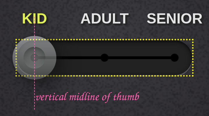
One, the simpler option. The thumb's vertical midline should move from a distance d away from the left edge of the track's content-box to the same distance d away from the right edge of the track's content-box, where d is half the height of the track's content-box.
d = .5·H₀

H₀ = height of track content-box
This would ensure consistent alignment for sliders with the same track and ruler size, but differently sized thumbs:

Two, probably the more correct option. Because if there's something that bothers me about the above, is that it feels that the second longer thumb goes too far outside the track.
The thumb's vertical midline should move from a distance d away from the left edge of the track's content-box to the same distance d away from the right edge of the track's content-box, where d is the maximum between half the height of the track's content-box and half the width of the thumb's border-box minus half the difference between the height of the thumb's border-box and the height of the track's content-box.
d = max(.5·H₀, .5·w₂ - .5·(h₂ - H₀))

H₀ = height of track content-box
w₂ = width of thumb border-box
h₂ = height of thumb border-box
For a thumb with an aspect-ratio of 1/ 1, the two options are equal.
This would ensure consistent distance between the horizontal and vertical edges of the thumb and track boxes when the slider is at the minimum/ maximum value (and also, if the track and thumb are both pill-shaped along the same direction, having corner roundings that are half their smallest dimension, these roundings would be on concentric circles when the slider is at the minimum/ maximum value).
For example, take the case of the pill-shaped thumb of the third slider below - this would go too far out of the track using the first option, but looks just right using this second option.

(As before, these are all screenshots of sliders I've coded.)
Three, allow setting this manually somehow? I've definitely come across cases where the design required the bigger-than-track-height thumb to not even go all the way to the end of the track - sliders 1, 3 and 4 below for example:

Or this slider:

thebabydino
commented
2 years ago thumb and track vertical alignmentThis issue is one that it's been easy to get around, but it's a very common and annoying one, arising in WebKit browsers every single time we set the height of border-box of the thumb to be different from that of the content-box of the track.
For example, whenever we want something like this:
In WebKit browsers, after setting -webkit-appearance: none the default height of the content-box of the track is given by that of the border-box of the thumb. So when both the track and the thumb have a height that's explicitly set and these heights don't match, they are top-aligned, not middle aligned, which is what almost every design I've implemented asked for.
Fortunately, it been easy to fix so far with a margin-top only set on ::-webkit-slider-thumb (but not on ::-moz-range-thumb as well, since the track and thumb are middle aligned by default in Firefox).
thebabydino
commented
2 years ago progress is a track sibling, not a childIn Firefox, the track, the progress and the thumb are all siblings inside the input[type='range']. This means that the left edge of the border-box of the progress is attached to the left edge of the content-box of the input[type='range']. In this particular case where the thumb diameter is much bigger than the height of the track, meaning that the thumb goes beyond the lateral ends of the track, the content-box of the input[type='range] is the invisible box within which the thumb motion is restricted, a box extending beyond the lateral ends of the track.

On a first look, this is a problem we could solve with masking - that's the approach I took with this demo for example:

Unfortunately, this often ends up causing even more problems because ::-moz-range-progress has another even bigger problem that's a lot more obvious when the height of the border-box of the thumb isn't bigger than the height of the track, which is what we'll be taking a look at next.
thebabydino
commented
2 years ago Let's consider a basic input[type='range']. When this is at the minimum value, the ::-moz-range-progress pseudo has a width that's 0% of the range input element's content-box. When it's at the maximum value, the ::-moz-range-progress pseudo has a width that's 100% of of the range input element's content-box.
This is illustrated below (you can also play with the live demo if you want) where the actual input[type='range'], the track, the progress and the thumb all have a non-zero border and a non-zero padding. The padding area is transparent for all, while the border and content areas are semitransparent (gold for the actual input[type='range'], tomato red for the track, grey for the progress and purple for the thumb).

All seems fine for the default Firefox look where thumb is much taller than the track and progress.
However, the problem with it becomes obvious when we have a thumb that's shorter than the track or progress or has border-radius: 50%. Or both. You can see below how this looks in Firefox (live demo):

In the lower half, the progress is too short. In the upper part, the progress is too long.
IE/ pre-Chromium Edge used to do this better with ::-ms-fill-lower. At the minimum value, this pseudo had a width that was half of that of the thumb's border-box. At the maximum value, its width was equal to that of the track's content-box minus half of the thumb's border box. Illustrated below:

This meant it worked nicely in the cases where ::-moz-range-progress failed:

I also do something similar for WebKit browsers nowadays. I set a custom property either on the input[type='range'] itself or on its wrapper in the case of a range with a tooltip/ a range with a ruler with number labels and then update this custom property via JS whenever the slider value changes. When setting the custom property on the input[type='range'] itself, it looks like this:
addEventListener('input', e => {
  let _t = e.target;

  _t.style.setProperty('--val', +_t.value)
})
(when setting it on the wrapper, I replace _t with _t.parentNode)
The --val custom property is then used to compute the background-size of the progress-emulating, non-repeating top background layer(s) on the track in the case of a single thumb range (the multi-thumb case I dissected in detail in this series of articles: one, two).
$thumb-d: 4em; // thumb diameter
$thumb-r: .5*$thumb-d; // thumb radius

--track-w: min(100vw - 2.5em, 32em); /* responsive track width */

/* actually, it's not var(--val)/100 in the general case,
 * it's (var(--val) - var(--min))/(var(--max) - var(--min)) */
--thumb-x: calc(var(--val, 50)/100*(var(--track-w) - #{$thumb-d}) + #{$thumb-r});
To also cover the no JS case, I multiply the computed value for the background-size with a --js custom property that defaults to 0, but is switched to 1 in the JS case.
The background-size:
var(--progr-g) 0/ calc(var(--js, 0)*var(--thumb-x)) 100% no-repeatSwitching --js to 1:
.js { --js: 1 }document.documentElement.classList.add('js')This is simple, lightweight, flexible, but... no JS means no progress is seen on the track.
Going back to how ::-moz-range-progress currently works in Firefox, things look even worse when we want the track and progress to have rounded corners. Giving ::-moz-range-progress a border-radius that's equal to half he height of its border-box ends up looking really bad at small values (live demo, contrast with the nice-looking JS solution used by the other browsers):

We could round only the left corners of the progress, but this creates a different kind of issue at the other end while not solving the first one:

Sure, we could set overflow: hidden on the actual input[type='range'], but that wouldn't solve the initial problem and could turn into a an even bigger problem if we want to have an outer shadow on the thumb, a shadow that should be visible outside the padding-box of our input[type='range'] element.
Setting a mask on the progress works better, but we still have issues at the thumb corners (not to mention that adding a mask on the progress makes it show on top of the thumb, so then we need to set transform: translateZ(1px) on the thumb to fix that).
mask:
  radial-gradient(circle at $thumb-r, red $thumb-r, transparent 0),
  linear-gradient(90deg, red var(--mover-x), transparent 0)
    #{$thumb-r}/ var(--track-w) 100%
Covering those gaps with box-shadow won't do for a gradient/ image progress.
If the thumb only has a solid background and no outer shadow, we could ditch its rounding and use the progress background as a bottom layer underneath a radial-gradient() creating the thumb disc. But this comes with alignment issues, not to mention it requires to hide overflow on the input[type='range'] element and this creates another problem in certain situations, as mentioned above.
@mixin thumb($flag: 0) {
  border: none;
  width: $thumb-d; height: $thumb-d;
  border-radius: $flag*50%;
  @if $flag > 0 { background: mediumvioletred }
  @else {
    background:
      radial-gradient(closest-side, mediumvioletred calc(100% - 1px), transparent),
      var(--progr-g) right #{$thumb-r} top 0/ 50% 100% no-repeat #333
  }
}
There's also the option of moving and scaling ::-moz-range-progress while also emulating its background on the left end of the track.
$track-w: 32em; // FIXED track width, not responsive
$track-h: 4em; // track height
$track-r: .5*$track-h; // track radius

$thumb-d: $track-h; // thumb diameter
$thumb-r: .5*$thumb-d; // thumb radius

$mover-x: $track-w - $thumb-d; // range of thumb motion
$progr-f: $mover-x/$track-w; // factor needed to scale progress to a max of $mover-x

transform-origin: 0; /* scale w.r.t. left edge */
transform: translate($track-r) scaleX($progr-f);
background: var(--progr-g) #{-1*$track-r}/ calc(100% + #{$track-r})
The result seems good at a first glance, but increasing the height of the components relative to the track width shows we have a big problem: squishing the ::-moz-range-progress pseudo horizontally also affects the angle and the stripe thickness of its repeating gradient.
Sure, we could alter the angle of the ::-moz-range-progress gradient while leaving the one of the ::-moz-range-track gradient unchanged and the same for the distance between stripes, but this is going to cause alignment issues between the ::-moz-range-progress gradient and the one on the end of the ::-moz-range-track, which just makes us go deeper down the rabbithole of fixing problems caused by the fixes to the earlier problems.
In addition to this, the transform method only works if we have a fixed ratio between the track and thumb widths. It doesn't help if we want the track width to scale with the viewport while the thumb size remains the same because we cannot have division between values with units.
This method also comes with issues if we want to have a box-shadow on the track and/ or the progress.
At the end of the day, all these workarounds seem very hacky and not really worth the effort, so most often I just leave ::-moz-range-progress alone and make Firefox use the same JS solution that I use for the other browsers.
If there's going to be a standard progress, it's best if its left edge always coincides with the left edge of the content-box of the track, while its right edge always coincides to that of the vertical midline of the thumb, as it used to be the case for ::-ms-fill-lower.
cc @emilio as these last two problems are specific to ::-moz-range-progress
 toughengineer
commented
1 year ago
toughengineer
commented
1 year ago I'd say one more problem is focus outline (focus ring).
When the height of the <input> element itself is less than the height of the handle/thumb, focus outline looks weird in Chromium:

It looks ok in Firefox though:

Disclaimer: I'm not a web developer, like at all.
 MostafaFawzy7
commented
1 year ago
MostafaFawzy7
commented
1 year ago Hey guys, as I see, all of your awesome snippets are horizontal paths, can I ask anyone to provide a circular path, please 🙏
 SebastianZ
commented
1 year ago
SebastianZ
commented
1 year ago can I ask anyone to provide a circular path, please 🙏
What do you mean by "circular path"? Can you explain your use case?
Currently, the state of styling
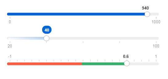
<input type="range">across browsers is a nightmare. Chrome, IE, Safari, and Edge each have their own way of styling range inputs with differently named pseudo-elements. With this proposal, I want to bring some unity and standardization to this similar to the CSS scrollbars spec. Currently, Chrome has no support for styling the "progress" part of a range input (the area corresponding to "below" the current value, in LTR languages, the track to the left. @danielstern has written an article about it on CSS-Tricks, and although it was last updated in 2017, most of it still applies.Definitions
Thumb: the UI element that the user interacts with and is dragged by the user - it shows the current state of the range. Track: The "groove" or bar that the thumb runs along - shows the "range" (min and max values) of the range.
Current state of range styling
WebKit/Blink (Chrome/Opera/Safari):
Firefox
IE/Edge
Proposal
As you can see, attempting to style a consistent range input across browsers is a daunting task and requires a lot of CSS and repetition of styles. I'd like to propose three new standard pseudo-elements for styling the range:
Sample CSS for the above mockup would be something like this: