w3c / csswg-drafts

CSS Working Group Editor Drafts
https://drafts.csswg.org/
Other
4.35k stars 639 forks source link

[css-fonts] Proposal to extend CSS font-optical-sizing #4430

Open Lorp opened 4 years ago

Lorp commented 4 years ago

Introduction

This proposal extends the CSS Fonts Module Level 4 font-optical-sizing property by allowing numerical values to express the ratio of CSS px units to the the units used in the opsz OpenType Font Variation axis. The ratio is intended to be multiplied by font-size, measured in px, allowing control over the automatic selection of particular optical size designs in variable fonts.

The proposal resolves the conflicting implementations of the font-optical-sizing: auto behaviour, and provides additional benefits for font makers, CSS authors, and end-users.

Examples

Background

OpenType Font Variations in CSS

When the OpenType Font Variations extension of the OpenType spec was being developed in 2015–2016, Adam Twardoch and Behdad Esfahbod proposed the addition of the low-level font-variation-settings property to the CSS Fonts Module Level 4 specification, modeled after font-feature-settings.

For higher-level control of font variations, there was general consensus that the font-weight property would be tied to the wght font axis registered in the OpenType specification, font-stretch would be tied to wdth, while font-style would be tied to ital and slnt.

OpenType opsz variation axis and CSS font-size

The consensus was that the CSS font-size property could be tied to the axis registered for optical size, opsz. The opsz axis provides different designs for different sizes. Commonly, a lower value on the opsz axis yields a design that has wider glyphs and spacing, thicker horizontal strokes and taller x-height. The OpenType spec suggests that “applications may choose to select an optical-size variant automatically based on the text size”, and states: “The scale for the Optical size axis is text size in points”. Apple’s TrueType Variations specification (on which OpenType Font Variations is based) also mentions point size as the scale for interpreting the opsz axis: “'opsz', Optical Size, Specifies the optical point size.” It is notable that neither the OpenType spec nor Apple’s TrueType spec addresses the interpretation of opsz values in environments where the typographic point is not usefully defined.

Optical sizing introduces a new factor in handling text boxes in web documents. If the font size of a text box changes, the proportions of the box not remain constant because of the non-linear scaling of the font; typically the width grows at a slower rate than the height, because of the optical compensations in typeface design mentioned above. Realizing that many web documents may rely on the assumption of linear scaling, Twardoch proposed an additional CSS property font-optical-sizing:

The font-optical-sizing property is currently part of CSS Fonts Module Level 4 working draft.

Controversy: opsz axis and CSS font-size (px vs. pt)

Unfortunately recent browser developments introduced ambiguity in terms of how opsz values should be interpreted:

Proposed resolution: numerical values in font-optical-sizing

The CSS font-optical-sizing property currently controls the relationship between font-size and opsz by means of a simple switch (auto/none). We propose to allow a numeric value for font-optical-sizing. This value expresses the ratio of opsz units to CSS px. Examples:

Results

Note

Proposers

svgeesus commented 4 years ago

@lorp thanks for raising this, and for the detailed and clear write-up.

@litherum it would be interesting to hear the WebKit perspective on this. Was this simply an oversight, so it should be treated as a spec-compliance browser bug, or was this a deliberate decision and if so, what was the rationale?

drott commented 4 years ago

Laurence and Adam, thanks for the proposal and what sounds like a generally reasonable approach to me. However, I have some questions on the Controversy section.

Unfortunately recent browser developments introduced ambiguity in terms of how opsz values should be interpreted:

  • Most browser implementers interpret opsz as expressed in CSS pt units (points). If optical sizing is enabled, all text has its opsz axis set to the value of the font size in pt.
  • Apple in WebKit has decided to interpret opsz as expressed in CSS px units (pixels). If optical sizing is enabled, all text has its opsz axis set to the value of the font size in px.

Could you clarify for which versions and environments you arrived at this conclusion? When I implemented font-optical-sizing, I found that latest Safari tip of tree uses CSS px (1, 2), and so does Firefox last time I checked (so I disagree with "Most browser implementers interpret opsz as expressed in CSS pt units (points)."). I implemented it based on px in Chrome as well, so I don't think there are any interoperability issues between browsers once the versions I looked at are generally rolled out.

Agree that still, there is potentially and interoperability between say a printing use of a font vs. its use as a web font and there is no affordance for mapping to the intended opsz value.

davelab6 commented 4 years ago

The problem is that all browser implementations ignored the OpenType Spec from 2016 and did something different, all in the same way, but we also now have a lot of fonts that were made with opsz axes according to the OpenType Spec.

A CSS px is device pixels per inch / 96, and a CSS pt is device ppi / 72. This is a big deal and imho the default value of this property should be 0.75.

svgeesus commented 4 years ago

And even if we don't end up adding this property, the spec should clarify that opsz is defined to be in pt and thus, browsers using px should use the 0.75 scaling value. I don't see any web-compat downside right now to making that change, because optically scaled type is little used currently and people probably haven't noticed tht it is being set too thin.

svgeesus commented 4 years ago

I notice that the one rendering-based WPT test for optical sizing checks that the result of

  1. setting the font-size (in px) with the initial value (auto) of font-optical-sizing
  2. setting font-variation-settings: 'opsz' to the same value as the px value

matches. In other words, the test checks that opsz is set in px. So yes there is interop but the rendered result in real-world usage will be suboptimal because the adjustment created by the font designer is not being applied correctly.

Lorp commented 4 years ago

@svgeesus agreed

@davelab6 agreed, with the caveat that your “pixels per inch” should be in quotes, since these pixels are of course based on the visual angle subtended by an idealized median desktop pixel from the year 2000, and thus the physical measure of 1pt in CSS varies significantly between devices/user agents :) But that’s a whole nuther discussion.

@drott thanks for that important correction. As Dave and Chris confirm, the fixed opsz:px ratio value of 1.0 is definitely too high, and even if it were set at 0.75 in all browsers I would resubmit the proposal for the benefits of varying it.

Crissov commented 4 years ago

Minor comment: Why use a float value for font-optical-sizing when CSS usually prefers percentages?

PS: A <length> value would also make sense to specify the size of an opsz unit, where 1px and 1pt would be used in most cases. However, this feels awfully specific to Open Type.

litherum commented 4 years ago

The observation that we made when we implemented optical sizing is that 1 typographic point = 1 CSS pixel.

This is clearly true: Safari, Firefox, Chrome, Pages, Microsoft Word, raw Core Text, and TextEdit all agree. Here is an image of Ahem rendered in all of those using a size of 48 typographic points:

Screen Shot 2019-10-17 at 11 51 35 AM

You can see that the rendered size is the same in all of these different apps. In addition, Pages even puts units on the font size: "pt". The documentation for raw Core Text (the second to rightmost app in the above image) also indicates that its size is in points:

The point size for the font

So, when we apply an optical-sizing value of X typographic points, that is equal to CSS pixels, and we apply this correctly.

I'm not making a point (no pun intended) about what should be true, or what the designers of desktop typographic systems intended to be true. Instead, I'm making a point about what is, de facto, true in reality.

davelab6 commented 4 years ago

@litherum please could you show us this on windows?

litherum commented 4 years ago

A CSS px is device pixels per inch / 96, and a CSS pt is device ppi / 72.

This is absolutely not true. See https://github.com/w3c/csswg-drafts/issues/614

litherum commented 4 years ago

@svgeesus

the adjustment created by the font designer is not being applied correctly.

We are absolutely applying it correctly. See https://github.com/w3c/csswg-drafts/issues/4430#issuecomment-543315394

Lorp commented 4 years ago

@litherum when you say “typographic point” you seem to be referring to a very Apple-centric measurement, whose dimensions (measured with a ruler off a screen) started off in the 1980s as exactly 1/72 inches, conveniently aligning with early Macs having exactly 72 pixels to the inch. However since then, the size of the Apple 100% zoom screen point has varied significantly depending on the device. At the same time, Apple UIs and documentation continue to refer to this measure as “points” without very often reminding users or developers that each device applies its own scale factor such that these are no longer the 1/72 inch points defined in dictionaries.

As Dave implies, Windows specified its own definition for “standard screen resolution” of 96ppi, and, respecting the idea that a real-world point is 1/72 inches, observed a 4:3 ratio for a font size: in a traditional Windows app, 9 points is 12 actual pixels. Higher device resolutions meant that these pixels became virtual, and that Microsoft, like Apple, could gradually shrink the size of that virtual pixel and, along with it, the physical size of the Windows point.

In CSS, the idea of the “pt” unit is de facto standardized on the Windows relationship of points to pixels, and CSS px are based on the idea of the visual angle subtended by a single pixel on a ~2000-era computer. Thus modern browsers including Safari treat 3pt = 4px.

It was therefore natural that font developers assumed browsers would adopt whatever the user agent defined a CSS pt to be as the scale for the opsz axis.

BTW it is regrettable there is no online reference for what 1px (CSS) measures on modern devices. Here are two classic pt measurements and three data points I just measured with my ruler. In all cases, 1pt (CSS) is 4/3 the size of 1px.

litherum commented 4 years ago

Thus modern browsers including Safari treat 3pt = 4px.

Yes, according to CSS Values and Units, 3 CSS points = 4 CSS pixels. We agree here. I'm claiming something different, about how CSS measurements relate to non-CSS measurements.

it is regrettable there is no online reference for what 1px (CSS) measures on modern devices.

CSS px is intentionally divorced from physical measurements. Again, see https://github.com/w3c/csswg-drafts/issues/614

robmck-ms commented 4 years ago

I'm not as nuanced in the CSS unit system, but it doesn't look to me like 1 typographic point == 1 CSS px, at least not on my Windows 10 machine. @litherum, am I misinterpreting your comment above?

image 
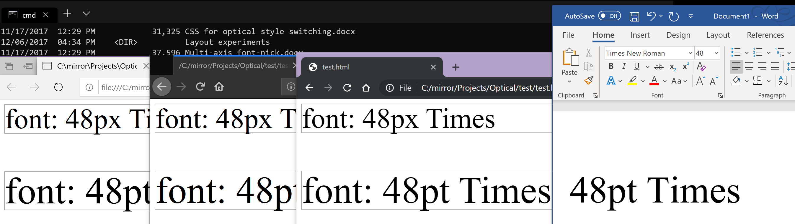
(Left to right: Edge (MSHTML-based), Firefox 69.0.3, Chrome 77.0.3865.120, MS Word win32 build 1911).

The concern I have relates to how fonts are built. Microsoft Sitka has the following styles:

Low (>=) High (<) Style
0 9.7 Small
9.7 13.5 Text
13.5 18.5 Subheading
18.5 23.5 Heading
23.5 27.5 Display
27.5 Banner

When a web developer sets font-size to 12pt (or 16px), it should be using the Text style of Sitka as that's optimized for body sizes (i.e. opsz=12). As I understand it, though, Safari, Firefox, and Chrome will pass 16 for the opsz in both these cases, resulting in Subheading being displayed, degrading the legibility of the font somewhat and deviating from the intention of the font designers. (Matthew Carter and John Hudson spent hours staring at different sizes and styles to determine these numbers, which is partly why they're strange numbers like 9.7).

If my interpretation of how browsers are working is correct, I worry that font designers will be struck with a difficult choice: build your font for the web, or for print - because you'll need different values of opsz for each to get exactly the results you'd like (type designers being a picky lot). They may choose to ship two versions (much to the confusion of their customers), or set values based on web or print depending on what their particular customers tend to use (thus you'll have customer confusion when one type studio caters to print media and another to web).

I hope, however, I'm just thoroughly confused and everything is fine (i.e. 12pt or 16px == opsz 12).

litherum commented 4 years ago

@davelab6

please could you show us this on windows?

Yes, thank you for this suggestion, it was quite illuminating.

Windows Ahem Font Size

Here, no apps state any units, but you can see that the size in the native apps is different than CSS pixels in the browsers. The blue app feeds “48” directly into IDWriteFactory::CreateTextFormat(), whose documentation says:

The logical size of the font in DIP ("device-independent pixel") units. A DIP equals 1/96 inch.

From this result, it appears that the size of a typographical point is different between Windows and macOS / iOS. This is a very interesting result, and I didn't realize it or try on Windows when implementing this. Thanks @davelab6 for the suggestion!

litherum commented 4 years ago

@robmck-ms

When a web developer sets font-size to 12pt (or 16px), it should be using the Text style of Sitka as that's optimized for body sizes (i.e. opsz=12)

This is very interesting. When a web developer sets font-size to 12pt (or 16px) on San Francisco on macOS & iOS, it should be using the optical sizing value of opsz=16.

So, this seems to agree that the size of a typographical point is different depending on which platform you're using.

We're making progress!

Lorp commented 4 years ago

it is regrettable there is no online reference for what 1px (CSS) measures on modern devices.

CSS px is intentionally divorced from physical measurements. Again, see #614

Indeed. My “point” is that the virtual “points” used by Apple and Microsoft have real-world measurements that not only vary just as much as the CSS px, but are also defined differently from each other (with a ratio of 4:3) — and web browsers adopted the Microsoft definition.

tiroj commented 4 years ago

@litherum

When a web developer sets font-size to 12pt (or 16px) on San Francisco, it should be using the optical sizing value of opsz=16.

Font makers are going to be pretty consistent in interpreting a point to = 1/72 inch — that's how a point is defined in the mental space in which we operate, and has been for a long time —, and that's the unit in which we specify values on the opsz axis. If there's a notion of a 'typographical point' in use in CSS or other environments that is different from 1/72 point, than a) that seems a bad idea, and b) y'all are going to need to make scaling calculations to get the correct optical size design from the opsz axis.

If it helps, we could add an explicit statement to the opsz axis spec that 'point' in that context = 1/72 inch.

Crissov commented 4 years ago

Am I reading this thread correctly, in that basically the only fonts that assume px instead of pt for opsz are Apple system fonts?

dberlow commented 4 years ago

Thanks Laurence and Adam for bringing this up. That it comes up again and again I think is the result of not taking issues of web typography on in real time, waiting for things to go wrong and then trying to fix them.

  1. Deciding on and uniting behind 72, and not any of it’s parents, like 72.289, 72.27? And also discounting typographic points that were misrepresented by any system attempting to display typographic points accurately, for any of the many reasons that was done before pixels became smaller, then a lot smaller, than points?

  2. Isn't device ppi desirable remove from quotes, as it is needed to represent the pixels of the users device, so opsz = actual size. Something out of type design scope, like “where the user is sitting” or what OS they use, doesn’t seem like it should be a “forever” issue in web font sizing wars?

  3. Getting actual sizes begins to make the development of more sophisticated self-adjustment of type by users nearly thinkable? I.E. “who the user is”, is the goal for some I know who care for world-script use, to replace the “zooms” we’ve been given with a better opportunity to serve users type they will each like reading?

@tiroj That’s agreed, FB and others join you in making opsz decisions based on typographic points. And we make a series of decisions inside the em, about how points are going to be distributed among glyph measures. This relationship between what is inside of the em, and what was going to happen outside, within 1/10,000”, used to be known and proudly used to make a vast range of things people wanted to read, or see.

That craft has not evolved very well as we can see. Right now, if type needs a small size and a W3C presence, a rut pretty clearly exists where it’s best if everything opaque inside the em is around just one measure that rounds to a minimum of little more than two px, (see default san serif fonts of the world), and that rut is swallowing the design of fonts, logos, and icons.

So I’d like to be onboard en route to discarding the tortured histories of non-standard rounding of 72, non-standard presentaion of what was purported to be 72, personal opinions of other people’s opsz implementations, distance of the user for whatever reason, false reporting of ppi by device manufacturers, and adoption of any of the above by W3C, or in practice there.

What to do to provoke a path to addressing the users’ stated device ppi, via ppi/72 = pts. per pixel or pixels per point? That is the question i want answered that I think “px” alone, or associated in some magically way with an actual size like opsz, does not.

litherum commented 4 years ago

I think I see what's happening.

Font makers are going to be pretty consistent in interpreting a point to = 1/72 inch.

Yes, we agree.

Let's take a trip back in time, before the Web existed, when early Apple computers were being designed. Here, the OS was designed for 72dpi devices, such that one typographical point = 1 pixel on the screen. I don't think this is true for Windows (though someone can correct me if I'm wrong). This design has continued forward to today, and even into iOS, even being generalized from the concept of a pixel into the modern concept of "Cocoa point." Different physical devices are shipped with different physical DPIs because of physical constraints, but the design of the OS has followed this design from the beginning.

Then, the Web was invented, and CSS along with it. Using px as a CSS unit became common. Browsers on the Mac decided to map 1 CSS px to one physical pixel on the screen. This is understandable; it would have been unfortunate if every border sized be an integral number of CSS px ended up being fuzzy on the Mac. The browsers correctly abided by all the ratios listed in CSS, where 1 CSS pt = 4/3 CSS px. So far so good.

Now, we fast forward to today, where we are discussing optical sizing. This is a feature that is defined to be represented in typographical points - specifically not physical pixels or CSS points. macOS and iOS are still designed under the design that one Cocoa point = 1 typographic point. So, if someone was trying to achieve a measurement of 1 typographical point = 1/72 inches (not CSS inches!) on macOS or iOS, the correct way to achieve that would be use a value of one Cocoa point, and the way of representing one Cocoa point in every browser on macOS & iOS is to use 1 CSS pixel.

I can't speak about any other specific OSes, but we can consider a hypothetical OS which was designed where 1 pixel = 1/96 inch = 3/4 typographical points. If someone was trying to achieve a measurement of 1 typographical point = 1/72 inches (not CSS inches!) on this hypothetical OS, the correct way to achieve that would be use a value of 4/3 pixels, and the way of representing 3/4 pixels in the browser might be to use 3/4 CSS pixels.

Crissov commented 4 years ago

The browsers correctly abided by all the ratios listed in CSS, where 1 CSS pt = 4/3 CSS px. So far so good.

Um, actually, some browsers violated the original spec and authors relied on their behavior, so CSS was changed to accommodate them and the rest of the browsers had to follow suit. Originally, pt etc. were truly physical measures on all media.

Crissov commented 4 years ago

If everyone agrees that Open Type for opsz assumes DTP points of 352+7/9 µm, this would require browsers to know the physical dimensions of the output device in order to implement optical size correctly. (This would also make other physical units in CSS more likely. #614)

Only as a fallback, they may assume one of the classic values, i. e. 25400 µm = 1 inch = 72 or 96 device pixel or an integer multiple thereof like 216 (Retina @2x) for desktop screens, or one of the modern values, e.g. 120 ldpi, 160 mdpi/@1x, 240 hdpi, 320 xhdpi/@2x, 480 xxhdpi/@3x and 640 xxxhdpi/@4x for handheld devices.

Unlike pt, browsers then must not scale physical points to fit px, i. e. cinema projection and VR goggles would basically always use, respectively, the largest and smallest optical size.

tiroj commented 4 years ago

Hi Miles,

So, if someone was trying to achieve a measurement of 1 typographical point = 1/72 inches (not CSS inches!) on macOS or iOS, the correct way to achieve that would be use a value of one Cocoa point, and the way of representing one Cocoa point in every browser on macOS & iOS is to use 1 CSS pixel.

Isn't this where it falls apart? You've defined a Cocoa point as =1/72 inch, but a CSS pixel is defined as 1/96 inch. So treating on typographic point as = one Cocoa point but using one CSS pixel to represent one Cocoa point is going to mess up the sizing of anything specified in typographic points.

I'm almost afraid to ask what a 'CSS inch' is. Are you referring to the fact that at lower resolutions there is rounding in display of absolute measurements? Otherwise a CSS inch is the same as a standard inch, no?

[The whole question of how best to implement resolution- and other device-dependent adjustments in OT variations design space is something most people are praying will go away. It may yet need to be better addressed.]

litherum commented 4 years ago

Isn't this where it falls apart?

Not at all. CSS pixels are not defined to have any physical length. A CSS inch is defined to be equal to 96 CSS pixels. It’s up to each UA to pick a size for 1 CSS pixel. All major browsers on the Mac agree to set 1 CSS pixel equal to 1 Cocoa point. The design of the OS models this as equal to 1/72 physical inch (though if you get your ruler out, you’ll find that the physical pixels don’t exactly match this).

Changing Mac browsers to treat 1 CSS pixel as 3/4 Cocoa point would Introduce the behavior the OP is asking for. However, that would 1) change the rendering of every website on the web, confusing users 2) remove interop that is already present, and 3) cause integral-px borders (which are common) to get fuzzy. Changing every website because of optical sizing, which is only used on few websites, doesn’t seem worth it.

If the optical sizing value was defined to be set in CSS points, there would be a different story. However, it is defined to be set in typographic points, and macOS and iOS are correctly honoring that definition.

tiroj commented 4 years ago

A CSS inch is defined to be equal to 96 CSS pixels.

Can you point me to the specification for this, because everything I've found so far suggests the opposite, that a CSS pixel is 1/96 of a standard inch (which is precisely how I recall it being defined when the move was made to make px a non device pixel measurement). I've not found anything that suggests that a CSS inch is derived from 96 CSS pixels, rather than the other way around.

It’s up to each UA to pick a size for 1 CSS pixel. All major browsers on the Mac agree to set 1 CSS pixel equal to 1 Cocoa point. The design of the OS models this as equal to 1/72 physical inch

Let me see if I get this straight:

You're standardising 1 CSS px = 1 Cocoa pt = 1/72 standard inch. Yes?

But 1 CSS px = 1/96 of a CSS inch. Yes?

So, for your OS, 1 CSS inch = 1⅓ standard inch. Yes?

litherum commented 4 years ago

Can you point me to the specification for this

https://drafts.csswg.org/css-values-3/#absolute-lengths

So, for your OS, 1 CSS inch = 1⅓ standard inch. Yes?

Yes! This is a better result than having most borders end up being fuzzy.

tiroj commented 4 years ago

Thanks for the link, Miles. I suppose the concept of the CSS pixel being the canonical unit that enables compatibility between the 'absolute' measurements does sort of imply that they are derived from it, rather than vice versa, but it still seems whacked out that this can inflate the size of these units so far from their standard measurements.

robmck-ms commented 4 years ago

Windows rendering system at its most fundamental level assumes 96 pixels per inch. More accurately: it has the concept of 96 Device Independent Pixels (DIPs) per physical inch.

When Windows boots up, it queries the EDID from each of the displays to get the pixel counts and physical size, computes the physical ppi for the device (96ppi is the floor, so projectors and giant displays are treated as 96ppi). Then, it computes a scale level between the physical ppi and 96DIPs. If your monitor's 96ppi, then you'll be running at a scale of 100%. If 144ppi then 150%. The scale factor is not continuous (e.g. you can't do 107.256%), but is a step function amongst a set of fixed levels (e.g. 100%, 125%, 150%, ...) because there are a lot of bitmaps UI assets in applications and they can't support arbitrary scaling. The user can change this scale factor any time they want in the system display settings.

The nutshell of this is: Windows does a best-effort to get 96DIPs to be one physical inch, but it's not always precisely that. The rest of the rendering stack is based on that.

So, for Windows we can assume the following:

  1. There are 96DIPs in an inch (best effort).
  2. 72 points in the API = 96DIPs
  3. The OS and applications either use API points or DIPs. (I believe browsers generally use DIPs as that's what DirectX is built around).

So, since 72 CSS points = 96 CSS pixels, and (on Windows) 1 CSS pixel = 1 DIP and 96 DIP = 72 API points ~= 72 typographic points (best effort), then it is reasonable for browsers on Windows to use CSS Points (or at least 4/3 CSS pixels) for opsz.

But, actually, all this fuss to get close to 1/72 of an inch on a physical ruler misses a key point:

As I pointed out back in #807, opsz should vary based on the document type size, not the rendered type size. There are a lot of really legitimate reasons for the type size to be completely different than the opsz (e.g. for the severely vision-impared, they may have text rendered at 3 inches high on the screen, yet they absolutely need all the legibility features built into the opsz=12point). But, it should remain consistent within a document.

So, it makes more sense to use the units of the document. For HTML, that's CSS pixels and points (which are already defined in a 96:72 ratio). How those pixels and points map to typographic points, DIPs, or whatever unit system a given OS uses, is, I believe, not relevant as it's outside the context of the document. Within the context of an HTML document, there's only CSS pixels and CSS points. I recommend that opsz be set to CSS points as, within the context of the doc, that's the most relevant measure.

That document-centric view may also be helpful to avoid platform-dependent mapping issues. If browsers relied on underlying OS rules (e.g. 1 CSS pixel = 1 pixel = 1 typographic point; or 96 CSS pixels = 96 DIPs = 72 typographic points), then rendering would also end up being platform-dependent, which I don't think anyone wants, or force all browsers to adopt the underlying rules of only one platform, which I believe is the current state (if I'm not misinterpreting). The document-centric view keeps rendering consistent within the document, affords usability and other scenarios, and keeps everything independent of underlying platform assumptions.

/cc @gr3gh

litherum commented 4 years ago

The biggest difference between https://github.com/w3c/csswg-drafts/issues/807 and this issue is about implementer recommendations vs normative requirements. Our browser on our platforms needs to apply the optical sizing appropriate for the environment. Other behaviors are wrong on our platform.

tiroj commented 4 years ago

Our browser on our platforms needs to apply the optical sizing appropriate for the environment.

That's understandable, and I'm just trying to wrap my head around whether that's actually happening. Simply stated, and with all the usual caveats around resolutions and closest match, will your environment get the opsz instance that most closely matches the physical size of rendered type as expressed in typographical points? Put another way, if I have type that is something like 14pt in measurable size on a device, will an opsz 14pt instance be displayed?

litherum commented 4 years ago

will your environment get the opsz instance that most closely matches the physical size of rendered type as expressed in typographical points?

Yes.

svgeesus commented 4 years ago

From this result, it appears that the size of a typographical point is different between Windows and macOS / iOS. This is a very interesting result, and I didn't realize it or try on Windows when implementing this.

I think this dates back to the original Macintosh (and Lisa?) which had 1/72 inch pixels, specifically so that 1 pixel would equal 1 point. This was way before CSS redefined SI measurement units :) and is also the source of the oft-quoted and wildly anachronistic "screen resolution is 72ppi, printers are 300 ppi" (from the original LaserWriter). Edit: I see several people already pointed this out.

It isn't the case on other systems though, which is why CSS eventually settled on the 1in = 2.54cm = 96px definition in V&U, largely for Web compat reasons.

tiroj commented 4 years ago

Chris,

It isn't the case on other systems though, which is why CSS eventually settled on the 1in = 2.54cm = 96px definition in V&U, largely for Web compat reasons.

There seems to be two different interpretations of that definition, though.

The first would be that a physical inch is divided into 96 CSS pixels, ergo that a CSS px is an absolute measurement value (rendering of that value may not be absolute because of resolution, but that's true of any absolute value).

The second would be that 96 CSS pixels of arbitrary size constitutes a CSS inch (and a CSS 2.54cm!), which is hence also of arbitrary size, and which Apple treats as 1⅓ physical inches by virtue of how they define the size of a px unit.

Is either of these interpretations definitively correct relative to how the units are defined in CSS?

svgeesus commented 4 years ago

The second, as defined here: "All of the absolute length units are compatible, and px is their canonical unit."

litherum commented 4 years ago

Browsers use the arbitrary conversion between OS (typographic) units and CSS units. For example, one of the types of zoom in WebKit is a layout zoom, where we intentionally change the conversion factor between OS and CSS units, thereby redefining each CSS pixels to be a larger amount of typographic points. This type of feature isn’t incorrect; it simply tweaks an implementation-specific conversion value.

robmck-ms commented 4 years ago

Browsers use the arbitrary conversion between OS (typographic) units and CSS units.

@litherum: I think I just got confused. I'd been assuming that the term 'typographic points' you'd used referred to physical points. E.g. if I put a typographer's ruler on the screen, '72 typographic points' would register 72 points or 1 inch on my ruler. But, in the quote above, you say something a bit more nuanced: 'OS (typographic)' that 'typographic points' is an interpretation by an OS and not a physical measure.

robmck-ms commented 4 years ago

To wrap my head around all this, I did some testing to see what values of opsz browsers were using and how they actually render on screen. Quick summary: Macos is using unexpected values for opsz, and does not render 72pt at 72 physical points on-screen as measured with a ruler (in fact, it's 54pt which is 3/4 of 72, which may be interesting here). Windows Firefox uses values of opsz that are based on css px, while MSHTML-based Edge sets opsz based on css pt. All the Windows browsers render 72pt as 72 physical points as measured on screen with a ruler. (96dpi monitor with the OS at 100% scaling).

Test environment

I created a new version of Selawik Variable Test that adds an opsz axis. This font includes ligature glyphs that will show parameters that were given to the rasterizer (this comes thanks to some clever hinting tricks by @gr3gh, with tips from @nedley so that the hints execute even on macos), documented here. The new version of Selawik Variable Test is here.

The opsz axis in this font doesn't have any visual differences (the fvar table is the only table that it appears in). However, if you use the \axis2 ligature, then it will show you the normalized opsz coordinate used to render the font. The axis is defined as being from 0 to 100, which means the normalized coordinate is just the opsz coordinate / 100. (Note: there may be rounding errors due to axis coordinates being 2.14 fixed-point internally, thus the \axis2hex ligature gives you the exact normalized 2.14 value).

For measuring physical type size, you can also use the em-dash in Selawik as this glyph is the full UPM width. (Theoretically, you can also measure the distance between an ascender and descender, but you have to account for the difference between vertical metrics in the font and it's UPM value, so the length of the emdash is easier).

I've created a codepen for everyone to use to try out this font on various browsers and OSes: https://codepen.io/robmck/pen/GRREgzG (Thanks to @lorp for hosting the font).

Now here's the interesting bits:

Windows

image

image

image

macos

image

image

image

Thoughts

I had hoped there'd be more commonality here. Both opsz values and physical sizes differ.

From CSS/web folks, what would be expected here?

behdad commented 4 years ago

This is clearly true: Safari, Firefox, Chrome, Pages, Microsoft Word, raw Core Text, and TextEdit all agree. Here is an image of Ahem rendered in all of those using a size of 48 typographic points:

This basically means: Safari f#cked up, and Firefox and Chrome matched it. Doesn't make your claim true. :)

litherum commented 4 years ago

@robmck-ms

I'd been assuming that the term 'typographic points' you'd used referred to physical points. E.g. if I put a typographer's ruler on the screen

No. There are 3 distinct coordinate systems here:

  1. CSS Units
  2. OS / Typographical Units
  3. Physical Units (as measured with a ruler)

The conversion between 1 and 2 is arbitrary, and browser features ("layout zoom") have even been built on top of this arbitrary conversion.

The conversion between 2 and 3 is arbitrary, because manufacturing processes are physical, constrained phenomena.

Optical sizing occurs in the 2nd coordinate system, because it has to match the rest of the system. I make no claims about anything that happens in the 3rd coordinate system.

litherum commented 4 years ago

@behdad

Safari f#cked up

Please use civil language.

Also, we did not "f#ck" up. The fact that OS / typographic points match across the whole system, in browsers and in native apps, is a feature.

behdad commented 4 years ago

@litherum

Please use civil language.

You are right. I apologize.

Also, we did not "f#ck" up. The fact that OS / typographic points match across the whole system, in browsers and in native apps, is a feature.

What I'm saying is that had Safari chosen to match CSS points, not pixels, to CoreText points, then everything would have still lined up and we wouldn't be having this conversation.

litherum commented 4 years ago

If Safari matched CSS points, it would be incorrect on macOS and iOS. In fact, we used to do it wrong, and I fixed it in https://bugs.webkit.org/show_bug.cgi?id=197528

robmck-ms commented 4 years ago

It seems like there are two issues here:

1) The size that text is rendered 2) What value to set opsz to for a given size

For the first issue, the web community has gone through an enormous amount of work to carefully define units, sizes, etc to get this right, and has done so. E.g. as @litherum describes, on macos and ios, 1 CSS px = 1 CoreText pixel = 1 macos typographic point. That is exactly the right choice to ensure text size rendering across all applications on macos and ios. Similarly folks have analogous choices to maintain text size consistency on other platforms. None of this could or should change.

So we come to the second issue: what is the implementation recommendation for the value to set opsz to for a given text size in CSS, which can be defined in myriad ways, but ultimately comes down to CSS px? Safari's implementation (and FireFox and I believe Chrome following in suit) is to set opsz = px. This recommendation is consistent on macos because opsz is defined in terms of points, and macos typographic points = CSS px. To ensure cross-platform consistency, then other browsers on other platforms would have to follow suit and set opsz=CSS px, even though the assumption this is based on (CSS px = OS point) is not true.

I've several concerns with this approach:

1) There is no way for a font maker to make a single font that works the same in print as it does on the web. For example, many font makes have customers in the magazine, newspaper and book publishing world (as well as advertising), who care very much that print matches web. With the above recommendation, text at the same nominal size (e.g. 20pt) will look different between web and print. To satisfy their customers, font makers would have to issue two versions of the font - one for print, and one with opsz scaled by 3/4 for the web (and managing two versions of the same font isn't a great compromise for customers, either - especially since one of the selling points of variable fonts is simplifying the number of font files you have to deal with). An alternative implementation is for the W3C to ratify @lorp and @twardoch's proposal so foundries can tell their customers to go always set this property in CSS.

2) If designers don't know to apply the correction to fonts with an opsz axis built as the OpenType specification defines, then it negatively impacts legibility. The font will render with a higher effective opsz, which biases the font away from legibility and towards personality. In reading, legibility is everything.

3) This recommendation does not implement the OpenType specification as the specification was intended. As someone who worked the OpenType spec, I would love for the OpenType world and the CSS world to be able to work smoothly together, the two specifications complimenting each other. It doesn't feel so smooth right now. (But perhaps that's natural as we're all learning each other's context, assumptions, immutables, etc).

So, here is my proposal:

First, we must not make any changes to the fundamental assumptions that have already been made for text sizing. Macos will still have 1 CSS px = 1 CT px = 1 macos typo pt, as it should be, and analogously in other platforms. Second, the implementation recommendation would be that browser set the value of opsz to 4/3 of CSS px. As I understand it, the CSS px is the fundamental, common unit, so we relate the recommendation to it and not "point" as it is too varied in definition and implementation (CSS point, macos point, windows point, UK point, European point, ...).

By doing this, print matches the web; legibility is maintained; and the CSS specification and OpenType specifications are in harmony (as opposed to dissonance we are experiencing in this thread).

Failing that, then we still need some other solution. W3C could adopt @lorp and @twardoch's proposal, as it's a lovely compromise. But, I know I'd have to recommend everyone set font-optical-sizing to 0.75 to make fonts work, and the engineer in me cringes at the idea of having a solution in which everyone sets X to Y to work well. But perhaps there is another solution?

davelab6 commented 4 years ago

https://twitter.com/kakurady/status/1189116778519105537?s=19

litherum commented 4 years ago

Why not just have browsers on each OS honor their OS's design? Browsers on macOS and iOS should match the typographical conventions of that OS, and browsers on other OSes should match the typographical conventions of those other OSes. Font creators can rely on the expectation that opsz is set to the font size in typographical points.

I believe your proposal requires text on macOS / iOS drawn in a browser looking different than text drawn in a native app at identical sizes. This would be extremely unfortunate.

Crissov commented 4 years ago

@robmck-ms Is this a correct tabular summary of your test results?

OS Browser / Engine opsz @ 72pt opsz @ 72px 1in / 1 inch
macOS all ~96 ~54 ~75%
iOS Safari / WebKit ~96? ~54? ~75%?
Windows non-browser 72? 54? ~100%?
Windows Edge / MSHTML 72 54 ~100%
Windows Firefox / Gecko 96 72 ~100%
Windows Chrome / Chromium 96 (100) 72 (100) ~100%
Windows Safari / Webkit ~96? ~54? ~75%?
Android Chrome / Chromium 96? 72? ~100%?

(I tried the Codepen in Chrome on Android, but either opsz or TTF did not work.)

robmck-ms commented 4 years ago

@robmck-ms Is this a correct tabular summary of your test results?

Mostly, yes, but some updates below:

For macos: I discovered that the avar table in the font was causing some problems on macos, so I removed it, and updated the URL in the codepen. (The avar table is not relevant to this test, so unnecessary) This accounts for the strange numbers I saw for macos, and brings us within rounding error of what I'd expect:

OS Browser / Engine opsz @ 72pt opsz @ 72px 1in / 1 inch
macos all 95.996 72 ~75%

Currently, there is no "Windows non-browser" line yet as browsers are the only applications that currently support automatic optical size. (DirectWrite does not have an API specifically for optical size selection because it's concidered an app-level decision as it has the context of the rendering intent (e.g. it knows if its zooming or not)). If/when Office supports automatic optical size, it will be based on the point size of the text in the document.

I didn't test Windows / Safari as I didn't think there was such a thing anymore. Is there? I couldn't find a Windows webkit build.

I tried the codepen on my Android phone. The text size in landscape is much different than portrait, so I don't know what to use as a baseline, so I didn't report on Android. I added a third line to the codepen that forces opsz to 50 to verify that the font does work on Android.

robmck-ms commented 4 years ago

Why not just have browsers on each OS honor their OS's design?

That's an important question. Paraphrased: why break consistency with other apps on the OS (especially after so much work went into getting the text size the same)?

Ultimately if you maintain that consistency, and the web follows the macos convention, then legibility will be reduced (due to using higher opsz than designed), and it will not be possible to build one font that works on both web and print.

But, I think you already have a consistency problem anyway: Safari will set opsz=16 for 12pt. Will TextEdit or Pages use opsz=16? I would expect that they would just call CoreText with 12pt, and since CoreText thinks 1pt = 1pixel (and has no 4:3 bulit into it), won't it use opsz=12? If so, native apps on macos will use opsz=pt, because there's no 4:3 mapping, while Safari uses opsz=4/3pt. That means the optical style will differ between Safari and these apps, despite them being rendered at the same physical size.

Looking beyond that, any app that considers print a primary endpoint (e.g. Microsoft Office, Adobe InDesign, Pages?...) will likely use the document point size for automatic optical size. I.e. 12pt text will use 12 opsz. (If/when Office supports automatic optical size, this is what we will do). When it comes to print, there's realy no other option: there is no other unit analogous to CSS px to fall back on (there is no device-independent pixel in print), and the output is always consistent (12pt is exactly 12/72"). So, between these apps and Safari, all set to 100% zoom, you'll have consistency in physical size, but inconsistency in optical style.

(It's worth noting that when I talk about print, I'm not just talking about printing a Word doc on your laser printer; I'm including the whole print industry - books, magazines, newspapers, advertising, packaging, etc. They're all run on applications that run on Windows and MacOS (more often on the latter)).

Ultimately, then, it looks like there's a tradeoff: On one hand: internal consistency on a given platform; on the other: legibility and the ability to make one font that works the same in print and web. If internal consistency is possible (I don't know that it is), is improving legibility and enabling one font to server print and web worth breaking that consistency? Or flipped: Is maintaining internal consistency worth reducing legibility and requiring print & web fonts to be built differently?

robmck-ms commented 4 years ago

Side note: it's not strictly possible to have each browser support the OSes typographic conventions: To do so, macos browsers would all set opsz=16 for 12pt since one macos point is 1 CSS px, thus 4/3 CSS pt, and Windows browsers should set opsz=12 for 12pt since on 1 OS point = CSS point and 1 DIP = 1 CSS px. Of course, we can't do that because we wouldn't have cross-platform consistency. I believe this is why Firefox chose to have consistency, by supporting the macos typographic convention on all platforms, even Windows. That's not strictly honoring the host OS convention, but honoring the macos convention.

I guess my proposal comes down to this: do you set opsz to one OS point, or one CSS point? The former might have internal consistency on macos, but is inconsistent with print-based applications and, strictly speaking, browsers on other OSes (unless they adopt one macos point). The latter would be consistent amongst other OSes and print apps, but forces macos to break consistency and adopt a Windows point.

The real culprit is history: if the web had adopted macos conventions, then we'd be having this exact same conversation, with the roles swapped.