Open Lorp opened 5 years ago
Perhaps I should say 'quantization' rather than 'rasterization' as the point is that the glyph outline design (what I just called the '1000 UPM grid') is resolved to a 'css px' grid, that has a varying "resolution", and that grid, not a physical size, is what MUST be targeted - because the actual physical size has been abstracted away, along with ppem raster sizes and real pixels.
And yet it isn't really abstracted away, because there is an actual physical size to a piece of text that is displayed to a reader. There may be difficulties in determining what that size is going to be from an upstream perspective, given the variety of devices, platforms, libraries involved, and there may even be difficulties in determining what that size is, given the variety of resolutions involved. But the text is an actual, physical size, which is what the optics of the reader is seeing, and which optical size is supposed to address. If it really can't address that physical size any more, maybe the thing to do — given all those givens — is to throw out the concept of optical size as it is currently understood by type designers and typographers, to throw out all the analogues to size-specific metal fonts, and to instead embrace a more vague, less size-specific concept of 'size tuning' of design: smallest, smaller, small, smallish.... That suggests the possibility of a properly abstracted ‘size’ axis scale like that we have for wght, in which CSS might define what big round number equals 'Smallest' then 'Smaller' etc.. Then we could stop worrying about points and pixels, and just avar map our design spaces to the abstract scale.
The opsz scale HAS ALREADY been redefined to use 'px' as a unit.
What we disagree about, I think, is the implication of that decision. It isn't just a change to a different unit, but from an absolute, physical unit to an uncertain flexi-unit. Redefining the opsz scale to use px as a unit means redefining it as not optical. Yes, we can say that Mac OS is the oddity in the way it makes a kind of px and a kind of pt equivalent, and hence the size of px on that platform vs other platforms, but I'm not left with any reassurance that it is the only oddity or will remain the only oddity. Once you have a flexi-unit, you really can't make any assumptions or predictions.
that an actual inch is 96 device pixels
Not device pixels: abstract pixels (unless one happens to be using a 96 ppi device).
If the display device is anchored on physical units, an actual inch is exactly 1in
is exactly 96px
(and pixels may be meaningless in that environment otherwise). However, screens are the predominant output medium for browsers and they are anchored on a logical to physical pixel ratio. This, in fact, is an optical measure because unlike physical size it already factors in typical viewing distances. opsz
retains the type designerʼs illusion (or, put nicer: informed assumption) that the physical size of the text using their font tells them something about the available output device resolution (e.g. re ink sinks) or its textual role (e.g. heading) in advance. It hardly does.
John: "Once you have a flexi-unit, you really can't make any assumptions or predictions."
Yes, you can't. You have a flexi-unitized distance of user, and size of the font, and weight, contrast and width.
And as Type Size in the world at large is a standard based on other standards, and lots of other sized things have other units systems also based on those standards. So, we are here conversing about CSS not having the ability to represent any of those standards or their offshoots, or know how much they are scaled.
On Wed, May 27, 2020 at 5:57 PM John Hudson notifications@github.com wrote:
Perhaps I should say 'quantization' rather than 'rasterization' as the point is that the glyph outline design (what I just called the '1000 UPM grid') is resolved to a 'css px' grid, that has a varying "resolution", and that grid, not a physical size, is what MUST be targeted - because the actual physical size has been abstracted away, along with ppem raster sizes and real pixels.
And yet it isn't really abstracted away, because there is an actual physical size to a piece of text that is displayed to a reader. There may be difficulties in determining what that size is going to be from an upstream perspective, given the variety of devices, platforms, libraries involved, and there may even be difficulties in determining what that size is, given the variety of resolutions involved. But the text is an actual, physical size, which is what the optics of the reader is seeing, and which optical size is supposed to address. If it really can't address that physical size any more, maybe the thing to do — given all those givens — is to throw out the concept of optical size as it is currently understood by type designers and typographers, to throw out all the analogues to size-specific metal fonts, and to instead embrace a more vague, less size-specific concept of 'size tuning' of design: smallest, smaller, small, smallish.... That suggests the possibility of a properly abstracted ‘size’ axis scale like that we have for wght, in which CSS might define what big round number equals 'Smallest' then 'Smaller' etc.. Then we could stop worrying about points and pixels, and just avar map our design spaces to the abstract scale.
The opsz scale HAS ALREADY been redefined to use 'px' as a unit.
What we disagree about, I think, is the implication of that decision. It isn't just a change to a different unit, but from an absolute, physical unit to an uncertain flexi-unit. Redefining the opsz scale to use px as a unit means redefining it as not optical. Yes, we can say that Mac OS is the oddity in the way it makes a kind of px and a kind of pt equivalent, and hence the size of px on that platform vs other platforms, but I'm not left with any reassurance that it is the only oddity or will remain the only oddity. Once you have a flexi-unit, you really can't make any assumptions or predictions.
— You are receiving this because you were mentioned. Reply to this email directly, view it on GitHub https://github.com/w3c/csswg-drafts/issues/4430#issuecomment-634964196, or unsubscribe https://github.com/notifications/unsubscribe-auth/AAO5VDXE6I4DYZ5PEAB3AVDRTWEDRANCNFSM4JBXYCMQ .
But the text is an actual, physical size, which is what the optics of the reader is seeing, and which optical size is supposed to address.
Per Miles in 2017, there are 4 different zoom modes in Safari (https://github.com/w3c/csswg-drafts/issues/807#issuecomment-285703481), so while it is trivially true that any text is an actual, physical size, the 'logical' size is what optical size is supposed to address. Highway signage has letters physically a meter tall, but they are logically small-size and closer to caption or dictionary letters.
What we disagree about, I think, is the implication of that decision. It isn't just a change to a different unit, but from an absolute, physical unit to an uncertain flexi-unit.
Do you agree that the flexi part is handled by font-optical-sizing: FLOAT
?
Redefining the opsz scale to use px as a unit means redefining it as not optical. Yes, we can say that Mac OS is the oddity in the way it makes a kind of px and a kind of pt equivalent, and hence the size of px on that platform vs other platforms, but I'm not left with any reassurance that it is the only oddity or will remain the only oddity.
Sure, but that's why the proposal is for extending font-optical-sizing
to accept a FLOAT number value, and not merely extending the ENUM values from auto, none, inherit, initial, unset
, to include apple
, and then have to extend it as more oddities become culturally significant enough to warrant inclusion.
Once you have a flexi-unit, you really can't make any assumptions or predictions.
Yes, you can; you can predict what a 1000 UPM glyph drawing will do when quantized to a 12 css px size grid and a 16 css px size grid and a 144 css px size grid.
that an actual inch is 96 device pixels
Not device pixels: abstract pixels (unless one happens to be using a 96 ppi device).
Right, which is increasingly rarely the case, but because the number of device pixels is very rarely lower, but rather more and more increasing, this doesn't matter, because the 96 abstract pixels per inch look better and better.
If the display device is anchored on physical units, an actual inch is exactly
1in
is exactly96px
(and pixels may be meaningless in that environment otherwise)
No, the assumption that there are 96px to a physical inch has almost never been true. Eg https://en.wikipedia.org/wiki/Dot_pitch
opsz
retains the type designerʼs illusion (or, put nicer: informed assumption) that the physical size of the text using their font tells them something about the available output device resolution (e.g. re ink sinks) or its textual role (e.g. heading) in advance. It hardly does.
Yes, totally :)
If a digital graphics system does allow "the ability to represent any of those [ 'in the world at large' ] standards or their offshoots, or know how much they are scaled," there will be a lot of fuzzy graphics.
opsz retains the type designerʼs illusion (or, put nicer: informed assumption) that the physical size of the text using their font tells them something about the available output device resolution (e.g. re ink sinks) or its textual role (e.g. heading) in advance.
I disagree. The whole point of opsz as currently defined is that it isolates size specific design from thing like resolution and typographic role, in such a way that those can be handled orthogonally (in terms of variable font design space, this might be literally orthogonally). So, for example, I recently delivered Text and Display versions of a typeface to a client, but these are stylistic variants intended for different typographic roles, not opsz variants of a single style. Similarly, the presence and size of ink traps or grade variations is not primarily a matter of size-specific design but of output medium. So if I were building a variable font that I wanted to have control of stylistic features appropriate to different typographic uses, and functional features appropriate to different output media (including possibly different kinds of features for digital display vs print media), I would want those to be independent of the opsz features, the latter being a kind of ideal of size-specific design for high resolution display and high quality offset printing or whatever medium is the target output of a particular project. So opsz doesn't provide a grab-all of features covering typographic role, output resolution, etc., but rather a starting point to which those kinds of features can then be applied.
However, screens are the predominant output medium for browsers and they are anchored on a logical to physical pixel ratio. This, in fact, is an optical measure because unlike physical size it already factors in typical viewing distances.
Type designers are also factoring in typical viewing distances when we design for physical size. The adjustments we make for 6pt type vs 36pt type are based on either typical reading distances, or on specific distances if we're designing for e.g. electronic signage displays to be installed in a known location.
I'm perfectly okay with the concept of type size anchored on a logical to physical pixel ratio that factors in typical viewing distances. I'm just concerned that this should give type designers a fixed target for optical size-specific design, and this seems to me to be in everyone's interest, because that last thing we should want is some type designers making opsz for Windows, and some for Mac OS, and others for Android. If different platforms are going to handle the logical to physical ratio differently, we'd still want the opsz design work to be based on a common set of 'informed assumptions'.
Ideally there would have been an axis for optical size used only in print, and a separate axis for document size or typographical role used on screens and in print.
Since standardizing a new axis and changing browsers and already-released San Francisco is unlikely to happen, the opsz axis is probably going to remain about document size or typographical role on the web (and non-web graphical interfaces). The question is then whether the opsz axis should also be about document size or typographical role in print, which means giving up on optical size entirely (and making the name of the axis a lie), or should be about optical size in print, which means different fonts are needed for web and print.
In both cases, numerical values in font-optical-sizing are useful. What the opsz axis means in print hardly seems within the purview of the CSS Fonts module.
Or am I wrong and is it worth trying to get an approximation of optical size on the web anyway?
It looks like you're at the point in this debate where you're considering that you need some sort of unit based on an actual, physical measurement, rather than something nominal like a CSS pixel? If so that's currently a dead end. See https://github.com/w3c/csswg-drafts/issues/614.
See #614
I think this is highly relevant thread, and I encourage anyone reading this issue who has not read that issue to do so in its entirety! :)
I myself had not caught up on the latest (2020) comments there, and the most recent one proposes:
On the pages where you need the accurate length ... set a
--unit-scale: 1.07;
(subbing in the real value) property on thehtml
element [ with the ratio of css cm to physical cm on your device and then ] instead ofwidth: 5cm;
, writewidth: calc(5cm * var(--unit-scale, 1));
.
This for me is very exciting, is very similar to this proposal :)
It seems to me, the best one could do in redefining the opsz scale to use 'px' as a unit would be to apply a special definition of that unit as being 1/96 of a physical inch, which I suppose would address what some browsers are doing now while still providing type designers with an absolute size target.
I think that might be a practical compromise... -if- MS was going to stick hard to the idea that opsz units
should be interpreted as physical units size values. But! :) https://docs.microsoft.com/en-us/typography/opentype/spec/dvaraxistag_opsz says, bold emphasis mine:
The scale for the Optical size axis is text size in points. For these purposes, the text size is as determined by the document or application for its intended use; the actual physical size on a display may be different due to document or application zoom settings or intended viewing distance.
So it seems the existing OpenType 1.8 Spec already acknowledges that "points" is not actually physical points at all, but CSS Points or MS Word Points and so on.
No, that is not what that statement means. When we drafted that text we were thinking specifically about zoom and display distance affecting size, as stated, and not about environments applying different definition of 'points' and hence different scaling of size at the same zoom and distance.
It’s surprising to me that throughout this whole convoluted discussion, no one has explicitly proposed the idea of linking the opsz
axis to a unit that is, and always has been, related directly to actual optical size in the most pure sense of relative/angular measurement – e.g. arcminutes, degrees, etc.
The CSS “pixel” (a.k.a. the “reference pixel”) was redefined by the W3C at some point, via reverse justification, to make it an angular measure, at least in theory (~0.0213 degrees). But in practice, if you do any tests for how that works with different devices when viewed at their typical/intended viewing distances, the unfortunate reality is all over the place. Such an unreliable unit isn’t very helpful for the purposes of fine-tuning optical size designs, not to mention being confusing, thanks to the many conflicting definitions of “1 pixel”.
With that in mind, why not invent a new unit of angular measure that corresponds to the perceived size of a physical typographic point when viewed at a typical viewing distance that designers could understand intuitively. The dmm
was proposed for VR scenarios (1dmm
= the perceived size of 1 millimeter when viewed from 1 meter away) … Why not tie opsz
to a new typographic unit (dpt
? oppt
?) that equals, say, 1 physical point when viewed from 16 inches away (i.e. approximately 3 arcminutes)? Something like that would correspond very directly to the idea of pure optical sizing as @tiroj mentioned – separate from resolution, inking, output medium, etc.
As an added bonus, this might also provide new opportunities for addressing the relationship between virtual and physical size (which I have been writing and making tools about for years).
I'd be quite happy with a unit based on 1/3 of a physical point at a viewing distance approximately 16 inches. It is easily translatable to the mental scale of type with which designers are already familiar, while introducing useful concepts of distance and optics.
Most of this discussion has been around how to address what browsers are already doing with the existing scale, which is tied up with existing platform legacies around treatment of points and pixels. Moving to a different, scale unit for opsz is attractive, but means all those browsers and platforms would need to rethink and recode how they make use of the axis. Personally, I think they probably should, but is there any willingness?
We just call "CSS pt" be that physical point. What's wrong with that?
I meant, "angular point".
I support Nick's long term proposal, but there is an immediate, and urgent, need for action now to address the inconsistency of OT spec and entrenched unified browser implementations.
We just call "CSS pt" be that physical point. What's wrong with that?
How big is a CSS pt? I thought it was 1/72 inch, but if some people are defining an inch as 96 flexible px units, I'm past accepting any undefined use of any of these terms.
How big is a CSS pt?
4/3 of a CSS px.
It’s worth noting that the nature of a CSS pt
(as well as px
, in
, cm
, and all the other compatible “absolute” CSS units) actually changes between a fixed/physical measure and a relative/angular measure depending on the context (as if everything wasn’t already confusing enough).
To quote the W3C’s explanation:
For print media at typical viewing distances, the anchor unit should be one of the standard physical units (inches, centimeters, etc). For screen media (including high-resolution devices), low-resolution devices, and devices with unusual viewing distances, it is recommended instead that the anchor unit be the pixel unit. For such devices it is recommended that the pixel unit refer to the whole number of device pixels that best approximates the reference pixel.
So, for print, 1 CSS point should theoretically be the same as 1 traditional, physical point. For screen-based media, 1 CSS point should theoretically be about 0.0284 degrees when viewed from a typical distance. (As I mentioned before, though, the practical realities are very different. Even in print, the absolute CSS units are rarely reliable.)
The point of bringing this up is to show that mapping opsz
to CSS points isn’t exactly the same thing as mapping to an angular measure, and definitely not one that is straightforward, reliable, intuitive, and easy to measure or test against.
If the OpenType spec adapted a more straightforward angular unit for the definition of opsz
, user agents could interpret that value however was most appropriate for them, referencing whatever information they have (or don’t have). The results may vary from one place to another, but at least the design for the typeface can be very intentional and precise, based on a reliable and easily testable optical size. Otherwise, maybe don’t bother calling it “optical size”.
So, for print, 1 CSS point should theoretically be the same as 1 traditional, physical point.
Nope. Only for "print media at typical viewing distances". So, a billboard will be handled the same way that a projector is. Really all it's saying is that "roughly about 72dpi angular at typical distance". That's the most specific one can define without forcing everyone into what they cannot deliver.
I'm past accepting any undefined use of any of these terms.
Luckily, this is defined: https://www.w3.org/TR/css-values/#absolute-lengths
@frivoal The same document that defines these 'absolute lengths' goes on to say that
All of the absolute length units are compatible, and px is their canonical unit.
From which I take it that the actual size of any of these units is ultimately dependent on the size of px, and that can vary quite a lot.
The concept of px is really nice — it's something close to the concept of measuring visual angle, since it ostensibly takes into account viewing distance—, but interpretation and implementation seems more varied than needed for size-specific design for text. Hence, earlier in the thread, I was suggesting that if we were to redefine the unit scale of the opsz axis, we would need to more precisely define it than CSS px seems to be defined, and in effect that means locking in a standard viewing distance, such that one could say e.g. the unit is 1/96 of a standard/industrial/physical inch or, as Nick suggests, a degree of visual angle at that standard distance. That's what we need to be able to do the type design work. If we don't have something that precisely defined, then we're not doing size-specific type design any more.
@nicksherman CSS 1:
Pixel units (…) are relative to the resolution of the canvas, i.e. most often a computer display. If the pixel density of the output device is very different from that of a typical computer display, the UA should rescale pixel values. The suggested reference pixel is the visual angle of one pixel on a device with a pixel density of 90dpi and a distance from the reader of an arm's length. For a nominal arm's length of 28 inches, the visual angle is about 0.0227 degrees.
What was fixed retroactively is the relationship between physical and pixel lengths.
I always thought that 1 arc minute would make a nice unit, as it is the nominal optimum visual acuity. The reference pixel is about 1.362 arcmin. The mentioned 1 mm/m or 1 mrad is about 3.44 arcmin (and is similar to 1/14 pt/in at 3.41 arcmin, while 1/16 pt/in is 0.868 mrad ≈ 2.98 arcmin).
Nope. Only for "print media at typical viewing distances".
Every single css-to-pdf converter I'm aware of maps 1 CSS point to 1 PDF point, which is 1/72inch. I'm aware that printing from a web-browser may not, and I'd consider that a bug.
If you choose to scale that PDF for printing that's well beyond the scope of anything you can solve in this issue. The same goes for any solution that depends on an accurate physical length on screen.
The description of the size of 1px is necessarily approximate. It gives authors, and implementers, a rough idea of how to map 1 CSS pixel to a display. But if you want something with a higher level of accuracy on screen, it's not there¹. In many cases, like projectors or dual monitors, no answer exists. This was the point being made in https://github.com/w3c/csswg-drafts/issues/614.
¹ Not always there. It could be for mobile, where the display hardware is fixed.
On the concept of an angle-subtended basis for text size, some research we did is published in slide form at https://bbc.github.io/csun/how_big_should_subtitles_be/index.html - head to slide 3.5 for a data table, and a few slides on we demonstrate the pain of trying to implement angle-based sizing, and how we ended up going for a rather flawed breakpoint-based design, because that's what we can currently do.
There are two things I think have been pointed out since the beginning about optical sizes that I think are relevant to spend time on. First type designers since the beginning of punch cutting have understood that you can’t control the distance of the user. We are not designing type to be printed on peoples eyeballs, and then we make it smaller. We never have. Claiming distance is now a value to be considered for reading on computer screens is a hoax invented for another purpose.
Second, revaluing an existing system of typographic points, and that’s what’s being discussed, seems to think typographic points are going away, at best, getting confused at least. I’m not sure everyone thinks that’s a good idea, But perhaps that’s how this is the Next attempt to get type sizes right in css, inventIng imaginary values. But, even if one bolted the head of every user to the next invented value, the intended distance is factored by what?, all software has is the supposed scale factor, not the size it’s starting with in a useful value system, like an actual size.
On Jun 2, 2020, at 3:22 PM, John Hudson notifications@github.com wrote:
I'd be quite happy with a unit based on 1/3 of a physical point at a viewing distance approximately 16 inches. It is easily translatable to the mental scale of type with which designers are already familiar, while introducing useful concepts of distance and optics.
Most of this discussion has been around how to address what browsers are already doing with the existing scale, which is tied up with existing platform legacies around treatment of points and pixels. Moving to a different, scale unit for opsz is attractive, but means all those browsers and platforms would need to rethink and recode how they make use of the axis. Personally, I think they probably should, but is there any willingness?
— You are receiving this because you were mentioned. Reply to this email directly, view it on GitHub, or unsubscribe.
I was suggesting that if we were to redefine the unit scale of the opsz axis, we would need to more precisely define it than CSS px seems to be defined, and in effect that means locking in a standard viewing distance, such that one could say e.g. the unit is 1/96 of a standard/industrial/physical inch
Right, that's exactly what I think is appropriate.
Scale interpretation: Values can be interpreted as text size, in points.
Becomes,
Scale interpretation: Values can be interpreted as text sizes in 1/96in. Values can be converted to Points (1/72in) by multiplying 0.75x.
And,
The scale for the Optical size axis is text size in points.
Becomes,
The scale for the Optical size axis is text size in in 1/96in.
If this redefinition of unit scale is made, is the original proposal required? I believe yes because on some systems it is ~1/72in or ~1/54in and CSS authors want to adjust it.
To me, the simplest, most intuitive (and, incidentally, least disruptive) approach would be to just say “1 opsz unit corresponds to an angular measure of 3 arcminutes, the equivalent of 1 typographic point when viewed from a typical viewing distance of about 16 inches”. Simple, easy, done. Browser makers can implement whatever logic they need to translate that into CSS pixels, and fonts that already use a typical interpretation of typographic points for the opsz values will still work as-is.
Dave’s suggested interpretation for the opsz spec is:
Scale interpretation: Values can be interpreted as text sizes in 1/96in. Values can be converted to Points (1/72in) by multiplying 0.75x.
I just wanted to state what may have already been said before: this shifts the temporary complexity of change off of browser & OS developers, but turns it into permanent complexity for type designers & mainstream users. I can see why that is appealing in the short term, but preserving browser similarity in the short term shouldn’t justify user pain in the long run.
Nick’s suggestion is:
1 opsz unit corresponds to an angular measure of 3 arcminutes, the equivalent of 1 typographic point when viewed from a typical viewing distance of about 16 inches
I agree with the goal of including an interpretation that software/hardware vendors can use. However, I believe this might be simpler to understand & implement if it is modified slightly:
1 opsz unit corresponds to 1 typographic point. This is equal to 4/3 of a CSS px unit, or an angular measure of 3 arcminutes when viewed from a typical viewing distance of about 16 inches.
That is, we should prioritize the simple, actionable measures first, because most readers won’t know how to measure 3 arcminutes at 16 inches. (At least, I certainly don’t. I assume it would involved some trigonometry to calculate 1/72 inch?)
I see, I partly missed the point of Nick’s suggestion.
It prioritizes the angular measure to start based on the idea of being equal to distance, rather than starting from the basis of absolute size.
However, I still do wonder whether it makes sense to lead with that. From what I’ve read so far in the thread, it seems that device makers already do try to set a CSS px unit to absolute sizes that correspond to expected user distance. So, 4/3 px should theoretically already equal 3 arcminutes on a phone, a desktop, and a football-stadium jumbotron.
I assume it would involved some trigonometry to calculate 1/72 inch?
Yes, this is exactly the kind of relative-size calculation @chrissam42 and I made sizecalc.com for.
So, 4/3 px should theoretically already equal 3 arcminutes
That would be nice. However, the CSS spec uses 28 inches as the base viewing distance for its calculations, explicitly defining 1px as “about 0.0213 degrees” (i.e. ~1.278 arcminutes). As such, 4/3px only equals ~1.704 arcminutes.
most readers won’t know how to measure 3 arcminutes at 16 inches
One of the main points of my proposal is users (and even type designers) wouldn't really need to know how to calculate arcminutes if they have an understanding of point sizes when viewed at a typical reading distance.
FYI, there's now discussion of this issue among the ad hoc OTvar stakeholder group, in response to a testing-the-waters proposal I wrote to change the opsz scale unit to 1/96 of a physical inch, as Dave suggests. I'm now leaning away from that option, because after a slow walk through of what Apple is doing, it seems to me that they're actually the ones getting it right, and the fault is in browsers that assume some unit equivalences that apply on the Apple platform can be applied elsewhere. So my current inclination is to update the spec to clarify the meaning of 'point' in the opsz context (as being 1/72 of a physical inch, as elsewhere in the OT spec), and to explicitly state that it is not appropriate to interpret the opsz scale as any other unit, such as CSS px. [I do like Nick's 3 arcminutes suggestion, but wonder if adding references to other units within the spec would confuse rather than clarify.]
This means, of course, that non-conformant browsers will need to be fixed, and hence an effort to log bugs, do a better job of communicating the correct way to implement opsz instance selection, and live with a period of increased variance in behaviour between browsers that get it right and those that don't. The good news is that fonts would not need to be updated, and the relatively small number of shipping fonts with opsz support can help make the case to browser makers that they can fix their current behaviour with minimal impact on websites.
I'm now leaning away from that option, because after a slow walk through of what Apple is doing, it seems to me that they're actually the ones getting it right, and the fault is in browsers that assume some unit equivalences that apply on the Apple platform can be applied elsewhere.
Can you explain? Apple is the one who started passing CSS pixels to opsz
in Safari.
I asked Myles specific questions about what opsz instance selection is being made in a number of different situations on the Apple platform, and in each case Myles' answer, if accurate, indicated that they were treating the opsz unit as 1/72 of a physical inch (or as near as possible given particular displays). On that platform, the way they scale CSS px relative to points means that they can use px equivalence for opsz instance selection, because they treat
1 CSS px = 1 physical pt = 3/4 CSS pt
So if text in the browser were specified at 12 CSS pt, they would be using a 16 opsz instance, because that corresponds to their scaling of the type to match what they do across their platform. Given that scaling, requesting the opsz instance in terms of px is just a convenient way of them getting the appropriate size instance for their platform, i.e. they're not actually treating the opsz unit scale as px, but passing px is the method they use internally to translate opsz units to the scaling of type on their platform.
Where things seem to have gone wrong is in other browser makers not understanding the reason Apple was passing px, and why it wouldn't make sense to do that outside of the Apple platform and its specific scaling behaviour.
John. That doesn't make sense.
So you are suggesting that same browser, same page, same font, should invoke different opsz
value on different operating systems.
So you are suggesting that same browser, same page, same font, should invoke different opsz value on different operating systems.
If the resulting actual size of type displayed is different, yes. That's the whole point of opsz instance selection: it should be as close as possible to the optical size of the text displayed. As Myles pointed out early in the thread, the actual size of the same nominal size text does display at different sizes on different platforms, and displays larger on Mac than on Windows. What platforms are supposed to do with the point unit scale of opsz is to translate to that from whatever scale they use internally to size type, and select an appropriate instance, and since a CSS pt is not necessarily equivalent to the physical point of the opsz scale, that means simply passing CSS pt values to opsz isn't always the appropriate thing to do. So what Apple are doing makes sense because, on their platform, 16 opsz units is the correct selection for the size at which they display 12 CSS pt text. If another platform is displaying 12 CSS pt text at something close to 12 physical points, then that platform should be using the 12 opsz instance. The specified size of the text is the same, but the platforms are differently scaling the type and hence need to use different methods to select an appropriate opsz instance.
I fully agree that it has been a source of confusion to everyone else that Apple chose to do the translation to opsz units in Safari via the expedience of passing px units, rather than expressing the translation as some kind of transformation between units.
they treat
1 CSS px = 1 physical pt
Maybe someone else should also test this, but ...
I don’t think that is even close to true on my Apple devices?
(Unless, perhaps, I am misunderstanding what you mean by “treat as equal.” I guess maybe there could be some kind of argument that a user tends to be closer to a laptop screen than to a printed page, and therefore treating as equal is attempting to match arc radians? Annecdotally, however, the opposite is true for me: I tend to read papers from maybe 16"–20" away, but I sit about 32" from my screen.)
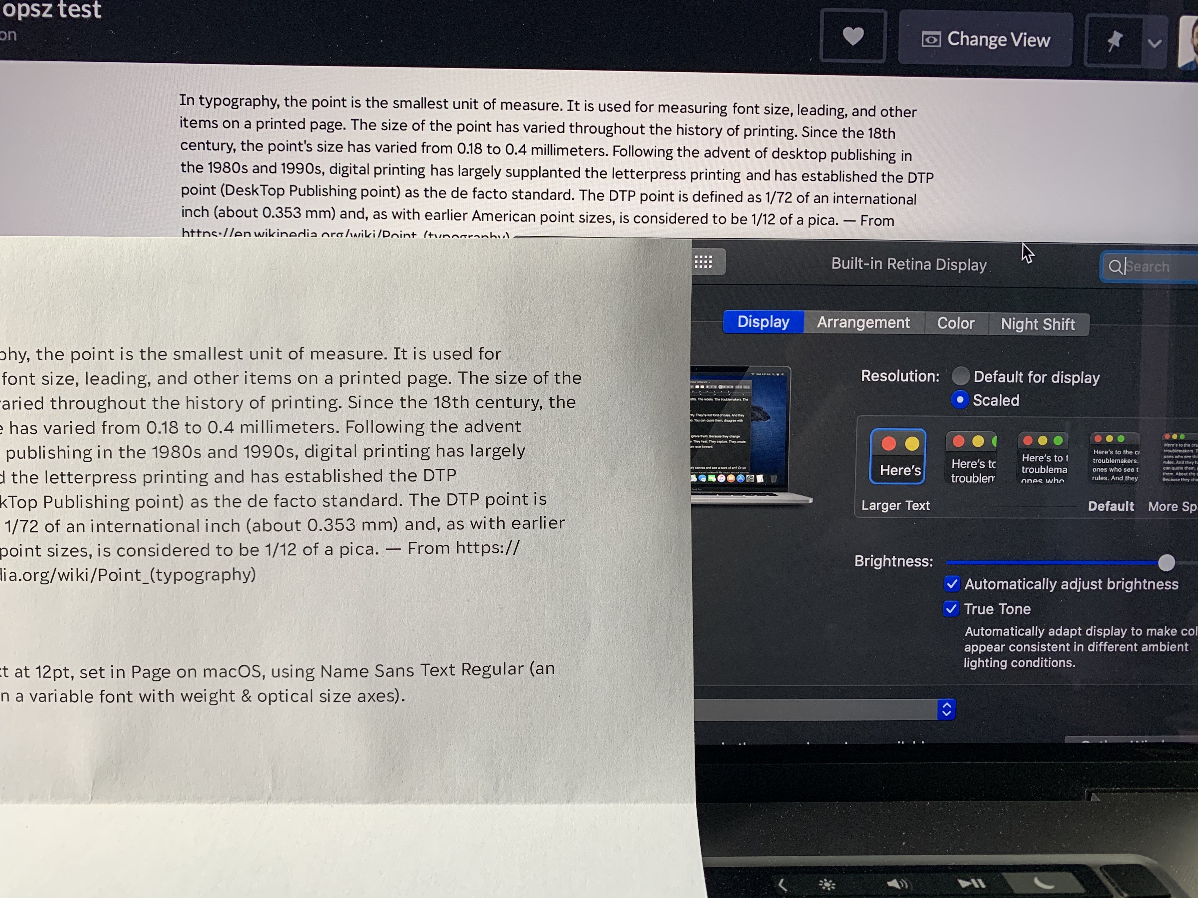
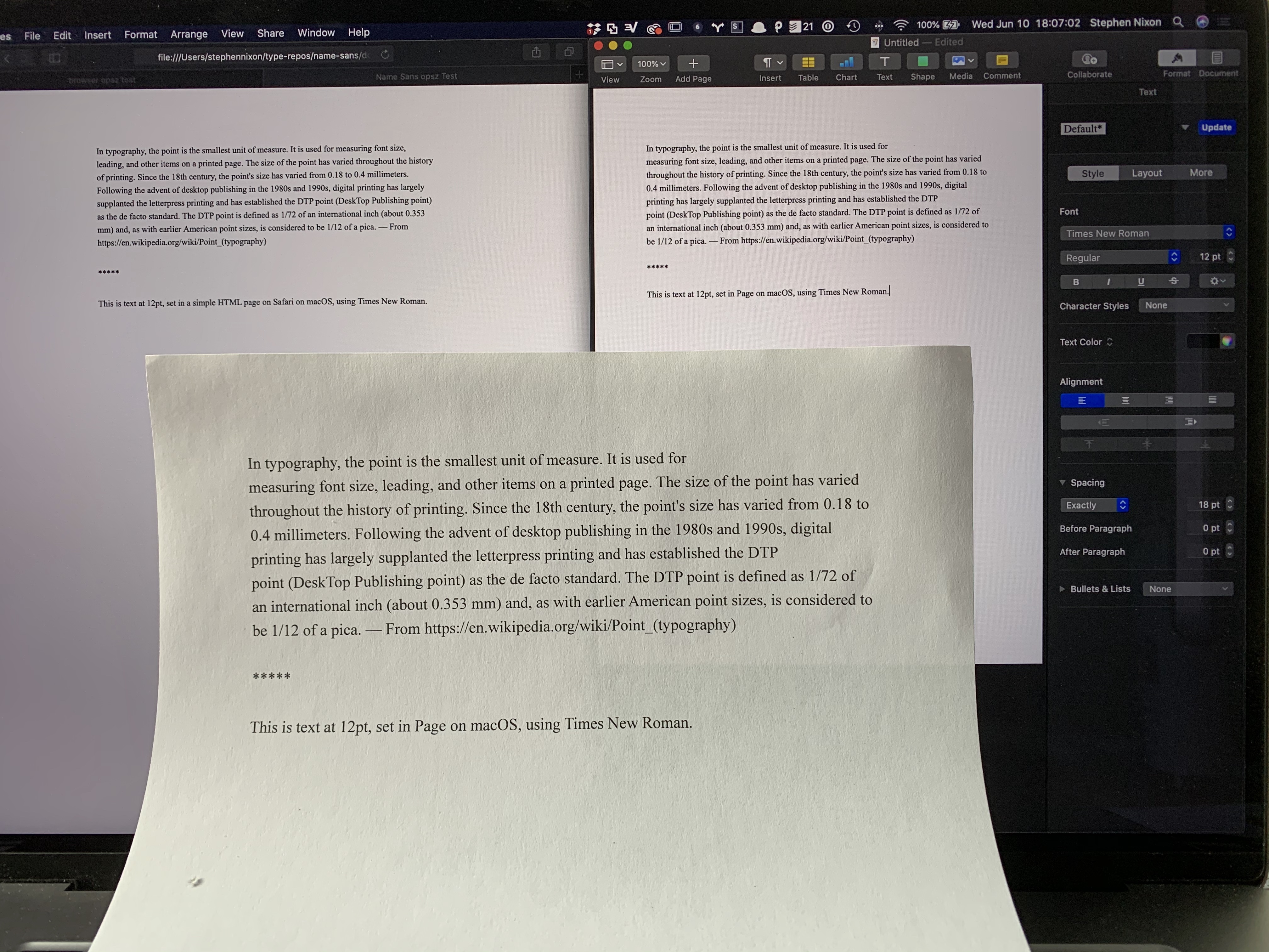
Below is a photo comparing:
initial-scale=1
in the head
)The rendered font size of text really is consistent between the 12px in Safari & 12pt in Pages (sorry, I didn’t properly match the line height, but I checked with a screen capture overlay). However, 12px on the iPhone is far smaller, and 12pt on a printed page is far larger.
Even if I scale up my MBP display to its largest setting, the 12px type is still quite a bit smaller than 12pt printed text.
The closest I can get to a screen:physical match is if I 1) scale to the second-largest screen setting and 2) set the CSS to 12pt. But, even then, the printed size is still slightly larger.
Just to be sure this wasn’t some weird inconsistency in my own font, I also tested it with Times New Roman. Again, the apps match 12px/12pt on the same screen, but the physical size of printed 12pt text is about double the physical size of text on screen.
Or, have I completely missed the point of what you and Myles meant?
I guess maybe there could be some kind of argument that a user tends to be closer to a laptop screen than to a printed page, and therefore treating as equal is attempting to match arc radians?
@arrowtype Based on our user testing results I would make exactly that argument.
they treat
1 CSS px = 1 physical pt
Maybe someone else should also test this, but ...
I don’t think that is even close to true on my Apple devices?
The core issue here is that on the one hand, John Hudson, David Berlow, Eben Sorkin, and presumably all other type designers, are designing opsz masters by looking at them in proofs printed where Points are 1/72 of a physical inch, and setting opsz values appropriately based on that. On the other hand, browsers are all using opsz values directly as CSS px values.
Per your evidence, "12pt" is massively inconsistent everywhere.
But is a 36 css px square massively inconsistent everywhere when measured on common devices with a ruler? That has certainly been my assumption, but I haven't tested it.
If this is true, then it seems to me that type designers should carry on designing and calibrating their opsz units for the absolute size of print media, and just let the chips fall where they may with web font rendering; and the OP proposal will be needed for authors who care to get it right.
If it is not true, then I am back to thinking that opsz units ought to be calibrated to that size.
At the risk of adding more grit and less light - I have been looking at print too but in the main I have been really deciding about opsz on screen with my face about a foot from the screen and using InDesign + Chrome. The reason was that I am expecting the most critical use will be in a browser.
I do think that calculating arc radians based on distance is the best way even if it is a complex thing to do and arguably a bit fuzzy. I say this because I think that it is the best map of the human experience of our type which is what I hope the type I make serves in some way.
Thanks for the insights, Eben. I'm working on some draft wording for a clarified opsz axis specification that makes clearer how to implement it, and may also provide some suggestions for how type designers can approach size-specific design with an eye to interoperability. The trouble with using screen as a base for the latter is that there are too many variables that can have a significant effect on physical size across devices and platforms. So while we all spend time testing our fonts on screen, we need a common target for size-specific design that has fewer variables, which implies e.g. a common or minimum resolution, a reference distance, and a physical scale unit. My intent is to be able to provide a solid base for implementors to make opsz instance selection based on all the available information in any given circumstances — which could ideally include nominal size on platform, device, resolution, and distance — which means among other things having a presumed distance targeted by design. I think it's probably something like print at 16 inches, but am talking with colleagues to see what distance or distance range people are actually using.
Thanks very much for doing that. If the result is something that offers one (or multiple) procedures or recipes to arrive at a common calibrated result that would be wonderful.
For what it’s worth – if it’s helpful for factoring in angular measures to the context of an official spec – the German DIN standards for font sizing recommendations are based on angular measurement.
<aside> Recommended minimum legible font sizes in DIN 1450 are indeed based upon angles, as are ergonomic character heights in ISO 9241 Parts 30x.
DIN 1450 also prefers ex-height over em-height to specify font sizes (which CSS needs font-size-adjust
for), but it also offers a mapping table to millimeters and pica points.
Signalisationstext (public signs) | Konsultationstext (notes, captions, legends) | Lesetext (main, body, paragraph) | Schautext (headings, titles) | ||
---|---|---|---|---|---|
m | x-height, 1ex |
9′– | 10′– | 13′– | 20′– |
g | stroke width | 0.17ex–0.20ex | 0.13ex–0.20ex | 0.10ex–0.20ex | — |
h | hairline width | 0.12ex–0.19ex | 0.06ex–0.19ex | 0.04ex–0.19ex | — |
n | font width | 0.45ex–0.55ex | 0.48ex–0.58ex | 0.40ex–0.60ex | — |
a | character spacing, 1en |
0.45ex–0.55ex | 0.40ex–0.60ex | 0.35ex–0.65ex | — |
f | serif spacing | — | 0.10ex | 0.05ex | — |
Reading distance | Signalisationstext (public signs) | Konsultationstext (notes, captions, legends) | Lesetext (main, body, paragraph) | Schautext (headings, titles) |
---|---|---|---|---|
0.4 m | 2.75mm = 7pt | 3.5mm = 9pt | — | |
1 m | 5.25mm = 15pt | 6.25mm = 17.5pt | 8mm = 23pt | — |
2 m | 10.5mm = 30pt | 12mm = 35pt | 16mm = 45pt | — |
4 m | 21mm = 60pt | 25mm = 70pt | 32mm = 90pt | — |
10 m | 53mm = 150pt | — | — | — |
40 m | 212mm = 600pt | — | — | — |
100 m | 530mm = 1500pt | — | — | — |
ISO 9241 assumes a preferred viewing distance for desktop monitors of 600 mm, varying from 450 mm to 750 mm with a minimum viewing distance for adults of 300 mm. Usual LCG character heights are then 20′ to 22′ with a minimum of 16′ and a maximum of about 30′, whereas typical CJK character heights are 25′ to 35′ with a minimum of 20′. On an ideal, paper-like display, the LCG minimum could be as low as 10′ to 12′. ISO 24509, on the other hand, estimates minimum legible font sizes by age (for visual acuity), distance, luminance level, contrast, font type (serif/sans-serif) and writing system (alphabetic/syllabic/logographic), which results in vast tables which have been implemented in an online tool by AIST that is referenced in the standard.
So you are suggesting that same browser, same page, same font, should invoke different opsz value on different operating systems.
If the resulting actual size of type displayed is different, yes.
How does (or should) this interact with page zoom in browsers? If I hit Cmd-+
to zoom a webpage that uses optically-sized fonts, should the browser use a new opsz
value to account for the new physical size?
What about if I pinch-zoom the display on a mobile device?
The opsz axis definition already states
In applications that automatically select an Optical size variant, this should normally be done based on the text size with a default or “100%” zoom level, not on a combination of text size and zoom level.
I am working on proposed revision to the axis definition text to clarify some things, but this statement or something like it will remain.
Introduction
This proposal extends the CSS Fonts Module Level 4
font-optical-sizing
property by allowing numerical values to express the ratio of CSSpx
units to the the units used in theopsz
OpenType Font Variation axis. The ratio is intended to be multiplied byfont-size
, measured inpx
, allowing control over the automatic selection of particular optical size designs in variable fonts.The proposal resolves the conflicting implementations of the
font-optical-sizing: auto
behaviour, and provides additional benefits for font makers, CSS authors, and end-users.Examples
font-optical-sizing: 1.0;
current Apple Safari behaviour where 1px = 1 opsz unitfont-optical-sizing: 0.75;
Apple TrueType and OpenType behaviour where 1px = 0.75 opsz units (1px = 0.75pt in many user agents)font-optical-sizing: 0.5;
custom behaviour where 2px = 1 opsz unit, to “beef up” the text (e.g. in an accessibility mode for visually impaired end-users)font-optical-sizing: 2.0;
custom behaviour where 1px = 2 opsz units, to reduce the “beefiness” of the text (suitable for large devices)font-optical-sizing: auto;
use thefont-optical-sizing
ratio defined in the user agent stylesheetBackground
OpenType Font Variations in CSS
When the OpenType Font Variations extension of the OpenType spec was being developed in 2015–2016, Adam Twardoch and Behdad Esfahbod proposed the addition of the low-level
font-variation-settings
property to the CSS Fonts Module Level 4 specification, modeled afterfont-feature-settings
.For higher-level control of font variations, there was general consensus that the
font-weight
property would be tied to thewght
font axis registered in the OpenType specification,font-stretch
would be tied towdth
, whilefont-style
would be tied toital
andslnt
.OpenType opsz variation axis and CSS font-size
The consensus was that the CSS
font-size
property could be tied to the axis registered for optical size,opsz
. Theopsz
axis provides different designs for different sizes. Commonly, a lower value on theopsz
axis yields a design that has wider glyphs and spacing, thicker horizontal strokes and taller x-height. The OpenType spec suggests that “applications may choose to select an optical-size variant automatically based on the text size”, and states: “The scale for the Optical size axis is text size in points”. Apple’s TrueType Variations specification (on which OpenType Font Variations is based) also mentions point size as the scale for interpreting theopsz
axis: “'opsz', Optical Size, Specifies the optical point size.” It is notable that neither the OpenType spec nor Apple’s TrueType spec addresses the interpretation ofopsz
values in environments where the typographic point is not usefully defined.Optical sizing introduces a new factor in handling text boxes in web documents. If the font size of a text box changes, the proportions of the box not remain constant because of the non-linear scaling of the font; typically the width grows at a slower rate than the height, because of the optical compensations in typeface design mentioned above. Realizing that many web documents may rely on the assumption of linear scaling, Twardoch proposed an additional CSS property
font-optical-sizing
:auto
: “enables” optical sizing by tying the selection of a value on theopsz
axis to the font size changenone
: “disables” optical sizing by untying that selection, so font size change happens linearlyThe
font-optical-sizing
property is currently part of CSS Fonts Module Level 4 working draft.Controversy: opsz axis and CSS font-size (px vs. pt)
Unfortunately recent browser developments introduced ambiguity in terms of how
opsz
values should be interpreted:~Most browser implementers interpret
opsz
as expressed in CSSpt
units (points). If optical sizing is enabled, all text has itsopsz
axis set to the value of the font size inpt
.~ [In fact, Chrome and Firefox, as well as Safari, interpretopsz
inpx
units. Updated thanks to @drott’s comment below.]Apple in Safari has decided to interpret
opsz
as expressed in CSSpx
units (pixels). If optical sizing is enabled, all text has itsopsz
axis set to the value of the font size inpx
.Font makers and typographers are upset at Apple’s decision. They design fonts with the assumption that
opsz
is expressed in points. Sincepx
values are commonly higher thanpt
values (typically at a ratio of 4:3) interpretingopsz
inpx
means the that a higher optical size will be chosen than intended. For 9pt/12px text, theopsz
design12
will be chosen, which will yield text that is too thin, too tightly spaced, and potentially illegible. They argue that the user experience will degrade, and optical sizing will actually yield worse results than no optical sizing, effectively defeating the whole purpose and unjustly giving variable fonts bad reputation. Inconsistent behaviour with the same font will cause problems for font makers and CSS authors.Apple defends this decision, suggesting that CSS authors can simply set
font-variation-settings: 'opsz' n
.CSS authors object that using
font-variation-settings
breaks the cascade for font styling and, because of the nature of optical size, is unsuitable for application at the document root level. Therefore it will not get used.Proposed resolution: numerical values in font-optical-sizing
The CSS
font-optical-sizing
property currently controls the relationship betweenfont-size
andopsz
by means of a simple switch (auto
/none
). We propose to allow a numeric value forfont-optical-sizing
. This value expresses the ratio ofopsz
units to CSSpx
. Examples:font-optical-sizing: 1.0;
current Apple Safari behaviour where 1px = 1 opsz unitfont-optical-sizing: 0.75;
Apple TrueType and OpenType behaviour where 1px = 0.75 opsz units (1px = 0.75pt in many user agents)font-optical-sizing: 0.5;
custom behaviour where 2px = 1 opsz unit, which would “beef up” the text (suitable for very small devices)font-optical-sizing: 2.0;
custom behaviour where 1px = 2 opsz unit, which would “reduce the beefiness” of the text (suitable for large devices)font-optical-sizing: auto;
use thefont-optical-sizing
ratio defined in the user agent stylesheetResults
User agents can ship with default
font-optical-sizing
other than 1.0. (The CSS specification might recommend 0.75 as a reasonable default for most situations.)Font makers can ship a single font whose
opsz
axis works as intended in browsers as well as print.CSS authors can change the value whenever they like, independently of the choices made by browser vendors and font makers.
CSS authors can specify a different
font-optical-sizing
ratio for different media queries, including print, or for aesthetic purposes.End-users can be offered accessibility modes that choose low values for
font-optical-sizing
to ensure lower-than-defaultopsz
values and more legible text.Note
Proposers