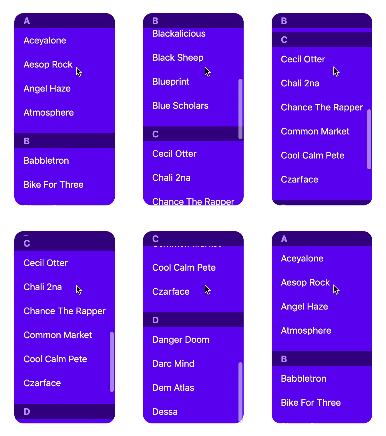
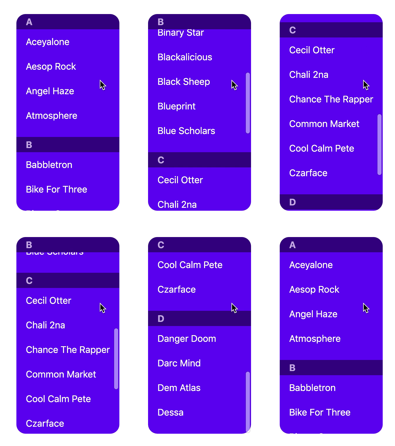
To be a little more specific, the problem here is that sticky elements only get "pushed" by hitting the end of their container. If you have multiple sticky "headings" like this in a single container, they'll just overlap each other; if you make them partially transparent you'll see all the preceding sticky things are just sitting there underneath the "current" one.
This is problematic for several reasons:
- As @argyleink says, the visual appearance of the previous sticky header being "pushed" out of the way by the new one is very appealing, but currently requires wrapper elements to be employed. (For
dl, you can validly usedivwrappers for thedt/ddsets now, but that wasn't always the case.) - Some markup patterns can't be converted into the "sibling wrapper elements" that gives the desired effect; in particular, nested document sections with sticky headings can't be changed to this without dramatically changing the document structure.
- If your headings are differently-sized, or not fully opaque, you can see the preceding sticky elements underneath them, which is the vast majority of the time not what you want.
In order for sticky elements to get "pushed" by their container scrolling off the page, they have to handle their positioning late in the layout process anyway, as they need to know the bounds of their container. To achieve @argyleink's desired effects, sticky elements would additionally need to know, at minimum, the static positions of all their stickypos siblings, and possibly the static positions of all stickypos descendants of their container (if we want the nested-sections case to work as well), so they can stop shifting when they hit the first stickypos edge they find. I suspect that this isn't a huge difficulty over what exists today; the necessary information is available at the same time as the current required information.
Then just toss in a new margin-ish property to allow some gap between the old and new sticky elements, and you're golden.
The Scene
I've discovered that I can get different sticky results with the same CSS and different DOM.
Default Sticky Stack behavior:
vs
Sticky Slide behavior:
The Problem
Each of these demos is using a
<dl>to get the job done, but one has a single<dl>and the other has many. In order to achieve the (arguably more native competitive style) sticky behavior, I have to break the semantics of my content.Potential Solution
The children need a way to specify their spacing relationship to the other sticky items. The web has traditionally done this with margins, so what if we added to the sticky margins to the spec. This would be similar to scroll margins/padding, would follow new logical property syntax, and ultimately allow the first demo to achieve the look of the 2nd demo with a little bit of added CSS.
The styles above specify that the sticky
<dt>'s children should have space between them, so when they come near each other, the space should be maintained, and one element get's pushed/pulled out/in by the other. They compete for the space instead of share it.Conclusion
Current sticky behavior can be super desirable, and has been very convenient for many of my use cases. But this one scenario has been tricky, because changing my HTML to get a specific CSS result doesn't feel appropriate. I don't think the syntax I proposed is as thoughtful as it could be, and should be thoroughly vetted. I do want to get a conversation started about the best ways to pacify this edge case, giving developers ways to achieve the effect without changing their markup.