 tiye
commented
2 years ago
tiye
commented
2 years ago quote https://en.wikipedia.org/wiki/Eight_Principles_of_Yong
It was traditionally believed that the frequent practice of these principles as a beginning calligrapher could ensure beauty in one's writing.
 yisibl
 frivoal
 tabatkins
 ziyunfei
 VaJoy
VaJoy gongpeione
 myakura
 Naeemo
 foolip
 azbo
azbo cxh194311
 woeoio
 vicdf
vicdf dufemeng
 aaron-ai
 wlbksy
 hingbong
 linrf
linrf Rvtea
Rvtea volcanicll
 DreamOneX
 bobwxc
 y122972
 weolar
 sword4869
 ArthurMao
 yuan3721
 BI1LQV
 1219521375
 SkyeYoung
 Siricee
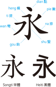
 sparklerl
 Matthewow
 sunhaitao
 Baoge2012
 nc7s
nc7s faceless2
 CoelacanthusHex
 jtyjty99999
 tiansh
Chrome just implemented the ic unit this week, when I shared this news in Chinese social media, some people are confused about the chosen character 水(water), especially those people who had the handwriting practice experience, they think 永(forever; eternal) is the right choice.
See this Twitter thread: https://twitter.com/intenttoship/status/1555274307735285760