 Crissov
commented
2 years ago
Crissov
commented
2 years ago Widow and orphan control have been existing for a long time in CSS, not so long in browsers. https://caniuse.com/css-widows-orphans However, they work differently than in Indesign. You should probably explain how or why that’s insufficient.
 adamzea
 astearns
 faceless2
 SebastianZ
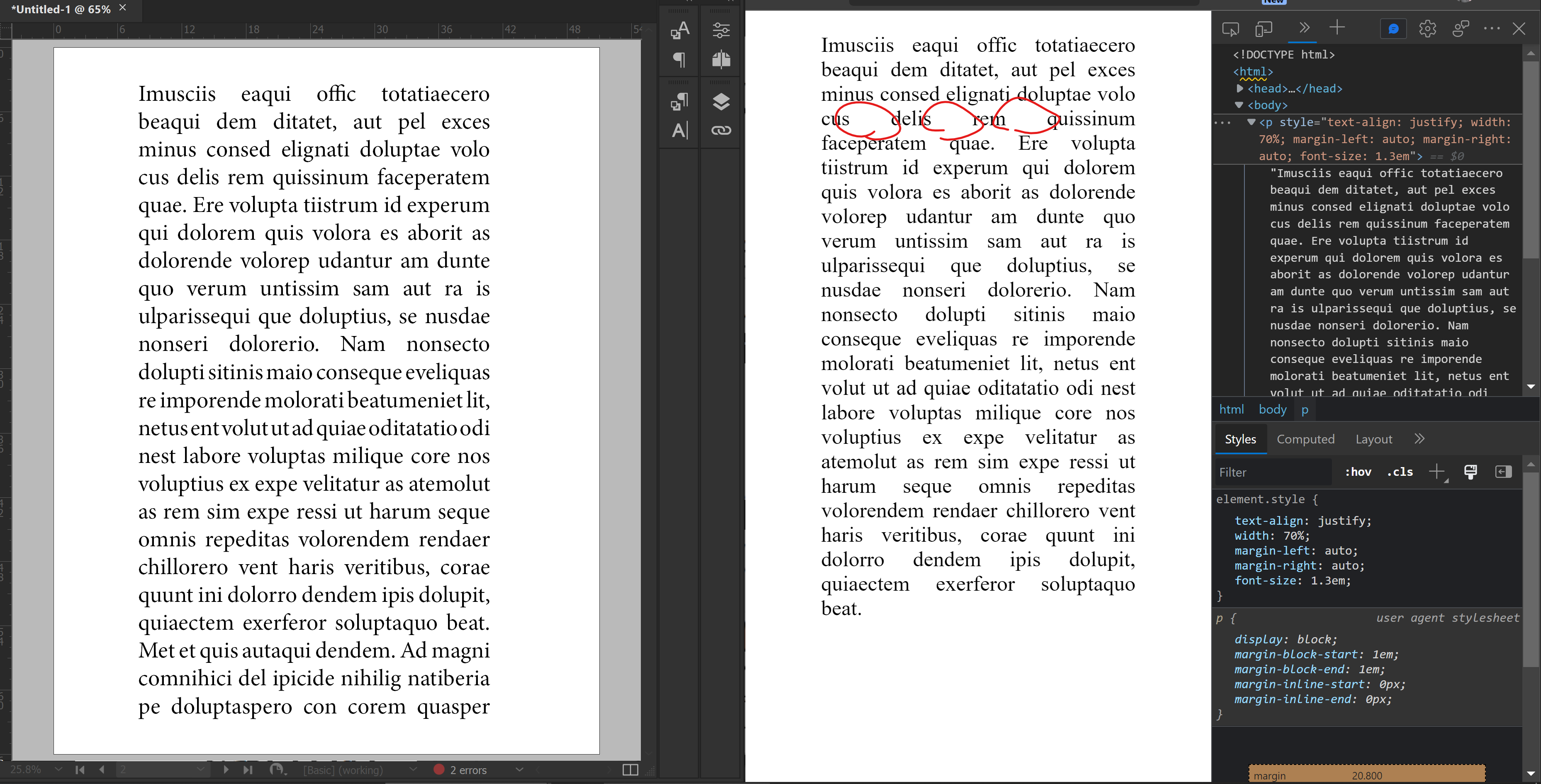

I hear this is the place to bring up feature requests for future CSS standards. Apologies if it isn't.
I think it’s about time the WWW started getting better typography controls in CSS. If you look at what typography designers can do in print applications like InDesign, the typography capabilities in CSS are still relatively primitive especially in the context of responsive design.
In the late 90’s as a beginning web designer, I would always have to tell my boss (a very experienced typography designer) that the things she wanted to do with type just wasn’t possible. It’s now 2022 and many of those things still aren’t possible (though we do have web fonts now at least.) I’ve been waiting for decades for some of these typography controls to come to CSS standards and web browsers, so maybe if I describe them properly, someone will notice.
Runts
CSS still has no runt controls. A runt is when a paragraph ends with one word on one line. It’s very ugly. In print design software, we can fix this procedurally by selecting the last X number of characters using a GREP style and applying a no-break attribute to them. So if I set the last 15 characters to no-break in a paragraph, that will make the last 2 or 3 words stay together and therefore stay on the last line no matter what the container’s width becomes. This is not possible in CSS, but I think it should be.
The syntax could be something like:
Then we could have something like below that applies the nowrap white-space attribute to the last 15 characters of a paragraph:
One current work around for this is to add a BR break tag before the last two or three words in a paragraph and use media query breakpoints to apply “display: none” to the BR tag in instances where the paragraph width does not create widows on the last line. This requires manually adding the BR tag to content in the database and also requires manually measuring which media query breakpoints should activate or deactivate the work-around. That’s way too much work for something that can be automatic with a GREP rule in InDesign.
Orphans/Widows
Original Comments DeletedCan be controlled with https://drafts.csswg.org/css-break-3/#widows-orphans and https://drafts.csswg.org/css-break-3/#page-break-propertiesParagraph composer
Another issue in WWW typography is in the ragging of text on each line. There are no decent controls for this. With InDesign, I can choose from different automatic paragraph composer settings and then I can tweak the minimum and maximum variations for things like word spacing, letter spacing, and glyph scaling.
The syntax could be something like:
The CSS word-spacing property already exists, but doesn’t support any minimum/maximum variations within a multi-line paragraph composer. The CSS letter-spacing property also exists, but again doesn’t allow for variations within a paragraph according to the paragraph’s line ragging. There are no glyph scaling properties in CSS.
A balanced rag between lines in a paragraph is ideal in terms of typography and this is done by increasing or decreasing word spacing, letter spacing, and glyph scaling on a line-by-line basis in order to decrease the differences in line widths and make a more pleasing paragraph shape.
Sentence Spacing
Nobody does good sentence spacing in typography design anymore, so very few people probably even know about this aspect of typography design. Many people these days follow the convention of including only one space between sentences. For paragraphs with shorter sentences, this reduces the number of visual “pigeon holes” that may clutter the paragraph. However, with longer paragraphs filled with longer sentences, the single space between sentences makes the paragraph more difficult to read. Thus the smart way of typography design is to increase the space between sentences within longer paragraphs, while reducing the sentence space between shorter paragraphs.
See the advice given by Philip Luckombe in The History and Art of Printing (London, 1771):
Also see: Why two spaces after a period isn’t wrong (or, the lies typographers tell about history) – Heraclitean River (archive.org)
I’m not sure what the syntax for a sentence spacing control should be as ideally we should have selectors to control shorter sentences separately from longer sentences. Perhaps the selectors can be defined by sentence character count. Currently we have no CSS selector for sentences at all, nor do we have any attribute for controlling the space between sentences. Maybe something like