 jensimmons
commented
7 years ago
jensimmons
commented
7 years ago Yeah, I was asked this question twice this week. As people start to expand their imagination for what's possible in layout with CSS, they are reaching for the things they've seen... Pinterest and other sites use this layout. It is a Flexbox-like layout, but with different content order than what's possible using multicolumn.
 Zatnosk
 tabatkins
 MatsPalmgren
 hunboy
 jamesdoc

 yisibl
 jcklpe
 nategreen
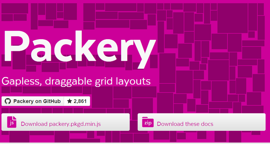
 MrGrigri
 rachelandrew
 Loirooriol
 simonlayfield
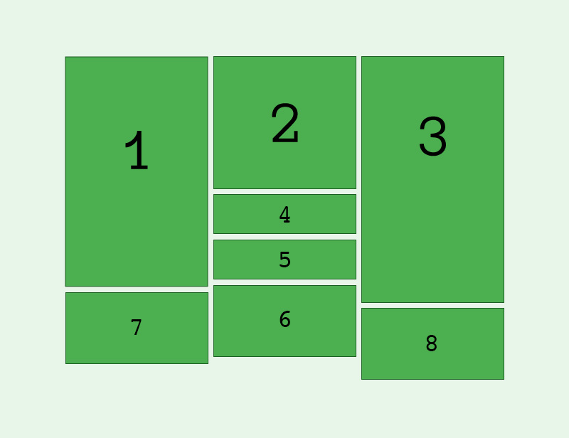

 mor10
mor10 GreLI
GreLI MladenJanjetovic
 Dan503
 andybarefoot
 ghost
ghost
 OliverJAsh
 FremyCompany
 AmeliaBR
 frivoal
 SabineWren
 gethinoakes
 jonjohnjohnson
 oscarotero
 desandro
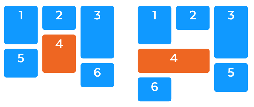
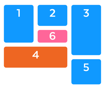

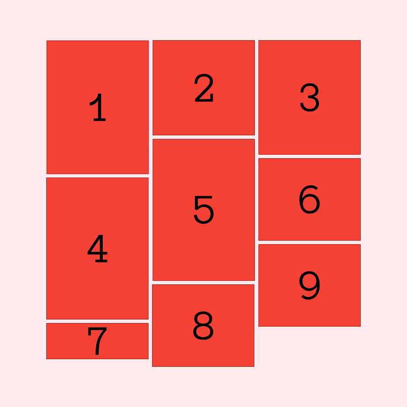
I'm getting frequent questions about whether Grid can handle a Masonry style layout using auto-placement.
You can see a good example, along with some author use cases here.
Currently the closest you can get with CSS to this type of layout is to use multi-col however the items then flow top to bottom rather than across the rows.
This feels more like a behaviour of flexbox than grid, as the solution is very much based on the size of the items. Opening this in order to record the feature request/use case for future discussion.