 alastc
commented
5 years ago
alastc
commented
5 years ago If it works on some sites but not others (like Github) it is probably prevented by the Content Security Policy, but a good browser/extension combo is not affected by that for the reasons Patrick mentioned.
 Myndex
 patrickhlauke
 mraccess77


 :
That was the post where I brought local adaptation and surround effects into the discussion.
:
That was the post where I brought local adaptation and surround effects into the discussion. 


 WayneEDick
 bruce-usab
 Ryladog
 StommePoes
 incyphe

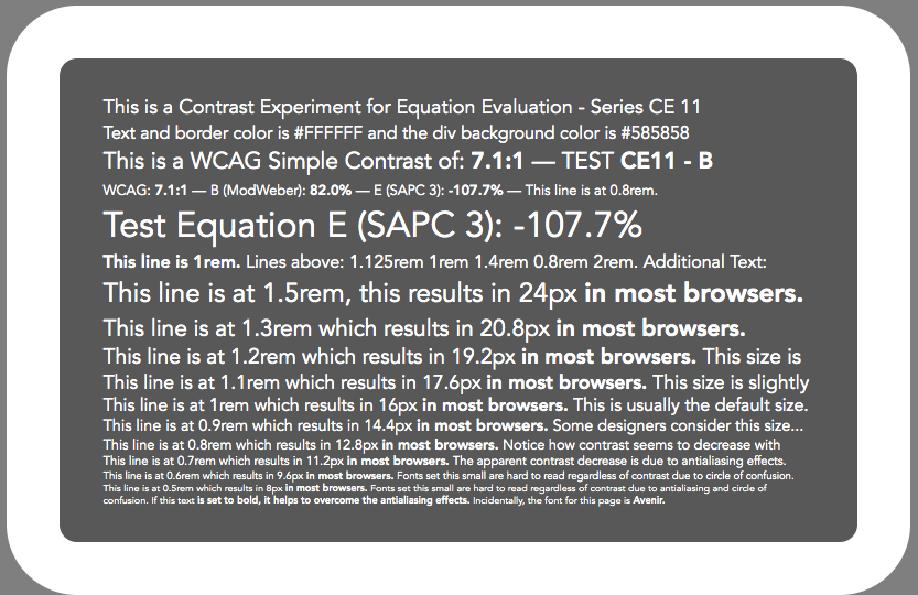
 This chart is linear to perception, not linear to light.
 pawelurbanski
 jrus
jrus mrlebay


 bruskowski
 svgeesus
 NateBaldwinDesign
Note (Jan 2023):
This thread is mainly the very early research notes and discussions that lead to the development of certain perceptually uniform contrast methods. While of interest from a historical perspective, the most current understanding of perceptually uniform contrast can be found at the Contrast Resources page, and current discussions in the APCA forum.
The initial conclusions did not present themselves until the first several months of posts, around the time of initial fixes described in May 2019, however the present day body of knowledge is substantially improved beyond that point.
As such, this thread remains here as a matter of historical interest only, and should not be referenced directly. For a reference, a good current overview is this article
Thank you for reading,
— Andy
Andrew Somers
W3C AGWG Invited Expert
Research Lead, Visual Contrast
Color Scientist @ Myndex Research
Original Post of April 2019:
The W3C's specification for determining sRGB contrast as discussed in "Understanding WCAG 2.0 and 2.1, Minimum Contrast 1.4.3" is not perceptually uniform and as a result creates "contrast ratios" that are not meaningful. The end result is incorrect contrast choices for some web colors. Compounding the problem are the number of "contrast tools" based on this math all over the web, and all of which are returning invalid data.
The end result are websites that may comply with the W3C's math for contrast, but are otherwise difficult to read. The bad math coupled with contrast tools have provided designers with color schemes of poor accessibility. This needs to be addressed!
PROBLEM SUMMARY
Edit May 2019: after first-round research, we've found that the issue is not so much using "simple contrast" as it is the manner (or lack of) considering ambient lighting, the nature of illuminated1 displays, and/or a lack of math that better models human non-linear perception.
(L1 + 0.05)/(L2 + 0.05)(aka "simple contrast")is only really useful to determine monitor max on/off (#FFF / #000)Edit 6/19 I'll restate this as "does not accurately model an illuminated1 display in real world ambient conditions": . It fails badly in the midrange colors as it does not adjust for human nonlinear perception. As such it should not be used to programmatically determine legibility of colors, esp. in the middle and darker ranges.Weber contrast, Michelson Contrast, Bartleson-Breneman Perceptual Contrast Length (PCL), or other possible candidates are better choices for programatic legibility assessment. I am currently conducting studies on a "best" programatic contrast assessment algorithm for UI/Web design and will update this issue as I do. I am presently leaning toward a variation of PCL as it prevents the near-black contrast expansion. Using this and applying an exponent to the luminance data looks promising.
Edit June 2019: results of research/experiments below show that a "standard" Weber contrast does not provide better performance by itself — it requires a modification for a more accurate model of a computer display).
Note1: By "illuminated" I mean both emissive (led), and transmissive backlit (LCD) display types.
Web Links to some of the pages of the document: https://www.w3.org/TR/WCAG21/#dfn-contrast-ratio https://www.w3.org/TR/UNDERSTANDING-WCAG20/visual-audio-contrast-contrast https://www.w3.org/TR/2008/REC-WCAG20-20081211/#relativeluminancedef
PROBLEM EXAMPLE:
I prepared a webpage that demonstrates the problem here: http://myndex.com/WEB/W3Contrastissue
(Edit: the full set of experiments is at https://www.myndex.com/WEB/Perception )
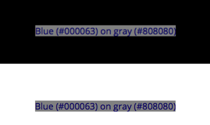
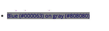
Here is a reduced resolution screenshot of part of that test page.
In the above experiment, we set a number of panels to color-pairs with a contrast ratio of 4.5:1, this counts as a "PASS" for the W3C spec of minimum contrast for small text. Interspersed among these panels are color-pairs that the W3C criteria counts as a "FAIL" even for large text, with a contrast of 2.9:1
As you can see, many of the "PASS" color pairs are actually hard to read and of low contrast, while all of the "FAIL" pairs are substantially easier to read and of higher perceptual contrast.
The point here is that the "contrast ratios" created by the equations listed in the WCAG documents are not useful or meaningful for determining perceptual luminance contrast.
Part of the reason this is happening is using simple contrast (L1/L2) Simple Contrast fails to account for non linear human perception in values between #000 and #FFF. Also troubling is the use of outdated standards documents or drafts. I list these issues on the webpage: http://myndex.com/WEB/W3Contrastissue
The upshot of all this is that if "contrast ratios" are going to be promoted as a means to define color for accessible design, then there needs to be a clear path to assess contrast based on human perception.
Looking for a Solution (EDIT 4/25/19: Better solutions in later posts)
One idea is to process the luminance with an exponent (^1.6) then take 1/3rd the contrast result, using either weber contrast or perceptual contrast length.
The purpose of the exponent is to shift contrast for black/dark text vs white/light text, this adjusts for our perception that light text on a medium or darker background has a higher perceived contrast than dark text on a medium background. The purpose for taking 1/3rd of the result is to bring the output numbers into line with the W3C standard indicating a 4.5:1 contrast.
A more ideal solution would be to commission a study with human subjects of various visual impairments to fine tune a model for programatic contrast assessment.
-Andrew Somers Title Supervisor General Titles & Visual Effects Hollywood, Ca.