 steverep
commented
7 years ago
steverep
commented
7 years ago @alastc and @mraccess77, I think the change you are proposing to the trigger condition is pretty harmless and does clarify a bit. I'll make that change now. Thanks.
Closed allanj-uaag closed 7 years ago
steverep
commented
7 years ago @alastc and @mraccess77, I think the change you are proposing to the trigger condition is pretty harmless and does clarify a bit. I'll make that change now. Thanks.
 spanchang
commented
7 years ago
spanchang
commented
7 years ago Will the popup container need a role, name and will the boundaries of the popup be clear to a screen reader user? If this popup contains interactive controls plus text / images, should it not be a dialog? Here is a note on distinguishing various terms: https://ux.stackexchange.com/questions/90336/whats-the-difference-between-a-modal-popup-popover-and-lightbox
 awkawk
commented
7 years ago
awkawk
commented
7 years ago @alastc and @mraccess77 and @alexswli - I suggested "The tooltip does not obscure any essential part of the triggering element." By working in "essential" it could be ok to cover part of a trigger area, just as long as it didn't adversely impact the user's ability to read the content.
awkawk
commented
7 years ago Regarding the definition, I don't think that hover box is the way to go, for reasons already stated.
I think that we are talking about a tooltip. Some tooltips are more complex than others, but there are tons of libraries out there to help developers make good tooltips and if we decide to call them "call outs" or "thought bubbles" or anything else we we will really need to clarify that what we mean is what they likely know as a tooltip.
I have some concern that there are use cases where what pops up is actually a dialog box. For example, I tab through a form with one required field (or use the mouse) and when I get to the "submit" button a validation script kicks in and pops up a dialog that says "you cannot submit the form because the email field is required". That dialog may well cover the submit button, possibly even entirely, but as a modal dialog box that isn't unexpected.
I guess I'm wondering if we should be primarily focusing on non-interactive popups. We already have 2.1.1 for keyboard access and the mouse access to interactive controls is not typically a problem, so maybe we don't need the part about the tooltip remaining visible while focus is on a component within the tooltip?
steverep
commented
7 years ago @DavidMacDonald wrote:
I agree that there are some situations where we don't want to forbid the popup from overlapping the trigger. Especially large triggers. I think as long as part of the trigger is exposed it's ok... I'd also suggest that since these are custom popups, we explore requiring the esc key to close it while it has focus. (in addition to it closing when focus leaves.
...and @alexswli wrote:
The tool tips shows up in relationship to where the pointer hovers. If it is high up on the tile, the tool tip is high. In the first screen shot, it overlaps the tile just a tiny bit. So, how does the appearance of the tool tip "disrupt orientation" any more or less than the second second screen shot where the entire tool tip goes inside the tile? Where would you like the tool tip to show up? The top of the tile is pretty far away from the pointer. If you have high enough of magnification on, it may way go outside of the screen. That does not sound like a good solution.
I do not think requiring that escape to close the popup is necessary, although it certainly should be a advised technique. However, I do think that we are getting into a discussion where the most accessible thing to do depends a lot on the size of the trigger.
Problems will quickly arise by adding a size cutoff though. What is small or large would be highly user dependent, depending on things such as magnification level and visual field capabilities. So, as a compromise, I would propose we make it an either/or condition. How about something like:
I'll take suggestions on exact wording here. We want to say that requiring CTRL+ALT+Shift+F12 is not a pass here. SC 2.1.2, No Keyboard Trap, does a similar dance.
PS - I jumped the gun on @awkawk's suggestion to change it to "essential" content, assuming there would be no argument ;).
steverep
commented
7 years ago @awkawk wrote:
I have some concern that there are use cases where what pops up is actually a dialog box. For example, I tab through a form with one required field (or use the mouse) and when I get to the "submit" button a validation script kicks in and pops up a dialog that says "you cannot submit the form because the email field is required". That dialog may well cover the submit button, possibly even entirely, but as a modal dialog box that isn't unexpected.
I had a similar discussion above on dialogs with @mbgower. Your scenario immediately fails SC 3.2.1, On Focus, because there has been a change of context, assuming the dialog has gained focus and needs to be dismissed. If it hasn't gained focus, then that's inaccessible for many reasons. I put a note to explain this in Understanding.
 alastc
commented
7 years ago
alastc
commented
7 years ago I think that we are talking about a tooltip.
A tooltip has quite a specific meaning in web development (wikipedia, bootstrap, MSDN), it is too narrow for this purpose, for example the one Jim mentioned on the call is a lot bigger than a "tooltip".
I have some concern that there are use cases where what pops up is actually a dialog box.
I don't think I've come across a dialogue box which is activated by hover or focus, in fact wouldn't that be an issue with 3.2.1 on focus? (At least for the focus part.)
when I get to the "submit" button a validation script kicks in and pops up a dialog
Wouldn't that be activated by submitting rather than focusing on the button? When I've seen the automatic ones that apply before you submit, they put the errors inline, in the page rather than popping up. Even in the case where an example pops up above, it would be a good idea to stop it going over the triggering element.
We already have 2.1.1 for keyboard access and the mouse access to interactive controls is not typically a problem,
It is a problem if you've zoomed in, seeing a larger popup (like Jim's example) is impossible if it disappears when you leave the trigger.
awkawk
commented
7 years ago I had a similar discussion above on dialogs with @mbgower. Your scenario immediately fails SC 3.2.1, On Focus, because there has been a change of context, assuming the dialog has gained focus and needs to be dismissed. If it hasn't gained focus, then that's inaccessible for many reasons. I put a note to explain this in Understanding.
Ok, fair enough, but the same thing can happen onblur from the previous control and the user result will be the same. But then we are talking about a different type of thing so I take your point.
awkawk
commented
7 years ago A tooltip has quite a specific meaning in web development (wikipedia, bootstrap, MSDN), it is too narrow for this purpose, for example the one Jim mentioned on the call is a lot bigger than a "tooltip".
Wikipedia: "The tooltip or infotip or a hint is a common graphical user interface element. It is used in conjunction with a cursor, usually a pointer. The user hovers the pointer over an item, without clicking it, and a tooltip may appear—a small "hover box" with information about the item being hovered over" MSDN: "Tooltips appear automatically, or pop up, when the user pauses the mouse pointer over a tool or some other UI element." Bootstrap: no good quote but matches what we are talking about here
It is a problem if you've zoomed in, seeing a larger popup (like Jim's example) is impossible if it disappears when you leave the trigger.
Sure, and that's why the rest of the SC is needed. If one can move the mouse to view the tooltip content then people will be able to read that information whether the method of invoking the tooltip is by keyboard or mouse.
So we are left with: a) don't obscure essential content with the tooltip b) the pointer needs to be able to be moved over the tooltip without it going away c) the tooltip doesn't go away unless the user takes an explicit action (or possibly some time limit is reached). Actions could include - tabbing away from the focused control, hitting esc key, clicking somewhere else with the pointer, initiating a mouseover on another hoverable object, or 10 seconds elapse (just picking an arbitrary time, lengthy tooltips might have more time assigned to them). Another option that I suspect that we will hear about is moving the mouse away from the items that cause the tooltip to remain in view for more than some amount of time.
alastc
commented
7 years ago I'm really struggling with the term "tooltip" for this.
In HTML the tooltip is generally implemented with the titleattribute, and not styled or controlled by the author. So an actual tooltip is excluded from this SC because it "is controlled by the user agent".
(NB: Edge is quite different from other browsers for showing title attributes.)
It also cannot fulfill the mouse-into the popup aspect because it will disappear when you leave the trigger element.
So a real "tooltip" is excluded from this SC and cannot fulfill it (which is why it was excluded in the first place). That would make it very confusing as the term we use for a transient floating box.
awkawk
commented
7 years ago I would write a version to align with the above like this: https://rawgit.com/w3c/wcag21/popup-interference_ISSUE-75_AWK/guidelines/sc/21/no-tooltip-interference.html https://rawgit.com/w3c/wcag21/popup-interference_ISSUE-75_AWK/guidelines/#no-tooltip-interference
(don't worry, this is a different branch!)
awkawk
commented
7 years ago In HTML the tooltip is generally implemented with the titleattribute, and not styled or controlled by the author. So an actual tooltip is excluded from this SC because it "is controlled by the user agent". (NB: Edge is quite different from other browsers for showing title attributes.)
First off, we aren't only talking about HTML so even if a term is used in a certain way in HTML that doesn't mean that we will have a perfect match in WCAG. For example, see "label" in WCAG.
Second, there are many libraries available to allow authors to implement tooltips, including the bootstrap one you linked to earlier. I wouldn't say that you need to use the title attribute in HTML to make an "actual" tooltip any more than I would say that you need to use the img element to put an actual image on a page.
It is true that HTML tooltips that are created using the title attribute aren't covered by this SC, but that is the case whether we call these things popups, tooltips, or anything else.
It also cannot fulfill the mouse-into the popup aspect because it will disappear when you leave the trigger element.
Same response. We know that title attribute tooltips aren't going to be able to or need to meet this SC, no matter what we call them.
So a real "tooltip" is excluded from this SC and cannot fulfill it (which is why it was excluded in the first place). That would make it very confusing as the term we use for a transient floating box.
Tooltips are technology independent and represent a UI concept where additional information appears on focus or hover. Yes, the tooltips made with the title attribute are an easy way, but by far not the only way, and many developers and sites won't use them.
steverep
commented
7 years ago c) the tooltip doesn't go away unless the user takes an explicit action (or possibly some time limit is reached). Actions could include - tabbing away from the focused control, hitting esc key, clicking somewhere else with the pointer, initiating a mouseover on another hoverable object, or 10 seconds elapse (just picking an arbitrary time, lengthy tooltips might have more time assigned to them). Another option that I suspect that we will hear about is moving the mouse away from the items that cause the tooltip to remain in view for more than some amount of time.
@awkawk, two comments here:
z-index. In my opinion, if the triggers are in a common group, nothing else should popup - one at a time and keyboard focus takes priority.awkawk
commented
7 years ago Mousing over another object would definitely not be considered an "explicit" action here. That would be "implicit" and not satisfactory. Remember we're talking about users with low pointing accuracy here, so the whole point of remaining visible while focused is that I don't need to worry about where my pointer is anymore, and I can zoom and pan at will. I would say it's acceptable for new content to popup, but care should be taken to keep the focused trigger's popup on top with z-index. In my opinion, if the triggers are in a common group, nothing else should popup - one at a time and keyboard focus takes priority.
If I have a hover action on one item I need to suppress hover actions on other items until the user explicitly (e.g. hits esc) to close the first hover? That sounds like a recipe for rejection from the design community, and an end-user nightmare. If a low-vision user is probing around with the mouse they will trigger any hover effect in their path and then before they can do anything else they need to dismiss the first inadvertent hover? Sounds like a problem to me.
steverep
commented
7 years ago If I have a hover action on one item I need to suppress hover actions on other items until the user explicitly (e.g. hits esc) to close the first hover?
That's absolutely not what I'm saying. I'm saying to suppress further onmouseover responses in the same menu only when a sibling has responded `onfocus``, or at least be careful about z-indexing. If siblings are all responding both to focus and hover, I think that's the most reasonable approach.
alastc
commented
7 years ago Second, there are many libraries available to allow authors to implement tooltips, including the bootstrap one you linked to earlier.
And that example uses the title attribute as the data-source of the tooltip, then uses JS & CSS to style it.
Tooltips are technology independent and represent a UI concept where additional information appears on focus or hover.
Agreed, but when you say tooltip, people (especially web developers) think of things like this:

Not the range of things we are trying to cover, including things like this:
I would also anticipate public comments along the lines of "Authors can't control tooltips, why are you trying to create a guideline about it?"
awkawk
commented
7 years ago Agreed, but when you say tooltip, people (especially web developers) think of things like this: Not the range of things we are trying to cover, including things like this:
I think that we've established that we don't agree on what constitutes a tooltip, so we should see what other people say.
What would other people call the floating area of text found in @alastc's comment above (from https://www.w3.org/WAI/GL/low-vision-a11y-tf/wiki/Metadata_On_Hover#Perkins, where it is referred to as a tooltip)?
awkawk
commented
7 years ago I'm saying to suppress further onmouseover responses in the same menu only when a sibling has responded `onfocus``, or at least be careful about z-indexing. If siblings are all responding both to focus and hover, I think that's the most reasonable approach.
@steverep, I'm not sure that we should be saying, effectively, that once a person starts using the keyboard that they don't have the same mouse experience they would if they didn't. I do think that there is something challenging about someone using the keyboard to reach a spot where there is a hover/tooltip and then if they pick up the mouse to interact with it they may need to traverse many other items before they reach that area of the screen. Some sort of time interval that is long enough to allow people to access the content but short enough to not cause frustration would be good, but difficult to define.
 johnfoliot
commented
7 years ago
johnfoliot
commented
7 years ago Andrew wrote:
I think that we are talking about a tooltip. Some tooltips are more complex than others, but there are tons of libraries out there to help developers make good tooltips and if we decide to call them "call outs" or "thought bubbles" or anything else we we will really need to clarify that what we mean is what they likely know as a tooltip.
If we are, indeed, speaking about "tooltips" (as they are commonly thought of today, whether 'native' or scripted), then let's be absolutely clear that this is what we are talking about.
As I read discussion about 'containers' that "pop-up" (and further that they are exposed via onfocus or onhover) I can't help but ask about other types of "pop-ups", for example in this semi-pseudo code:
<script type="text/javascript">
        function getAlert() {
                    alert("This is hardly a tooltip, right?");
        };
</script>

<p tabindex="0" onfocus="getAlert()">Mouse over this text</p>
Mousing over the text will indeed launch something that pops up on a different layer on my screen. Is that a tooltip?
So... are we talking about "tool tips" and similar types of onscreen advisories, or JUST tool tips? (And we will need to get that definition clearly articulated in the draft spec)
What would other people call the floating area of text found in @alastc's comment above
Well, I would call the second example a modal dialog, even if/though it wasn't explicitly launched via an onclick action, but instead a different event handler (onfocus, onhover, etc.).
In other words, what are we really talking about? Is it information presented that is linked to a specific type of event handler, or content that is rendered on a "higher" z-index level, where that content, by being on a different z-index level, is obscuring the content "beneath" it? I believe it is the latter, and that it covers more than just "tool tips" as commonly understood today.
JF
steverep
commented
7 years ago @awkawk, I'll defer to any usability studies on this specific topic of combining hover and focus events and what is expected to be on top, but again GitHub has already implemented (either on purpose or by accident) exactly what I'm saying. In the WYSIWYG editor, put keyboard focus on the bold button to display its tooltip. now hover over adjacent buttons like italic or quote. Their tooltips display, but bold is on top.
In fairness, the opposite was also not hard to find. The menu on whitehouse.gov works on hover and focus, and the focused sub-menu will disappear if you hover another menu. Of course, it also fails 2.1.1 so other conclusions can be drawn about the thought put into it...
alastc
commented
7 years ago For @johnfoliot's JavaScript example, that would be a horrible thing to do and I'd have no problem with discouraging that use-case.
However, user-agent defined popup/tooltips/things are excluded from the SC.
As to whether that example it is a popup/tooltip/something else, I think most people would agree could fit under a description of pop-up, pop-over, or dialogue box. A key difference is that it is not under the authors control, and is not part of the DOM.
What we are trying to name has these properties:
I think pop-up, pop-over, hoverbox(?) work.
Dialogue and tooltip don't because they imply things that aren't true of the target elements. Dialogues aren't (or at least shouldn't be) triggered by hover/focus. Tooltips are expected (by at least some people) to be a browser-based feature drawn from an attribute.
I don't care if we call it a pan-galactic gargle-blaster so long as the definition is right, but I'd rather not clash with names that have distinct other meanings in web-dev terms.
awkawk
commented
7 years ago @steverep
GitHub has already implemented (either on purpose or by accident) exactly what I'm saying. In the WYSIWYG editor, put keyboard focus on the bold button to display its tooltip. now hover over adjacent buttons like italic or quote. Their tooltips display, but bold is on top.
On my Mac/Safari the bold button has tabindex=-1 and I can't focus it with the keyboard. What config are you using?
johnfoliot
commented
7 years ago that would be a horrible thing to do and I'd have no problem with discouraging that use-case.
No disagreement. I deliberately sought to provide a horrible illustration of an example of what a "pop up" could be, as it was being explained as something that showed up over top of content, and that it appeared via the onfocus event handler. My example met both of those criteria, yet somehow it also appears that my example is not what we collectively mean, so...
What we are trying to name has these properties:
It is in the page, in HTML terms that means part of the DOM otherwise it isn't under author control.
[JF] My example meets this criteria
It's appearance is triggered by hover/focus.
[JF] My example meets this criteria
It can be any size.
[JF] My example DOES NOT meet this criteria. Question: is the ability to style this thing we are defining an essential part of the definition?
It is an element (rather than an attribute), even if that element is created from the content of an attribute (like the bootstrap example).
[JF] My example DOES NOT meet this criteria. I suspect that this is an important differentiator, but is it the only one? Or simply just one?
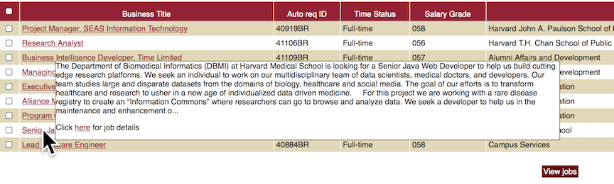
It is not modal, it's existence depends on the pointer/focus, and it should not affect the focus order. [JF] This is once again a reference to specific event handlers (or rather, it appears to be a specific exclusion of onClick) Q: Is this also an important differentiator, or would dialogs that only rendered on top of content via an onClick not be covered by this SC? In other words, in Alastair's example here: [image: large pop-over element with multiple paragraphs of text within it] ...if that dialog box ONLY opened when the user clicked on the business title, would it be in scope for this new SC, or out of scope?
J F
On Wed, Aug 9, 2017 at 9:37 AM, Alastair Campbell notifications@github.com wrote:
For @johnfoliot https://github.com/johnfoliot's JavaScript example, that would be a horrible thing to do and I'd have no problem with discouraging that use-case.
However, user-agent defined popup/tooltips/things are excluded from the SC.
As to whether that example it is a popup/tooltip/something else, I think most people would agree could fit under a description of pop-up, pop-over, or dialogue box. A key difference is that it is not under the authors control, and is not part of the DOM.
What we are trying to name has these properties:
- It is in the page, in HTML terms that means part of the DOM otherwise it isn't under author control.
- It's appearance is triggered by hover/focus.
- It can be any size.
- It is an element (rather than an attribute), even if that element is created from the content of an attribute (like the bootstrap example).
- It is not modal, it's existence depends on the pointer/focus, and it should not affect the focus order.
I think pop-up, pop-over, hoverbox(?) work.
Dialogue and tooltip don't because they imply things that aren't true of the target elements. Dialogues aren't (or at least shouldn't be) triggered by hover/focus. Tooltips are expected (by at least some people) to be a browser-based feature drawn from an attribute.
I don't care if we call it a pan-galactic gargle-blaster so long as the definition is right, but I'd rather not clash with names that have distinct other meanings in web-dev terms.
— You are receiving this because you were mentioned. Reply to this email directly, view it on GitHub https://github.com/w3c/wcag21/issues/75#issuecomment-321275023, or mute the thread https://github.com/notifications/unsubscribe-auth/ABK-cyKT4A1MrVd5jrnC01DvUd9gdq0Tks5sWcQygaJpZM4LB0zx .
-- John Foliot Principal Accessibility Strategist Deque Systems Inc. john.foliot@deque.com
Advancing the mission of digital accessibility and inclusion
awkawk
commented
7 years ago @alastc
It is an element (rather than an attribute), even if that element is created from the content of an attribute (like the bootstrap example).
How do you think about this for PDF or other non-HTML technologies?
alastc
commented
7 years ago Hi @johnfoliot,
Unless I'm missing something, I don't think a JavaScript alert is part of the DOM. The script to create it might be, but the element itself is not, it is part of the browser chrome. The author cannot control where it appears or what it looks like. There is limited control over the text-content, that's it.
Excluding browser-chrome pop-ups was a side effect of excluding tooltips from title attributes, but probably a good one.
The exclusion of things which are onclick is deliberate, if it opens onclick and closes with some other explicit control (e.g. an X in the corner) that's fine. It is when things are triggered by hover that it becomes difficult/impossible to control or read when magnified.
The example was difficult because it was shown onhover, but moving the mouse to the right (to read the box when magnified) made the box disappear.
@awkawk I'm assuming that PDF has similar principles, although I've not tried to create a within-the-tags based pop-over in PDF. I've seen pop-ups in Acrobat, but not tooltips or larger popup elements, are there methods for those?
awkawk
commented
7 years ago I'm assuming that PDF has similar principles, although I've not tried to create a within-the-tags based pop-over in PDF. I've seen pop-ups in Acrobat, but not tooltips or larger popup elements, are there methods for those?
With scripting you can do almost anything.
steverep
commented
7 years ago ...if that dialog box ONLY opened when the user clicked on the business title, would it be in scope for this new SC, or out of scope?
@johnfoliot, that's clearly out of scope as it does not operate only on hover or focus. To be crystal clear, a modal popup of any kind is not in scope here, and if a modal popup did appear only on hover or focus, that should fail 3.2.1 anyway.
steverep
commented
7 years ago On my Mac/Safari the bold button has tabindex=-1 and I can't focus it with the keyboard. What config are you using?
@awkawk... Sigh, I enjoy the privilege of using a screen reader. I can focus them by arrowing to them, but yeah I'm now noticing they're not in the tab sequence. You can perform the wonderful trick of clicking bold but moving your mouse off it before releasing the mouse button, which should leave focus on it.
awkawk
commented
7 years ago You can perform the wonderful trick of clicking bold but moving your mouse off it before releasing the mouse button, which should leave focus on it.
:) not on my config.
awkawk
commented
7 years ago To be crystal clear, a modal popup of any kind is not in scope here, and if a modal popup did appear only on hover or focus, that should fail 3.2.1 anyway.
But could that modal dialog cause the same problems? What if I invoke the dialog on blur? Should we be thinking about that?
alastc
commented
7 years ago A model dialogue doesn't cause the same problem because it is model, i.e. the focus (including visual) is locked on the dialogue. It may block the trigger, with the 'lightbox' style ones it certainly will block the trigger, and that's fine. It doesn't disappear depending on your mousing, there is an explicit close method.
Regarding PDF scripting being able to do anything, I think the same principles can apply then. If elements are shown over the top of the page with mouse/focus, the same things apply (including tooltip being a misleading name ;-)
steverep
commented
7 years ago But could that modal dialog cause the same problems? What if I invoke the dialog on blur? Should we be thinking about that?
If a modal took focus onlur, how is that not also a 3.2.1 failure?
Assuming the modal handled focus properly, the prime low vision issue in my opinion is when the dialog does not make itself visually distinct as a dialog (e.g by graying out the rest of the page). Yes, that's a hole, but a different SC I think, closer to UI Component Contrast.
awkawk
commented
7 years ago If a modal took focus onblur, how is that not also a 3.2.1 failure?
Because 3.2.1 doesn't speak to losing focus, just receiving it: 3.2.1: When any component receives focus, it does not initiate a change of context.
 alliMSFT
commented
7 years ago
alliMSFT
commented
7 years ago Does the applicability of Hover requirement (If the popup is triggered via pointer hover, then the pointer may be moved onto the popup without loss of popup visibility) depend on interactivity of the tool tip/popup/or whatever we will call it? What is that use case of moving the pointer to it unless it is interactive?
 allanj-uaag
commented
7 years ago
allanj-uaag
commented
7 years ago The use case is to read the information. With magnification on, you hover on something, the popup happens, you move the mouse to read the popup, but it vanishes as soon as pointer leaves the trigger. Developers copied the popup behavior of tooltips (from title attrib)
On Wed, Aug 9, 2017 at 12:10 PM, alexswli notifications@github.com wrote:
Does the applicability of Hover requirement (If the popup is triggered via pointer hover, then the pointer may be moved onto the popup without loss of popup visibility) depend on interactivity of the tool tip/popup/or whatever we will call it? What is that use case of moving the pointer to it unless it is interactive?
— You are receiving this because you were mentioned. Reply to this email directly, view it on GitHub https://github.com/w3c/wcag21/issues/75#issuecomment-321319895, or mute the thread https://github.com/notifications/unsubscribe-auth/AG_WL3fdahoFhVRExcxBeb99x1J1-OwZks5sWegUgaJpZM4LB0zx .
-- Jim Allan, Accessibility Coordinator Texas School for the Blind and Visually Impaired 1100 W. 45th St., Austin, Texas 78756 voice 512.206.9315 fax: 512.206.9452 http://www.tsbvi.edu/ "We shape our tools and thereafter our tools shape us." McLuhan, 1964
alliMSFT
commented
7 years ago How does reading the content relates to moving the mouse?
allanj-uaag
commented
7 years ago When using magnification you use the mouse to move your virtual viewport to see content not within the viewport. You may only see the first 3 or 4 characters of the popup, when you move to mouse to move the viewport to read the content, the pointer leaves the trigger and the popup disappears. At 4x magnification the monitor only sees 1/16 of the actual screen.
On Wed, Aug 9, 2017 at 12:21 PM, alexswli notifications@github.com wrote:
How does reading the content relates to moving the mouse?
— You are receiving this because you were mentioned. Reply to this email directly, view it on GitHub https://github.com/w3c/wcag21/issues/75#issuecomment-321322699, or mute the thread https://github.com/notifications/unsubscribe-auth/AG_WL_R-1c-JEHdNjusZsmlKc3WgMT5Sks5sWeqIgaJpZM4LB0zx .
-- Jim Allan, Accessibility Coordinator Texas School for the Blind and Visually Impaired 1100 W. 45th St., Austin, Texas 78756 voice 512.206.9315 fax: 512.206.9452 http://www.tsbvi.edu/ "We shape our tools and thereafter our tools shape us." McLuhan, 1964
steverep
commented
7 years ago Because 3.2.1 doesn't speak to losing focus, just receiving it
@awkawk, but focus has to move somewhere else and there's the failure. We ought to amend 3.2.1 to say "receives or loses" (errata in my opinion).
alliMSFT
commented
7 years ago @allanj-uaag , so onmouseout cannot be used. Is that right? What is the behavior you seek to get the tool tip content to go away? Esc, onmouseover, change of focus, or click?
awkawk
commented
7 years ago We ought to amend 3.2.1 to say "receives or loses" (errata in my opinion)
Real-time validation depends on this when exiting focus from a control. I'm sure that we won't amend 3.2.1 if only for that reason.
steverep
commented
7 years ago Real-time validation depends on this when exiting focus from a control. I'm sure that we won't amend 3.2.1 if only for that reason.
It depends on using onblur, but certainly does not require a change of context afterwards. If I type in a partial social security number because I can't remember the whole thing and need to look it up, then hit tab to fill in the stuff I do remember only to get thrown to a modal that won't let me move on, is that good accessibility? But, if that were the only field and there was no submit button, then I unfortunately see your point.
steverep
commented
7 years ago All,
It's becoming way too clear that there is not a term that everyone is going to agree on here. Given many folks being confused about clicks and modes, we could be more verbose and call it a "no-click nonmodal popup", but that seems pretty crazy. So, here's my attempt at a version that doesn't use any glossary term, referring to the popup only as "additional content" or "additions", and adding a note to describe the scope:
Hover and Focus Content Visibility: The following are true when additional content becomes visible after associated trigger content gains keyboard focus or pointer hover, except where the visual presentation of the addition is controlled by the user agent and is not modified by the author:
Note: Custom tooltips, sub-menus, and other nonmodal popups which display on hover and focus are examples of additional content covered by this criterion. Modal dialogs, in or out of the page, typically take focus and thus are not covered because such behavior would not meet success criterion 3.2.1, On Focus.
Please give a thumbs up or down reaction to this comment if you feel it's now clearer.
alliMSFT
commented
7 years ago @steverep , there is some editorial issue where you used both "addition" and "additional content" to describe the same thing.
Can you explain the intent behind the OR condition in the Trigger requirement?
Why does it have to be a keyboard, and not a pointer, exit method?
allanj-uaag
commented
7 years ago onmouseout could be used if it is on the popup content. When the pointer leaves the popup, then it can close.
On Wed, Aug 9, 2017 at 1:26 PM, alexswli notifications@github.com wrote:
@allanj-uaag https://github.com/allanj-uaag , so onmouseout cannot be used. Is that right? What is the behavior you seek to get the tool tip content to go away? Esc, onmouseover, change of focus, or click?
— You are receiving this because you were mentioned. Reply to this email directly, view it on GitHub https://github.com/w3c/wcag21/issues/75#issuecomment-321341171, or mute the thread https://github.com/notifications/unsubscribe-auth/AG_WL4ggoGbJIR47H0kcUpF7Q_29nPZ-ks5sWfnggaJpZM4LB0zx .
-- Jim Allan, Accessibility Coordinator Texas School for the Blind and Visually Impaired 1100 W. 45th St., Austin, Texas 78756 voice 512.206.9315 fax: 512.206.9452 http://www.tsbvi.edu/ "We shape our tools and thereafter our tools shape us." McLuhan, 1964
awkawk
commented
7 years ago I think that is a good direction but have some suggested edits:
Content on Hover or Focus: When content becomes visible as a result of a part of the page receiving keyboard focus or pointer hover, the following are true, except where the presentation of the content is controlled by the user agent and is not modified by the author:
Trigger: Either the additional content does not obscure any essential content within the triggering user interface component, or the addition can be closed via a standard keyboard exit method, such as the escape key. Hover: If the additional content is triggered via pointer hover, then the pointer may be moved onto the addition without loss of visibility of the addition. Focus: The additional content remains visible while the trigger has keyboard focus, unless the user takes an explicit action to close the addition.
Note: Custom tooltips, sub-menus, and other nonmodal popups which display on hover and focus are examples of additional content covered by this criterion.
alliMSFT
commented
7 years ago @allanj-uaag , let me backtrack your earlier comment on hover.
When using magnification you use the mouse to move your virtual viewport to see content not within the viewport
What you are seeking isn't to ask the pointer to go into the additional content. You are asking the pointer to able to move away from the trigger in order to move the viewport and still see the additional content after the viewport movement, no?
steverep
commented
7 years ago there is some editorial issue where you used both "addition" and "additional content" to describe the same thing That was done intentionally to save a bit on verbosity. I think they clearly refer to the same thing as you said.
Why does it have to be a keyboard, and not a pointer, exit method? We're talking about users with low pointer accuracy in general. Having to find the close button is just one more visual task taking away from seeing and concentrating on the trigger. Is that really much of a concern? A keyboard handler would actually be easier to implement since nothing needs to be added to the DOM.
alliMSFT
commented
7 years ago @steverep , keyboard operation is already a requirement per 2.1.1. "... via a standard keyboard exit method" looks like an unnecessary duplication.
Repeating a question that you did not answer. Can you explain the intent behind the OR condition in the Trigger requirement?
alliMSFT
commented
7 years ago @allanj-uaag , I think I figure out what you're saying. You're saying that you want the point to go onto the "additional content" to keep it visible, assuming space allow, shift the viewport to make all the additional content visible by moving the pointer. Is that right?
awkawk
commented
7 years ago Is that right?
That's it exactly.
Current versions of SC and Definitions
SC Shortname
Popup Visibility
SC Text
The following are true when a popup becomes visible, except where the visual presentation of the popup is controlled by the user agent and is not modified by the author:
Suggested Priority Level
Level AA
Related Glossary additions or changes
What Principle and Guideline the SC falls within.
Principle 1: Perceivable, Guideline 1.4: Distinguishable
Description
Popup content that appears only on focus or mouse hover can present many challenges for users with low vision and others whose mouse accuracy may be low. Techniques can be employed to successfully perceive and interact with popups as long as certain conditions are met when a popup is displayed.
First, if a popup is positioned to cover all or part of its triggering content, then the trigger can become much more difficult to perceive under magnification. In this situation, screen area that doesn't trigger the popup may be the minority, resulting in a difficult cycle to pan the screen without re-triggering the popup. The solution is to always position the popup adjacent to its trigger.
Next, a popup can be difficult or impossible to perceive if a user is required to keep their mouse pointer over the trigger. For large popups, magnified views may mean that the user needs to scroll or pan to completely view the popup, which is impossible unless the user is able to move their pointer off the trigger without the popup disappearing. Another common situation is when large pointers have been selected via platform settings or assistive technology. Here, the pointer can obscure a significant area of the popup. A technique to view the popup fully in both situations is to move the mouse pointer onto the popup itself. Ensuring this capability also offers advantages for users who utilize screen reader feedback on mouse interactions.
Finally, when a popup contains user interface components that can gain focus, a user technique can be employed to move focus onto the popup. As long as the popup remains displayed, the view can then be magnified, scrolled, or panned for optimal perception without regard to mouse position over the content. For popups with multiple clickable items, this also offers the advantage of being able to make and correct a clicking mistake without losing visibility of the popup.
This criterion does not attempt to solve such issues when the appearance of the popup is completely controlled by the user agent. A prominent example is the common behavior of browsers to display the
titleattribute in HTML as a small tooltip.Additional notes to be clarified in Understanding:
Benefits
Testability
For each possible popup on the webpage, check that:
All must be true to pass.
Techniques
Related Existing Techniques
New Techniques
onclick(accessible to keyboard and touch devices) to show popup contentSupport Material
The Low Vision Task Force wiki on Popup Interference contains a wealth of additional information and background.