webaverse / app

Web metaverse client
https://app.webaverse.com
MIT License
340 stars 213 forks source link

Art: Main character / Drop Hunter ('Scilly') #1382

Closed Vianvolaeus closed 1 year ago

Vianvolaeus commented 3 years ago

This will serve as the design issue for the main character, user of the 'megasword'.

Will update as appropriate.

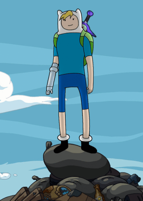
The idea of using the ears from #1294, but with the existing character design, was explored briefly. image

avaer commented 3 years ago

Looks great! I think the ear wearable is a good type of direction even if we don't end up using it.

The discussion centered around decking out the character with some interesting spoils (hopefully more semiotic and generic nature than making reference to any specific drops), and possibly increasing the amount of sportiness/gaminess. Asymmetry in decorations could work well.

IMO two parts with excellent vibes already are 1) the action collar/mask and 2) "skirt over slacks" trope. That doesn't mean they should be kept exactly as is, I just think they are already doing a lot to create the impression of a protagonist.

image

Manga character design pokemon styled anime girl

Also, since there seems to be ash ketchum energy in this chara, my interprestation is she would rarely be in a bored pose, or just hanging out. Ash is always doing something and it's hard to imagine him chilling and daydreaming.

One of the first things I do with charas is give them the expression they would be likely to have, and it's different for each one. That is very subjective at this point but it helps me visualize.

scillia2

avaer commented 3 years ago

Deku from Hero Aka.

deku

avaer commented 3 years ago

drops

avaer commented 3 years ago

Another comment from testing a sample VRM; this one should not be busty or have much rounding on the torso, to maintain a level of androgyny and sense of speed in the silhouette.

It seems important to making the crazier animations believable.

GaladWarder commented 3 years ago

Initial linework and design pass is done, ran out of time today (it's after midnight here) but will work on callouts, some emotions, and materials/colors, and presentation/cleanup pass tomorrow.

image

There's enough here to tell the the direction it's going, and enough hopefully for Vian to start messing with it. If there's anything large that needs to be changed, let me know - it's easier to change now before colors and lighting is masked in.

avaer commented 3 years ago

This captures the most important parts of the vibe, and it has the right shapes.

Face

IMO we should not change the face from the originals, most of which comes down to expression and pose. This concept feels "cool and exclusive" rather than "cool and inclusive", from the nature of the pose.

You would be hard pressed to find Ash Ketchum in such a pose in any official media; he would not be standing around looking cool, he doesn't have time for that. He would be always be having fun or facing some sort of challenge.

Ash looking cool (fanart, not correct vibe)

50 cosas sobre mi  - Extra

Instead of that, you always see him doing something.

Ash in natural habitat (could be official)

Fuck Yeah Beta Pokemon

The clothes are a good basis and the right style is there, but IMO it's not quite decked out enough yet. If this is a drop hunter they are likely to have some discord in the things they wear. For example the bottom half works well here, in asymmetry and some mismatch.

image

Finally I think having a pose with sword being used would help.

scott

GaladWarder commented 3 years ago

Sounds good, I'm working on these changes now and will update here once I have them!

GaladWarder commented 3 years ago

Made some adjustments; this is a bit more sketched-in than the other sheets; I'm needing to speed up the workflow a bit more. No real colors, these are just value indications for the materials. I can do a full color/material pass if needed as it comes up.

DropHunter_FilterClothing_V3 copy

The bulk of the design is unchanged, it's mostly character personality and pose tweaks. Added some asymmetry, as well as taking the 'epic' knob up a bit.

Should be enough to model on here and with the previous sheet, hit me up if specific callouts are needed. I'll compile everything once I have a sec to do a presentation pass and clean these up a bit more.

avaer commented 3 years ago

It's leveling up! Summarizing discussion (it's up to you @Vianvolaeus if you want to start on this yet):

Model

Art

Vianvolaeus commented 3 years ago

Base model can be kept, that's a-ok 👍

robot arm can be kept or redone as needed

The rigging on the robot arm whilst keeping it symmetrical for animations, etc, is quite time consuming, just a headsup if you do want me to redo that entirely, but I might be able to add a new upper / lower arm shape like we're seeing in this design, and keep the existing hand. I'd go back and re-UV it if that's the case.

White hair (easy change)

Deceptively difficult change 😄 I'll see what I can do with it, I get where you're coming from and agree. Should imply speed, action, etc.

should be triangular at the back as if windswept due to speed (sonic vibe)

Agreed.

Loot/patches type things (like it was sewn on)

This character uses potions, do we want to directly reference that with some kind of specialised potion holster? Other than that, I can add rigging, pouches and straps easily enough to anything.

Can do a more interesting shoe base

I can either flair up the concept design or I can go really all out with it and do something like the below artwork:

https://www.artstation.com/artwork/e0YXqb

1335 is 99% finished, just getting transparency to display correct, so I'll start on this one tomorrow.

avaer commented 3 years ago

Yup sorry, I meant the model hair color is perfect already imo (gray/white, it's very unique), just the art would need to align with the model since it is blue there.

avaer commented 3 years ago

The rigging on the robot arm whilst keeping it symmetrical for animations, etc, is quite time consuming, just a headsup if you do want me to redo that entirely, but I might be able to add a new upper / lower arm shape like we're seeing in this design, and keep the existing hand. I'd go back and re-UV it if that's the case.

Let's keep the robot arm and move it onto new body then, I don't see any issues with the design; what we have is actually one step further than the art, since it is a fully robot arm.

This character uses potions, do we want to directly reference that with some kind of specialised potion holster? Other than that, I can add rigging, pouches and straps easily enough to anything.

Not anything referencing specific items like potions, however a bag on the side with some semiotics seems appropriate as a decoration.

image

I can either flair up the concept design or I can go really all out with it and do something like the below artwork:

https://www.artstation.com/artwork/e0YXqb

One of each shoe type? Flaired running shoe and robotic foot. Left arm is robotic so the right leg could be robotic. The other option is just two running shoes if it's easier. Two robot legs would be overkill on the cyborgness IMO.

avaer commented 3 years ago

Decoration/patch ideas.

sami • เกนชิน💧🔶 on Twitter

Original work, by Gin Oyoyo

avaer commented 3 years ago

Shoes with very good texture: image

Also cool shoes: image

Vianvolaeus commented 3 years ago

Couple of hairstyles based off of the original, with the rear changed. image

image

GaladWarder commented 3 years ago

Pushed the asymmetry, introduced a few options for robotic leg and a few different shoes that break silhouette more/look more interesting.

Also added patches and some extra geo to the alts, hopefully there should be all the needed ingredients here.

DropHunter_FilterClothing_V4

Vianvolaeus commented 3 years ago

I'll be able to expand on this with more precision etc tomorrow, now the above is present.

I like the third variation's leg, it looks like it could be the same manufacturer or designer as the arm we currently have.

Textures are incredibly rough, just a fast texture paint in Blender.

I've taken care to keep the shapes of the jacket etc quite ambigious on gender.

image

avaer commented 3 years ago

Good stuff!

Clothes

Slightly worried about panty shots now that I see it. Can we add some sort of shorts as well (which would be very fitting for the chara), and perhaps lengthen the skirt?

This is from Infinity Train:

image

Hair

The hair is a bit too large at the back, the swoop back should be the kind that would happen naturally if you're going fast all the time, rather than the result of a lot of styling.

Basically I think this should be a gradient rather than a hard line.

image

An attempt to cut down on the hair volume -- IMO we weren't far off initially.

image

Legs

Finally, the legs design looks good -- just adding shoes would be enough, without any robotics.

However I think the legs should be thinned out some percentage for this action heavy chara; it makes poses read better. Adventure Time uses this technique to an extreme effect. Although I don't think we should go to any inhuman extremes, we can probably channel that vibe.

img

avaer commented 3 years ago

This hair is getting in the right direction but it is too short/styled.

The lore reason is Scillia is not the kind of person who would care about trendy hair, but she would care if it was aerodynamic.

image

Vianvolaeus commented 3 years ago

Clothes Slightly worried about panty shots now that I see it. Can we add some sort of shorts as well (which would be very fitting for the chara), and perhaps lengthen the skirt?

Yeah, I considered this with the newer design and had painted shorts on underneath. I'll go back and change things up.

Here's how that looks at the moment. image

Here's a reposing / scaling of the original hair we had:

image

Vianvolaeus commented 3 years ago

Leg scaling. I've set 3 values that can be recalled from pose library in comparison to the current/original.

Final overlay image is base value vs maximum.

Past this point it ends up looking quite silly.

image

Vianvolaeus commented 3 years ago

Long skirt added. Had to redo some simple mat work on this one - had to reimport a skirt that was a larger dimension.

Shorts are added - just painted onto base skin. This is probably 'safer' in terms of upskirting since there's nothing 'there' to see so to speak.

Adding in the shorts makes this odd overlap with the old dimensions of the socks, so I've made a second pair that are rescaled. image

avaer commented 3 years ago

The right hand side is perfect IMO.

image

avaer commented 3 years ago

Shorts are added - just painted onto base skin. This is probably 'safer' in terms of upskirting since there's nothing 'there' to see so to speak.

Yeah that works as long as the outline is strong, I think it's good here.

avaer commented 3 years ago

image

Can it be more spiky rather than wavy? In general I think the hair should be relatively angular and triangular, rather than swoopy.

The original gear hair was almost the best version to me.

image

Vianvolaeus commented 3 years ago

Yeah that works as long as the outline is strong, I think it's good here.

It's normalled, I can add in a slightly darker edge etc once we do a proper texture pass.

Sure, for the hair I can follow that silohette as I'm making it.

I've concepted up some boot styles, these will be up next. I think these will want a proper texture pass rather than roughly doing things if they're suitable:

image

avaer commented 3 years ago

It's normalled, I can add in a slightly darker edge etc once we do a proper texture pass.

Makes sense 👍.

I've concepted up some boot styles, these will be up next.

It's hard to tell from those outlines but IMO this is the thing we should be inspired by: https://github.com/webaverse/app/issues/1382#issuecomment-884438794

Those shapes look interesting but it's hard to see how they would be textured since they don't seem to match any reference to me.

I would err on the side of making these shoes large, even if it's just having a thick sole, in a similar way that Sonic's shoes are exaggerated in importance. It is hard to tell from here whether that is coming out but it should hopefully be an easy thing to tweak.

avaer commented 3 years ago

Btw I think it's worth posing this one if we can, with the sword, so that we can better tell where things are working. I can come up with that if needed.

avaer commented 2 years ago

Here is a very extreme version of what I see as being the right clothing decorations:

Gamer theme design (closed) by HJeojeo on DeviantArt (1)

We should do something like this, but only half or less. Note the presence of strong shapes/symbols.

avaer commented 2 years ago

I noticed that the eyes in the past versions of the model seem to have emissive eyes, which makes it hard to light darkly.

image

avaer commented 2 years ago

In the shot here, I can see some problematic round bulging in the jacket when posed.

image

Vianvolaeus commented 2 years ago

past versions of the model seem to have emissive eyes, which makes it hard to light darkly.

This is a holdover from VRM conversion and would be fixed on a any final pass (but realistically should be done earlier) - mtoon materials import to Blender as emissive.

problematic round bulging in the jacket when posed.

These are the front pockets and have some volume as a result. Trying to avoid having too much curvature and feminine features as per previous requests. If it's too bulky / blocky, etc, it can be toned down.

avaer commented 2 years ago

https://github.com/webaverse/app/issues/1382#issuecomment-885038008

This needs a new concept art pass with a new pose.

If we are are using this concept art as a source of pose inspiration (https://github.com/webaverse/app/issues/1392, which is fine), then we need to go back to the drawing board to something that matches the character — it’s not a pose Sonic would be in since it is very casual rather than energetic, especially the legs. In addition, the combination of soft walking and holding a massive sword like a pencil defies the laws of physics and human kinematics.

But there is a much more general problem where it seems there are 4 incompatible versions of this character floating around (gear, original great vrm, new vrm, concept sketch), and we are each choosing a different version to base art off of, which is clashing.

I think this should go back to concept art with more emphasis on believable pose and consistency (both for the character’s style; the pose should be a pose you can imagine Sonic being in, and for the sake of animations which feel like they have physical weight and plausibility).

avaer commented 2 years ago

@GaladWarder I think it’s more important to get this finished than the Drake.

avaer commented 2 years ago

Also can I just say, this issue is only a week old. Everyone is killing it.

avaer commented 2 years ago

image

The posed scene test synthesized reified some new ideas from the lore here, like the marked eye and eye shadow effect from underlights. It works well enough that IMO it could be subtly baked into the design.

GaladWarder commented 2 years ago

This needs a new concept art pass with a new pose.

Sure, no problemo! I will add it to the top of my list for tomorrow, and use the new bashed workflow for it. Are there any aspects of the design that need to be changed while I am redoing the pose? This would be a good time to make any final tweaks on the concept side.

avaer commented 2 years ago

Are there any aspects of the design that need to be changed while I am redoing the pose?

Yeah, the set test was my attempt to breathe life into the ingredients, and in the process I think we got the closest thing to what I was searching for: very strong and unique protagonist features, especially in the face.

B2389370-68D0-41DB-8D88-023B9D92156E

If you traced or captured this exact face I would be happy. I know it is hard to tell how much of this design is intentional, and how much of it is my lack of skill, but in this case I put in a lot of work to hack into looking how I wanted it to look;

The reason the scene was lit so strangely is to generate the illusion of the eye shadow, which I think completely changes the perception of the design. I also added the bite mark and slightly closed eye (I think this is a permanent feature of the character, but I simulated it here with visemes). And I added some ghostly features like making the tips of the hair curl upwards.

I will send the blend file.

avaer commented 2 years ago

Can trace a screenshot or from blender.

avaer commented 2 years ago

scillia-01

I just went ahead and finished the conceptualization and I'm happy with the result. This just needs to be traced and/or remade in a non-kitbashed style.

Notes:

avaer commented 2 years ago

I uploaded the .ai and .blend to GDrive.

Vianvolaeus commented 2 years ago

0xDEADBEEF is the name of the clothing brand.

The 0x could be stylized as a skull n crossbones as a logo. Just food for thought.

Vianvolaeus commented 2 years ago

Took the skull idea for the branding and chucked it at the shoes.

image

avaer commented 2 years ago

I love the 0x crossbones idea 👍.

That style looks good for the shoes, I just worry that they are not quite "big" enough.

She would basically have inappropriately large shoes because it was the best loot/loadout. That would further make the chara stand out.

Vianvolaeus commented 2 years ago

Ortho cam might be making them look a bit small. They're quite large in the overall silhouette of the character - speaking of which there's been changes there too: image image image

More conformal to the body and streamlined.

avaer commented 2 years ago

Thanks that’s helpful. One quick change is see is I think it’s better if the skirt is also more conformal, tighter to the side. It could also be reduceed in length (y scale). The goal of that would be to make the silhouette less like a women’s sign.

4BFC52EA-DDEC-4FDF-B466-BAC536F52EA2

Vianvolaeus commented 2 years ago

We can up the scale a fair bit before they'd start having clipping problems: image

Vianvolaeus commented 2 years ago

skirt reduced in length (y scale)

Sure, was lengthened a bit not too long ago. I can get a preview of new vs old. and we can gauge length.

Conforming it to the body reduces how dynamic we can make it, just a heads up.

Vianvolaeus commented 2 years ago

image

avaer commented 2 years ago

Sure, was lengthened a bit not too long ago.

Yup, but IMO the thing I was going for there was to make the silhouette less female. I thought a longer skirt would be more weighed down. I think the real solution is to make it more conforming.

image

Conforming it to the body reduces how dynamic we can make it, just a heads up.

Indeed, I think we can make that sacrifice.