 softvision-sergiulogigan
commented
5 years ago
softvision-sergiulogigan
commented
5 years ago @Regaddi I get this, when performing these Steps to reproduce:
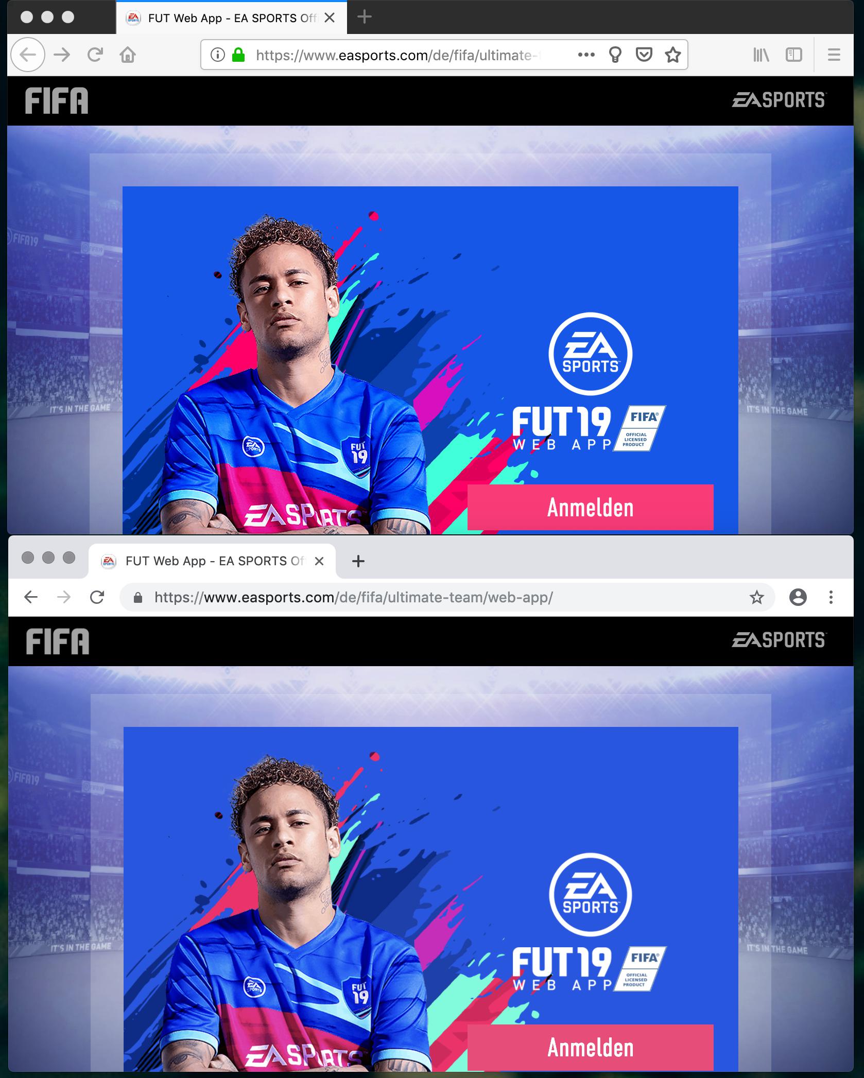
- Go to https://www.easports.com/de/fifa/ultimate-team/web-app/
- Click the "Anmelden" button.

Do you have any additional steps which you perform in order to reach the described state you end up in?
 karlcow
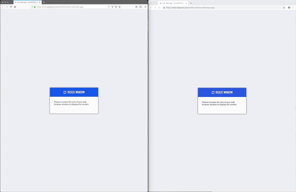
 Regaddi
 adamopenweb
 softvision-oana-arbuzov
URL: https://www.easports.com/de/fifa/ultimate-team/web-app/
Browser / Version: Firefox 64.0 Operating System: Mac OS X 10.13 Tested Another Browser: Yes
Problem type: Design is broken Description: Can't easily access Fifa 19 FUT Web App on Firefox Steps to Reproduce: When visiting the web app, it immediately states, that I should "rotate the device". When shrinking down to a mobilish viewport, the Login is prompted and I can login. When logged in, the App says "Resize window. Please increase the size of your web browser window to display the content." After increasing the size back again to a desktopish size I can access the app. However any list views are rendered like in mobile viewport.
The app works in Safari and Chrome as expected.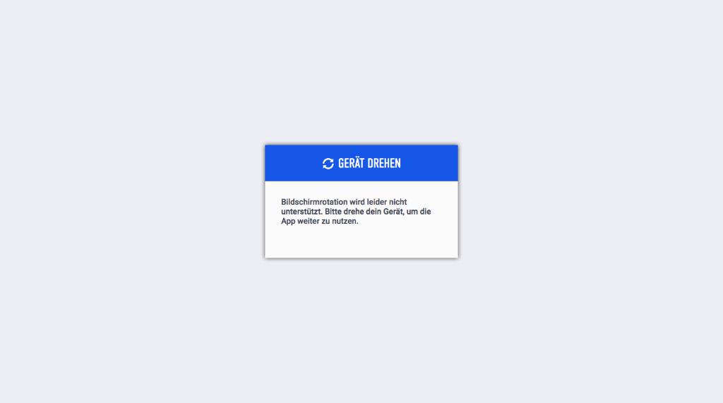
Browser Configuration
Reported by @regaddi
From webcompat.com with ❤️