webcompat / web-bugs

A place to report bugs on websites.
https://webcompat.com
Mozilla Public License 2.0
747 stars 68 forks source link

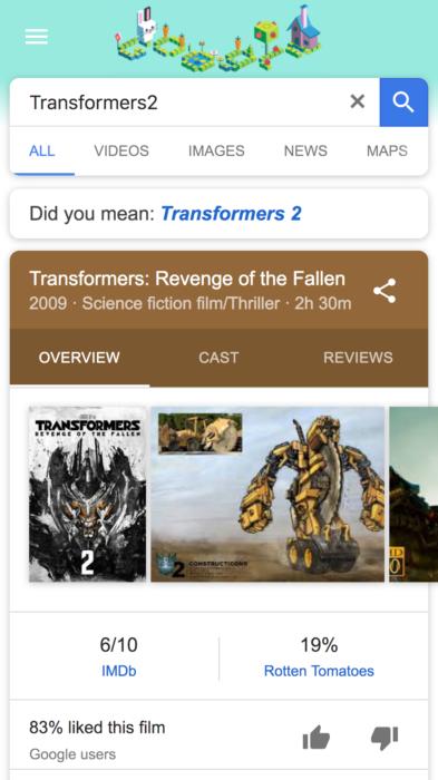
www.google.com - “MPAA” film rating and "New" labels are misaligned #8642

Closed softvision-oana-arbuzov closed 6 years ago

softvision-oana-arbuzov commented 7 years ago

URL: https://www.google.com/search?biw=360&bih=236&ei=ZxqDWb-KAYGva-LjsugK&q=Transformers2&oq=Transformers2&gs_l=mobile-gws-serp.3..0i10k1l3j0j0i10k1.5852.5852.0.7315.2.2.0.0.0.0.423.423.4-1.1.0....0...1.1.64.mobile-gws-serp..1.1.421.TEINKr2L2lI

Browser / Version: Firefox Mobile Nightly 57.0a1 (2017-08-02) with Chrome UA Operating System: LG G5 (Android 7.0) - Resolution 1440 x 2560 pixels (~554 ppi pixel density) Tested Another Browser: Yes

Problem type: Design is broken Description: “MPAA” film rating label is misaligned

Steps to Reproduce:

  1. Navigate to: https://www.google.com/search?biw=360&bih=236&ei=ZxqDWb-KAYGva-LjsugK&q=Transformers2&oq=Transformers2&gs_l=mobile-gws-serp.3..0i10k1l3j0j0i10k1.5852.5852.0.7315.2.2.0.0.0.0.423.423.4-1.1.0....0...1.1.64.mobile-gws-serp..1.1.421.TEINKr2L2lI.
  2. Observe MPPA file rating label on the movie Knowledge panel.

Expected Behavior: Label is centered.

Actual Behavior: Label is misaligned.

Note:

  1. Reproducible for all MPAA file rating labels (e.g. G/PG/PG-13/R/NC-17 - https://en.wikipedia.org/wiki/Motion_Picture_Association_of_America_film_rating_system).
  2. Not reproducible on Chrome (Mobile) 59.0.3071.125, on Firefox 54.0.1 Release and Firefox Nightly 57.0a1 (2017-08-02) without Chrome UA.
  3. Screenshot attached.
  4. Also reproducible for "New" label for "Top voted tags" (https://www.google.com/search?noj=1&ei=jDGEWbexOof7Uvzvl9AE&q=Minority%20Report&oq=Tom+&gs_l=mobile-gws-serp.1.0.35i39k1l2j0i131k1j0i131i155k1j0i20k1.3457.6099.0.7345.27.8.2.0.0.0.396.1836.3-5.5.0....0...1.1.64.mobile-gws-serp..21.6.1497.3..0.KX8rNBR8elU).

Watchers: @softvision-sergiulogigan @softvision-oana-arbuzov

sv; gs

Screenshot Description

newlabelmisaligned

From webcompat.com with ❤️

karlcow commented 7 years ago

The font for the rating is

._gdf {
    color: rgba(0,0,0,.54);
    font-family: Roboto-Regular,HelveticaNeue,Arial,sans-serif;
    line-height: 20px;
}

Roboto Regular but it seems it defaults on "Clear Sans"

Roboto is available on the Android device that I'm using. if I manually specify font-family: roboto then the rating has the right place.

very similar to #8621 and probably many font issues we have recently.

wisniewskit commented 7 years ago

It doesn't work for me to simply change to "Roboto" instead of "Roboto-Regular". The alignment is still not the same as it is in Chrome for the little "ad" boxes, for instance. The reason is their CSS:

._mB {
  display: inline-block;
  font-size: 11px;
  padding: 2px 3px 0 2px;
  line-height: 10px;
}

This is very tightly coupled to how Chrome/Webkit will lay the text out, and it'll almost certainly be slightly off in other engines regardless of the font that's chosen. These days they should really be using this instead to vertically center text in an inline-box on their top-tier content pages:

  display: inline-flex; /* or regular flex if preferred */
  flex-direction: column;
  justify-content: center;
  text-align: center;
  padding: 2px; /* however much they want, or specify a width, etc */

I'm not aware of there being any performance issues with using this instead, and it will be easier for them to maintain it in the longer run as well.

Also note that I'm not sure why they're even doing all of this, because centering text cross-browser really only requires matching the line-height and font-size, which they aren't doing. Instead they're tinkering with different values and padding to compensate (perhaps Roboto has some subtle alignment issues that I'm unaware of?).

RByers commented 7 years ago

@wisniewskit Do you guys see a lot of font layout issues like this? I wonder if it's worth trying to get some more interop between browsers here? I'll try to at least survey a few browsers to better understand the consistency.

RByers commented 7 years ago

Here's a simple repro (not using Roboto) which appears centered to me in every browser except for Firefox. Whether or not this is (or can be) specified, perhaps this suggests that it's worth looking at trying to better align Gecko's text layout behavior with all the other browsers?

wisniewskit commented 7 years ago

I definitely get the impression that it's worth it for interop, @RByers. This seems to me like Firefox is selecting a different baseline for text than other engines (at least in some cases), leading to a range of interop issues. I'm not sure if this is related to the relevant specs being looser than necessary for clear interop, or just Gecko being non-compliant (I'm waiting on feedback in that bug). There are likely other similar cases as well.

RByers commented 7 years ago

Interesting, yeah this seems related to bug 10355. I've added some comments to Gecko bug 1406552. I don't know enough about text layout to know if a behavior difference like this is entirely implementation defined, or how difficult it might be to specify it somewhere. @drott any thoughts?

I guess the use case here is drawing a box around text without any descenders such that the text appears vertically centered in the box.

drott commented 7 years ago

1) I wouldn't necessarily say this is underspec'ed, but there is some implementation leeway for what to do about line-height calculations depending on font rendering settings (rounding ascent/descent depending on subpixel rendering or hinting settings for example) 2) I agree with your use case definition:

I guess the use case here is drawing a box around text without any descenders such that the text appears vertically centered in the box.

I think the tricky part is that values taken from the font's ascent and descent metrics are taken into the line-height calculation. The CSS line height is ascent + descent (in Blink we're rounding these to ints for line-height calculation) + leading. Slightly simplified, leading is the extra spacing between lines. If you set line-height: to say 1.2, then you get 20% extra space added to line-height, 10% are added at the top, 10% below.

We're rounding the ascent and descent values since placing lines at subpixel values on lower resolution displays leads to deteriorated text rendering quality.

But since there is rounding, this means that the baseline can shift a pixel up or down, depending on font size and metrics inside the font.

Given that there are some tricky bits around baseline positioning and font height, subpixel font rendering, etc. I am not sure the use case can be 100% solved by using CSS and bringing font rendering / line-height implementations closer together. For this icon-style use of creating a PG-label, perhaps converting the font to curves and using SVG is the better approach.

Modifying your reduction (see above), testing this with Firefox Beta on Android and with Firefox Nightly on Android, I see that the use of the ClearSans font plays into this. I did not find a way for FF to resolve/use Android's local version of Roboto in this case. But instead, for the font stack defined in the search pages' CSS Roboto-Regular,HelveticaNeue,Arial,sans-serif; it falls back to sans-serif and uses its own ClearSans.

I am attaching two screenshots displaying http://roettsch.es/pglabel/

My interpretation is: Clear Sans contributes to pushing the baseline slightly lower. To some degree that even happens in Chrome. While Roboto's baseline looks okay in both cases. Note that FF finds "Clear Sans" for the font stack in search, while Chrome uses Android's local Roboto for the font stack that is used in search.

However, in the end, there does seem to be a difference in baseline computation between FF and Chrome here, CC @jfkthame.

Chrome Canary on Android

chromecanary_pglabel

FF Nightly on Android ff_pglabel

RByers commented 7 years ago

Thank you @drott!

Here's a screenshot from Safari 11 on MacOS

screen shot 2017-11-22 at 10 46 30 am

And Firefox 57 on MacOS

screen shot 2017-11-22 at 10 48 45 am

Chrome 64 MacOS:

screen shot 2017-11-22 at 10 50 14 am

And Edge 16 via Browserstack

screen shot 2017-11-22 at 10 47 12 am

It seems pretty clear that although there's some variability between fonts, Firefox on Android is really an outlier - everyone else seems to be doing something pretty consistent. At this point I think we're blocked on Firefox folks digging in to understand why their behavior on Android is apparently so different.

For this icon-style use of creating a PG-label, perhaps converting the font to curves and using SVG is the better approach.

I can believe that's true, but for our web compat purposes here it's irrelevant. In practice a major property is doing something that works well on all browsers except Firefox, and our goal is to eliminate the compat problem from ever causing trouble again - not just get google.com fixed. Our only real options for fixing that problem is to either get Firefox to match, or change everyone to something else which we can all agree on (in either case, ideally but not necessarily by writing spec-text and web-platform-tests).

jfkthame commented 7 years ago

Regarding the original example here, where:

The font for the rating is

._gdf { color: rgba(0,0,0,.54); font-family: Roboto-Regular,HelveticaNeue,Arial,sans-serif; line-height: 20px; }

Roboto Regular but it seems it defaults on "Clear Sans"

Roboto is available on the Android device that I'm using. if I manually specify font-family: roboto then the rating has the right place.

this is a clear web authoring error, related to a WebKit/Blink bug. Note that Roboto-Regular is not a valid font family name, and so the given CSS should not result in the browser using Roboto at all. Roboto-Regular is the PostScript name of a specific face within the Roboto family, and should not be recognized by the font-family property. The CSS Fonts spec is quite clear on this. This behavior is a longstanding bug in the WebKit-derived browsers (also seen on macOS), and leads to people writing non-interoperable CSS like this.

drott commented 7 years ago

@jfkthame I agree. However can you confirm that FF on Android can actually access the system fonts? I should retest, but if I remember correctly, FF Nightly did not pick up system Roboto even if I used Roboto as family name, see above:

I did not find a way for FF to resolve/use Android's local version of Roboto in this case.

jfkthame commented 7 years ago

I'm not aware of any reason it wouldn't be able to use system Roboto. Note that @karlcow's comment said that

Roboto is available on the Android device that I'm using. if I manually specify font-family: roboto then the rating has the right place.

suggesting that it worked fine for him.

miketaylr commented 6 years ago

However can you confirm that FF on Android can actually access the system fonts?

@snorp would you know of any bugs around this?

wisniewskit commented 6 years ago

For the record, the Blink bug making it permit Postscript font names is: crbug.com/641861

wisniewskit commented 6 years ago

Also, I no longer see an MPAA rating on these film pages. @karlcow, @softvision-oana-arbuzov, can you still see it?

karlcow commented 6 years ago

The design has changed.

Screenshot Description

miketaylr commented 6 years ago

@snorp would you know of any bugs around this?

(i sent a follow-up email to James)

softvision-oana-arbuzov commented 6 years ago

The issue is not longer reproducible since the design has changed and “MPAA” film rating and "New" labels are no longer available. screenshot-1525957413451

Tested with: Browser / Version: Firefox Nightly 62.0a1 (2018-05-09) Operating System: Samsung Galaxy Tab S3 (Android 7) - 1536 x 2048 pixels, 4:3 ratio (~264 ppi density), Samsung Galaxy S6 (Android 7.0) - Resolution 1440 x 2560 pixels (~577 ppi pixel density) Add-on: Chrome UA on Google For Firefox Android

softvision-oana-arbuzov commented 6 years ago

Re-tested and the issue is no longer reproducible due to the design change.

Tested with: Browser / Version: Firefox Nightly 62.0a1 (2018-06-06) Operating System: Samsung Galaxy S6 (Android 7.0) - Resolution 1440 x 2560 pixels (~577 ppi pixel density), Google Pixel (Android 8.1.0) - 1080 x 1920 pixels (~441 ppi pixel density)