Closed karlcow closed 5 years ago
They seem to be doing server side detection, probably using a device detection framework.
mtaylor at omg in ~/dev/compat/addons/baloney on master
π http http://www.rakuten.co.jp/ User-Agent:"$IOS" | grep format-detection
<meta content="telephone=no" name="format-detection">
mtaylor at omg in ~/dev/compat/addons/baloney on master
π http http://www.rakuten.co.jp/ User-Agent:"$FFA" | grep format-detection
(no result)
IE Mobile and Chrome Mobile also get the mobile optimized site.
Straightforward server-side browser sniffing: Compare the content-length of the responses to these HTTP requests
GET http://www.rakuten.co.jp/ HTTP/1.1 Host: www.rakuten.co.jp User-Agent: Mozilla/5.0 (Android; Mobile; rv:34.0) Gecko/34.0 Firefox/34.0
HTTP/1.1 200 OK Content-Type: text/html; charset=EUC-JP Vary: User-Agent Content-Length: 307333
GET http://www.rakuten.co.jp/ HTTP/1.1 Host: www.rakuten.co.jp User-Agent: Mozilla/5.0 (iPhone; CPU iPhone OS 6_0 like Mac OS X) AppleWebKit/536.26 (KHTML, like Gecko) Version/6.0 Mobile/10A405 Safari/8536.25
HTTP/1.1 200 OK Content-Type: text/html; charset=EUC-JP Content-Length: 172338 Vary: User-Agent
We might be able to get a contact through W3C representative. Rakuten became a member of W3C a little while ago.
Mozilla Japan has a contact. Tomoya or other guy will contact them. Also Discuss about #916 to them.
@kudodo Has rakuten been contacted?
Yes, @chikoski is discussing with Rakuten. They know the problem, therefore showing desktop site now. Still under negotiation for fixing the issues.
thanks :+1: switching to sitewait.
This is not fixed. User agent override candidate.
For documenting.
Still a couple of glitches. for this part.
Ah this too.
aka
<div id="search">
<ul id="searchUpper">
<li id="searchInput" class="sggstInputWrap">
<span style="display:block;position:relative;"><input value="" name="sitem" size="40" class="searchInput clearValueButton" id="sitem" placeholder="γγΌγ―γΌγγγζ’γ" autocomplete="" maxlength="2048" type="text"><div style="position: absolute; height: 36px; width: 36px; top: 0px; right: 0px; cursor: pointer; z-index: 9999; display: none;" id="clearVal"><img src="http://a.ichiba.jp.rakuten-static.com/com/img/home/iphone/top/btn.gif" style="position:absolute;top:50%;left:50%;margin-top:-10px;margin-left:-10px;right:5px;"></div></span>
<span class="delval" style="height: 30px; display: none;"></span></li>
</ul>
<div class="boxPCAC" id="searchLower">
<div class="select" id="searchSelect">
<select name="g" class="searchOption" id="foo1">
<option value="0" selected="">γΈγ£γ³γ«γ§η΅γθΎΌγ</option>
<!-- cut the options -->
</select>
</div>
<div id="searchBtnBox">
<input value="ζ€η΄’" name="sp_and_search" id="searchBtn" type="submit"></div>
</div>
</div>
CSS is
#searchLower {
display: -webkit-box;
display: box;
-webkit-box-pack: justify;
box-pack: justify;
}
.boxPCAC {
display: -webkit-box !important;
display: box !important;
-webkit-box-pack: center !important;
box-pack: center !important;
-webkit-box-align: center !important;
box-align: center !important;
}
If I add display: flex !important;
it fixes it.
.boxPCAC {
display: -webkit-box !important;
display: box !important;
-webkit-box-pack: center !important;
box-pack: center !important;
-webkit-box-align: center !important;
box-align: center !important;
display: flex !important;
}
It would probably requires too
#search select.searchOption {
font-size: 12px;
height: 30px;
appearance: none;
-moz-appearance: none;
}
``
@dholbert I wonder if it's part of https://bugzilla.mozilla.org/show_bug.cgi?id=1208635
Rakuten has redesigned a bit its Web site, but still doesn't know how to identify Firefox Android on mobile.
This is currently what it looks like on Firefox when we lie about the user agent string (faking Chrome UA)
I wonder if someone from @Rakutentech can help us find the right person in charge of the user agent sniffing for the Rakuten server so Firefox Android can receive the mobile version which is sent to Chrome and others.
Maybe @tcnksm or @CAFxX
Asking internally who's the right person @karlcow
@CAFxX Wonderful. Thanks a lot. If someone at Rakuten needs help, do not hesitate to ask.
@karlcow I've received internal confirmation that they're looking into it
Excellent. Thanks for letting us know.
As of today this is not fixed. We will probably put in place UA override for fixing it. https://bugzilla.mozilla.org/show_bug.cgi?id=1385206
This issue is still reproducible.
Tested with: Browser / Version: Firefox Mobile Nightly 58.0a1 (2017-11-05) Operating System: LG G5 (Android 7.0) - Resolution 1440 x 2560 pixels (~554 ppi pixel density)
Seems to finally be working with no issues on Firefox for Android! Mobile site is provided.
Can you check again? I attached my screenshot, seems good to me.
Sorry, my bad, I didn't know about the User Agent override: https://hg.mozilla.org/mozilla-central/raw-file/tip/mobile/android/app/ua-update.json.in
I can't confirm if the issue was fixed.
It works for me too now and the layout has changed from the original reported one. Also #1385206 is fixed.
Tested with: Browser / Version: Firefox Nightly 65.0a1 (2018-12-17) Operating System: Samsung Galaxy S7 Edge (Android 8.0.0) - Resolution 1440 x 2560 pixels (~534 ppi pixel density)
@karlcow can you confirm this also?
confirmed.
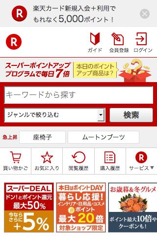
URL: http://www.rakuten.co.jp/ Browser / Version: Firefox 39.0 Operating System: Android Problem type: Desktop site instead of mobile site
Steps to Reproduce 1) Navigate to: http://www.rakuten.co.jp/
Expected Behavior: Receive the mobile version
Actual Behavior: Receiving the desktop version. This is not happening all the time. Firefox Android users sometimes get the mobile version, sometimes the desktop version. See also https://bugzilla.mozilla.org/show_bug.cgi?id=958411
country: jp