Closed neoinsight closed 8 years ago
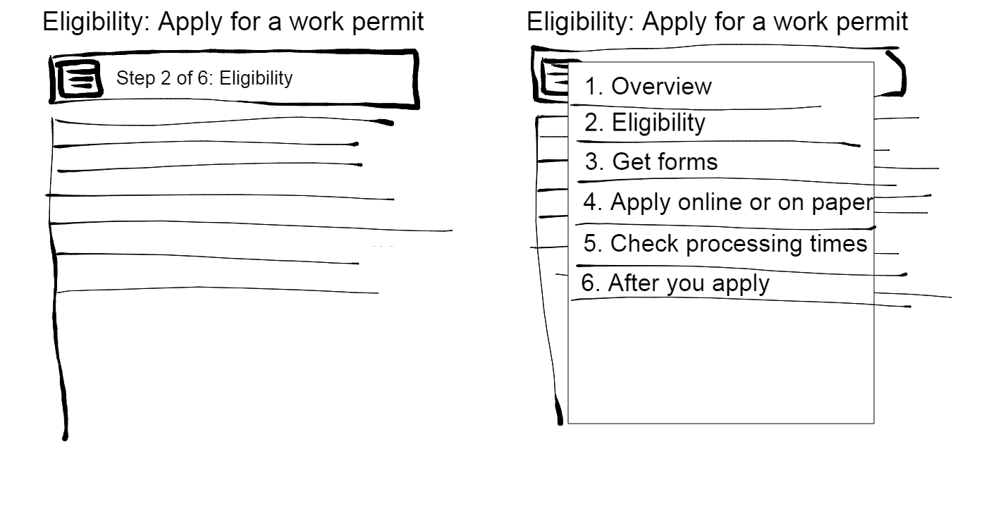
@pcwsmith, here is what I've come up with to make Advanced Service Initiation more mobile-friendly. I tried several alternatives at the top -
So what I want is for the element to be open by default for wide views, and closed by default for narrow views. But I don't know how to do that - beyond my rudimentary coding abilities.
@thomasgohard Can you advise me on whether/how this is possible? Maybe it would have to be a new variant of Details/Summary Polyfill called Mobile Details/Summary Polyfill. This new variant is OPEN on wide views by default, and CLOSED by default on narrow views. Whatever, I just need some code that would make it work for testing purposes. Then we could take someone's existing Advanced Service Template implementation and test on desktop and mobile with this version.
Here is a link to a demo page with it working - except it's just step 1 of 6, none of the other steps are implemented so it's just for a demo. http://neoinsight.com/test/wetform2/enavgcdemo2.html
Thoughts and feedback welcome.
Before collapsing those elements, what about reducing the amount of space they're using?
There's a lot of white space around those elements, that can be reduced. We can also suppress the title on non-active elements. As long as we make sure the touch targets are large enough it should be fine. And that way we wouldn't force an interaction to display the steps.
@thomasgohard Good point and applies to desktop too! Laptop users risk seeing only the top of the template. I still find the middle one too much for mobile users to scroll through.
I really like Option 3 above, except that the NEXT title should be expanded, not the current one. So the 1 would be dark blue and collapsed if you are on 1, and you would see 2. Eligibility instead. I got very excited about it but then thought through that it still risks pogo-sticking - they still have to touch and click to see WHAT #3 is and go back if it's not the right one, which is what I was trying to address.
The point is that I only want to collapse for mobile, not desktop. Is that possible? Keep the ideas coming!
I really like where we're headed with this. What are your thoughts on this?
The main concerns I was looking to address:
Potential issues that may arise:
Alternatively, what about something like this, which would address the issues above:
sorry for being late to the party here, but it looks like yer all doing fine without me lol.
@patburt I do think two menu icons might be confusing? - and also we have seen in the user testing so far that while some folks get the hamburger, others miss it completely. So doubling down might be risky?
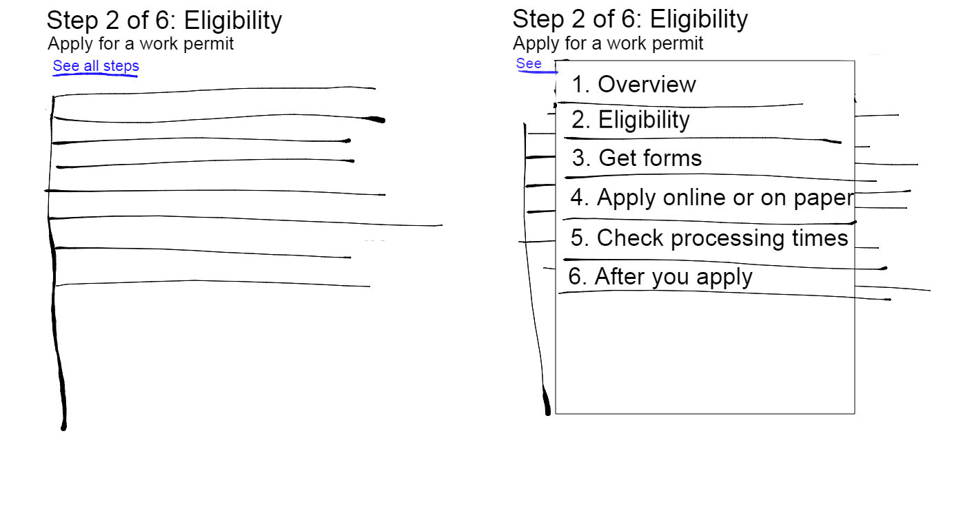
I like the "See all steps" link - that's a clear and simple instruction which helps to compensate for the steps being hidden.
@thomasgohard I like option three - can we see it with the tweaks that @neoinsight suggested? How would the expanded button look with a longer label? (e.g with "documents you must provide" from the example)
@patburt Your description of the concerns is exactly right. Agree with @pcwsmith that a menu button has not been successful so far, so another is not a good idea. 'See all steps' would likely work really well. In fact, if you squish the working demo page I created to mobile view, your final sketch does portray the way the demo works in mobile now ( http://neoinsight.com/test/wetform2/enavgcdemo2.html )- I just changed the link to 'See all steps'.
There are clearly two issues here that we are working on - want to keep them both in mind:
So I'm back to the question for @thomasgohard - could we create something that opens by default in desktop and closes by default in mobile?
What if it was more of a floating menu instead of an expand/collapse, so this doesn't happen: "I pressed a button and nothing happened!"
Trying a little harder with mockups:
edit I also reformatted the header. For the coders out there, I used <small>
in the header.
@patburt oh yeah we gotta fix the breadcrumbs too! If memory serves, there's an issue somewhere on this thing about making 'em responsive...
@patburt Oh I see, good point! Great idea on the header. Will go do that so the demo keeps improving.
I haven't actually seen that problem happen in testing with details/summary - the "I clicked a button and nothing happened" - it seems like there is enough of a cue in the arrow and highlighting.
There are floating overlays in WET4 http://wet-boew.github.io/v4.0-ci/demos/overlay/overlay-en.html The centred one looks like what you've portrayed. The right panel one could be a good solution - but it works the same in mobile and desktop views.
Like this: http://neoinsight.com/test/wetform2/enavgcdemo3.html
That's sharp. I like it. I imagine CSS/Javascript can be whipped up so the overlay only happens in mobile. @thomasgohard ?
@patburt That may be considerably more complex than the details/summary, because it just has to open or close based on mobile, but here there's whole different chunks of code. I understand from background discussions that differentiating on mobile versus desktop is a real design cost and risk, since so much is built on standard HTML5 and Bootstrap. Correct @thomasgohard ?
But now that we've gone down this path, I have another idea. What if the OVERVIEW page stays exactly the way it is right now (ok, with the spacing tightened up a bit), then the STEP pages have a different template that uses the overlay or details/summary to only See all steps if they are needed.
That way they can stay the same in mobile and desktop. I will implement that in the demo and we can all give it a try. More later...
@neoinsight @thomasgohard @patburt @pcwsmith : Great discussion with a mobile mindset as the first, and are we closer to closing this issue?
@hsrudnicki No, this will take another round of testing before it can be closed, probably at least a month.
@patburt , @pcwsmith Ok, here's the demo. Step through starting from here: http://neoinsight.com/test/wetform2/enavgcdemo_locs-en.html
Click the link for Newfoundland and Labrador - you'll land on the OVERVIEW. It has all the steps laid out in full. But after that, click Next or 1.Marine Weather, and you'll end up on a step page with the steps hidden in the See All Steps details/summary. So there are three pages in this demo - the first with the locations, the second is the Overview for Newfoundland and Labrador, and the third is Step 1 for Newfoundland and Labrador.
This broke the current model where the overview is part of the steps, and you can always get back to it, but the I decided that was ok, because the overview is NOT a step. In the early testing we did on the prototype, no one ever went back to the overview again after the first time they saw it.
Looks good. Liking the idea that the overview lives above the steps (heh). Any way we can adjust the overivew page in the demo so that it uses Thomas' minified buttons:
@pcwsmith Re your comment above about the minified buttons. The whole point of the Overview page is that it's the only place that you see the full text of all the steps. So if you are coming back after submitting an application to find out how to check the status for example, you want to see all the full text on the overview to skip directly to that after applying step.
sorry attached the wrong crop - meant the second one.
Maybe the following discussions can help in solving this issue: https://github.com/wet-boew/wet-boew/issues/4287 https://github.com/wet-boew/wet-boew/issues/4915 https://github.com/wet-boew/wet-boew/issues/5516 https://github.com/wet-boew/wet-boew/issues/6493
My "two cents" to your discussion: 1) Based on http://www.smashingmagazine.com/2013/03/27/navigation-mega-sites/ discussion about Navigation For Mega-Sites navigation, and that the micro-site approach is the most reliably scalable. Micro-sites can break larger sites down into manageable content areas. "Most importantly, they can be simultaneously distinguished from and related to each other by careful use of graphic design." Think of " breadcrumbs working as a large format navigation system on their own, but do think they are very powerful complement to traditional navigation formats" 2) Generally, and as well based on https://www.patternfly.org/wikis/patterns/navigation/primary-navigation-bar/, applications may have from 1 to 3 levels of information hierarchy. Each application will have primary navigation, which is the highest level of order in the navigation. Primary navigation may be followed by secondary and tertiary levels of navigation, as needed. The single-level menu includes a horizontal row of linked items, that is the default primary navbar, and all other options are added to this basic pattern. There two options to combine these next-level navigations either horizontally as a next level of persistent navigation or with a vertical menu pattern when you want to expose local navigation 3) Additional consideration based on the second link: the primary horizontal navbar should contain no less than 3 and no more that seven menu items, also the selected item should be highlighted/active, a responsive design implementation is required
@pcwsmith Ah, that revised image makes more sense. Maybe we could add this change to https://github.com/wet-boew/GCWeb/issues/930? I didn't think that one should be closed - this fits with the tweaks approach - I believe @dk-night agrees. @shawnthompson could tell us whether it's possible?
I'll summarize this issue for now, based on a group discussion yesterday:
https://github.com/wet-boew/GCWeb/issues/970 - refers to the Advanced Service Initiation template, but it's a styling issue (use of graphic design in mega-sites navigation) for next previous buttons in mobile view to move between siblings of this web page template
As discussed yesterday with @thomasgohard @lucas-hay @LaurentGoderre @nrustand92 @dk-tbs @neoinsight , we will proceed with tweaking the in-page nav elements in the Advanced service initiation template, given recent usability results.
Finding was that the top menu takes up too much space in mobile – users can’t see page content. To fix, Thomas and team will revise the CSS to slim down the menu - as per his design option referenced in my comment from May 13: https://github.com/wet-boew/GCWeb/issues/971#issuecomment-101807940
Proposed timeline: v4.0.17?
I know that most users weren't annoyed they had to scroll down after tapping the steps buttons on mobile. Will it help if once you tap, e.g. apply, then user automatically jump to the "Apply" section rather than scrolling down? On Jul 16, 2015 2:11 PM, "Peter Smith" notifications@github.com wrote:
As discussed yesterday with @thomasgohard https://github.com/thomasgohard @lucas-hay https://github.com/lucas-hay @LaurentGoderre https://github.com/LaurentGoderre @nrustand92 https://github.com/nrustand92 @neoinsight https://github.com/neoinsight , we will proveed with tweaking the Advanced service initiation template, given ecent usability results:
Finding was that the top menu takes up too much space in mobile – users can’t see page content. To fix, Thomas and team will revise the CSS to slim down the menu - as per his design option referenced in my comment from May 13: #971 (comment) https://github.com/wet-boew/GCWeb/issues/971#issuecomment-101807940
— Reply to this email directly or view it on GitHub https://github.com/wet-boew/GCWeb/issues/971#issuecomment-122038373.
@nrustand92 That would probably help, but note that it's not really scrolling, it's opening a new page. The other thing is that would make it work differently than in desktop view. The WET team has been focused on keeping the interaction (in particular what happens when the user clicks/touches something) the same for the different views. Based on the testing, tuning the CSS to trim those menu boxes should address this.
@neoinsight ok I understand :-) On Jul 17, 2015 9:15 AM, "Lisa Fast" notifications@github.com wrote:
@nrustand92 https://github.com/nrustand92 That would probably help, but note that it's not really scrolling, it's opening a new page. The other thing is that would make it work differently than in desktop view. The WET team has been focused on keeping the interaction (in particular what happens when the user clicks/touches something) the same for the different views. Based on the testing, tuning the CSS to trim those menu boxes should address this.
— Reply to this email directly or view it on GitHub https://github.com/wet-boew/GCWeb/issues/971#issuecomment-122272375.
Closing this issue - addressed by #1013
Based on recent testing with mobile participants, I'm seeing a need to address some design issues to improve mobile success. This might include re-ordering the order elements appear in mobile, as per issue https://github.com/wet-boew/GCWeb/issues/969. But it should also address ensuring that templates are mobile first, particularly if they are designed for mobile hotspots - services that analytics show are getting a disproportionate level of use from mobile devices compared to other services/pages.
In particular the advanced service initiation template ( http://wet-boew.github.io/themes-dist/GCWeb/servicecomplexe/index-en.html )is a concern in mobile. We have only tested a prototype with a few desktop participants. We looked at using it for a Coast Guard service, but the service is a mobile hotspot - high rates of mobile use, and having all those steps at the top of every page in mobile view meant way too much scrolling before they got to the task content.
We ( @steve-h and I for DFO) are exploring a number of design options that include:
We'll post a link here to the mockups once we have something ready for discussion and review.