whoisjunhong
commented
2 years ago
whoisjunhong
commented
2 years ago 
Open whoisjunhong opened 2 years ago
whoisjunhong
commented
2 years ago
 soc-se-bot
commented
2 years ago
soc-se-bot
commented
2 years ago No details provided by team.
[The team marked this bug as a duplicate of the following bug]
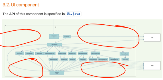
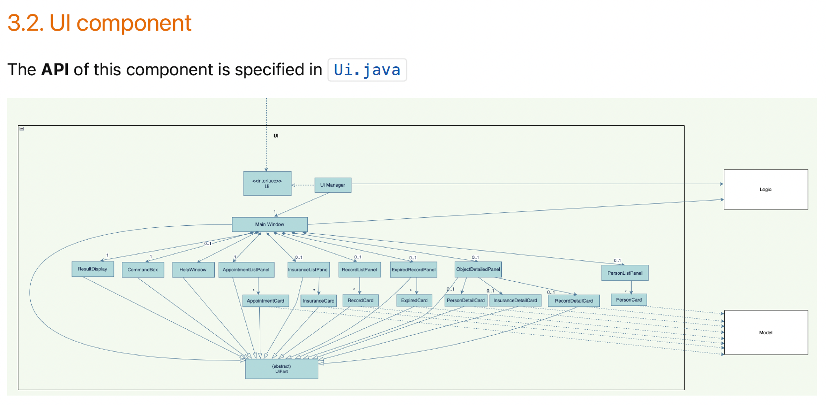
Too many components, everything is too small in the Ui component diagram
Note from the teaching team: This bug was reported during the Part II (Evaluating Documents) stage of the PE. You may reject this bug if it is not related to the quality of documentation.
Since there is numerous components, everything appears as too small to be read without zooming in.
[original: nus-cs2103-AY2122S2/pe-interim#3496] [original labels: severity.VeryLow type.DocumentationBug]
[This is the team's response to the above 'original' bug]
We truly have this many components and this is already the high-level components only. there is no low-level components shown in the diagram. also, this is the biggest size we can show on the page.
Team chose to mark this issue as a duplicate of another issue (as explained in the Team's response above)
Reason for disagreement: Similar to the original issue, however, my issue states that the font size is too small. I am okay with the number of components stated.
Team chose [response.Rejected]
Reason for disagreement: I think with the large amount of components available, it would be good to increase the font size or even increase the box size to make the diagram neater and more visible. As shown in the image below, there are so much empty space for the components to be placed or enlagred to aide the developer in reading your DG