Team's Response
No details provided by team.
The 'Original' Bug
[The team marked this bug as a duplicate of the following bug]
It would be helpful to the target user to be able to view multiple components (Client, Insurance, Record, History) especially when using certain commands
When using edit commands such as 'edit -r', it requires many parameters such as CLIENT_INDEX, INDEX (for record), and INSURANCE_INDEX. As per the UG,
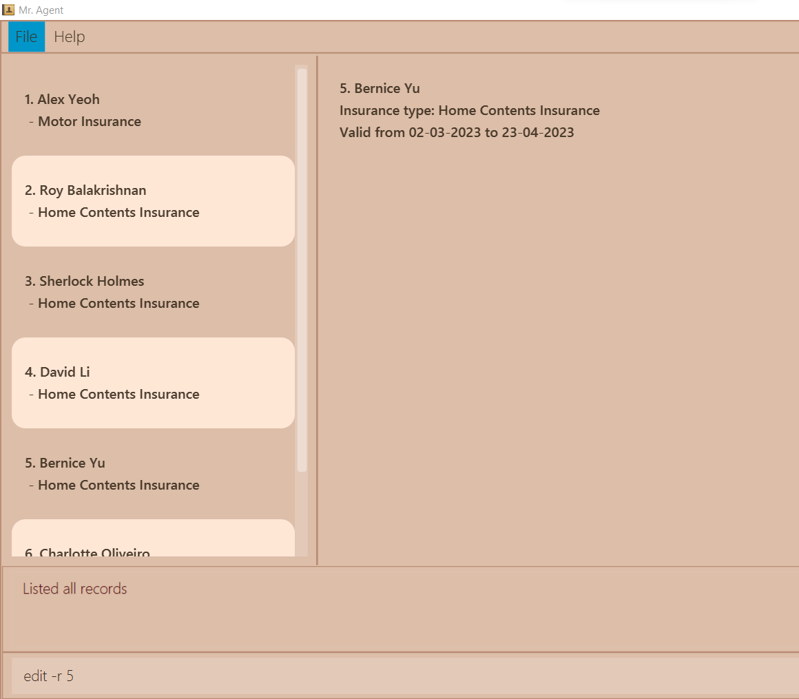
However, Client, Insurance, Record and History all share the left side tab. Doing list -c, list -i, list -r, list -h and list -e clears the left side of the GUI. So for example, when I am trying to use edit -r, the tab is usually on Records (since the user is likely to do list -r first). However, both the CLIENT_INDEX and INSURANCE_INDEX is required. Often times, especially with many insurances or clients, I may not be able to remember exactly which index the client is at or the insurance is at. Lets say I want to edit Record 5:
In this case, if I'm unsure about which insurance index or client index I want, I have to delete my command and check and memorise the index numbers/write down which defeats the purpose of quick and efficient CLI for this application.
[original: nus-cs2103-AY2122S2/pe-interim#3033] [original labels: type.FeatureFlaw severity.High]
Their Response to the 'Original' Bug
[This is the team's response to the above 'original' bug]
There is no major problem using this feature. However, it will affect user experience and cause inconvenience only. If we put everything in the same panel, there will a problem of arrange them.
Items for the Tester to Verify
:question: Issue duplicate status
Team chose to mark this issue as a duplicate of another issue (as explained in the Team's response above)
- [x] I disagree
Reason for disagreement: It is a different issue, mine states that it violates typing preferred constraint. This issue states that the user can view the start and end date of the insurance after clicking on the user box.
:question: Issue severity
Team chose [severity.Low]
Originally [severity.Medium]
- [x] I disagree
Reason for disagreement: The user can only view the insurance start and end date of the user in the center box only by clicking the user box, if the user were to use the keyboard as intended, such as UP and DOWN arrow and pressing ENTER to select the user, ENTER button does not select the user and display the start and end date of the insurance of the user in the CENTER OUTPUT BOX. A video is attached below to show the issue in more detail. The CIRCLE around the mouse arrow represents a mouse click.


Context: Data such as the start and end dates cannot be viewed without the use of a mouse, it violates Constraint-Typing-Preferred