Closed Nyekomimi closed 6 years ago
Yes, I have the exact same problem. I'm on Win7 64bit Ultimate. I tried going with the dark theme and I still have the same issues and the dark theme does not change the area above and where the tabs would appear. Why did FF change this? It is really ugly now and frankly no faster than before.
In Win10 and OSX they are properly curved on hover + when selected. Transparent otherwise.
Unfortunately I don't have a machine running Windows 7 anywhere to test this :(
I'll keep this thread open in case someone may create a pull request to fix this bug? Screenshots etc welcomed.
When using fe. this https://addons.mozilla.org/cs/firefox/addon/summer-time-converse-madonna/, the tabs/tabs backgrounds are ok.
I can confirm this bug in my Windows 7 Ultimate x64. Also, it only bugs with the Firefox's default, light, and dark theme. If you use other themes, it doesn't have the weird background bug.
Windows 7 Pro x64 - same here
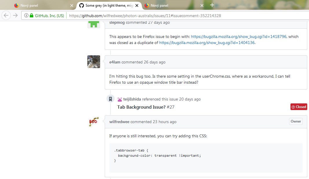
This appears to be Firefox issue to begin with: https://bugzilla.mozilla.org/show_bug.cgi?id=1418796, which was closed as a duplicate of https://bugzilla.mozilla.org/show_bug.cgi?id=1404136.
I'm hitting this bug too. Is there some setting in the userChrome.css, where as a workaround, I can tell Firefox to use an opaque window title bar instead?
If anyone is still interested, you can try adding this CSS:
.tabbrowser-tab {
background-color: transparent !important;
}
Yes, confirm, works with default layout well in w7. Thank you.
I've released the fix and will resolve this. :)
https://github.com/wilfredwee/photon-australis/releases/tag/v0.3.2
This make entire point of skin moot (since that rectangle makes it look squarish ect) and keeps "tabs" part of hud too high (as it is in vanilla Firefox Quantum), rather than making it shorter (like it should be and like it was in previous Firefox instances)